Monday, November 29, 2010

Animation. Or thinking about aniamating, at least!


Animation is on my mind right now. Renderosity was having a sale (seems like everyone is having them) and I took a whole bunch of things out of the wishlist and dumped them in the cart ... not quite on a whim. The models were carefully chosen to either add to the NARC video I'm almost ready to work on, or the graphic novel which I'm working on daily --

But as I began, animation is really on my mind, and I spent a little while at YouTube, looking for two things. One is the theatrical trailer for the movie which was done about 12 years ago now, Final Fantasy II - The Spirits Within. The state of the art in 1998 was already amazing. Check this out:


You notice what's kept to an absolute minimum? Human faces. The digitals were already perfect for machines, skies, landscapes, flame and explosion effects, But you might notice in the few shots of human faces, those faces are, with the exception of the girl at the heary of the story, not as expressive as real human faces.

I read somewhere, a loooong time ago, that a vast amount of the budget of the movie was spent on her hair! They also spent huge amounts of time, budget and processor power on the one character -- so much, in fact, that if they'd tried to give all the characters the same justice, the movie would probably have been in production till 2003!

So, wisely, they put their efforts into doing one character superbly and the lashing up the SPFX around her. Now, fast-forward ten years, and watch this:


...this is not the same as the Final Fantasy video I embedded a few weeks ago. This is a very different mix, with a different music track. The the whole thing pivots on the expressiveness of of the characters -- of whom the boy (is the name Tidus? I don't actually know the game) is by far the more expressive. Allow for the video compression, of course -- and then remind yourself ... this wasn't done for any major motion picture. These were the video clips done to accompany a game.

Phew. CG animation has come a long, long way in the last decade, and you have to wonder where it can, and will, go in the next decade. My personal hope is that there is a continual trickle-down of technology. Right now, the animation I hope to do is a mix of the "cunningly devious," the simple and the damn' hard work. It's all going to have to be keyframed, because that's what I have to work with. It'll also have to be within the rendering capacity of the two machines we have on the desktop. Ten years from now, what will we be able to do on the desktop? One lives in hopes...

And -- with somewhat baited breath! -- I'm just about to give it a shot and see what's doable.

Jade, 30 November
NOTE: posted using MK's logon because this afternoon, I cannot connect -- how weird is that?

Wreathed in light


Just a grab bag of images today -- some pretty spectacular stuff, but nothing that follows a single theme. I was "painting with light" again. I wanted the absolutely classical male form, and this is close to it. Beautiful. The body morphology reminds you of the young Ron Ely. Now, don't you dare tell me you don't know who Ron Ely is! Even if you weren't born in 1968, that's no excuse ... well, maybe a little one. But only a little one...

Most of the rest of this post has been deleted because it refers to in-progress renders ... and since the images have vanished here, the text is worse than "serves no purpose!"


...And yes, I would be using Photoshop Elements, if it didn't cost $149! I was looking at Corel Painter today ... whoa. And that one is $700. So I think I'll stick with GIMP and try it on Windows 7, on the laptop!

Jade, 29 November

Saturday, November 27, 2010

Screamin' Science Fiction ... Jane Russell on Steroids (or, fourteen year olds making laundry)


Sorry guys, I just couldn't resist. Classic erotic science fiction of yesteryear is the (fairy) godfather of the works of Boris and Julie which are titillating today's fourteen year olds (and making a bunch of laundry), but if you think we invented the genre -- nope. Sorry. Anyway -- I felt like being a bit silly today, and why not? Here's the art without the overlays:

And this was the sensible, conservative one! After this I thought, hey, let's get really silly. You want Jane Russell on steroids? (And for those of you who don't know who Jane Russell is ... for godsakes find out before you get any older!)


There you go, Jane Russell on steroids, as depicted by some ancestor of Boris's, for the 1949 edition of Screamin' Science Fiction.

Just kidding, folks. It's the warrior maiden I rendered seriously yesterday, with a new backdrop painted in GIMP with Ron's Bokeh brushes. I just ... attenuated a couple of the, uh, extremities. Didn't even have to reset the lights. And you know me when it comes to laying out magazines and paperbacks. I love doing it. I do the whole job in Serif, which makes it huge fun.

Also, one of my favorite 3D model haunts, Content Paradise (which is the model emporium belonging to Smith-Micro, the company behind Poser) was having a Black Friday Sale -- 600% off everything for 24 hours. So I shot straight over there and got loads of the things I've been needing to stage the coming episodes. There's tons of stuff you never saw before. Tomorrow, I'll be doing the next chapter, but I'll be doing it directly from the script to the graphic novel format, no narrative format in between. These pages are not due to be up on the Abraxas site for another three weeks, because I'm posting 2-3 pages per day, but yes, I'll give a sneak preview on the blog here, for the folks who have been following the story for a month or more. You shouldn't have to wait...

Jade, 28 November

Thursday, November 25, 2010

Warrior Maiden


Happy Thanksgiving to all my American visitors! Just touching base with you here, actually ... am pretty sick at the moment, and haven't had the time to do much of anything for a couple of days. This here is Beryl. One of three twin sisters, Beryl, Bertha and Beulah. Warrior maidens ... at least in the mind of some fourteen year old male who has the idea that 1) voluptuous women bounce off to battle mostly naked, and 2) voluptuous women remain maidens for long enough to bounce off to battle done up any way at all.

Just one piece today, because it took several centuries to get this render. It's raytraced, and each render takes forever, even with a fast machine. Then you discover that the lights are too bright, or not bright enough, or in the wrong places, etc., and 25 mins. through yet another render you cancel out of it and start again.

This one is a real Boris girl. I'll do some more renders featuring Beryl -- probably tomorrow, now I've got the whole thing set up.

More tomorrow. Must go and take a pill now. Or something.

Jade, 26 November

Monday, November 22, 2010

Creating character body morphs in DAZ Studio 3


As promised, here's the companion feature -- or continuation of the feature -- where we created a new, unique Michael 4 character, starting with the "doll" right out of the box. In the last segment we created the face from scratch. In this one, we're going to work on the body, and we'll wind up with the stunning creature you see striking a pose above! In fact, this one is such a stunner I went on and did a male nude glamour shoot with him, which will be posted to the Exotic blog in about an hour. Stay tuned.

Okay, so let's get started! First, return to the file where you were working on the face and back the camera off so you can see the whole body...

This is the doll, just as it loads. The only thing it's had done to it is, the JM Alexander skinmap (hairy ... default) is loaded, and I put a pair of Speedoes on him for the sake of modesty. Also, on this blog I won't be talking about how to load up and configure the dangly bits. That would be inappropriate for a blog where the faint of heart are known to tread, albeit infrequentlly

The first thing to notice is that when you select the M4 model, the Morphs++ menu opens up on the right side of your screen. These morphs are the familiar slider bar controls that give you absolute control over virtually everything.

Let's be silly before we get clever. Lets' grab the "whole body" slider controls and drag them as far as they'll go, see what happens:

Instant Incredible Hulk. How did a shaved gorilla get in here? Thank gods for the UNDO icon! So when you've seen how far you can push everything, undo the whole thing and get back to the M4 doll. Now, start with the full-body morphs and adjust them delicately to get a nice balance of body morphology...

NOTE: all the screencaps in this tutorial are uploaded at 1:1 size, so you can click to open them and see exactly where I dragged the controls. You can read the percentages off the images, if you wanted to absolutely duplicate this bod!

Now, this is a bit more like it. He looks like an athlete, really toned. Now you can get into the minor adjustments. This is the point where the visual changes can be rather subtle. You might have to look twice to see the difference, but in the one below I've been working on the arms and shoulders...

This is closer to what I had in mind when I started, so it's time to turn him around and organize the kind of bubble butt that makes it into the magazines:


So far, so good. I "turned off" the Speedoes so you can see the effect. You have the morphs to change the size and shape of the glutes, the flex and tension on them. I also changed the width of the hips and the amount of "love handles" he's carrying. This is starting to look really good, so -- "turn on" the Speedoes and turn him back around:

Starting to look very nice indeed. Starting to get that "bombshell model" look about him ... so, on a whim I decided to change the skinmap. It's still JM Alexander, but I switched to the "shaved" option. Models are always depilated:

At this point, it's also worth rendering one and seeing what the overall effect is. I don't have any lights set in this render. I have gone into the Surfaces tab and turned the "lighting model" to MATTE on both the M4 and the Speedoes. If you don't turn the skinmap's lighting model to MATTE, almost all of them get white blotches. And when the skinmap's lighting model has been changed this way, you also have to change the lighting model on the costume, or it'll shine like patent leather, which looks unrealistic.

Now, when you set the lighting models to MATTE, and you don't have any lights set up on the character, your first render will probably look dull, even lifeless. Don't worry about it -- this will come back to life when you set up your lights.

And now it's time to get "up close and personal." I won't be working below the belt in this feature, for obvious reasons, but unless you're happy with the generic chest, it's time to work on that, and you will find that you have control of everything. And I mean, everything.

The results are good enough now to set up some photo lights and render a proper one. Pose the model, put a slightly provocative expression on that angular, unique face we created last time, and here you are...
Set the background to black, render this properly, and save the render. Now you're cooking, and this model is absolutely unique:


So lets' see what we can do with him, in the photographic sense. Add a prop and a couple extra lights, turn him around so we wind up with a render we can display here ... lose the Speedoes (again) and render this again. A quick tweak in GIMP or whatever, and ...

Jade, 23 November

Saturday, November 20, 2010

Creating character faces in DAZ Studio 3 (tutorial)


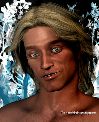
As always, start and the end ...! This is the finished face, all done, looking sun-kissed, seductive, like a surfer-dude who just walked off a beach, still tasting of the sea. Very, very nice! It'd be even nicer if you could just click on a button and buy the whole thing, but as I often say in these posts, "Sorry guys, you can't buy him anywhere, he's one of mine.

The other day I promised to do a post talking you through the HOW of this, so you can make your own ... and here we are. Now, you can't do this without the Morphs++ for Michael 4, and if you don't have this, you'll have to get it. There's no other way. If you do go ahead and get the Morphs++, I would be inordinately grateful if you'd start from the DAZ banner on the left of this screen. That is an affiliate link, and they do pay me a small percentage when someone makes a purchase starting from a link on my page, and like everyone else these days, heck, I could use the bucks! So do keep this in mind as you read on down.

So let's get started!

This is Michael 4, fresh out of the box. All I've done to start with is add the high rez skinmap, so that you have a clear face to start working with. Notice the bounding box around the head. I've selected his head ... and when you do this, you notice the Morphs++ menu opens up on the right of your screen. Now you're all set to change, well, everything.
You can start the easy way. They give you about a dozen presets to play with, with names like Allan and Daryl and George and Randy. Each one of these is a distinct genetic type, so by choosing a slider bar and pulling it left and right, you can change the ethnicity of your character. I've jiggled almost all of them to achieve this current face! They "nest" or "stack" the characteristics of any of the slider bars, so you can go a long way on this alone. You might easily get something you like enough to save it and call it good. But...


I wanted more, so I kept on going. Underneath the ethnic slider bars in the Morphs++ menu are the ones that control things like the fullness of the face, the flatness of it, the roundness of it. Once again, it's all about adjusting slider bars will you start to see something you like...
When you've gotten yourself into the ballpark with these simple controls, it's time to start the fine-tuning process. Under the "Full Head and Face" menu, which you've been using so far, you'll find very special sub-menus: Upper Face, Eyes, Nose, Mouth, Lower Face, Upper Face ... which means exactly what you think it means!

Now you go to work making his eyes slant, making them larger or smaller, closer together or wider apart, deeper, not so deep ... change the skinfold, the arch of the brows. Anything. Everything. When you start you see a face you like, make sure you save it! One crash, and you lose a lot of work, and it kills you when you can never, never get back to exactly the face you had. It's practically impossible to duplicate the work.
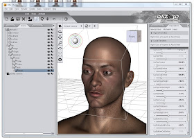

When you get to this level of adjustments, they're often so subtle you have to look twice to see them. In the image above, I've been working on his mouth. This is the only part of the model which has changed, and you can only really see it in the upper lip. But it took about 20 minor adjustments of the slider bars to get just this effect...


Now it's his nose and cheeks ... I sank his cheeks to an extent that looked right with this skinmap, and prior to lighting and rendering ... at the end, you'll notice I un-sunk his cheeks a lot to fill out his face. Be prepared to keep adjusting every time you do things like --
Add a toupee and a set of custom eyeballs. The effect putting hair on him makes is enormous. (This hair is Neftis's Rock Star Hair -- from DAZ, and available via the same affiliate link as above, hint, hint.) A hairdo can make the eyes seem too deep, the nose too small, the skintone wrong. And the easiest way to tell if the dynamic of the face us working -- or not -- is to render one here:
That's not too bad. Notice in the left side, I have my custom eyeball set open! That's The Eyes Have It (also from DAZ ... ditto the affiliate link; thanks, guys)
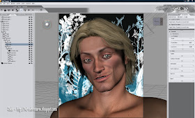
Now, we're cooking. But I'm looking at that skinmap (which is the M4 High Rez skinmap), and thinking, "Hmmm. What would he look like with another skinmap?" This is just an experiment, you don't have to do this. Be aware that when you change the skinmap you really, really change the way the character looks! It can be a shock. It's not just draping a new texture on the same face ... well, it is, but it makes a much bigger difference than you expect:
And the third one is just about perfect. See how the set of the eyes changed? The brow became heavier, which suits this rawboned face. This is the JM Alexander skinmap, and of course when you fit the map it also automatically sets its own set of eyeballs...
The JM Alexander eyeballs are nice, but The Eyes Have It are specifically, and only, eyeballs, so they designer's heart and soul went into the creation of nothing but eyes. It therefore stands to reason that they're superior. So...
At the same time, I decided that this surfer-dude needs longer hair, and it ought to look a bit windblown. You do this by using the morphs provided with the hairdo which you purchased, installed, and slapped onto your character. Hmmm ... very nice. Almost there. The only thing is, now it's all come together with the right skinmap, hair and all -- and not what the photographic lights are set as if this were a studio shoot, those cheeks are too sunken. So I go back into my Lower Face morphs and unsink them. The last thing I do is give the character a name, and save it. You can save him in a master file, and just import him into any new scene where you want him to appear; or you can also save him as a Character Preset. This saves to a .dsb file, and you don't open this, or load it, you merge it onto an existing Michael 4. During the merge, all the facial characteristics load onto the M4 "doll," and if you've given him a special physique, this also loads -- the .dsb character preset will also load the skinmap and eyes. The only thing you need to do after merging it is add a hairstyle, and you're done. 

Everything is ready now for the final render, which is where I came in, and ...


...there you are ... go ahead and make your own character faces. It's a load of fun, and you get unique characters with your own personal mark of creativity on them. Enjoy!


UPDATE: it seemed like a great idea to continue with this character and create the whole body. If you'd like to see the genesis of a whole new guy, click here ... and he turned out so well, I also did a Male Nude Glamour shoot with him. Find the link to that post in the second half of this tutorial!

Jade, 21 November

Friday, November 19, 2010

Hangin' out with roaches, waiting for a ride


Something very different ... a kind of Mad Max future, perhaps. The last time you saw this actor, he was playing the mercenary Yussan in Abraxas - the lost songs. And before that he was playing Vladislav the vampire who's more than a match for Horace and Hortense! (If you don't don't what's going to ... you don't spend enough time on this blog, and are missing at least some of the fun.)

The beauty of having all these characters is that you can cast them in new roles, new scenarios. This one -- I see the year as about 2030, after technology has galloped and the world has gone to hell. He's a cop -- undercover, and trying to talk his way out of a sticky situation. This time around he manages it -- slick talking, silvertongue. He waits for a pickup -- backup to get him out of here, and his ride arrives -- big, noisy, dirty, raising storms of smog.

The props are all from Powerage -- three different sets of props, all mix-n-matched together. The coat is the duster from the M4 Cowboy set ... but it's re-treaded with the texture from our Mexican blanket! The hair is Midnight Prince. For the life of me, I can't remember what the skinmap is. HZ Victor?? It could be. It's the one with the goatee -- very nice skinmap.

Don't ask me where the inspiration for these came from! Here is the character in his grand vampire role  ...The face morph? Sorry, guys. Like Leon and "Achilles" and some of the ones you see over and over, he's one of mine, you can't buy him anywhere.

But what I can do is a special post, talking you through the process of making your own amazing faces. I'll put that on the agenda...

Jade, 19 November

Monday, November 15, 2010

A little romance. Because I feel that way


Gay heroes ... and a little bit of "melt your heart" romance. Why? Because I feel like it -- and because at last these renders "made the cut." It's taken a long time to get some Jarrat and Stone romantic shots past Mel Keegan. The creator of the NARC universe and these characters set the bar for such pictures very, very high. They must reflect the devotion and emotion of the characters, and the frequent anguish of their lives, be sexy and yet not provocative. Mel retains absolute control over the content of all NARC images, though it's my joy to render them. These ... well, these got the Keegan stamp of approval, and here they are.

What got me in this mood? Wellll, I was reading Aricia's post from a couple of days ago -- on her celebrity gossip blog, you know the one? It was the post where she talks about the last season of Torchwood, the heartbreaker, where Jack loses Ianto. really, Seriously. With the kind of "zip the body bag" finality that's never going to happen to the immortal and indestructible Jack Harkness himself. I was thinking back on Torchood and the whole Jack-and-Ianto romance ... the most endearing gay romance every filmed, bar none. (Here is Aricia's post, which started all this. And incidentally, AG: congratulations on getting back to posting -- we've missed you!)

And because Torchwood is SF, my thoughts came around in a big circle to NARC, Jarrat and Stone, and I was thinking, apropos of Jack losing Ianto, "Good lord, have you ever counted the number of times Jarrat and Stone yank each other back from the edge of the void?!" And MK says, "Yes I have ... haven't you noticed how the characters are changing slowly but surely, since the first book?" Yes, Mel, I have. And I can't help wondering where they're going in future...

So I was thinking about Jack and Ianto, and then gay romance and science fiction, and as a consequence, Jarrat and Stone. So you can see the progression of logic that led to these renders. And they're gorgeous. These hit the spot. MK was delighted, and here they are.

You don't often think of science fiction -- much less grand-scale space opera! -- and romance of any genre, much less gay, in the same context. But in fact the Jarrat and Stone romance has to be one of the great love stories of all time.

Last night the Aussie government opened talks aimed at (soon, we hope!!) introducing marriage rights for all in this country, and we mean all, not just those who were born hetero ... and it turns out that in a recent poll, 65% or more of the general public is in favor of playing nice for a change, and recognizing that love is love.

So today's renders also add my ten cents' worth to that cause. I hope that the next 10 years -- as today's kids grow up into adults -- will turn 65% into more like 85% percent. Today's kids are awakened and understanding, and quite ready to accept a person on his or her own terms, not making rules about one's orientation. Writers like Mel Keegan, actors like John Barrowman, and characters like Jack Harkness and Ianto Jones on TV, and Jarrat and Stone in literature, are helping to make the change. If I can do my own bit, I'm delighted to pitch in.

So please accept this as my pitch. I mostly talk through my images. And these are beauts!

Jade, 16 November
NOTE: posted using MK's logon because this afternoon, I cannot connect -- how weird is that?

Sunday, November 14, 2010

Touching base -- render issues galore


The reason for all the TLC after rendering was complete was that, frankly, I can load about 50% of what I need to load into DAZ Studio 3 to do this scene properly, before my computer gets a terminal case of the herkie-jerkies.

Now, there are ways and means to build up these shots and do the whole thing inside DAZ ... but it takes more time than I have right now. Basically, you'd start from the bottom up with the absolute distance layer, the background to the whole scene. This would be hills or woods and sky -- whatever is in your desired background. Lay this into DAZ as the backdrop, and then import enough trees and shrubs and fallen logs in front of it to create a nice woodland. Render this and import the image is a new backdrop ... stand the character against it, and some bushes around him ... plus all those fiddly little plants around his toes, plus something to "disguise the join" between the real 3D stuff and the background -- which was "real 3D" in the first phase of this. Render that and import it as yet another new backdrop ... and then import the trees and bushes which are between the character's layer and the camera. Render this, and call it done.

The real difficulty is in keeping the lighting and focus in control across the whole project, as well as remembering where everything is, and where the shadows are falling. And in the end you wind up with a scene that can only be viewed from one angle, because as you went along you compressed each layer into 2D and reimported it as a static backdrop for the next layer.

And all this took how long?!

The alternative is to load up the distance backdrop, and then load up as many trees, shrubs and plants as the program will tolerate and still be functional. Set the lights, get your renders, and give them a lot of TLC later, with Photoshop brushes, in GIMP. Why? Because there's nowhere near enough plants and grasses in there to make it look like he's standing or sitting in a bed of sweet herbs, and you'll see clearly where the ground plane meets the backdrop. If you could load in many times more plants, you could disguise everything and do the whole thing in CG. But not with this system! Quad with 4G of Ram and a GeForce 240 video card ... not up to the task, folks, which gives you a whole new perspective on movies like Avatar!

My next project is Episode 7 of the Abraxas series ... tomorrow, I hope. See you then!

Jade, November 15

Friday, November 12, 2010

Woodland creature -- more timeless digital beauty


The woodland creature again ... and isn't he beautiful, with such guileless innocence, it gives you a shiver. There are more renders -- several adults only ones, which will be going to the Exotic blog -- but I'm pretty sure I'm about to get pipped for time again today.

(Have blown off way too much time dealing with a difficult, pig-headed client who seems determined to make me the villain if I don't give him his own way in a situation where he's clearly dead wrong. How do you deal with such people? Have tried being polite, diplomatic and courteous!! Seems I'm just a villain, and a moron to boot. Well ... damn. And this, folks, is what happened to my art time today.)

Anyway -- I did get the time necessary to do the TLC on these renders. I could have done the whole thing with 3D model plants, but by the time I got about halfway there the computer wouldn't handle any more, not even the 2D/3D kind, which are actually 2D images artfully stacked in the background to save RAM. So ... compromise

Basically, I used Photoshop brushes, in GIMP, to paint ferns, grasses, little plants, into the "seams," where you could see where the joins were! The character is sitting on a plane, not in the grass, and you had a hard line, like the edge or a ruler. This is the absolutely perfect use for painting in GIMP, and as long as you're just doing a painting, not an animation, you'll get away with it.

But I gotta tell you, all this gives you a new perspective on the big CGI movies! Look at the forests in Avatar ...!

Can you even imagine the computer power it took to do that stuff, and have Jake in among the little grasses and plant and tiny animals, and ...! These shots of mine have about six trees, maybe ten bushes, a ground plane with texture, a JPG in the background -- and a Quadcore with 4GB of RAM and a Gig on the GeForce card gets the herkie-jerkies. Ye gods, what are they using to render movies like Avatar?! Drool, drool...

Oh -- quickly, before I have to dive back to work: that's the JM Falcon skinmap, the Daniel hair by Neftis set to black; the Troglodyte horns resized an fitted to M4, and nice subtle displacement added. The face ... is one of mine. He's a rare beauty, isn't he?! The trees are props from Merlin and DM; the bushes are PNature props, and all the little grasses and herbs and whatnot, were painted using the DesignFera plants Photoshop brush set. Result: gorgeous!

I'll try again tomorrow to get the other artwork up to the Exotic blog.

Jade, 13 November
NOTE: posted using MK's logon because this afternoon, I cannot connect -- how weird is that?

Woodland creature ... timeless digital beauty


Just a quick post to let you know I'm still alive --! Work is ballistic, but I gave myself a break ... rewarded myself with a little art ... there's more from this series of renders, but the others need post work and there isn't any time today. Tomorrow. I'll get the others touched up, and post the ones that can be posted here, and the others to the Exotic blog.

Join me then ... because they're really lovely, they just need that bit of TLC that I can't give them today!

Jade, 12 November

Thursday, November 11, 2010

Raytracing, bucket filling and thumb twiddling activities


EDIT: the images for this post were stored elsewhere, and when an account went down ... phhttt. Photobucket, or Flickr, os some such thing. I can't find them on any local hard drive, sorry...

Experiments continue as I go into the Render Settings : Advanced tab and see if I can squeeze some extra power out of the 3DLight render engine! Turns out, you can, but there's a high price/

The middle and bottom images in this set are rayraced, which gives interesting results ... doesn't 100% eliminate the ugly grain which shows up in the skintones as soon as you turn on the shadows. The top render is the best .. it ain't raytraced. It uses something called "circular bucket fill."

The thing is, that top image took two hours to render, and the middle one took about 90 minutes. The quality is much nicer, but the images take soooooo long to get, if the render is finished and you find out there's something not right in it, it's practically impossible to do another render in the time you have available. For instance, I raytraced the bottom image too, but the first time around the reflections in the water were just ... wrong. It didn't look good at all. The time penalty is wicked. And I think that even (or especially?) if one were using either the Octane or Reality render engines, there would be a similar time penalty.

The circular bucket fill is far and away the highest quality, so it makes sense that it takes the longest time. I think what you probably have to do is finish your set of "ordinary" renders and then pick one which came out especially well and do the looooong render in the evening while you're having dinner. Barring something unforeseen -- like the reflections in the water being no good -- you wind up with an extra-special render on top of the ordinary set. In a worst -case scenario you wind up with something that didn't work, but at least it didn't render in the background, turning the computer into an exhausted mollusk (tired snail) while you were trying to work!

Experiments are proceeding...

Jade, 11 November

Wednesday, November 10, 2010

The magic is in the raytraced details...


On the same theme as yesterday -- and again, this is uploaded at over 1000 pixels wide, so you can see the details. Please do click the image and enjoy! There is no post work on this. None at all. This is the pure render, right out of DAZ. The extra painting in the sky -- the backdrop -- was done in GIMP before the image was re-imported.

But I was looking at yesterday's work and thinking how like one of the classical fantasy paintings it is. I got to wondering how it would look if it had been painted on canvas. So...


It's a really cool technique -- you wouldn't believe how easy it actually is to do this in Serif and Irfanview. You basically set the fabric texture as an overlay with a 6o% transparency, and then export the composit to Irfanview for fine-fine-fine tuning of the gamma, contrast and color saturation.

It's also very true that you could do the whole thing in GIMP, but Serif is much more convenient ... difficult to describe, unless you're accustomed to both. There's things you do in GIMP and things you do in Serif, just because it's so much easier! And as for Irfanview ... well, it's just the best, when you want to fiddle with the colors, tones, gamma, sharpness, whatnot, of any image. It also has a tiny footprint, so it loads in a split second, whereas GIMP takes several minutes to load! (Also, I find that GIMP has a fundamental instability, it loves to crash or lock up if/when you have it loaded with give or more Photoshop brush sets. I love GIMP, it's true! But I need to have half a dozen brush sets loaded, and this makes the program too slow loading and too unstable to use it on a whim. Meanwhile, Irfanview loads in a split second and I don't remember it ever crashing. Ever.)

Now too much new art today, folks ... sorry! I'm having a struggle with my health, am buried in mountains of work, and we just had a computer die. It shut itself down after system upgrades and never started up again. So tomorrow we have to go and get a new system. Oh, my aching credit card!

But I do hope to be feeling better soon, and I should have tunneled my way out from under the mountains of work...

Jade, 10 November


***Posted by MK: my connection is intermittent, too slow for this. Seriously, guys, I've got dialup speeds. How are you expected to do anything these days, at 1990 dialup speeds?!!!