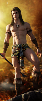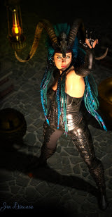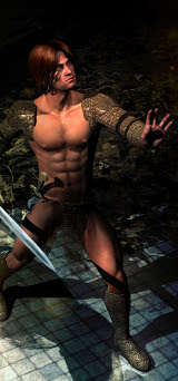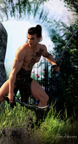
Today it's all about surfaces, and the textures you can slap onto 'em, and how you get these effects. I've been chatting with a visitor about this, and it's actually pretty interesting, so let's recruit Michael 4 and have him model for us!
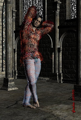
In honor of Halloween, just past, we've cast him in the part of a Goth. That's the Elven Prince hair set to ebony, and the Lockwood costume. The skinmap is Albane ... an albino. Eventually, as our hero looked less and less like a Goth, I changed out the eyes for rich green ones, but at the outset he's an albino goth, red eyes and all:
So those are the textures right out of the box, just as they load. It's not bad, but it's ... ordinary. Nothing wrong with it, but it's ho-hum. A bit boring. So let's just DUMP all the textures and start over:
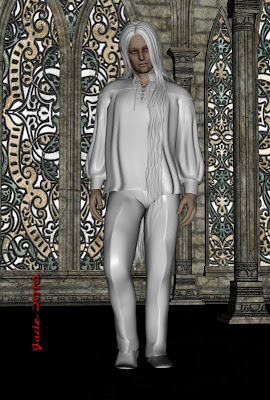 What you want to do is go into the Surfaces tab, select each of the items one at a time. Click in the field under DIFFUSE , and you open the dialog. Look up in the top left hand corner of the big list that opens. See None? Click it. One by one, you make the textures go away, and you wind up with virgin white plastic. So far, so good.
What you just did was to turn OFF the diffuse maps, and this instantly tells you what a diffuse map is, and what it does. They're the maps that put the fabrics or visible textures onto objects. Turn 'em off, and you see the objects for what they are.
Just playing here, try adding silly things back onto the nekkid objects. Right where you clicked "none" to turn off the diffuse maps, you can also click "browse," and choose new textures. You'll be doing this a lot, so play around with this, get used to it with something silly:
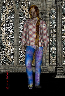 The guy now looks like a small explosion in a garment factory! But by doing this, you really get a grasp on what the diffuse maps are. You might be wondering where all the textures come from. I made all the textures which are used in these renders. Just make them yourself, using parts of photos, or webpage backgrounds, which you can download free in loads of places. You know how to make seamless textures from tiles ... same thing here.
So now let's put some decent textures on the model and get to work:
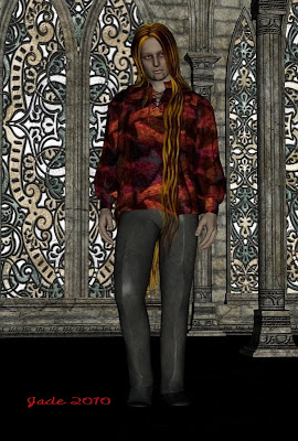 This is better: a tie-dye fabric texture on the shirt and leather on the pants. If you look at this full-size through, it still looks plastic. Not enough has been done with it to stop the plain object underneath from showing through. So, what else can you do with this, to make it look more real? This is where your maps come in!
First, let's get rid of the background and lights, to make the renders go faster -- we'll put them back in at the end. NOTE: from here on down, they're just test renders -- fast and flat, to see the results...
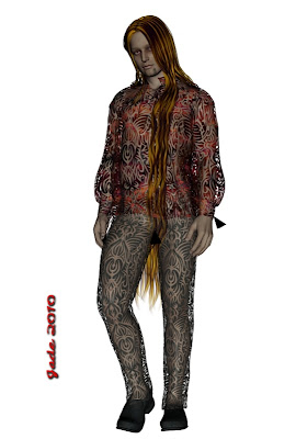 So right here I've added one extra map ... the OPACITY map. This is just a black and white image (pure black, pure white -- in the days of yore we used to call this zip-a-tone). The white stays, the black goes transparent. You add this map in the Basic surfaces tab. See the dialog there? Click in it, and browse for your displacement map. Where do you get these maps? Honestly -- make your own! Get a black felt-tip pen and draw a pattern on white paper. Scan it in, save it, an then set it as the opacity map. You can also get clever with GIMP or Serif, or whatever you use, but the end result is the same: a pure b/w image saved as a JPG and applied to an object. The black parts go transparent.
Notice, you can also play around with the percentage of opacity. This is how you can turn leather into silk. In fact --
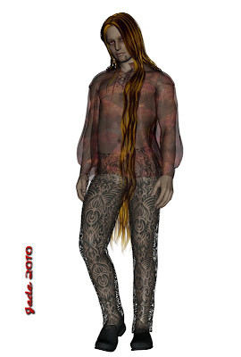 What I did here was take the opacity map OFF the shirt model, and just lower the percentage of opacity. The more you pull the slider, the more transparent it gets. Nice! So --
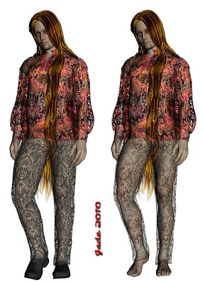 Basically, play with the controls and make the costume fade in and fade out, till you figure out how it works. While you're doing this you'll start to notice that the opacity map creates a great pattern through the fabric, but it can wind up looking exactly like a pattern printed on the fabric, which isn't the effect you want. This is because it's just a 2D effect applied to the 3D object. Now, you want to make the fabric look as if it's transparent in 3D...
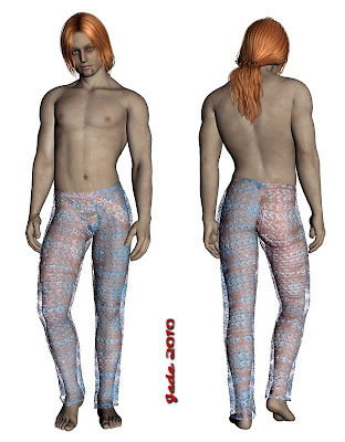
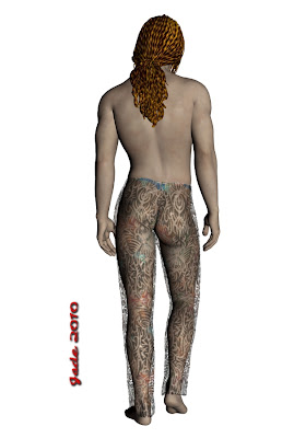 You'll probably have to click on the image to see the effect, but ... we're getting there now. What I've done for this render is get rid of the old diffuse map on the pants, because it was just leather and it's one flat color. I put on a map with some swirls of color so it's much more interesting, and then I gave the poor man a little something to wear under the costume, because it's rapidly vanishing. Then, the important part.
To get a 3D effect using a 2D map, you have to apply a DISPLACEMENT map. As the name suggests, the map "displaces" the surface of the object. And here's the trick: apply the same map you used as the OPACITY map -- set it as the displacement map too, and don't forget to crank the slider up to 200% to really see the change.
Now, here's where it gets interesting -- and fun:
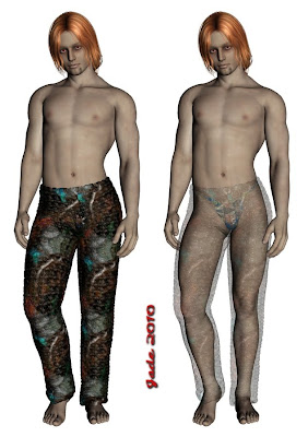 Click on this to see it full size and see the effect. By playing around with the displacement maps you can create the effect of texture in fabric. What I've done here is take the opacity map OFF the pants, and then apply a DISPLACEMENT map to look like fabric texture. Also, notice that your displacement map controls have positive and negative values which you can jiggle. You can make the pants foof up or get tighter ... and if you then decrease the opacity to make them transparent, you get foofie harem pants made of gossamer silk. Now we're cooking!
So now you can set the diffuse map to decide the color, det the opacity map to decide the pattern of the opacity, juggle the percentage of the opacity to decide how transparent something is ... set the displacement map to get a lovely 3D effect, and jiggle the positive and negative values to set the degree of foofiness. What's next? Because it's still looking "flat" here. Well...
 Now it's time to pay some attention to the surface values. You have three basic colors you can set: DIFFUSE, GLOSSINESS and AMBIENT. Technically, "ambient" is the color something is when it's in the dark. Now, strictly speaking that's dumb, because things in the dark are only ever black, right? But in the wonderful world of 3D art, "ambient" means the color something is before a light shines on it. A...ha. Glossiness speaks for itself: when you shine a light on something, how glossy does it get, and what color does it gloss up?
You get to set not only the color you want it to gloss up, but also the degree of glossiness. Here's what they don't tell you: 100% is NO GLOSS, and 0% is shining like a searchlight! Makes sense, doesn't it? Not.
While you're thinking about gloss, you should also think about REFLECTIVITY. The two things are not the same, though they're similar. Reflectivity adds an amazing effect to floors, walls, surfaces, widows ... fabrics. Things like silk and organza have loads of reflectivity, so don't forget to set this, while you're working with the gloss. Also, see below -- lighting models. When you set the lightning model to metallic, reflectivity really starts to work for you.
Next thing you need to be aware of is how the surfaces interact when they lie on top of each other. When you're working with garments, the shirt is probably over the pants, or the skirt is over the tights. By the time you've got loads of different maps and surface values stacked onto both the shirt and the pants, sometimes you don't get the effect you expect, or think you should get:
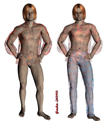 I can't give you a clear reason for why the surfaces interact the way they do. It might be down to the shortcomings of the render engine! I'm still using the 3DLight engine, which is free and ships with DAZ Studio 3, because I don't have the money to buy myself a candy apple at this point in time. I drool over the Octane render engine, and Reality etc, but those require a 64 bit system, which I also don't have. So like most people, I'm making do. And if you are too, you need to be aware that surfaces can and do interact a bit strangely when they're all loaded with values and maps and then overalaid.
What can you do about it? You can jiggle the settings -- mainly the opacity settings. Work with one garment at a time. Turn them on and off till you get something close to the effect you wanted.
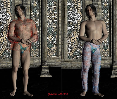 Then, when it's all coming right, turn on the costume ... turn on the backround ... set the lights, pose the figure, and you're alllmost ready to render up the final shots, which in fact I started with, waaaay above! But first --
One more thing you can do in the surfaces tab. If you decide to leave the costume off, you often find that in the final render Michael 4 will render with white blotches or streaks on his skin. This is very annoying, and it happens on many, many skinmaps, up to and including the elite ones, which cost a packet. The solution is to be found in the surfaces tab. You want to go into the LIGHTING MODEL, and turn it not to "skin" but to "matte." This will fix the problem:
Now, let's return to the full-quality render ... takes time, but --
There's only one thing I did to the costume for the display renders at the top of this post, that I haven't talked about here ... except for just touching on it in the last paragraph. It's the LIGHTING MODEL. You'll need to find this, in order to fix skinmap problems, and once you have found it, you can also apply lighting model effects to fabrics or anything else. This looks almost like the shirt is made of metal:
...and the trick is to set the lighting model to (!) metallic, and then crank the REFLECTIVITY up full blast -- then shine some lights on it.
That's all of it, nothing kept secret. It's a heck of a lot of fun to play with -- it'll take a little while to learn it, but as soon as the penny drops, it's actually easy. Trust me on this -- I puzzled all this out for myself earlier this year!
Jade, 3 November
***Posted by MK: my connection is intermittent, too slow for this. Seriously, guys, I've got dialup speeds. How are you expected to do anything these days, at 1990 dialup speeds?!!!


