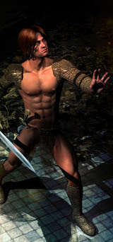
Now, the smart thing would be to fix this in the render. And I've learned that it's something to do with the softness of the shadows cast by one or more lights ... but it has zip to do with the shadow bias. The ONLY thing that improves the "thousand gray freckle effect" is to dial down the shadow softness till the effect is almost imperceptible. Eventually you'll reach a point of compromise where you'll get just enough softness out of your shadows on the one hand, and few enough of the freckles on the other, and you can live with it.
So here we are with another fantasy book cover starring DAZ's Michael. For those who came in late: nope, this is not Genesis anything. This is the grandfather of the recent Genesis figures; and if you're clever with how you handle this "digitoid," as Mel Keegan has called the digital actors, you can do a lot with them. In fact, I've been looking at some renders, lately, of the Genesis figures rendered in -- I think -- Poser; and they're not all that impressive. In other words, you still have to be careful and clever with them, or you can get plasticky results (and yes, I know there's no such word.)
We're going to call this an "artistic male nude," because most of him qualifies!
One more cover to go. Counting down to the end of this assignment...


