Here's the whole cover painting -- but the canvas effect isn't going to show too well when Blogger is done resizing it:
 Wellllll ... it shows a bit, but you don't get the full effect. This is the new cover for The Lords of Harbendane. The book came out a couple of years ago, and it is a fantastic fantasy novel. Why are we putting a new cover on it? You may well ask! Because the existing cover -- gorgeous though it is/was -- appears to be putting sales in jeopardy. We're not 100% sure about this, but there's one sure way to put the theory to the test, and that is to put a new cover on it and see what happens next.
So I took the existing background which was a digital painting done for the first version:
 This, I stripped into DAZ Studio 3 as a background image. It's already a major piece of digital work -- the sky, the mountains, the lake and the foreground belong to three different pictures. The mountains are in Alaska. The foreground is in Finland. The sky is a digital airbrush painting ... this was one of the last projects I did prior to getting into full CG work. This was hand-painted in Micrografx, whereas today I'd do it in Bryce.
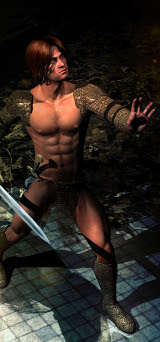
Next, design the characters, Rogan and Tristan:
 Then, crop an area which will make a good ebook cover (paperbacks are going the way of the dodo. They're so expensive to set up, besides anything else. It will cost upwards of $100 to set up a paperback, and -- fact -- very few people are buying them anymore. Ebooks have won the war ... and Kindle has won the ebook contest! So, that the hey. Go with the flow).
Then front cover area was then shipped into GIMP to be painted a little bit in three corners -- just gives the work a better cohesion, since it's been turned from a landscape into a vignette. The GIMP version was then shipped back into Serif to have the canvas texture overlaid. Then these two were combined, and the composit was shipped out into Irfanview to be color corrected.
Then, back into Serif X3 to have the text objects overlaid:
 And that's it -- done. Heck of a nice cover for an incredible book (almost mainstream fantasy, this one; the romance is gay, but it's so understated, the love story is part of a tapestry so vastly wider, the Rogan-and-Tris saga is only a small(ish) part of an epic.
Now, let's see if the new cover will inspire readers to give this novel a go. It's actually both tragic and weird that great books can be halfway undone by being jacketed in artwork which might be lovely in its own right, but just doesn't seem to fire the imagination of readers. So here's the experiment: let's see if this one does!
Jade, 15 October


