Sunday, January 27, 2013

Ice blue ... and summer rain


I'm in a science fiction mood today, and since I wanted to do a bit of work in Bryce 7 Pro ... and I wanted to work some more in layers, where various elements of a painting are rendered and/or painted separately and composited in Photoshop, I thought -- here goes nuthin'. I had a mental snapshot of an idea ...

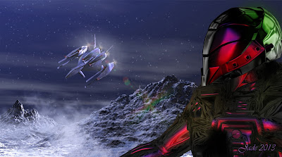
If you're sharp eyed, you'll recognize the NARC armor, and you might even guess that this is the planet Aurora, from Scorpio. You'd be right! So here's how it worked:

Step one was to render up the landscape in Bryce:


That's the raw render, right out of Bryce 7 Pro. Not even any stars in the sky yet, much less any snow in the air. But the lighting conditions and mountain forms were exactly what I wanted, so the next step was to go back into Bryce and add the spacecraft:


So far, so good. The spacecraft is an OBP, which is the Bryce version of an OBJ. A long time ago I bought two whole packs of these in a Renderosity sale ... there are so many in the packs, I still haven't looked at them all. They lend themselves very well to work like this. Here's the raw render, begging to be overpainted in Photoshop... 


Stars in the sky, ice dust, engine flares ... nice. In and of itself, this picture is actually finished ... but I'd wanted this to be the background, so the next step was to import it into DAZ Studio to have the figure work done right on top of it...


...and there's the raytrace, just as dished up by DAZ. I set a red light and a blue light out of the frame at bottom right and top right, so they would interact and give the impression that something major is out of the shot -- a vehicle, a building. This also provides some color to an otherwise almost mono-tonal shot. And this is begging to go into Photoshop to have the last layers of painting added...


...colors added into the reflective surfaces of the space armor, and ice dust kicking up in the foreground; there's a light snow falling, and some red/green lens flare, which adds that extra little kick. Incidentally, this, above, is 1900 wide, which should be just about perfect for wallpaper for many monitors...

I used Bruce 7 Pro, DAZ Studio 3 and Photoshop Elements 9, and Irfanview for quick adjustments to brightness, contrast and saturation, on the fly. The armor is a composite of several different models. The .abr brushes are Ron's Fog, Ron's Bokeh Lights and Ron's Snow, all of which you can get from the DAZ marketplace. 

Meanwhile, on the other side of the desk, Dave is doing amazing things in Vue. I think Bryce is better suited to rendering alien environments, and I really enjoy this kind of work. Dave is doing fantastic things in Vue, and he has yet to really test the system since having his RAM doubled. The house move stopped everything dead in its tracks ... grrrr.

But we're done, finished, now, and everything is starting to settle in. In fact, some of the new plants we bought are so happy, they're flowering -- especially as we have some "Irish sunshine" right now. For most of the rest of the week there'll be a lovely, fine, cool rain. It's soooo nice ... and my dwarf hibiscus thinks so, too. Check these out:


I call these "Hibiscus in Summer Rain," and the flowers are absolutely perfect in these shots, since they'd only opened a few hours earlier. The rain is a welcome break for us, in South Australia, but I imagine our cousins in Queensland don't want to see another drop of it! As I write this, they're being hammered by storms, and the hotels on the shorelines in Brisbane and other places are said to be sandbagging, because the ocean is breaking right up to their front doors. Ouch. Dave and I had been thinking of a vacation up there to mark our wedding anniversary, which comes up in March, but ... nope. Instead, we're looking at going back to Mount Gambier, which we loved last year. If you've been following this blog for any length of time, you'll remember the images! Twelve Apostles, the Limestone caverns, the Blue lakes ... you remember. Yes, I think we're quite ready for another adventure! (Enough with the Tolkien references already -- want to know something dreadful? With the house move and all, we haven't seen The Hobbit yet! Later this week. Honestly.)

Jade, January 28 (public holiday long weekend, for Australia Day)

Jogging my Memory


Is it just me, or does everyone forget about 75% of anything, when you haven't had a chance to do it for a few months? I spent a couple of hours today trying to wake up my brain and make it remember how to do stuff that, last November, it was doing on autopilot! There were a number of projects I was fiddling with, before the move. The first two pictures, today, you've actually seen before, a looong time ago. I was never 100% satisfied with the render of the young beauty asleep in the sun, because the hair, when seen in closeup and with the strands seriously stretched and pulled and twisted, reaches a point where you really can see the fact every strand is made of myriads of small straight sections, all articulated at the joins. I've wanted to repaint the hair for months now. The second one, which I call "Misty River," was rendered in Bryce 7 Pro most of a year ago, but I was never able to get back to it, to finish it. And the third one is a "process painting" done in Irfanview and Photoshop, rescuing an image of the trails up at Aberfoyle Park, SA, in the springtime (you can tell it's spring: all those yellow flowering trees). The photo was fine up to a point ... the sky is full of powerlines!

So, in the interests of jogging my memory, I took the opportunity to finish these, since my work space is set up and ready to rock and roll. If you're wondering, this is where it all happens:  


Laptop, 24" flat screen, keyboard, two mouses (mice? Meece?) mouse pad, Wacom Bamboo, spaghetti of cables. Confusing, isn't it?! The Mighty Thor's brainbox is on the floor under the desk...

Memory jogged quickly enough. I was very pleased with the repainting on the catnapping dude:


That's much nicer. The one thing that had let this picture down, before, was the hair, in extreme closeup. Call this one fixed.

And while I was hunting around for old files, I stumbled over some folders I'd archived from about four computers ago (yep ... counting them, four, not even including this laptop)...


This is what you'd call "process art" -- each piece starts as a photograph and is tweaked and generally abused until it resembles a painting. You'll need to see a couple of those at large size, to see the effect. The question you're asking is, why would you bother? 

Sometimes, it's a useful way to rescue a picture that had a serious defect (like the sky full of powerlines). Other times, the image has great subject matter and framing, but it was shot at incredibly low resolution, which makes it a reject today even though it was a nice photo in 2003. Pictures can be saved by being turned into art, and you can get this kind of effect sooo easily:


In fact, that's the reason I didn't do more process art. It was just too easy. I had a brief flirtation with this, did a few dozen of these pieces, and then let them go. These were all done in Irfanview and finished off in Micrografx Picture Publisher, which had a set of neat borders which were added with a click. I'm sure Photoshop must have the same kind of thing ... I honestly haven't looked yet!

Incidentally, if you're wondering how to do this kind of art: over-saturate the piece; then crank the contrast waaay up; then blur it till it's almost gone, then re-re-re-resharpen it, till the picture goes very slightly whacko at the detail level. Tweak the color and contrast some more, and ... well, that's basically it. You can also play with the color balance -- drop out the red or the blue, see what this does to the image. Fundamentally, here, you're forcing the software to duplicate the artist's human efforts. Paintings are often too contrasty, or too color saturated, or some color or other is overstated. By forcing the software to shift the image this way or that, you can make the same kind of statement an artist would make with a paintbrush. The thing is, it's so easy. Too easy. I guess there was no challenge, so I didn't have much more than a flirtation with this!

But I am playing around with some cool things that Photoshop does, and I gotta get back to Manga Studio. And Bryce, come to that. Going to be busy this year!

Jade, January 26 (Australia Day)

Thursday, January 24, 2013

La Vie en Rose

While moving house, I had the great pleasure of unpacking my oooold 33rpm record -- don't laugh, I have about 300, collected over years and years, and some of my favorite music is on them. Many albums were never issued on CD, to my knowledge -- or, if they were, I never saw them. One such album is a collection which includes "La Vie en Rose" -- the original music, by Carl Maria von Weber, which I don't think has much, if anything, to do with the 2007 movie about Edith Piaf...

The music got me to remembering a videoclip I saw decades (ouch!) ago: Mikhail Barynshikov dancing "The Spetre of the Rose" to this music. It was one segment in a long documentary series hosted by Margot Fonteyn, and I'd literally forgotten about it, till I unearthed the vinyl album. What a memory jogger!

Next stop, YouTube, and whaddaya know! Check this out, folks:

UPDATE: since I posted this, something has happened to this video, making it not play. I'll leave the link, in case it comes back on line, but for the moment ... well, dang. No video. Grrr.


...Baryshnikov in his late twenties, or at about thirty years of age. Glorious? Oh, yeah. And in turn this got me to thinking about art, and Sepctre de la Rose was the perfect vehicle via which to explore something I've wanted to do since before the house moving started. Back in October and November last year, prior to the Era of Boxes, Bubblewrap and Stickytape, I was speculating about art composited in Photoshop in layers. A ha! Here was the opportunity.

The background in this piece is a photograph of the trees near the "bog garden" at Loftia Gardens, on the shoulder of Mount Lofty, South Australia, which I took about three years ago. The foreground flowers were photographed in 2008 in Handorf, SA, right after a rain shower. The figure was designed last October for another project...

...and the composition was done this afternoon, including a lot of painting, especially the hair:


The hair was panted in three layers, using my Wacom Bamboo, which was my birthday pressie last year, and which I love so much, if the house was burning down, it's one of the few things I'd grab on my way out the door (any family members inside, including puddy-tat; cash, credit cards and ID; cell phone, turned on and calling 000 even as I dove for the Wacom Bamboo. We don't call 911 or 999 in this country. Do I have time to grab a change of clothes, too? Rats. Go for the Wacom Bamboo instead). 

With the figure posed, lit and rendered, the picture was combined in three layers: blurred out background ... on top of that, the figure ... on top of that, the foreground roses, which started life as two different photos. Next, the light and shadows were painted in, in colors -- he's highlighted in red on one side, by light striking up off the rose, and by in green on the other side, by light filtering in from the trees. All the other stuff, like "god rays" through the trees and motes in the air, highlights and shadows on the rose, and some "atmospherics" around the edges, were all painted at this point too ... but the hair is what makes it immediately "real."

Juxtaposing real images with 3D models can be risky, because images of reality tend to make the models worked into them look rather fake. But if you're clever with the lights and shadows, you can get away with it, and I think I did, in this one. The image was rendered at 3000 pixels wide, to give me the ability to get in there and paint tiny details, and then resized, and the version I've uploaded here is 2000 wide, so you can actually see those details.

Speaking of seeing details, there came a knock at the door today, when I hadn't expected a delivery truck till next week. That was fast! Two days ago, there was a catalog in the physical mailbox, down at the gate, from a company called mln.com.au -- that's the name, MLN. They're having this fantastic sale, with enormous discounts on big, big, huge monitors. Like, a full HD, LED 24" from LG, for A$167, still under A$200 with shipping? Now, how was I going to go past that?! Two days later, it's sitting on the desk beside me, with the NARC movie poster displayed as the wallpaper. Wow. I just did La Vie en Rose on it, and I'm blown away by the resolution, contrast, vibrancy, color register.  So nice!

Thanks once again go to Dave for saying, "Get it. Get it! Get it!!" Part of me still hesitates to just bite on these things, and I'm always so glad he, uh, insists. It's too bad Blogger doesn't have emoticons -- there would be a cheesy great smiley sitting right here!

Jade, January 25

Wednesday, January 23, 2013

As Samwise was heard to say, I'm back!


I haven't actually died and/or been abducted by aliens, but I have to confess, there were times when it seemed like it was happening ... and times when it could have been preferable to what was actually going on! If you've been following this blog at all, you'll might recall how Dave and I started to move house in November. We managed the move, with the final date when every last matchstick and bottle cap had to be out of the old house as of January 10, and in the last two weeks we've 1) recovered, 2) healed up of most of the myriads of physical injuries you always do yourself during this kind of work (it's an unwritten law), and 3) unpacked.

A promise I made to myself: I will not indulge myself in artwork till the last box is unpacked!

Wellll ... there's about two left. Near enough's good enough.

[Edit: links have been deleted here, because The Bookshelf has been gone for years and years now]

And along came a challenge I couldn't resist. Kit Moss, of the Our Story Historical Fiction pages at the GLBT Bookshelf wiki, asked me if I could do something as rich and evocative as the pieces I did previously to head off the Fireside with Lichen Craig section of the same site. The Fireside art featured a, well, a fireside with chairs, candles, clock, decanter and books galore (see the art here), and it was probably somewhat easier than you might have imagined, because it didn't involve figures. Figure work almost always entails either costuming or props or both, to set said figures into a context -- historical, fantasy, SF, what have you. Kit Moss asked me for a historical setting, preferably the Crusades era, the Roaring Twenties, Ancient Rome, that kind of thing --

And I blush to confess, I don't actually own the costumes or props to wrangle those. 3D models aren't all that expensive, but when you're fleshing out a whole 3D universe inside your computer, and you have to purchase everything from a coffee mug to a space-going aircraft carrier ... it gets expensive due to the sheer volume of stuff you're buying. Somewhere, you gotta draw a line or you'll lay down enough money to buy a new car! So I wound up with a lot of SF and fantasy props and costumes, because they lend themselves so well to the kind of art I like to do for my own amusement (and also for the NARC and Hellgate art, which I love doing -- the SF worlds of Mel Keegan. You know. Of course you do.). But I never did get around to buying much in a historical vein, because I don't do very much work in that context...

Sooo, how was I going to wrangle a historical setting, with figures?

Aha! Inspiration struck. Unclad figures against a backdrop. I started looking at landscapes and images from Rome and Greece, but the problem is, those buildings are all in ruins today. Using a modern day image of a Roman or Greek site would give us an image of a couple of gorgeous, nekkid lads canoodling while on vacation, somewhere in Europe in the summer of 2012! Then I thought, how about using something like a Roman classical mosaic, and Photoshop it into ninth dimension for effect?

It was a good idea, and would have worked; but not nearly as well as starting with a classical painting and zapping it into the ninth dimension, though Photoshop!

The sound you can hear is probably an artist by the name of Thomas Couture spinning in his grave, because the work I've just done is highly derivative, and without Thomas Couture's background, it would just be a couple of gorgeous young dudes standing in front of a big green screen.

So, who's this Couture guy? Over to Wikipedia for this:

 Thomas Couture (21 December 1815 – 30 March 1879) was an influential French history painter and teacher. Couture taught such later luminaries of the art world as Édouard Manet, Henri Fantin-Latour, John La Farge,[1] Pierre Puvis de Chavannes, Karel Javůrek, and J-N Sylvestre.

He was born at Senlis, Oise, France. At age 11, Thomas Couture's family moved to Paris where he would study at the industrial arts school (École des Arts et Métiers) and later at the École des Beaux-Arts. He failed the prestigious Prix de Rome competition at the École six times, but he felt the problem was with the École, not himself. Couture finally did win the prize in 1837.

In 1840, he began exhibiting historical and genre pictures at the Paris Salon, earning several medals for his works, in particular for his 1847 masterpiece, Romans in the Decadence of the Empire. Shortly after this success, Couture opened an independent atelier meant to challenge the École des Beaux-Arts by turning out the best new history painters.

Couture's innovative technique gained much attention, and he received Government and Church commissions for murals during the late 1840s through the 1850s. However, he never completed the first two commissions, while the third met with mixed criticism. Upset by the unfavorable reception of his murals, in 1860 he left Paris, for a time returning to his hometown of Senlis, where he continued to teach young artists who came to him. In 1867 he thumbed his nose at the academic establishment by publishing a book on his own ideas and working methods called "Méthode et entretiens d'atelier" (Method and workshop interviews). It was also translated to "Conversations on Art Methods" in 1879, the year he died.

Asked by a publisher to write an autobiography, Couture responded "Biography is the exaltation of personality—and personality is the scourge of our time." He died at Villiers-le-Bel, Val-d'Oise, and was interred in Père Lachaise Cemetery, Paris. 


The "Romans of the Decadence" painting is the one he's famous for, and rightly so. It's amazing. It's so amazing, one almost hesitated to mess with it. Almost. Well, it was painted over 160 years ago, and Thomas died over 130 years ago, so it's well and truly "out of copyright," and the only sin I could commit (and y'all know me far better than that!) would be failing to give due credit for the base work on which the derivative art was built.

So here you go:


There it is, in entirety, and in its original colors, before I took it into Photoshop and began to do heinous things to it. The background I wanted for the new iconic render was dark, mysterious, perhaps a little ominous, rather "pregnant with every potential," including terrible danger. It had to say all of this through the means of color, shadow, contrast, and the way those three qualities can bias the eye to seeing things, and inspiring emotions. 

So, step one was to get rid of almost all the native color of the piece, and at the same time render it down to something much more like a drawing than an oil painting:


Then, with this achieved, I could repaint great swathes of it with "false color," reds, golds, purples, which lead the eye to and fro, and generate an emotional reaction --


-- especially when the background was shipped into DAZ Studio and used as the backdrop for the figures:


The figures are color toned to look like they're part of the scene, and many of the shadows on both them and the background were hand painted after the render, to agree. I also hand painted the hair on the blond guy; and those face and body morphs were crafted specifically for this piece. I stood a column right behind them, so there's one piece of architecture in the foreground, with right-falling shadows, which helps to male background and foreground "merge" convincingly.

The last thing to do was the text object overlays. The sharp-eyed will notice that I painted down a swathe of the background with a matte, something like a drop shadow, to make the title stand out. The font, incidentally, is Vivaldi, around 40 point ( I love the capitals:); and the composition work involving text was not done in Photoshop, but in Serif. I'm still using Page Plus X3, because it does everything I need to do; they tell me Serif X6 is out now, but I feel no compulsion to rush away and get it. So here's the final composition:


Then, resize it to the 700-wide format that's most useful on the website where it'll be appearing, and it was done. The result is so attractive -- it has a depth that I find irresistible -- and the assignment was a lot of fun. Thanks to Kit Moss for giving me the chance to do this!

What's next for me? For a start, get those last few boxes unpacked! Write the next segment of Abraxas, which has been haunting me since November --

I was asked, did I retitle Abraxas? It changed from The Forgotten Songs to The Lost Songs -- and I've just changed it back. Yes, I did retitle it, but frankly, I've come right back around to thinking that "Forgotten" works better than "Lost." So, yes, it was retitled; then switched right back again. Sorry about that. It seemed like a good idea at the time.

Also, I need to get back to Manga Studio, which I'd only just opened up when the necessity to shove my whole life into boxes arose. And during the "dead zone" of December, I began thinking about art and stories, and I'm dying to look at art that's developed in layers -- each layer rendered in DAZ-Reality-Lux, and then everything assembled in Photoshop. I can "see" some astonishing images in my mind's eye. Now, let's see if I can figure out how to winkle them out of there!

More soon. Soon.

Jade, January 24, 2013