Showing posts with label filters. Show all posts

Tuesday, March 26, 2024

By request -- Tutorial: the easiest possible Photoshop landscape painting


All illustrations are uploaded
at full size -- you'll
need to view them at 1:1
to see them properly!

If you have a pen tablet and the skill to draw from scratch, any picture will start with a sketch. It’s the “proper” way to create a picture … but not too many people can actually draw! Even artists who can draw invariably start with photo references. The finished picture will, in almost every instance, be an amalgam of two or several photographs, where you have traced and combined desired elements from each and discarded the unwanted features.

Now, if you can draw, Step One is to start the project with at least a sharp idea in mind of what you’re trying to create. Once you have the image firm in the mind’s eye, Step Two is to gather the reference photos, get into your paint program (Photoshop is great for this … so is Krita), and start tracing off the individual elements that will go together to make your unique image.

But this little tutorial is going to assume you can’t draw –- or that you don’t have a pen tablet, and no immediate plans to buy one. There’s a hundred reasons for not having one, and not planning to buy one. This doesn’t mean you can’t create lovely images, using tools that are at your disposal, if you have any paint program, or Photoshop (yes, even Elements).

So, assuming you can’t draw from scratch, any image you create is always going to start with one or more photos … but rather than tracing off elements from them and combining them into a fresh sketch, here. we’re going to start simple. In this tutorial, we’ll take the simpler (faster) route, and create a painting that takes no drawing at all. None. I promise.

It all starts with at least one photograph! In a perfect world, it would be your own snapshot, but if you live in a desert and want to paint the ocean, or on the plains, and you want to paint mountains, you’ll have to find your base photograph(s) elsewhere. Ideally, these need to be free images. You don’t want to actually steal photos from photographers ― luckily, you don’t have to.

The Internet is teeming with freebie sites. There’s everything from the free wallpaper sites, which supply high quality images, to user-driven sites like pixabay.com … millions of free images that are posted by users via another form of visual social media. They’ve been made available for visitors. There is also Wikimedia, brim-full of non-copyright images. As a last resort, consider the actual gist of copyright law: a new work (literary or artistic) must be 15% different from the original that was its source. Well, even supposing you stole a photo from a photographer, the image you’ll be creating will be about 75% different, so if push came to shove … well, I leave the ethics of the art to you! I’m not here to talk ethics, rights and royalties!

Found on Pixabay (free) ... it'll do for the base image!

So, this will be my picture. I’ve sized it to 1600 to 1067. Why? Two reasons. One: this is one of the standard aspect ratios for images. Two: it’s not very big, because it doesn’t have to be very big … because I’m not painting by hand on this one. If I were going to paint with the pen tablet, using Photoshop or Krita, I would set the size to at least 2500 pixels wide. You need the wiggle room to paint ― but there is a major downside to working with colossal images. Unless you have a supercomputer, the processor can struggle when the images get so big. Any hesitation, lag or delay between what your virtual brush is doing and what appears on-screen can be fatal when you’re painting. Rather paint on a smaller canvas and avoid strife. You’ll know the limitations or otherwise of your processor, so sizing the image at this stage is up to you.

Next, you’ll notice that the picture I’ve chosen is extremely flat. This means it has low contrast, no vivid colors, no real white or black zones, and a lot of chromatic grays. This is what you want, to start with. A flat picture will accept the abuse you’re going to heap onto it, when you come to apply all the filters, all that dodging and burning, the merging of layers with blend modes, the over-burning of the lens flare you’ll be adding. If you start out with a high-contrast image, it’ll be stark before you know it, mostly black and white. So, if your image is not soft and flat to begin with ― go into Photoshop (or whatever), and deliberately make it flat and soft.

(This tutorial assumes that you know how to do this, in whatever paint or photo program you’re using. In Photoshop, for instance, you want to go Enhance > Adjust Lighting > Levels … and just play around till you see what you want. If you don’t know how to do this, just play. Make a mess, have fun … it’s the best way to learn!)

So, now we have our base picture. We’ll put it into Layer One, and rename the layer ORIGINAL PHOTO. Notice all those other layers above it, which I’ve turned off in order to show the base picture. Those layers are where the magic happens, and you’ll be in charge of every filter, blend and merge. Starting with the same image, ten artists will come up with ten different pictures, barely alike. It’s your work … you choose what’s happening on the canvas.

TIP: when you do anything in a project ― apply a filter, adjust the lighting or sharpness, always, always DUPLICATE LAYER before you move on and do one more thing. Work on the clone layer, the copy, not the original layer. If you do further work on a clone, and you make a mess (it’s inevitable; it will happen; no one is immune to this rule!), you can throw the mess in the bin and go back to the original layer. Clone it again before doing things to it. This will save your sanity, if not your life!
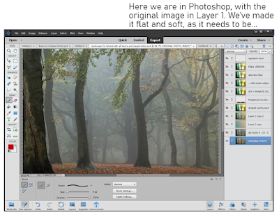

If you were going to actually draw now, using the base image as your source, you would start your pen tablet (Wacom or Huion, or whatever; I have used both, and currently use the Huion while the Wacom Bamboo is put away). You would create a new layer op top of the photo … you would select a brush to draw/paint with … pick a color from the photo to paint in … and, in the new layer, you’d start to trace over the shapes and forms of the trees, plants, water and ground. You’d change and adapt what you wanted to change ― say, take out a fencepost, or get rid of a parked car, or omit the trash somebody dumped!

Since you’re not drawing here, instead, we’re going to use a shortcut. Photoshop has a wide variety of filters that can sometimes give a photo some of the characteristics of art. The filters are not fool proof. They often do not work well. Even when they do work, if you just slap a filter onto a photo and call it “done,” all you have is a Photoshop filter slapped onto a photograph … it doesn’t look very good. It certainly isn’t an enchanting painting.

But the process of adding a filter to the photo is the first step in getting to the painting. This is the trick that saves you having to draw, if you can’t draw, don’t have a tablet, or don’t have the time. There are all kinds of filters, some quite good, some really bad, some utterly pointless. A handful can work well some of the time, but don’t expect them to work every time ― it can be a bit of a crapshoot!

It’s up to you to choose the filter you like the best. No one can choose this for you … you are the artist, and this is your project. The photo is going to turn into a painting in your way. No one else’s!

You’ll find the filters here: Filters > Filter Galley … and you’ll need to sort the wheat from the chaff. It’s mostly chaff. Very few of these filters will do anything at all for you. If you apply just one, the result will probably be boring, lifeless, flat ― nothing enchanting about it. This is just the first step.

So, here is Step Three: apply the first filter, whatever you choose. In my picture, I applied Dry Brush, with a brush size of 0, brush detail of 10, and texture of 3. You could use anything you like … but remember that what you choose must be matched to what the picture needs, or it won’t work out very well. This is why “Zen Photoshop” really is art, not just a mechanical process.

Experiment with all the filters. Apply them all, configure them all, delete what you don’t like till you get to something you do like. Save the file. Now that you have Step Three to your liking, immediately duplicate the layer … you’re going to be working on the clone, not the original!


Okay, now we’ve got some lines into the picture, which simulates the work we’d have done by sketching or tracing, the next thing to think about is the color scheme, or pallet. If I’d sketched the whole thing by hand, color would still have been the next thing to tackle; at this point, the process is fairly similar. Now, if I were painting by hand with the pen tablet, this is the moment where I’d take a large, soft brush and start to put in swathes of color, which set the tone, and would also decide which will be the light and dark areas in the finished piece…

Using the shortcut method, it’s not so different. To a certain extent, the colors are already in the picture, because it started as a photo ― but the colors are all wrong. I had an idea in mind when I started, and this picture is not even close. I wanted “early morning in an enchanted forest,” but the photo I started with is just a kind of misty, murky twilight. All it gives me are the shapes of the trees. That’s only the starting point. I need to get the colors I want, or it’s never going to look like an enchanted woodland.

There’s two ways to go. You might get lucky with Photoshop’s “colorize image” function ― I haven’t had much luck with it, and seldom use it, but it’s worth trying. To do this, convert your cloned layer to monochrome, and then … colorize it. See what happens. Don’t be surprised if it’s not very good; it seldom is!

So, I always go the other way, and deliberately set the specific color pallet I want. Okay, so how do you do this? It’s actually not that difficult. In your mind’s eye, see the colors you want. Now, open the color picker pallet. Choose two colors that represent the most opposite colors in your imagined painting ― it could be the sky and the ground, or the light and the shadow areas. Set those two colors as the active swatches ― ie., they will be the ones your brushes are painting with, and which are used by the bucket fill tool … and when you option the gradient tool, you’ll get both.

This is what you’ll be doing. With the colors picked according to the image in your mind’s eye, select gradient fill. Create a new layer ― and fill it with a gradient. It’s hit and miss in Photoshop, so keep stroking the input path across the screen till you see what you want. Got it?

So far so good. Now, put a blend mode onto the layer to bake those colors into the layer below, which has the photo converted to lines. Aha! The magic begins as the picture assumes the colors you want! For my picture, the blend mode I used was Overlay, at 100% opacity. You could choose from half a dozen blend modes, and adjust the opacity from 10% to 100%. Only you know what you want your picture to look like. Get in there and play with the blend modes and opacity till you see exactly what you want.

Got it? Then, merge the bucket fill layer into the layer with your chosen line filter. And duplicate the resulting single, fused/merged layer immediately, so that you can go on to the next step.


With the colors set, it’s time to breathe life into this project. The magic happens when you begin to paint with light ― literally.

Look long and hard at the picture. See, in your mind’s eye, where the light is coming from. Can you see it? If you can see it, you can paint it, even with a mouse. The tools you’ll be painting with are dodge and burn. Dodge make areas of the painting brighter. Burn crushes the shadows or mid-tones, making them darker. You’re the artist: it’s up to you to paint with light and shadow, and create the picture. You have the outlines; you have the colors. Now ― paint. You don’t need a pen tablet for this; the work is not fine or detailed. Dodge and burn are more like “area weapons” than fine-scale tools. They’re best applied over significant portions of the image ―

Tip: go carefully, applying about 10% or 20% of dodge, and maybe 5% or 10% of burn on any one click. Build up the effect, little by little, and let the image take shape slowly rather than trying to do it all in one mouse click.

You’re the artist here. You’ll need to use your artist’s eye, your judgement, and create the image you saw in your mind’s eye. Photoshop can’t do this for you … this is where the art comes into its own. Experiment; find out what works; throw the failures into the bin and re-clone the previous layer for another attempt until you see just what you want. Note that dodge and burn can both be applied to highlights, midtones and shadows, but you really can’t dodge crushed shadows, and you also can’t actually burn featureless highlight areas to any great effect. Remember, zones close to 1 and 255 have no information in them, and it’s impossible to add information that isn’t there. So be careful how far you go with dodge and burn, because when the information is gone ― when you’ve brightened or darkened too far ― you won’t be able to add it back in. Go gradually, slowly, and build up. (If you do go too far and erase too much information, there’s a trick for getting it back … you can always paste the dead areas over from a previous layer, merge them into the new dodged, burned layer, and dodge/burn them juuust enough to fill in those dead zones. It’s tricky, but it does work.)


At this point, you might decide that you’re finished. If the painting looks done to you, that’s it. If it meets your original vision, you’re done. That’s art, and the call is yours to make.

For myself … I decided I wanted more texture in it. If I were painting by hand with the pen tablet, this is the time when I would start to doodle in color(s) and put in all the fiddly bits, the detail, or pseudo-detail that seduces the eye into thinking you’re looking at foliage when, in fact, you’re not. But we’re taking shortcuts here ― allowing for the fact that you might not have a pen tablet, or else you just don’t have an hour to two to spend faffing around, doodling. For whatever reason, you can take the shortcut.

You can apply another filter, and pour on more texture, save yourself the time and work. This is nothing that you can’t do by hand ― and it’s a lot of fun killing a whole afternoon or evening with this kind of detail doodling. But if you only have ten minutes … Photoshop to the rescue again.

The filter I chose was Poster Edges, with the settings dialed way down, so the filter didn’t ruin the picture….

And last of all, I added lens flare. Go to the very brightest area of the image ― where the sun would be, striking through the morning mist. Go to Filter > Render > Lens flare, and pick one of three types of lens flare. Position the hotspot. Dial the intensity up or down till it looks right to you. This was the point where I decided the picture was just what I wanted. I did try saturating the colors, but decided this “overcooked” it, and undid the effect. I could have gone on messing about … adding birds and bokeh and dust motes with ABR brushes, but you really can overcook a picture. One of the key things about art is knowing when to stop … when to sign off on the picture, and call it good!


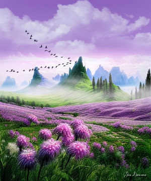
And the result, in closeup, so you can actually see it on the screen here? Worth a quick look before I call this post done:


...and that's the point where I signed off on it and called it done! 

Sunday, February 18, 2024

Too hot to think, so -- let's play in Photoshop

Photoshop filtering and colorization, from an Iray plate


Photoshop filtering and colorization, from an Bryce plate


Photoshop filtering and colorization, from a composite of various AI elements


Photoshop filtering and colorization, from a composite of various AI elements


It's waaaay too hot to do much today ... including think ... so I'm just playing in Photoshop. Experimenting, not just with filters but with filters added on top of filers. What happens when you overlay them? 

Start with a sketch, rough-color it by zapping in a lot of  pigment, then start piling on filters. How you get the sketch is another question entirely. Speaking for myself, I can't draw for beans, never could. I work from photos, or DAZ Studio (Iray and raytrace) plates, and I don't mind starting out with a bunch of AI plates, which are mined for the elements which the human artist will combine to create something new and unique. It's either that, or I lay down thousands of bucks for 3D props (yeah, right), or I trace over people's photos ... and they'd be thrilled about that. So, for me, it's a bundle of AI plates, and then digital tracing, LOL. Whatever works. 

Saturday, December 22, 2018

A hunk, a stag, a stream ... plus Gaussian blur and film grain

CG character design: The Mercenary
The Mercenary -- again. I really like the character, and couldn't resist coming back to him. Wondering about posing him with The Magician ... like, maybe they're in the same place, on the same job? The possibilities are endless and delicious. But --

If there's one thing that "bothers" me about the classic raytrace (which is pretty much where I'm stuck, not being able to outlay several grand on hardware and software at this time, to play catch-up with all the front runners who take Genesis whatever and fabulous render engines for granted...) it's that a raytrace is "too sharp, too clear, too perfect," or something -- an almost indefinable quality that makes even a good picture look fake ... and can make a poorly-rendered character look like a plastic doll, or manikin, perhaps one of those life-like marionettes. The big question being, of course, what can you do about this as a work-around?

So I'm starting to play with film grain and Gaussian blur, to introduce a kind of imperfection to the image, to sort of "knock the edge off the digital perfection," which might fool the eye into seeing a human being instead of a piece of plastic. Here's a detail crop to give a better look at this:

Gaussian blur and film grain added to a CG render
Gaussian blur and film grain were added in Photoshop (I imagine Krita has the filters too, but I confess, I haven't even looked for them yet: am still learning to handle the brushes there). Just enough film grain to knock the edge off the digital perfection ... just enough Gaussian blur to fool your eye into believing a camera took this shot. Raw CG renders with DOF left off are ... just too much in-focus to look real! (This character has also been over-painted with beard shadow, body hair, and a bit of work done on the wind-whipped head-hair ... same reason. The raw model (Michael 4, wearing face and body designed by me) is just too plastic to convince, or please, anyone much today, in the wake of the aforementioned Genesis and fabulous unbiased render engines. (Anybody remember Captain Scarlet and Captain Blue? No, not the more recent digital animation, the 1960s production. Yeah, that one ... did I just date myself??)

Also in this render, I've overdriven the bump maps on everything to heap texture into the shot; the only thing I didn't do was turn on DOF. Technically I should have; but if you just spend twenty minutes over-driving the bump values, then turn on depth of field and the background blurs out, why bother with the bump maps? So in this one I went for texture; in the next one, I'll play with DOF.

Also been painting in Photoshop and Krita. This first one is a digital watercolor done from a photo that was such crap, it belonged in the bin -- but it was the only one where the framing and composition were perfect! So, naturally, the automatic light metering gave me a washed-out photo in pale grays and no real color, and blurred the hell out of it into the bargain. The camera konfooz itself. (My bad: I "cooked" it in a veryveryvery hot car. I think I halfway killed it. Sound of sighing.) So the assignment was, can you take a garbage photo, derive the sketch and wind up with a very nice painting? And the answer is, yes, you can:

Digital watercolor in Photoshop
Please do have a look at that, large size (I uploaded it at 1600 wide) ... am very proud of the fine work. This was produced 90% in Photoshop, with just a tiny bit of painting done in Krita (because it has a brush that Photoshop doesn't; if you have the right .abr brushes in your Photoshop, you could do the whole thing in Photoshop).

Then, this one below is the reverse: 95% done in Krita, with just a little bit of work done in Photoshop for the same reason: a specific brush I wanted to use:

Krita painting: something like oils or acrylic
This one (Stag at Dawn) is much more like a work in oil or acrylic, not at all like watercolor. With the watercolor -- digitally -- you're pouring in layers and layers of semi-opaque "washes" to get a cumulative result. With this one, you're spattering tons of paint onto the digital canvas, all at full opacity, layer after layer of texture to come up with a final result. I'm actually very pleased with this one; but the technique is a lot more time-consuming than the digital watercolor technique. Will save this for projects that either warrant the extra work, or are superbly suited to the process.

Wednesday, May 11, 2011

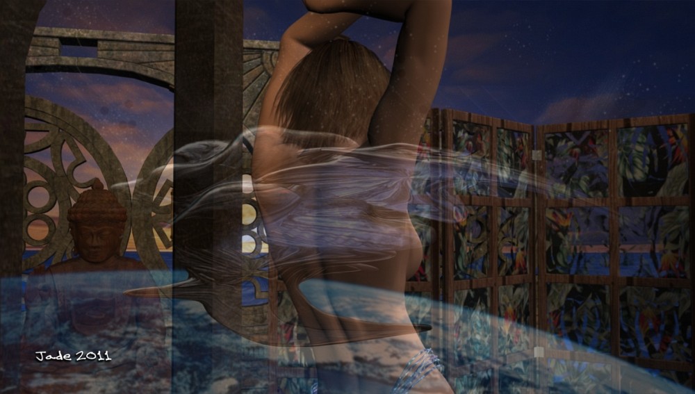
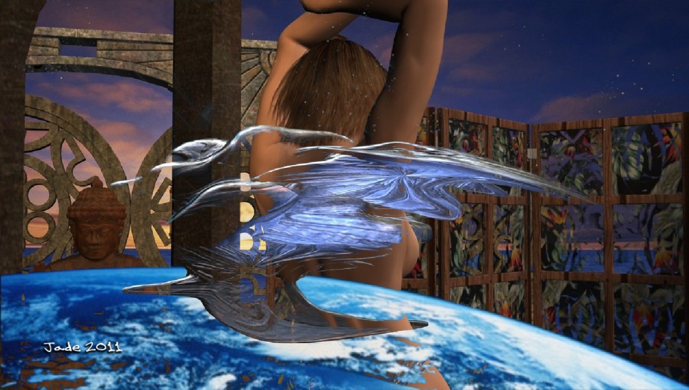
Merge modes ... what the heck are mege modes?!


So...interestingly -- from the artist's point of view -- I was asked to explain a little bit about what "merge modes" are. I was talking about this the other day, when I was posting book cover art, and mentioned doing the composites. So, what in the world are merge modes?

Basically, the term refers to a wide range of options and alternatives that are open to you, when you merge one image into another image. The way the tones, colors, gradients and so forth interact when one image is combined with another is called a "merge mode." On top of this, you then have the opacity or transparency of the merge to play with, and you can combine different merge modes (also known as "inks" in certain programs, such as Macromedia) to get a huge number of effects.

As usual when it comes to art, it's far easier to show, not tell, so I've taken two very different images, pasted one into the other, set a number of different inks, and saved the results, which I'll paste in here. You'll probably have to see these at 1000 pixels wide to get a real idea of what's going on, because Blogger pastes up its on-page images at 400 wide, which is really too small! If you click on each image, I uploaded it at large size, though -- and it's well worth a look, because this is where a lot of the magic of digital art starts to happen...


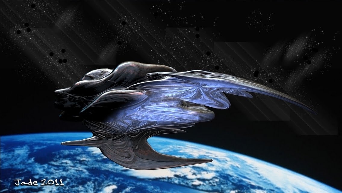
For the bottom image, which is getting pasted onto, I used the organic starship you saw a couple of days ago:

And for image two, being pasted over it, I used one of the images from a V4 glamour shoot. Okay, so here's where happens when you set a merge mode...


Now, you notice I'm not going into what each mode is called! This wouldn't do you a shred of good, because each program calls them by different names ... also, the names would mean nothing to you, if you don't know what they are, and the only way to learn them is to play with the software and see what happens. By setting this mode or that mode and seeing the result, you figure it out faster and have a lot more fun. Everything else is too much like a textbook!

Okay, so -- which software? Here, I can't really help you, because there are, to my knowledge, four main packages today, and I don't use any one of them to do this work. There's Photoshop, which will absolutely, positively do this work for you -- though I'm not sure if the cheap cut, Photoshop Elements, would have the tools. Pay $1600, and you're certain to get them, but I couldn't even guess at the interface, because the closest I ever came to Photoshop was a brochure!

Then there's Corel Painter, which costs about $700, and this also will definitely do it for you(if it didn't, at that price, I'd sling it back at them and demand a refund). Don't be fooled into paying $30 - $130 for the Corel Photo Paint program. All this does is apply some pretty iffy filters to photo images, to turn them into ersatz artwork. I played with the free evaluation copy for an hour one day, and thought the results were pretty poor. You can do far better by combining the photo image with a texture image by using a transparency on one of them, and then tweaking the contrast, color saturation, and playing with the soften and sharpen tools!

The other two packages are open source and free. There's GIMP, which is the open source shadow of Photoshop, and Paint.net, which I'm told is the open source shadow of Corel Painter. GIMP probably does the merge modes, but how, I have no idea, because I've never (and I blush to confess this) gotten deeply enough into the program to find out! I use GIMP for painting in .abr brushes, which is absolutely indispensable, and for this alone, I love GIMP.

The last one, Paint.net, I've never actually used, but some people speak very highly of it.

Hope that helps, guys! See? I do read comments, and I do answer questions!

Jade, 11 May

Thursday, November 26, 2009

Survival Run


This one is actually a pretty complex shot, so I thought I'd upload a set of "progress steps" which should make it easier to visualize the recipe:

Obviously you start with your figure. (Incidentally, click on the filmstrip at left ... it's actually about 500 pixels wide, so you can easily see what's going on there. Also, the finished pic was uploaded at 1000 wide...) You start with a bare stage. Bring in your model, add whatever hair and clothes (or not!) that you want. Change the color of his eyes maybe, and pose him however you want him posed. By this time you ought to know what the background should be. Forest? City street? Docking bay? Okay...

You can pay a fee and download a digital model (which is the best way to go), or you can paint something yourself (also great, but takes a long time), or you can use a digital; photo (also cool, but do some digital effects on it, or it ends up looking "raw" and "fake"), or you can swipe something off the Internet ... in which case, for goodness' sake do SOMETHING with the image to make it different from the work you swiped!! You can flip it left to right; you can swap the colors; you can leech our or super-saturate the colors; you can blur it way down with a median filter. You can take out objects and paint in (or paste in) other objects. You still end up with a "derivative" image, and the original artist could either object or applaud! But at least you did did something rather than just stealing a picture.

Anyway, however you get the background, now the challenge is to set up the lights on the model (in DAZ) to make it look like the character is part of, and belongs in, the background. So you set up some distant lights and point lights of whatever color is right, and render one. Tweak it all till it looks perfect (middle one in the filmstrip). Then open the render in your paintshop program ... I like and recommend Micrographx. And go to town your your filters -- Light Studio and Lens Flare studio.

Keep going till you get exactly what you want, and ... save it. That's another one done!

Jade, November 27

Monday, November 23, 2009

Yaoi beauty ... daydreaming...

This is actually an incredibly simple image where the magic happens in the textures, which are about ten layers deep. The image itself is "just" a Michael 4 with long dark hair, curled into an interesting pose; the high-rez skin map was added, his eyes were closed ... and I confess, I gave him long, curly eyelashes! You can do with with the Morphs++, which let you change every single aspect of the face and body. (Yes, those too.)

Then the fun started --! After the lovely render was done in DAZ the next question was, how to make the image complex and rich. So I matted it onto a gold plate that looks like the image you see at left. Go ahead and click to enlarge it -- I uploaded it at a decent size and resolution. (Incidentally, if you want to use it in your own work, go ahead: these images are so easy to make, it'd be paranoid and dumb for me to object. But a backlink would be nice ... thank you kindly!)

To make the matte you see here -- get into Serif X3. Pull out a rectangle comfortably larger in both axes than the pic you want to mount on it. Set the border at 0. Go into the FX menu and pick the 2D Pattern Map. This will automatically pull up the 2D Bump Map, and 3D lighting.

It might sound complicated but trust me, it's not! The work bench you'll be seeing (including the elements to make up the final picture) will look like this:

Fiddle around with the settings till you get what you want ... play with the tools, see what they do! (I don't often read instruction manuals, have you noticed?!) Eventually you'll wind up with exactly what you want. Now, select the image of our beautiful daydreamed; go into the FX menu and choose Feather. Set it to to the highest it'll go. Park the image on top of the matte; put a signature on the work. Select all and lock 'em together ... export as an image. You're done!

So the magic in this one isn't the image itself, it's in the textures. Also, have a look at the texture of the background behind the daydreamer. I call it "scarlet maelstrom." It's the exact same background used on the render of the blond with the beautiful butt and the leather jacket ... but I put in a swirl, or a twirl, which turns a picture into a corkscrew, then clicked the gamma way down to make it dark and suitable to be used as a background to a dark picture.

Result: nice!

Jade, 24 November

Sunday, November 22, 2009

Yaoi mysticism

Go ahead and click on him ... he's 1000 pixels high, and at full size you can see the beauty. I'm really delighted with this shot, which was done in DAZ Studio 3, Micrographx and Serif X3. I call this one "Yaoi mysticism," because there's something deliciously delicate about this guy, and sensual, and then you get to the magic.

The next question is, how the [expletive deleted] was this done? And how long did it take?

It took about 20 minutes (!) and here's the cookbook method.

Start DAZ and load in a basic Michael 4; give him long hair with the Mon Chevalier hair style; set the color to dark by using your surfaces tab (the default is golden blond). Put a pair of jeans on him, and set the color to black (surfaces tab again). Set the background to black. Now it starts to get more interesting.

You're going to need two props to make the whole thing the same as the above, but at least one to get the neat crystal ball effect. If you can get hold of a "donut" as an .obj file, you can import this. Or you can go to DAZ (see the banner below) and buy some really amazing jewelry, among which there is sure to be a bangle. The plain gold bangle I've been using for ages is just a "donut" made in 3D Studio Max and exported to the OBJ file format, which can then be imported into DAZ. (I just got Hexagon for making models, but I still have to figure out how it works!)

The important prop is the crystal ball. In DAZ, click on Create > New Primitive > Sphere. Then use the controls to scale it to fit as a crystal ball. Then use the surfaces tab to make the color light blue or green, and set the opacity close to zero, which makes the object go transparent.

Position it between the character's hands; put a frown of deep concentration on his face ... so far, so good. The real magic happens when you set up the lights.

This shot was done with one distant light set to dim gold and two spotlights set to dim green. One spotlight was jiggled around till it was actually "inside" the crystal ball. The other was set just outside the glass. Both were VERY dim, and set to "point at" the character's head. Render an image right here, and then adjust the brightness and color of the lights till it looks something like this:
The next thing you want to do is add the razzle-dazzle, and you do this in your photo studio ... if you have Photoshop, bully for you! The rest of us don't have A$1800 to spend on a single prog (and even if I did, I'd use the money to take a holiday in the tropics), so I'm going to tell you how to do this in Micrographx, which costs about forty or fifty bucks (shop around!!), does the same job, does it with a dead-easy interface, works on XP and even Vista. You don't have to have a name like Gates or Murdoch to be able to afford the progs to do this work!

Open your best-so-far render in Micrographx 10. Open the Lens Flare browser (look under "Effects"), and --seriously -- play with the controls till the penny drops about how to use them. You're going to be jiggling flares and rays; you get to change the aspect ratio of the main one, set the length of the ray trail, change the color and brightness and sharpness of everything, decide where in the image the effect is going to be located (x,y controls), and ... lots more elements to play with. Christmas morning came early!

So play with the lens flare till you get exactly what you want, and then save (duh), and start to think about the border. You might not want a border ... I think it enhances the shot. This one was done in Serif X3. Import your best-so-far image to a new publication, and then draw a rectangle the size you want the border to be; set the "fill" at none; use the nodes on the drawn image to set the corner style. Use the Line & Border controls to set the color ... I used golden yellow. Now, click on the FX icon ... add a bevel & emboss to make it look 3D. Now, get into the 2D Bump Map controls ... set the "scale" to small and the "depth" to high, and then choose a pattern from the browser to control how the bump map looks. Play till you get just what you want. Sign the piece; select all objects; lock them together; export as a 200dpi image.

And you're done! If you don't know the software backwards and sideways, you could play happily all afternoon at this. If you do know the software, you can get this 3D painting from concept to "done" in the time it takes your rice to cook in the microwave. I did this last night, while the rice was cooking for dinner.

Yaoi mysticism. Beautiful.


Jade, 23 November

Thursday, November 19, 2009

Deep thought and rainbow hues

"Just a beauty shot" today ... an almost abstract figure ... because I'm so short of time, I have to be out that door and gone in about 90 seconds! This piece was done in DAZ and Micrographx, and it was dead simple, though you might not believe it, to look at it!

The process is this: start with a Michael 4; add a hairstyle you fancy (the model arrives bald or buzzcut); don't worry about the face, because you don't see it in this shot. Pose the model and spin it around using the x,y,x "translate" controls, until you get just what you want. Import an abstracty background ... nothing specific, just make sure it's dark, so the it contrasts the figure. Render this ... open the render in Irfanview -- gamma down, and contrast up. Copy/paste it into Micrographx Picture Publisher 10 and apply two filters to it. One: on the Light Studio, pick "Rainbow" and jiggle the settings till you get exactly the effect you want. Two: in the Paint Studio, choose "glow wind" as the filter ... set it up to take effect on the "R" channel (as in, R-G-B, being red-green-blue), and set the intensity level at "1" ... save it. You're done. Seriously.

The effect is fantastic, and the total project took about five minutes. There are two tough spots in this kind of work: 1) "seeing" the picture in your mind's eye, so that you're not just thrashing around among your filters, looking for inspiration, and 2) knowing the software, so you can get exactly what you want...! Like they say to piano students, "prektiz, prektiz, prektiz!"

Jade, 20 November

Wednesday, November 11, 2009

The rider from Lothlorien

Today's render is a thing of beauty ... one of Legolas's people, perhaps ... something that just stirred in the heart of Lothlórien. Isn't this one absolutely gorgeous?

It's the same horse model -- the Millennium horse; I put on the blue roan texture this time, and gave him the ice-blue eyes. The rider is -- as always -- the Michael 4 model, wearing a face designed by me, and hair by Neftis Salon (it's the Mon Chevalier hair) with a color set by me by using the surfaces controls. The background is an abstract painting I did in Serif, finished in Micrographx and Irfanview.

(To answer an of-asked questing ... no, I do NOT use Photoshop. Do you know what Photoshop costs??? Yeah, sure, $200 if you're upgrading. And if you're not?? A$1,879.00. They have GOT to be joking. I could take a family on a week's fly-away vacation to Magnetic Island for that!! So I use a set of three programs which, combined, provide everything Photoshop provides, and they cost, all together, A$74. Irfanview is FREE; Serif X3 is $56 at the moment (X4 just came out, so you can get X3 cheaply -- and believe me, it's 200% more than you'll ever need). And for the paint program, I use Micrographx Picture Publisher 7, for which I paid the legal price (!) of A$18 ... if you're rotten enough to cheat the publishers, you can get it free; you can even get Version 10 fee ... but take a tip from me. Version 7 is quite good enough, and it's not kosher to cheat publishers who're offering you top-notch software at weeny little prices! So no, guys. I don't use Photoshop -- and I don't actually consider it brilliant to pay almost two grand for a set of tools, filters, textures and materials, that you can, frankly, piece together for under $100 ... and then spend two years learning the Interface From Hell...! Apologies to all the Photoshop fans. I'm just not one of you -- I couldn't afford to be in the early days when I might have been attracted by the glitzy name! And then I learned the art, and discovered the extent to which you can use other progs, and put the clan on a plane to the tropics instead of paying this price --!!)

Anyway ... the process for creating today's render was this: set up the horse model with the blue roan texture. Set up a previously-designed Michael 4 with "my" face; add the hair, change the color to Legolas-blond. Merge the Michael 4 file with the horse file. Pose the Michael 4 as the rider. Pull out an old digital painting from a couple of months ago; resize it to a square. Apply the Median Filter at max; then sharpen the image to achieve the "painted" look. Save; import this into DAZ as a backdrop. Render the whole thing. Import the render into Micrographx and use the Darken/Lighten paintbrush to put a dark halo around the outside. Copy/paste this into Serif and add the border and the signature. Export as an image ... done!

It might sound complex, but it isn't. You have the programs open, and all you're ever doing is cutting and pasting between them. The only 3D render is done in DAZ; the only export-as-image is done at the very end, in Serif. Also, these are small-overhead programs. They do NOT overtax or crash your system.

So there you go ... the rider from Lothlorien. And ain't he beaut?

Jade, November 12