It's been a fifteen-year odyssey, from the first steps in 2009, when this blog launched -- when the art was simple, naïve, filled with the beginner's unavoidable errors -- to the present, when the work speaks for itself. I've wandered in and out of CG work, and these days I tend to concentrate more on digital painting ... in 2024, I'm still mostly a photographer, though writing is becoming more important each year, since I "turned pro" with story placements in the professional Science Fiction press. But I always find myself coming back to art, to painting. Yeeees, like everyone else, I've looked at AI. In all honesty, I don't really care for it, on so many levels, but on a "know thine enemy" scouting assignment, at least I took it for a spin and learned WHAT I don't like, and WHY. So here we are, fifteen years and more since the blog launched, and it's still here ... and I'm still here! We're both battle scarred, but the blog is currently in fairly excellent shape, after many, many hours of work to rid it of dead links, missing images, references to sites and blogs that no longer exist. Done. "Adventures in 3D and Digital Painting" is now firing on all cylinders. We're ready to roll -- and my new art gallery site is about 80% done too. I'm loading content, and it'll launch soon. 2024 is a whole new year ... I've promised myself, I'll try to make it a good one!
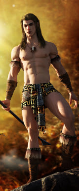
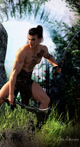
Archer in the Dawn
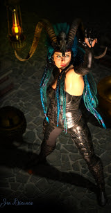
The Dragon Whisperer
The Pilot
Partners
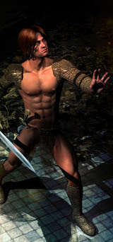
Swordmaster
Odinson
Space Pirate
Mean and Green!
Suited Up
Where the magic happens these days: Studio 4.14
Yes, I've made the transition. The new computer has fixed the major problems. I'm just exiting the experimental zones right, and creativity has actually recommenced
Here is where the magic used to happen
Note: I've changed to Studio 4.14 now, but most older art on the blog was produced in good old DAZ Studio 3! Studio 4.14 is now playing nice: I CAN save a file, which I couldn't before getting the new computer! New posts will feature images rendered in Iray and Terragen, plus Affinity Photo and Krita art, not to mention Amberlight. Am starting to break out of the "time warp," buying Genesis stuff ... but the transition will take a while!
.
.
The Lost Songs
Contents List
Barbarian Prince
Shaman
Elven Warrior
Mars Rider
The Goblin Queen
Huge thanks to all the folks following and visiting these pages...
Spent the afternoon experimenting with raytracing ... yes, raytracing! This, above, is not a raytrace, obviously. This one is an Iray render, using one of Sveva's backdrops to save time, and a lot of Merlin's grass (from the Wild Borders set) to make the foreground and background kind of "smoosh" together till they look contiguous (I just invented a word). What's interesting about this render is that I created the figure from scratch. It uses a skinmap called called Zander for Genesis 8, and the Landis Hair for Genesis 3, but the face and body form were designed on the fly. This is good. I can do this. I rendered it at 2000 pixels high, rebalanced it quickly to brighten it up (a lot faster than trying to figure out the Gamma in Studio, though you could do it that way, if you wanted to), and called it good. Oh -- the backdrop had some work done to it; I Gaussed it quite a bit to soften it, give the impression of a focal drop-off into the distance... Now --
This one is your raytrace I'd been hoping to get raytracing working properly in Studio 4.15, and I think we can call it job done! Everything is performing properly --
-- the vascular mapping is on and working, that's Michael 4's High Resolution skinmap, there's a displacement map on the costume, custom eyes, DOF on the camera, the works. Plus, I cranked the settings up sky high on the raytrace to pump the most quality out of it that's possible. This would have been an impossible, 10-hour render on the old computer (the reason I shut it down a year or so ago). How long did this take? About twelve minutes. Yes, I'm happy. Good old Michael 4 is back. And --
-- the resolution on the Genesis 8 character is pretty amazing. I believe there's an add-on you can get, which will "age" the Genesis figure. I might get this next, because the one thing about these figures is, try as you might, you always end up with a twenty-something, or even a teen, and I tend to like a guy who looks like he's been around the block a couple of times. Let me see what I can find, something like "Aged for Gensis 8." I have two lights plus an environment light on this, and the result is pretty darned good. Good enough, I think, that if I were using a photographic backdrop, you'd have a hard time picking this for a render. You could assume it's a snapshot. More soon!
Today's experiments were about mixing and matching bits of different costumes and then making them match up though the use of Iray shaders ... it's actually a lot of fun. You don't see it so much on the Rex character, above, because its just the leather jacket (for Genesis 1) and the jeans (for Genesis 3), and the Varun hair (Genesis 8); but when you get into the female character ... well, I'll admit there's a lot more to work with! Here we go --
That's a mixture of four different costumes, all made to match with shaders ... and then we get to the woman herself. That's G8 Female, right out of the box -- wearing Georgia's makeup and eyes, and the Side-part Hair for Genesis 2. (For these images, I'm not beating my brains out with sets and props; these backgrounds are lifted right out of the packs by Sveva -- you can find them on Renderosity. At this moment, I don't have time to run every experiment in the book with lights and shaders, and mess about with setting whole scenes ... besides which, I haven't (yet) got down to the installations! I still have 250+ things to install. And finally, when you set up a huge scene, you blow out your render times.) I played about with it a little bit ...
A tree by Flink, a bunch of other props, a backdrop out of Terragen, Iray lighting to simulate sunset. It's okay ... but the problem with 3D trees is that the leaves are the size of hubcaps or dinner plates. I'm honestly not that impressed with anyone's 3D tree models. Terragen is fine, till you bring in trees, and then unless you can afford the XFrog tres, which only work in Terragen, you're back to the same problem pf hubcap sized leaves, which rob the tree/scene of realism. And the thing that makes me relictant to spend hundreds of bucks on XFrog trees is that since they only work in Terragen, it locks you into working with Terragen -- which, in turn, is a subscription service, if you want to get away from the limitations of the free version. Its not cheap, and I don't have the bucks, in the long term. So, we'll just use backdrops, for the moment, I think! In any case --
Today's experiments were a big success, with one exception. The Wardrobe Wizard that worked so brilliantly yesterday failed today ... and this is weird, because it failed on the same costumed and figures it worked with before. Restarting the software did NOT work ... restarting the computer might, but I don't have the time. So ... another day, for that. So, there you go --
-- the magic of shaders. I like it! More soon. There are eight thousand more experiments to run. And I must get around to installing all those other goodies...
A woodland elf ... and I'm getting distinctly Yaoi vibes off this! The character would bear some more exploration, yes??! (nudge, wink)
Just daydreaming today ... still playing with the Ferendir skinmap, exploring ways to get the most out of it in DAZ Studio without -- yet -- seeing if Iray loves or hates it. You can't know till you try it and see what happens. This is "just" a raytrace, with the render settings cranked way up; and I also played with the tattoos packaged with Ferendir. The face and body morphs are my own design, though, using Morphs++. I'd forgotten how much I used to enjoy making new characters -- and this one is a beaut:
Sooo, because it take a fraction of the time to get a raytrace (rather than waiting all day for Iray), let's go again -- same character, new scenario, telling a story, or at least hinting at one:
Treasure -- a hunt for the stuff, by the looks of this! A ruin, a lantern, something sparkling with jewels. And take a look at that skinmap. This is marvelously responsive, and with a slight adjustment in the lighting it can look either very pale or deeper colored, almost Hispanic. Me like. I also really like this new face morph:
So, what you have here is Michael 4, custom face and body done in Morphs++, Ferendir skinmap, plus the facial tattoos, M4 Displacement to achieve the vascular mapping, Neftis's Danyel hair set to black, one of DM's columns used as a plinth, and the lantern from DM's Pyrago. In the top render, I used the Euros skirt with lots of surface mapping, plus two of Merlin's trees sized to be bushes, and the menhir from DM's Elven Rock. The backdrops are just that: backdrops. If I'd done this as sets (which I could have), they'd have been rendering for three times as long. Backdrops save a ton of time.
That's it for me, for today. Must sleep! Also, thunder is rumbling and it's probably wise to turn the computers off. Lots more to play with -- the only new toys I got around to today were the tattoos, the lamp and the backdrops! The toy box is overflowing with goodies! (Boom goes the thunder ... it really is time to log out and turn off...)
Just two images today ... because I'm soooo sick, I'm about to hit the deck. There's a whole lot of sneezing going on in Australia right now, and at least for me, runaway allergies have turned into a major sinus and throat infection. So I'm calling it way early today. The experiment this morning was to render the figure separately from the background. It works.
I did the bottom layer (the woodland) in Photoshop, from a picture captured in Belair NP last fall. Finished with that, I shipped it in as a backdrop and posed a new character in front of it (that's still the Michael 8 skinmap and Varun hair, which render very well. Then, when that was done rendering, I shipped it back into Studio as yet another bottom layer, and added the bushes in the foreground. Since the PNature props don't even install into Studio 4, much less render properly, I did the top layer in Studio 3, as a raytrace with one light set. So --
If it's going to be sets rendered separately and used as backdrops, that's fine. To get a feel for this, I used one of the Sveva images, from Renderosity, which are retailed for exactly this purpose ... I also did it as a raytrace, because to get the hang of this took about 200 test renders; and Iray is sooo slow, I'd have been testing till next year! Result --
A neat Gothic fantasy where the line between foreground and backdrop has been confused, or hidden, with various props. I added the Michael 4 and costume (my own character -- you might recognize him, though I did change out the hairstyle), plus the bench, lantern, the ivy in the foreground, and the floor. Everything else is a backdrop. Having got the hang of it, I'll try it in Iray next, and we shall see!
So, just the two images today: Iray pretending to be a photograph, and a raytrace pretending to be a painting! I like them both. Must admit, the Iray render is pretty convincing, and since there was no set to render, or foreground, it finished in about two hours even on my old PC. Hmmm. Interesting.
And now -- pills, and crash. More soon, when I've returned to life!
An autumnal mood ... and a bit of Michael 4 glam. I was in the mood for glam, snarfle. The first picture tells half a story. I call it "Relics" ... Oh, a battle was fought here -- Orcs and Dwarves, perhaps; and here's one of the scouts from the borders of the Shire, come to find out what became of friends who never returned home. Hmmm. That's not bad. The second picture ... well, I wanted to play with color casting. That is, throwing a bucket-fill into the top layer of the Photoshop post-render work, and then blending it to see how the color cast changed the mood and tone of the image. Well now! There's no reason the experiment couldn't be run with a bit of beefcake, is there?!
If you're interested -- the artists among you might be -- the location was set up first with a background landscape; here's what you could call the background plate:
That's the location without any depth of field set, though it is lit -- just one light. The terrain is was made in Bryce and exported as an OBJ, then imported into DAZ Studio, and the textures added. I did a diffuse (surface) map -- basically, a fairly small picture of leaf litter on the ground, tiled into an enormous 3000 x 3000 pixel image -- plus a displacement map (made from the diffuse map ... you drop it into monochrome, yank the contrast sky high and sharpen it a lot. This technique is pretty darned effective. The result is extremely realistic, even if you view the render at large size, in closeup ... and it's dead easy to achieve!
The sky was a custom Bryce render ... but while it was taking about 20 minutes to come up with something that was fairly blah, I thought to myself ... "You know, Terragen ought to be able to generate something better, and probably faster anyway." Soooo...
Terragen atmospheres -- no landscapes to speak of, because I just tilted the virtual camera to look UP at about 25-30 degrees of elevation, which puts the landscape on the horizon ... just right for use as backdrops in CG composite shots. Terragen skies are very, very easy to do, and fast! These renders took from 30 seconds to three minutes each! Ahem.
And speaking of autumnal moods (well I was, a moment ago!), fall has certainly arrived in this neck of the woods, about two weeks before winter is due to begin, according to the calendar. We took a hike in Belair NP this morning, and I'll share some of the photos here, and again tomorrow. I've always maintained that there's a line where photography and art blur together, and this is it:
Those are uploaded at 2000 pixels wide -- they make lovely wallpaper (you're welcome) and they do look so nice at large size -- please click so see them that way.
A long rainy day again ... so, art! Just one more look at the character I call "Raven" -- the Guardian -- before we leave this guy again, and go on to others ... I, uh, cheated. He's standing in the middle of the Mog Ruith set, which is VAST to begin with, and I filled it with props, set lights inside and outside (see yesterday's work, for the way the light falls through the open door, for a start) ... then you have the wings, and that hair. I realized, a) you can't see much of the background, but it's all still there and has to be calculated, which means b) this render is going to take a week! Soooo...
I actually rendered the background separately, with everything else dropped out of the shot; and I just did it with a deep shadow map, because I knew I was going to blur the heck out of it to simulate DOF:
...therefore, I got the background in less than a minute! Blurred it (a lot; in Irfanview, for quickness) popped it back in as a backdrop, then all I had to raytrace was the figure - wings - hair combination; which made for a five minute render! Then, some work in Photoshop (highlights, body hair, eyes, shadows, bit of digital grading to direct the viewer's eye where I want it to go), and I was done.
So -- more, since I have a long afternoon to amuse myself through! Why not --
--a storybook kind of image. A misty dawn, in Bryce 7 Pro. No, it's not photo-realistic, but it's actually rather pretty, and is exactly the kind of thing you'd see in storybook illustration. Bryce is pretty decent with atmospherics, even if you don't get photographic results. So, why not?
And continuing on the theme of misty mornings, I went on to this:
Well, it's not really a painting, but it's nowhere near the photograph I started with! What do you want to call this kind of image? I mean, take a look at this:
If it's not a painting, what is it? I'm stumped as to what to call it, so I leave it to you!
While I was rummaging through the old file folders, I found a whole bunch of things Id forgotten, including some borders that were made about fifteen years ago. I couldn't resist this recomposition:
That one is well worth seeing at large size --
...by the time I'd done a dozen things to it, and stripped in a canvas texture as well as the old border (added with a Photostop bend), it came up looking like a painting; so I added highlights and shadows to accentuate the effect. Very, very nice.
Okay, that's all from me for today! Another rainy day tomorrow, as far as I know, and I'm pretty much "home alone" all weekend, so ... expect more art, if only to pass the time! Hope you enjoyed these!
Answering a couple of questions today! Yes, you can reach me by email, and yes, I do answer questions! Of course I do ... thanks for asking! But first ...
Looking at Gil Cronin in the pictures from April 25th, something jogged my memory. Ah! The Mummy, of course! Arnold Vosloo as the shaven-headed priest who caused Brendan Fraser sooo much trouble during the First World War. Soooo...
Couldn't resist this:
No, it's not intended to look like Mr. Vosloo; just an excuse to play with the Anton's Treasures of Egypt prop set which I bought in a sale so many years ago, and seldom get a chance to bring out and dust off. I need so use 'The Man in the Hat,' and send him to Egypt, don't I! Anyway ... there you go: Egyptian priest. Looks like a supercilious character, actually; the kind you'd like to give a swift kick. But we won't. The eye makeup is hand painted in post ... the skinmap is actually the same JM Falcon you saw on Joe Ramos last week. It's a lovely skinmap.
And so to questions!
Why do we muck about in Photoshop so much after a render is complete? Well, several reasons. One, even really good renders often show "artifacts" that need to be painted out before you can do anything with the picture. Say, the costume doesn't fit right; the mesh on the body crumples; the hair prop looks weird, no matter what you do with it, or something that should have been reflective just refused to play nice, till you ran out of time to fiddle with it --
This picture, above, had a BIG problem ... but you needed a good eye to see it. Part of the attraction of this image is the high reflection in the polished marble floor, offset by the lovely softness of the background. The problem is that the balustrade in the background is (correctly) blurred by the depth of field the virtual camera perceives ... but when the same balustrade reflects in that floor, the exact patch of floor in which it reflects is smack in the "band" of the image where the depth of field puts this reflection into sharp focus. So you have a blurry balustrade way back there, plus an upside down one in tack-sharp focus -- in the floor! This is actually 100% correct ... but the human eye perceives it as weird!!The only thing you can do is "paint it down," ie., obscure it with over-painting, so the viewer's eye doesn't go into rebellion at perceived oddity.
The other thing one can play with to one's heart's content in Photoshop (or even Irfanview, if you want the freebie that has a zero percent learning curve), is the "balance" of an image. What does this mean? Okay...
...you'll need to see this, above, at larger size to make sense of it, but the answer to your question is in another question: Which version do you prefer? Darker? Contrastier? Softer and flatter? Monochrome? Usually, you have half an idea in your mind's eye before you begin, a concept of what kind of image you want to end up with. For this one, I wanted a hint of sunset beyond the balcony to show through, give us a hint as to what time of day this is. So, not too dark ... but I also wanted to crush the shadows to give the picture some gravitas. Sure, the original render is pretty flat. Hunh. Well, it's just a raytace, after all ... though I might see what LuxRender can make of it. In the meantime, rather than fiddling with Lux for three hours, I decided to put it into Photoshop and rebalance it. This means fiddling with gamma, brightness, contrast and saturation till you see something you like ... simple as that. There's no hard and fast rule about what's "correct." It all depends what you, yourself, want or need.
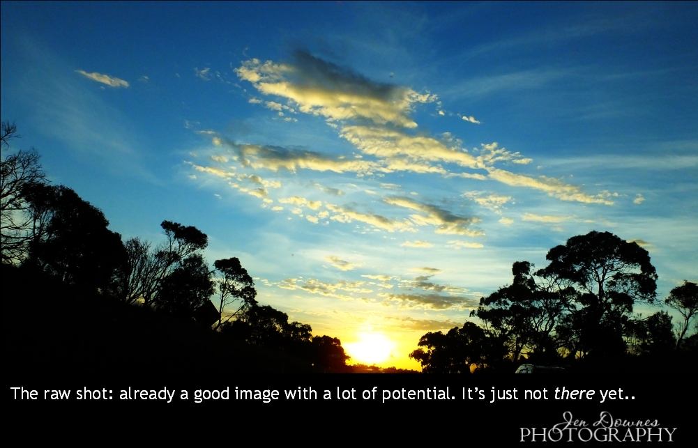
The same kind of work can be performed on photos, obviously ... and often is. For instance, let's start with the finished shot, which is half photo, half art:
This makes great wallpaper -- help yourself, I uploaded it at 2000 wide ... you're welcome. But a LOT was done to this shot to get it to this point. Here is where it started:
This was captured through the windscreen, at 100kph, on the way home from the Grampians last month. The sky did the most amazing things that evening. But the original photo has a road sign off to the left, the roof of a car on the right, and a windscreen full of "ufos" (dead bugs) to be painted out. Halfway through the fix-up process, I was here:
And that is already a gorgeous shot. You could stop right there and be very happy with it. I kept both versions ... I like them both. And if you notice, I cut out part of this same image and blurred it down, to use it as the backdrop for Imhotep. Take a look: the colors should look instantly familiar.
And of course you can also add stuff in the post-painting process that ought to be there, but weren't. For instance, the portrait of Gil Cronin. Gil wears a pair of diamond stud earrings, but I don't own any such prop, and I'm not about to go out and spent twenty bucks to buy one, even if I had the harddrive space to install anything new (which I don't: the reason I desperately need a new boot drive ... I'm now under 7GB left, and it's slowing the whole system down). In the interrim, before I can rush out and buy props, it's just as easy to paint the damned earrings! Photoshop to the rescue again, guys.
Some intrepid artists start from scratch and actually paint the whole thing right there in the software, Photoshop and/or Krita, or whatever ... and I've done this on a few occasions. Here's why I don't do it very often: one fairly simple picture consumes several days, and it's a long, slow process involving many hours of painting at the computer. Leaves me with too much pain in back, neck, hands, and often a splitting headache as well! In the same amount of time one could do a dozen renders and touch them up, without pain. But yes, I would, and will, and do, paint, if I'm contracted to, or if I feel like it! I just don't do it very often, for reasons of not enjoying the pain that goes with the job!
This was very nearly "the render that didn't happen" ... I knew that eventually I'd come up with a render that just could -- not -- be done. Or, not with my software and hardware! This seems to be it, because what you see here was composited from three layered images, when the original configuration stalled at 42% ... forever.
Initially, I had two buildings across the street, hit by spotlights; two walls to make a corner of a little French cafe; a transparent plane with bump map and reflection values set, to be the window glass; table and chair; bottle, glasses and plate, with transparency mapping on bottle and glasses; a Michael 4 (same dude as Amadeus, but with a honey matte on the Akaste hair); there was a lovely transparency map on the shirt too. It will render as a deep shadow map image, but as soon as you turn on raytracing, no joy. Soooo...
I took out everything but the buildings in the background, set lights and camera and rendered that, then re-imported the image as a backdrop and deleted the buildings. It still wouldn't render the remainder, so I did the bottle, glasses and food separately ... then did the table, chair and character against the backdrop -- with the window glass in place and reflecting ... and just pasted the bottle and glasses in!
Even then, it was an hour to raytrace the character, his hair, and the reflection in the glass, at which point I was so sick of this process, when the render turned out to be pretty awful, I almost chucked it in the bin. Sigh. Into Photoshop, and paint. And paint. And paint. And of course now I'm glad I did, because the nett result is rather good -- you just wouldn't believe how much painting it took to save it!
Harrumph. Anyway, this cafe scene came out of ideas spinning off a render I did yesterday that gave me phenomenal problems, but was fixable inside the render:
The problem with the car was that it looked like a huge slab of plastic. The human eye expects to see reflections in highly-polished Duco, and there was nothing because, of course, the 3D stage is not the real world: there is nothing to be reflected. Soooo, I went in and used a photo of some buildings on the foreshore as a reflection map. Now the car looked like a bloody mirror. So I went back in and added a displacement map to make it look like there are the usual million tiny imperfections in the surface, which got rid of the mirror effect. Put in the sky image as the reflection map for the windows ... and so on, and on, and on. Aarrggh. In the end, it came out right, but ye gods--!! Admittedly, it is a very complex render, with a vast set.
And it got me thinking: there's a story in here! Someone went to meet a friend at the bridge on the canal, but all they found was a pair of women's fashion shoes, abandoned. Shook up, our hero goes to a nearby cafe to make a call, wait for a detective to arrive, and have a fortifying glass or two. Et voile. Thereby hangs a tale.
More misadventures than adventures in Terragen in the last day or two: island creation is giving me strife (or a challenge):
Safe to say, I'm not doing it right yet. There has to be a way, and I have a few ideas. It's not as simple as making very tall islands in a common "hightfield terrain," then flooding it: too many islands!!! And it's not as simple as making a "power fractal" terrain, slapping some heavy detailing on it to erode it or whatever ... again, you don't get one island, you get a thousand. I don't want a thousand. I want ONE. Tomorrow, I'll see if I can make a credible island in Bryce, export it as an OBJ (this much, I can do), then import it into Terragen (it should do this), and (the bold experiment) see if I can have Terragen apply its surface shaders to the OBJ island/terrain/mountain structure, to work up the color and texture. I don't know if Terragen will do this, but it ought to, and it's worth a shot! If not, well, back to the drawing board!
But this came out reasonably well:
Same project as the "better" island scene, with the camera flown up to about 10,000 meters and tilted to look down on the clouds ... then, the sun repositioned for noon-ish, and evening. That's not too bad at all -- and I'm pleased to report, I'm doing this on my own, without chickening out and running back to the tutorials! Getting there. Slowly.
The space pilot, rendered in two layers, so as to avoid having a big lighting battle between the foreground human and background spacecraft. The backdrop is a one of the HST photos, which was cropped and enlarged specifically to fit. The ship was raytraced with some new textures to get around some unwanted decals inherent in the original model; then that render was shipped out into Photoshop to be muted and blurred, in line with the current paperback vogue. I use a slight motion blur, which seems to look better than the usual Gaussian blur ... this 'shopped version was shipped back into DAZ Studio to be the background for the portrait. Lots of toing and froing, but, trust me, it's the most efficient way to do this, even if it does take an extra half hour.
Michael 4 is wearing the Jagger skinmap and the Aether hair; and the M4 flight suit with the mission badge darkened out. The character was raytraced against the existing backdrop, then shipped back into Photoshop for some adjustments in the gamma, contrast and so on.
(The last step was to import the "done" version of the picture into Serif to have the titles overlaid, but we're not concerned with titles here. In fact, I'll hit you with the promotion for these books later ... you'll have a chance to pick up a swag of ebooks FREE, from Amazon, B&N and so forth, and get hefty discounts on a lot of others. I'll let you know when the deal is on.)
Not much else to say about this one. I have SIX covers left to do, to get out from under this job, and though it's been all kinds of fun -- and yes, I have appreciated the work (!) -- I'll also be grateful to have it done.
One of the reasons is, I'm starting to actually WRITE on a new fantasy novel, and as I imagine the scenes, I want to illustrate them. Am dying to cast the parts and get some images going. More about that later.
LuxRender plus DAZ Studio and Photoshop: Hiding out in the Giant's Cave ... at Morialta!
An old snapshot, taken in 2006 and quite low-rez, provides
the perfect backdrop for the render.
First, raytrace some stone walls and vines on the left.
Second, LuxRender the figure alone, using the same lighting set
as was created for the cave raytrace...
Here's the raytrace test for the shot, which was used as a
map/guide for hand-painting the shadows...
Comparison of LuxRender and the raytrace. Why bother with
an overnight render ...?! You be the judge!
Hiding Out in the Giant's Cave is an idea that sprang to mind just a few days ago, and instantly I had a flash vision of what I wanted to use in the background. Winter of 2006, Dave and I went for a hike at Morialta Falls, and climbed up to the cave, which is set high in a cliff wall overlooking the gorge. The view is spectacular. Though the cameras way back then were low-rez by comparison with today's cameras, the pictures are striking. The weather can be awful at Morialta -- at least at the time of the year when the waterfall will be running. (This is Australia ... you want water in the falls? Then, it's been, or is, raining. Duh.) I remember, on this day in '06 it was drizzling half the time, and cold -- but very beautiful.
Anyway, there was your perfect white-sky backdrop, to which I added some rocks and vines at left, raytraced to complete the illusion of a cave mouth. The rocks are actually Nike Image's The Path, rotated through 90 degrees, and with a lot of heavy bump mapping. Easy to make the cave, and fast to raytrace --
But I hit a snag instantly. I couldn't get the props to load in Studio 4, which is my way of getting onto the Reality bridge across to LuxRender. And I didn't have a lot of time to fight with this, so I thought, "stuff it, render the figure separately, using the same lights, and put the whole thing together in Photoshop."
Which is what you see here. Picture #4 has the figure only. The alpha channel is turned ON in Reality, and -- come back tomorrow for a 3k-samples-per-pixel render. It's a lovely render, and the job of putting it all together was actually pretty simple. Just some touch-up work on the figure, where the mesh showed as a lot of triangles and pyramids (!), and then sky color, clouds, mist, birds, vines and so forth, which isn't a long job at all, using Photoshop brushes.
Also a Lux render, "the fugitive," from May 11, 2012
...it's the Atlas skinmap by SAV (from Renderosity), though the character face/body is one of mine -- and the above Lux render was the second time this guy had been revamped. Here's the original raytrace, also from May three years ago:
...and that's just about as far as you can drive a raytrace, with a bunch of painting to make the most of highlights and so on. It's not bad at all ... but still, you can see why LuxRender is such a lure.
Speaking of things which are alluring ... I couldn't resist having a long, hard look at Michael 6, whis is, of course, the second generation Genesis male base figure.
This is what A$50 or so will get you these days:
...and of course, having put down the plastic for the new generation base figure, that's where you start shopping. Now, you want wigs, skin maps, costumes and morphs. So, might as well buy a bundle (link) that has the base figure and several of the above, for "only" about A$175...
And having committed to this upgrade, you're going to want the "mesh smoother morphs," which make the body ultimately malleable (link), able to be posed in any contortion, without the mesh buckling, which was always the problem with poor old Michael 4:
...and for an extra A$40 or so, the line between art/fantasy and reality really is blurring.
So, now you might as well go the whole hog, since you're in over two hundred bucks already, and also get the high-def, high-rez, hand-sculpted add-ons to Michael 6 (link), and be done with it:
...and this one, here ... darned if I can tell this 3D model from the real deal. So your shopping list is going to be the Michael 6 Pro Bundle, which gives you the base model plus a few wigs, a couple of skin maps, some poses and costumes; plus the Ultimate Natural for Michael 6 Body, to get the absolutely perfect body mesh; plus the Michael 6 HD Add-On --
And now you can start shopping for skin maps, toupees, costumes and so forth. As an educated guess, when I upgrade to Genesis 2, I'll need to drop about a grand, Aussie, to get my oars back in the water. Eep. Worth it? Oh, yeah ... when I have the bucks. Check this out:
...and there really is no answer to that! So, yes, of course I'll be going here.
Left: a render appearing over at DeviantArt ... Michael 5 (the precursor to 6) as poster-boy, pinup-boy. The artist has sadly only uploaded two renders, and nothing in years. But it's amazing what's being done with the Genesis figures, even without resorting to the top-end render engines. Have a look at this one, for example! Now, there's pretty. (And if I were a model working in the, uh, artistic category, I'd be starting to get worried, 'cause the stuff that's being done in that zone, with cutting-edge 3D models and the top-flight render engines, is rendering the human element obsolete! Interestingly, the "digital escort, or companion, idea is being toyed with -- pardon the pun -- right now. There's a story at Strange Horizons which is well worth a read: Kenneth: A User's Manual, by Sam J. Miller. Whoa.)
So, yes, of course I'll be upgrading . It's just a question of getting my hands on the cash and at the same time, having nothing pressing to do with it at the time! Right now, if I had a spare grand, well, upgrading software wouldn't be even close to the top of my agenda!
For the moment, I'm just going to chug along, doing what I'm doing -- which is actually having a lot of fun!
Commenting ... has been turned OFF due to personal abuse left via the comment form. Life is too short, and mine is too fraught, for me to deal with individuals, the high point of whose day seems to be the attempt to ruin someone else's. So ... sorry, but you can no longer comment, and this really saddens me. Many of you do know me, though, and if you really would like to be in touch, you can always find me via DreamCraft...
About Jade...
Yes, I'm "Jade from DreamCraft" ... *That* Jade, the one who used to unravel webpages that had gone haywire (still do, but only if I can't wriggle out of the job), and painted the covers for author Mel Keegan and others (still do paint covers occasionally, when I'm asked). We're downunder, in South Australia. Mostly retired now, writing/painting for the fun of it -- and, starting in 2021, selling my fiction and poetry to some leading pro markets. I love art, photography, fantasy, SF, drama. The kind of artwork you see showcased on the blog here is the perfect way to combine all.