Wednesday, March 15, 2017

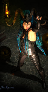
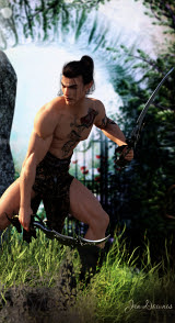
The Sea Witch ... pure digital painting this time


Lately I've been painting more and more -- digitally of course -- rather than "just" rendering subjects in 3D, and I'm delighted with the results I'm getting. You notice at once, this painting is carrying the signature "Jen Downes," rather than "Jade." Yep,  I'm switching over to my own name for the new generation of work -- the paintings -- because this current opus is illustrating a novel.

The novel is finished, but be patient: it's the first part of a trilogy, and the whole thing will be "shopped around," shown to literary agents and perhaps publishers, in due course. First I have to finish and edit all three segments. That's a Mount Everest to climb, so ... patience, grasshopper. 

Right now, I can tell you the trilogy is entitled THE SEA WITCH, and the first book is A WITCH OF SEVEN WINDS. Yes, it's fantasy. This is a mainstream fantasy -- a huge adventure with sailing ships, handsome heroes, intriguing villains, high magic, ocean storms, romance ... for me, it's a dream come true.

And I must say, I am loving the digital painting, as distinct from the product of 3D rendering. Not that I don't love 3D art too ... I do. But my hardware and software are now so incredibly obsolete, I can't produce anything vaguely competitive in that field, whereas in digital painting ... hey, I'm not half bad at this, and can only get better with work and practise. 

The character you see here is the wind witch, Sophia Dorne. Next up: Captain Jacques Adair of the 'Fliegander' merchantman Dragonwind. Soon as I can get the design work sorted.


Update, November 2023

It's still all about the digital painting. The trilogy is done, but I have no joy to report regarding the hunt for agency representation. The process was uniformly disappointing, an experience reported by about 99% of authors who walk this difficult path. So --

I made the decision to change tracks, write short fiction, try my hand there instead and "work up to novels" via baby steps. Even this has not been easy or quick, but as of this date I can report that I have had some real success with short fiction. I've been in ANALOG twice, been podcast by that publisher (which is major ... if you know your SF marketplace in the US, you appreciate what I'm talking about). I've been published in many places, in fact, with many more to come. If you'd like to know more...


...cross over to my writing blog for stories, links, news and a lot of art too, much of it digital painting.

Speaking of which, with several years to get good at this, the art I'm producing now is well worth sharing. You'll find a lot of it on the blog here, but let me when your appetite:


Thursday, November 10, 2016

Done and dusted: eighteen covers? No sweat. Well ... okay, a little bit.


Finally, after a lot of to-ing and fro-ing, adjusting and re-re-repainting ... here's the last image in the current commission set of book covers, DONE. It's been a huge job:

You have to conceptualize the thematic material, then track down the cover elements, do the background painting, design the character, design the render, do the render, paint render and background together in post work -- and along the way wrangle a superior raytrace that'll actually serve the purpose, according to today's demands. You'll be lucky to get through a project in a day; and very fortunate indeed if the client doesn't want something changed later --

Which is why you always, always keep all the project files for every piece of art. I have everything going back to the reference photos for every item in this eighteen-cover commission, and several times I was sooo glad I had them, because I had to go back in and work on some detail or other.

But we're done now, and the last job was to add the text elements for title and author byline, on each cover. Ye gods. One last thing I did was to track down the best available art for six other existing covers and reprocess it through to meet the same size and shape requirements -- and in one or two cases, to redesign the text elements to bring these others into line with the new edition.

The result --


-- nice. Very. I've uploaded this "proof sheet" (as we used to call such an item in the days when we used to contact-proof negatives in the darkroom) at about 2300 pixels wide, so you can really get a look at the new work. If you've been playing "spot the novel" I was working on during the last couple of months, here's your chance to find out how right you were! Some speak for themselves, of course, and others you could probably work out by identifying the giveaway themes in the background. A gargoyle. A stone circle. A galleon. A schooner. A light plane crashed in the sea. A break-bulk freighter. A rain forest.

Enjoy!

Next, for me ... I'm working on something of my own. I've got a fantasy novel going (!) and am dying to visualize characters and situations, so I'll be playing with art purely for myself. The novel is a lot of fun -- having a ball with it. Am six chapters through and starting to think about packaging and promoting it. Will I bother looking for an American agent --?! Ye gods. There's easier ways to beat yourself up. No, no, I'm going to have fun with this, not fifteen years of frustration and heartache, before I give the book away in 2032!

Can you even imagine 2032?

As they say on the TV news shows, "Back soon with more."


Friday, October 7, 2016

Fantasy warrior -- again! (Wow ... two posts in one day)


Fantasy warrior -- again! Yes, I managed to get the second cover for today finished, and here it is. Not much to say about this one, save that it was a bear to get the lighting right. There's something DAZ Studio does, and even after all this time I have no idea why/how it does it. Basically, one or all of your lights will look dandy with the shadows turned OFF, but when you turn them on, sure, you get shadows ... but they seem to be comprised of thousands of gray freckles. They look very daggy indeed, and you can end up painting for hours to get rid of them --

Now, the smart thing would be to fix this in the render. And I've learned that it's something to do with the softness of the shadows cast by one or more lights ... but it has zip to do with the shadow bias. The ONLY thing that improves the "thousand gray freckle effect" is to dial down the shadow softness till the effect is almost imperceptible. Eventually you'll reach a point of compromise where you'll get just enough softness out of your shadows on the one hand, and few enough of the freckles on the other, and you can live with it.

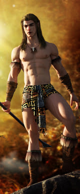
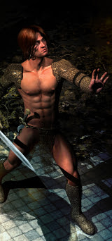
So here we are with another fantasy book cover starring DAZ's Michael. For those who came in late: nope, this is not Genesis anything. This is the grandfather of the recent Genesis figures; and if you're clever with how you handle this "digitoid," as Mel Keegan has called the digital actors, you can do a lot with them. In fact, I've been looking at some renders, lately, of the Genesis figures rendered in -- I think -- Poser; and they're not all that impressive. In other words, you still have to be careful and clever with them, or you can get plasticky results (and yes, I know there's no such word.)

We're going to call this an "artistic male nude," because most of him qualifies!

One more cover to go. Counting down to the end of this assignment...

Stormy Weather


Stormy weather: an old break-bulk freighter, a big storm running, and DAZ's Michael, lost in the middle of it. Yes, another book cover (two to go, still ... dying to be finished this weekend), but this was the assignment. I'd originally thought the background image would be the difficult part, but it turned out to be dead easy, about twenty minutes fiddling with twelve layers in Photoshop.

An ancient image of an utterly obsolete ship (probably went to the scrapyard thirty year ago. Or forty), plus one of my own stormy skies -- I grab the camera every time the sky does something extraordinary -- and then, with the backdrop done, a lot of work doing everything possible to make the old Michael 4 model render up quite realistically in a raytrace...

This is a new Michael face; he's wearing the Tosca skinmap, which I like a lot ... it has a realism which is very useful; that's the Garry hair, mussed up to make it look like there's a wind teasing it. This isn't a hairstyle I've used very often, because it's short, and my own preference is for longer hair. This time the project demanded short hair, though. Just two lights are set, one gray-green, the other pale gold, both with shadows; and the DOF is turned ON, as usual. (One of the neatest tricks for making a 3D render look a bit more realistic is to knock the "focus" off the virtual camera, just by a few percent. 3D renders, especially raytraces, can look rather obnoxious ... plasticky. There's no such word, I know. But if you whop the focus off a bit, you can get around that to a surprising extent.)

Okay: two more to go, then I can get into my own stuff. I've got this fantasy buzzing around in my head. I've actually written the first chapter of it, and would love to get into rendering characters and scenarios. The thing is, to do a full-on job I'll need to track down a 3D model of a galleon. Yes, you heard, a galleon. Or similar.

So I spent a few minutes on the DAZ marketplace, and was pleased to see you can get several ships that look pretty decent, for $15 - $40 ... good enough to get the job done, I guess. Though...

If you didn't mind laying down five...hundred...bucks you can get a Hollywood resolution model of the Golden Hind herself at TurboSquid:


Add to cart...? Uh, not today, thank you! Yes, I know: TurboSquid is where the pros go shopping for their odds and sods. But their pockets are somewhat deeper than mine! So we'll have to see what we can do, with what we an afford. That comes next, when I start to render the fantasy that's been buzzing around in my brain.

For now: back to work! I have two more book covers to do before I can call this assignment done, and they're not going to render themselves! (Wish they would...)