Tuesday, October 11, 2011
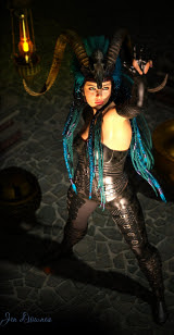
Very chic ... but would YOU go to war in this?!
The other day I mentioned that I'd picked up a copy of ImagineFX Magazine, and these mags -- which are a stupendous price, something like $22 per copy in the stores here -- have CDs of materials and goodies in the back. Here's the magazine:
...and it is an absolutely amazing mag, I just can't afford to buy it! The one on the right is the issue I got for my birthday last year, and the one on the left, I got off eBay in a sale for $10, which is half price!
And occasionally, the content packed on the CD is really interesting. In the issue with the closeup shot of the Arabian swordsman, the big freebie was a DAZ Studio 3 model, The Sentinel, by the designer, VAL. Well, I just had to load this up and play with it, didn't I?
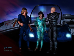
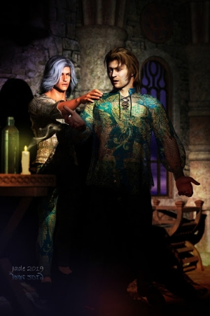
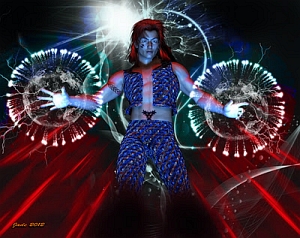
Ummm ... very chic. Very chic indeed. But I put the question to you: would YOU go to war dressed in this? One is inclined to say, "Daaaaarlink, du vill dezerve everytink du getz, and du vill get plenty." Of course, that might be the plan (I might have been watching too many episodes of Up Pompeii lately...)
Hey, this is a fantasy, right? This is a 14 year old boy fantasy, the kind of thing that would have Harold Green drooling all over his plaid shirt and shorting out that video mixing console he wears slung like an acoustic guitar. So --
If we're going to have a fantasy, let's have the proper fantasy, right? Here goes -- let's put some flesh on the poor woman's skinny bones, a big mop of windblown blond hair, and let's pretend those scrawny arms can lift a big piece of sharp steel by magic (presumably the same alchemy by which the rest of her anatomy gets to look like this!) ...
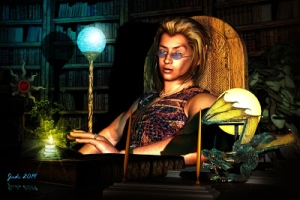
Seriously, this is Victoria 4.2 wearing the Jenna skinmap and face morph, but the body morph -- especially of the Amazon princess right here -- are by me. The costume is VAL Sentinel. The short hair is the Uranus hair, the long blond locks are the Nana hair. The texture on the boots is a brocade I made myself. The "shirt" (ouch!) and the skirt (double ouch!) started life looking like wisps of silk. I made them into "lace chain mail" (give the poor woman half a chance!) with the use of opacity and displacement mapping, and some nice reflectivity. The wall in the background is from the Castle Creator prop set; the candle-stand is from The Mage's Study. The battleaxe is from the Fae Weapons set. You can get most of these at Renderosity, and if you don't find them there, they'll be at DAZ.I have four or five lights on this and two shadows set ... they're not raytraced (takes too long on this computer).
And the last place in the world (sorry, Harold) where you'd see a cossie like this would be on a battlefield, or on the ramparts of a castle.
Damn! That would be cold around the kilt.
Jade, 12 October
The colors of spring -- shades of blue, shades of green


Touching base here, with photographs rather than artwork ... hey, photography is an art too! I'll be back soon with some interesting art, but something happened that hasn't happened in ages: had the chance to take a break in the day, and take lunch to the national park. Which made me think, "upload some photographs, share the colors of spring."
What you can't tell from these pictures is that it's NOT WARM yet. To put it another way, it's COLD! And it shouldn't be. In the middle of October, it's supposed to be about 90 degrees. In fact, it's chilly enough to be wearing a sweater ... and in the national park, which is in the hills, it was cold enough to be wearing a thermal shirt under the sweater!
However, it's so nice to see the whole place green this late in the year, so I'm bot about to complain. Much.
These images are from two shoots: Labor Day at Glenelg (downunder, that's the first Sunday in October), and today, at Belair National Park. Here's a few more, before I sign out for today. Back soon with a new fantasy costume that looks like it must be glued onto Victoria 4. And it's supposed to be battle armor. Ye gods. It was a freebie with a issue of ImagineFX Magazine, so I;m not going to look no gifthorse in no part of its anatomy, you understand --!


Yep, it's safe to say that spring is here. I just wish it would warm up a little bit!
Jade, 11 October
Sunday, October 9, 2011
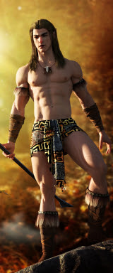
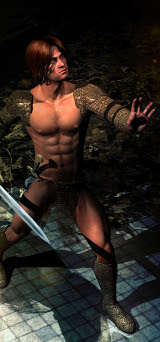
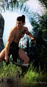
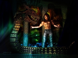
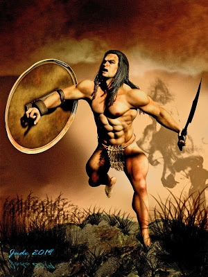
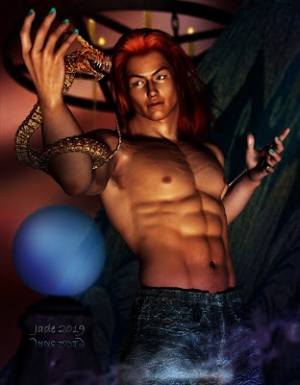
Conan who --? In fact, SAV's "Atlas" for M4 and Genesis
(In case you're puzzled: Genesis is a new 3D mesh technology; the base figure is packaged inside of Studio 4 -- you don't but it separately. But every single thing you want to do with it is an add-on, or a plug-in.)
But I was at Renderosity the day before yesterday, shopping for the props to finish off a commission piece, and there was this barbarian ... one look, and I was hooked. He was also on special, under ten bucks! I figured it had to be worth the risk, to find out of I could get the skinmap to work in the old DAZ, with the old figure. If it didn't work, I was out the price of a can of coffee. No biggie.
And the answer it, it does work!
The big challenge was in getting the files into the proper folders, the proper file hierarchy (or directory structure, as we used to call it back in the old DOS days. Yes, I'm afraid I'm that old), but the designer had given fair warning of this. As you know (or might), the old file hierarchy was:
users/documents/DAZ/Studio/content/runtime/...
...and after that, you copied anything you wanted to use in DAZ into Geometries, Morphs, Libraries, Textures, what have you. Tricky the first few times you did it, but soon enough, you can do it in your sleep. No probs.
With Studio 4, DAZ, in their infinite wisdom, have upended everything, changed the entire thing, so that none of the old installers will run (!), and from here on, when a third party designer like SAV wants to make something easily available for DAZ 3 and 4 (much less for M4 and Genesis), well, they're up against a bear of a challenge.
In the past, we bought a simple ZIP archive, inside which was a Runtime folder, and inside that, folders for Geometries, Libraries, Textures, and so forth. You just copy/pasted over the files and boom! You were in business. Now? That won't work. A designer would have to quite literally package the product twice, in two extremely different folder hierarchies, to make it plain-sailing for newbies... but that's not going to work either, because of the sheer size of the high-rez texture maps in a top-class skinmap. You physically cannot package that much content twice, so newbies are going to be stranded, doing some serius head-scratching.
Not being a newbie, I managed to get it figured out (as witness, the renders above), but ... gosh, thanks, DAZ. Newbies really needed this. I mean, the marketplace is now absolutely flooded to the eyeballs with easy-unpack products structured around the obsolete file hierarchy! Imagine a newbie coming along right about now ... downloads Studio 4 because it's the bang up-to-date prog, and the price is right (FREE), and then s/he is trying to shop at Renderosity, because it turns out that's where about 80% of the great content is hiding...! Total confusion.
So I'm making rude faces at DAZ for this, at the same time as giving a whopping five stars and a double thumbs-up to SAV for the Atlas character.
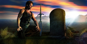
He's flawless. Literally. There are three face options (normal; wilder; and battle-face), and two body options (normal and battle -- ie, spattered with blood). The resolution is superb. The eyeballs are great -- in two colors and two iris sizes. In particular, I like the hands, which are battered enough to look ultra-realistic, and very, very high-rez. One runs out of superlatives.
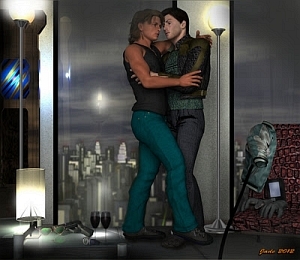
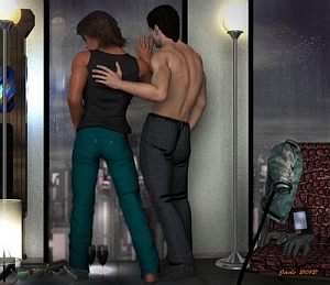
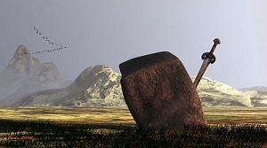
This is the best SAV skinmap yet -- I've reviewed SAV-Eros and also Yannis in the last few months, too. In the above renders, Atlas (Conan, by any other name) is wearing SAV's Spartacos hair, set to black, and the Euros costume with elements turned off. The set is H3D's Lost Path, with some additional props added in from the Elven Shed set by DM, and the Fae Weaponry fantasy broadsword. The Greek column is from an old, old prop set from the DAZ marketplace ... is it called Eras Columns? Something like that.
The backdrop was specially painted for the occasion...
The finished renders are intended to look like art -- they're not trying to mimic photographs; and they're so clean, they didn't even need any post work. You're seeing them just as they finished off in DAZ ... they're not even raytraced, just the trust old deep shadow map on a couple of the lights.
 |
| Raytrace |
SAV Atlas: five stars, highly recommended, and don't be put off by the fact it'll also work with Genesis. So long as you know your file hierarchy in Studio 3, you can get it figured out in a few minutes, and then you're cooking.
The other thing I've been working on is rejacketing the NARC books ... we're getting there slowly but surely. Just ... slowly! Here's the new cover for EQUINOX:
Nice? Nice.
Have been looking at Genesis lately ... suuuure, it's a fantastic new technology. But even though the basic program is a free download, you have to spend about $200 on plugins and so forth, to make it compatible with your existing content (when you've spent thousands of bucks on said content, there's no way you could afford to go back and start over with it!), and even then -- the old 32-bit systems, like mine, misbehave badly when running it. I'll need a brand, spanking new system before I can run Studio 4, which means ... oh, Christmas 2012! So till then, I'll be sticking with Studio 3, and watching from the sidelines as Genesis matures. It's still brand new, and probably has a bug or three! It'll be interesting watching it mature ... they might even be up to Studio 5 before I get the chance to upgrade!
Jade, October 10
Wednesday, October 5, 2011
You have 8,855 pixels ... what will you do with them?
Your mission, should you choose to accept it (like you have a choice!) is to sell your product. Your #1 marketplace is Kindle. And that means the challenge comes down to this:
You have 8,855 pixels to make your statement, grab your potential customer's attention and get them to load your page. That number of pixels is the area of an image that is 115 high and 77 wide ... on-screen, it's about the size of a postage stamp, yet this is the area you have to work with, and your mission is to bait a visual hook with a tempting, appetizing visual worm, chuck it in the water and see if you get any nibbles.
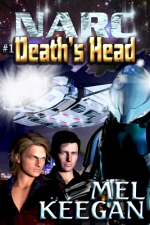
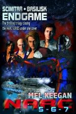
As you can see from the cover above, the NARC books ... at last! A long, long last! ... are being rejacketed, and they're on their way to Kindle. And it's a measure of the power of Amazon Kindle, at least as far as writers like Mel Keegan are concerned, that without Kindle editions available in MK's store, the NARC books have, over the space of the last couple of years, gone from being his #1 money spinner to way under-performing on the Keegan list. Kindle is that important. (Sure, other writers do better at places like All Romance Ebooks; but Mel Keegan doesn't write pure romance, and ARE is not the place for him. Kindle, however, has been the best thing that ever happened for Mel!)
So, as I've been working on getting the text all unformatted and reformatted for the Kindle editions, I've had my thinking can on, and have been pondering how to rejacket the NARC books for Kindle; and a major part of the question has always been, "How do I make classic science fiction covers look good at the size of postage stamps?
It ain't easy. It took three pairs of eyeballs and about four hours to get the design right, and my Serif desktop looked like this, below, even after I was done in DAZ Studio and Photoshop:
The process was one of trial and error. Basically, you chose the cover elements you needed and re-re-rearranged them, and re-re-resized them, till they looked good at 300 pixels high (as needed by OmniLit, which is All Romance Ebooks's more general retail partner), and at 150 pixels, which is the biggest size that's useful on routine webpages, and finally at 115 pixels high, which is how they're going to be showing up at Kindle.
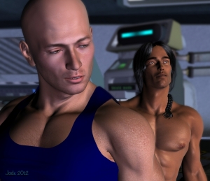
Oof. The picture elements are -- well, the characters, obviously. Jarrat and Stone. A gunship, the cityscape, the riot armor, a spacescape, the NARC logo rendered in Mad Max style chrome, and a lot of flare and glare off all that shiny metal. Plus the title of the individual book (in this case it's the first of the series, Death's Head), and by golly, did we forget something? Oh yeah ... the writer's credit. Ahem.
 And this, at left is what it's all about. The net result at 115 pixels high ... because as the potential customer scans down the list of books pulled up by searches such as "gay science fiction" or "adult techno SF" or "techno thriller" or what have you, s/he is going to see a series of postage stamps. So your postage stamp had better be a doozie, because you have one shot to try to grab attention and at least make the customer load the page.
 At the same time as issuing the novels via Kindle, we're also repackaging them in the epub format, and in the next week or so Dave will hopefully be reviewing three of the best ebook reader apps, which suit the new Android tablets. In fact, we just got one in order to test various formats before releasing ebooks in this and that visual style. The iPad is way too expensive, but the Android tablets are astonishingly cheap, and from what we've learned lately, they're literally flooding into public hands. These inexpensive little devices, along with the burgeoning Android app marketplace, are in the process of giving a terrific boost to the very serious business of ebooks. I'm very impressed. More about that later!
One cover down, four to go, to get the NARC series rejacketed. Then, the only books to repackage for the Mel Keegan list are the HELLGATE novels. Speaking of which, #5, Hellgate: Flashpoint, is a matter of weeks away. With any luck at all, it'll be in your hands by the end of October!
Jade, October 6
Tuesday, October 4, 2011
Grunge meets glam


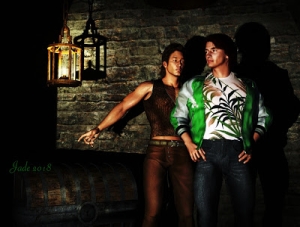
Grunge meets glam ... or is it glam meets grunge? At any rate, the location for the shoot was a back alleyway -- one can imagine trash bins just out of shot, and a puzzled looking tomcat looking on! And the costume (and there ain't much of it) revolves around a pair of boots. Fortunately they gave the poor soul a windbreaker when the breeze came up and suddenly you couldn't see him for the goosebumps.
I'm happily playing mix and match here, just taking a break between jobs. That's Michael 4, of course, wearing the Jackson skinmap and the GA Matthias face, and the SAV-Eros short hair set to dark brown. The boots are the Slide 3D Boots which go with an SF costume called "The Forgotten Hero," which you haven't seen yet -- because I haven't even had the time to unpack it! The backdrop is just a plane on which is pasted a very nice brick wall texture from a set called -- oddly enough -- Brick Walls.
There isn't a lick of post work on any of these renders. They're just as they come -- and a couple of them demonstrate the uncanny power of negative space. You're halfway expecting something to drop into the shot, or walk into it ... and the character's eye line tells you he's looking at something or someone. Something is going on just out of shot.
Well ... you and I know it's just the lighting person fiddling with the big silver reflectors while they try to work out if there's any coffee left in the thermos an any cookies left in the bag in the back of the car, the peppermint ones with the real chocolate chips.
But it's fun making up stories. And I can just imagine what's going through the minds of a few of you ... and why not?
Any reason for this project? Not really. Just playing with an idea -- boots. As soon as I get the chance, I'll stage a couple of SF shoots to show off the Forgotten Hero costume, and then there's a prop set I just got, shields and arrows and what have you, so I'd like to do a fantasy with a twist.
Jade, October 4


