Showing posts with label GIMP. Show all posts

Tuesday, May 21, 2019

Something old, something new...


Okay ... not new art -- I ran out of time, and I do want to touch base here today because the computer is about to get pulled apart and go to the shop. So I've delved back into the ancient archives and rebalanced a few of the very best from many years go. Top: Colorado Smith. Look at the shadow on the wall behind him!! I think anyone in the world would recognize that shadow, LOL ... the shadow is actually more important than the figure! Bottom: this is a Vue image in the background and a DAZ render in the foreground. I should do this kind of thing now, using the Terragen atmospheres I'm learning now...


Top: Stormweaver ... the background started life as a photograph and went through multiple processes to become artwork, which was used as a backdrop. The trick is to set up the lighting on foreground and background match. Bottom: Barbarian Princess. Always loved the reflections in that floor. The trick to getting them wavy is to apply a "wavy" bump map to the super-reflective surface -- almost any bump map designed for water is perfect...


Top: Elven Lover. Middle: Guard Duty. Bottom: Storm Light ... which was one of the first shots I was able to wrangle, in 2010, where I could pull sophisticated tricks, like transparencies on the fabric. Guard Duty was a long, long, long render as I recall. By 2012, most techniques were in place; the only things left to nut out were depth of field, special lighting, that kind of thing.


This, above, as I remember, was an experiment ... I'd just gotten GIMP and some brushes, and was happily painting my own backdrops. The hair is Spartacos and the skinmap is Atlas ... those, I would recognize anywhere, even after eight years! Ouch. Has it been that long?!

And some science fiction to round this out...


Three out of four of these, above, were done for book covers! The chromium "Fembot" was for a novel published by a company than ain't even there anymore ... the cyborg was a work-up design for the character that ended on the cover of More Than Human, and the space cities -- yep, you recognize those from Scorpio. Book covers are always a challenge.

The rainy-night-in-the-city scene is interesting: that's a photographic backdrop that's reflecting in the wet 3D ground ... which isn't actually possible, is it? Okay, here's the trick: create a plane (primitive), slap on the photo as a diffuse map and sit the plane right behind the figure. Add a ground plane and make it as reflective as a mirror ... yep, the background plane with its photographic diffuse map will reflect. Neat trick, and sooo useful. You're welcome.

Anyway: tomorrow the desktop gets taken to pieces and goes into the workshop. I spent this afternoon backing everything up, and ... it's time. I hope to get it back, blazingly fast, on Friday or Saturday. Then we'll get the new DAZ Studio, the new Reality, and we'll tale a look at Genesis... 😵

Friday, April 26, 2019

The Raze of Palenque, and SF heroes!


I promised you a barbarian, and here he is! I call this piece "The Raze of Palenque" ... but whether this Conan-clone (Clonan?) razed the temple or tried to save it is another question. I'm inclined to see Conan types as heroes, so maybe he waded in and saved the day. As you know, I'm a huge fan of Frank Frazetta, and I just felt like doing something in that vein today.

Actually, this is a very, very new spin on an ancient piece of work I did for a contracted book cover (The Swordmaker, from Renaissance eBooks, circa 2011, I think). The original work was set up as per instructions from the publisher, character, costume and all; but I always thought, "Dang, what a waste," because the art I was asked to execute was soooo pedestrian. I did the best one could with it, but ... sigh. At the end of the day it was a paycheck. What else is there? But, but, but...

No reason I can't lift out the character, even the pose, and do something fresh, spectacular and rewarding with it. Especially since eight years have gone by ... and don't think Renaissance is even still online. If the book is circulating anywhere, I don't know, so -- here we are.

(For the artists among you: believe it or not, Clonan here is an old fashioned deep shadow map render. I did a raytrace, yes, and this is one of the very few images that looks infinitely better on a plain old deep shadow map, which takes 1% of the rendering time! I have depth of field (DOF) turned ON, and a virtual f-stop of 50, to get this effect. A lot of what you see there was painted in Photoshop, however: you won't be able to score this right out of the render engine. Nice!)

Also --


...this is not a rerender, but a massive repainting of a 2012 image. I always loved this character, but I can't find the project files!!! 😭 Am right now searching high and low for them, on backup drives and so forth. Praying that I put them in some weird place ... I admit, I had a loony way of storing things back in those days. I actually deserve to lose itens. Ahem. Anyway --

Since I can't find (yet) the project files, I decided to put the old render into Photoshop and repaint it. Whoo! Gorgeous result. The original picture was a great idea, but the render was fraught with problems, including the fact that the mesh was trying desperately to come apart! I'd driven the bump mapping on the torso hard, to get real detail out of it, and it was showing the seams in the contours. Sooo, I've done a lot of work there, to correct that; hand-painted the hair, and the eyes; thrown the background out of focus to create proper DOF (which you get in low-light photography), and ... lots of little details, such as brightening up the building lights. It's a lovely result. Photoshop to the rescue yet again!

And...


Just a repost of an oldie, for fun. This one is fine just the way it is, even though it was done eight years ago and painted in ... GIMP! I didn't even have Photoshop at the time. But when a picture is right, it's just ... right. This one is called "Cyborg," for pretty obvious reasons. The only thing I've done with the gallery image is to enlarge is to it'll serve as a wallpaper, if you'd like to collect it. You're welcome ... enjoy.

That's all for today. Good news from the optometrist: my vision has actually improved in the last year, no need to change my glasses, and I don't have to go back till 2021. Phew. Next: call dentist, make next appointment to stand there folding hundred dollar bills into paper airplanes (or aeroplanes, if you prefer) and launching them at the man. Then, if I get a more or less clean bill from him, we can start putting together the funding to look at the computer: new boot drive with contents cloned over; new NVIDIA video card; new USB sockets that don't waggle about; DAZ Studio 4.9.9.9.9.9, or whatever it is (they'll do anything but go to Studio 5), Genesis 8, IRay, and lots and lots of skinmaps and costumes, to get back to where we are right now with Michael 4. Ouch. Bear with me. 😱

Tuesday, February 17, 2015

Starting a revamp on the old blog ... and about time!

The Shaman, in LuxRender
Woodland glade, in Bryce 7 Pro
Mist on the great River Anduin ... in Bryce, of course
Bryce again ... city waterfront on a misty, moonlit night

After years without a change, a revamp of the blog is in order, and a good place to begin is with the header art. The toughest job is finding something to fit the constraints imposed by the template. It has to be 980 pixels wide, and I'm using 300 high as a nice ratio between height and width, though it could be anything. 

Looking around among all my LuxRender images, I realized belatedly, not a one of them would drop properly into the required dimensions. Rats. So, somewhat paradoxically, the image you see above is a crop taken from a raytrace done in good on DAZ Studio 3 ... and then painted ten ways from Tuesday in Photoshop. I'll have to see if I can get something going in Lux that will fit the dimensions! It's so odd, because I rarely use DAZ Studio itself any longer.

The Shaman is quite an interesting piece; and you're looking the composite version here. I did three -- a rough in Studio, to make sure everything was in place, then two in LuxRender, one with the depth of field turned OFF, and the other with DOF not only turned ON, but also with a virtual aperture that gave boatloads of blur in the back- and foreground. Then it was a simple matter of shipping both the images into Photoshop as layers and blending them together to get the "juuust right" image.

If you're interested, see this at large size:


I've uploaded that at a good, big size, so you can see what's going in. Neat.

Once again, here I am hand-painting hair, which is something I once swore up and down that I'd never do. The reason is simply that the 3D hair props (wigs, toupees)  so often look baaaad when you render them in a high-end render engine. It's been said before that rather than redesigning their interface, DAZ should really have worked on a better render engine within Studio. If only! I keep hanging on, waiting for Studio 5, which might have been brought closer to something I want to use. At the moment, Studio 4 is still their flagship -- though the Genesis figure which replaced Michael 4 and Victoria 4 has gone into its second generation: Genesis 2. Wow. I still haven't dabbled in this, because no matter how good the figure is, you're still stuck with the crap interface and even worse render engine! Patience, grasshopper. One of these days I'll get into it, I guess. Or else Studio 5 will come out with a gorgeous interface ... and maybe Genesis 3 will be shiny and new to go with it, and I just won't be able to say no.

One question that's very frequently asked of digital artists is, how much post work is done on the art? And in particular, on landscapes? Well, it depends on the work, really ... but you'd have to trust Bryce, much less Vue itself, to do most of the work. After that, you get into Photoshop and do all sorts of stuff to it, but the basic image itself has to be 70% of the way there. For comparison, here's the Mist on the River image, just as it shipped out of Bryce 7 Pro:


And for those who tuned in late and are seeing just the new header art, here, below, is the old art, which was done in Studio 3 with a Bryce 5-generated backdrop and a modicum of over-painting ... and this one was done so long ago, it was over-painted in GIMP! It goes back to the inevitable time when (at last) I got a 64 bit computer that utterly refused to load Micrographx Picture Publisher, which forced me, kicking and screaming, to look into GIMP, because Photoshop was so vastly overpriced, it wasn't going to happen for me any time soon!


In fact, it's so long since I changed out any element in the template (been too sick for too long to even think about it), I'd forgotten how! I believe they've changed the interface not once but a couple of times while I was sidelined with personal problems. I hope ... knock on wood ... that I'm back to blogging regularly now. I used to enjoy this, and am looking forward to doing it again.

More soon, images drawn from the enormous cache of goodies that have been stockpiling while I was in dock...

Jade, Feb 18, 2015.

Monday, August 1, 2011

CG Art: Vulcan ... and how to do it!


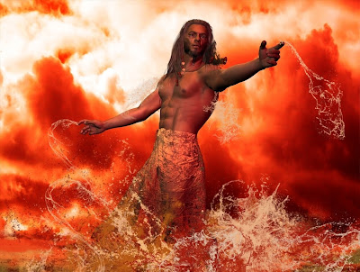
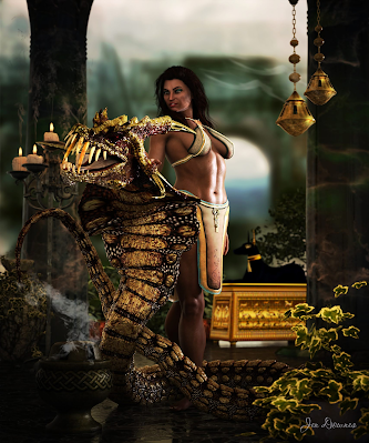
Thanks to the folks who commented and emailed about the Poseidon image from a couple of days ago -- and here, below, is the long post you guys asked for, telling "how to" ... that is, how to go from an idea to the finished painting you see above.

First comes the idea, and you need to have a "snapshot" in your mind's eye. A lot of people actually start sketching at this point, but it's not necessary if you've "seen" the finished image in your imagination, especially if you reckon you can coordinate all the elements to make this go. If you foresee problems, go ahead and sketch! Otherwise jump right in.

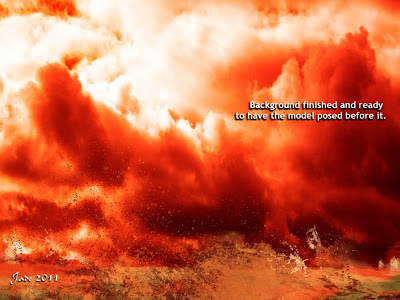
I wanted a backdrop that looked like clouds of smoke and steam in a volcano crater, so I started with stormy sky and sized this to what I wanted. The images of Vulcan and Poseidon are 1200 x 900. You can work at any size you like. Small images don't give you enough wiggle room, and large ones can give your computer a hernia, so -- you only need to work out your comfort zone, and you're home. The sky shot I used for the basic background in this piece was taken a few weeks ago, when a bad weather front was coming in. Cropped out of the bottom of the shot were trees and roofs and a jungle gym!(Always have a camera with you, and always be on the lookout for opportunities to grab skies, seas, textures...)


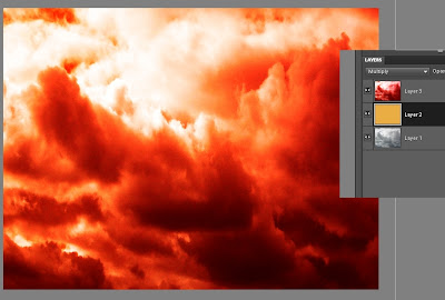
So use your stormy sky as your first layer. or bottom layer, in your Photoshop or GIMP project. Adjust the contras and brightness -- you want it quite contrasty. Then...

Create another layer and bucket fill in to what is going to be a tone halfway between the shadows and highlights of the background you want to to wind up with. In this case, a gold layer will do just fine, since I'm working between reds and dark browns.

Copy the sky into a third layer and colorize it to a fiery red. This is your top layer...

Now, play with the merge modes on the top and middle layers till it looks great. Only you know the effect that's in your mind's eye, but by playing with the color fades and burns and opacities, you'll create 100 effects, and trust me, you'll know what you want when you see it! Now --

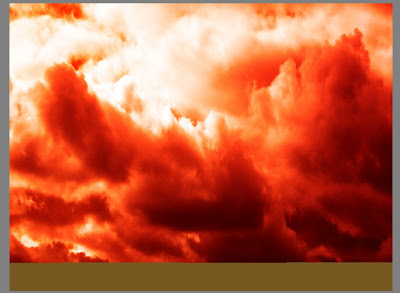
Flatten the image to one layer, and paste to new canvas.


(TIP: Return to old canvas, undo flatten and save the old project as a separate file with all the layers still available. If you do this, you can always return to this stage and rework it if you need to. You're trying to preserve as much of the work as you can at every stage, in case something goes wrong later and you need to go back and paint something again.)

Switch to the NEW canvas to work on from here on. Save OLD project as "Vulcan_0" and save NEW project as "Vulcan_01"

In your new canvas, you have the combo of the stormy sky, the colorized sky and the flat gold layer sandwiched between them. This is the combo create by playing with the merge modes, and then saving the best result as one image.


Create a new layer on top of the combo, and paint in the surface of the pool of molten metal as a strip of "median color" to suit the project. This is gold for molten metal. It's just painted with a 200 pixel square brush set on "normal" at 100% opacity. It doesn't look like a crucible, but it will soon!

Create a third layer and now start painting. Use wave brushes to paint in seething lava in base and medium tones. These are the .abr brush sets you can buy -- waves, splashes, water effects, steam, fog, fire, anything like this would give you useful effects. In this one, I used Elements of Nature - Waves (from Renderosity), and Ron's Splashes and Ron's Hydro Explosion (from DAZ).

Paint in three tones, basically: dark, medium and light. Paint till you don't see much of anything of the original gold layer that represented the surface of the molten metal.


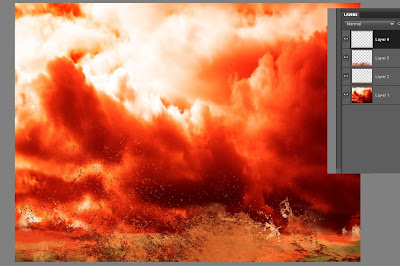
Create as many new layers as you need to control the brushed on affects. You could do one for dark, one for medium and one for the highlights. Or you can combine dark and medium (as I did here), and then do an extra layer for the highlights.

(You can get a lot more mileage out of the .abr brushes in Photoshop than you can in GIMP, because Photoshop allows you to change the angle of the brush ad infinitum. However, Photoshop costs a packet and GIMP is free, so you might prefer to just be clever with the brushes and resources you have at your disposal. I didn't get Photoshop Elements 9 myself till early July, 2011, when GIMP just stopped working for reasons unknown. I would load up a brush, try to paint a stroke with it, and get a crash to the desktop instead. So Dave hunted and kept on hunting till he found PSE9 froma licensed reseller -- for US$60, which is about A$55 right now. I put down the credit card gladly!)

Know when to stop -- your artist's eye will tell you when you've gone far enough! Stop before it turns into a mess, and...

Same as before, flatten this image to one layer and save it. Call it Background.jpg --


Paste this into a new canvas and save the project as as "Vulcan_02.' Make sure you save the _01 version before you flatten the image, so you can go back and re-work as needed in any layer.

Now you have your background finished, so it's time to switch over to working on the figure!

Set the stage size in DAZ Studio (or Poser etc., whatever you use) to the exact same size as your canvas size from the Photoshop of GIMP project...

Import Michael 4. Work with a plain white background for him at this stage, because there's a few things to do before you bring in the background you just painted, and the simpler the on-screen image is right now, the better...


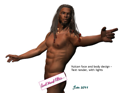
Add skinmap. I'm using the Jackson skinmap.

Design a face or use a third party morph. This face is one of my own face morph designs, which you create using the Morphs++ for Michael 4 package. (Buy this from DAZ, install it, and it pops up automatically. The world of creativity is now at your fingertips!)

Design a body morph or use a third party morph. This one is designed by me -- again, done using the Morphs++ pack.

Save the DAZ (etc.) project often! You have a lot of work invested in this now, and you wouldn't believe the aggravation of losing the whole thing because the PC barfed on a save or a render!!

Add a hairdo to suit your character. This one is the Yannis Rasta dreads set to black, and I've been in there and changed the textures on the coins and ribbons. You do this in the Surfaces pane in DAZ ... sorry, I can't help much with Poser because I've never used it! But in DAZ the Surfaces tab is your best bud. Get to know it, and enjoy the freedom to create like you never knew before...!


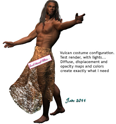
Add a costume. This is the Euros overskirt, from Renderosity. Lots of textures are provided with the model, but with the best will in the world (and not a syllable said against the designer) none of them will suit a project like this. I turned them all OFF as soon as the model was imported. The costume automatically "parents" to the Michael 4 figure, and with colors and textures OFF it reverts to a big lump of white plastic. Now --

Configure the costume -- pose it at the very least. You'll need to work with the "fit" and "movement" morphs provided by the model designer, and swing, bend, twist, pull the costume, till it's doing what you want it to do. Right so far, but it's still white plastic! So...

Add a diffuse map, a texture map, an opacity map, diffuse color, gloss color, to the model. This is not the place to talk about how to use these textures ... this tutorial would go on for days! But elsewhere on the blog I've talked at great length about how to do this. Have a look down the list of tutorials -- you'll soon find what you need! Basically, a diffuse map slaps a digital image of something onto a model. Fire or water or sky, or whatever you like. Then, a displacement map is a pure monochrome image that uses dead black and pure white to decide which bits of the model get pushed up or down. This image uses a digital photo of a fire as the diffuse map, and a monochrome image of scarred metal as the displacement map. There's one more map -- the opacity map. This makes parts of the model disappear altogether. For this image, I used a monochrome image of scummy water as the opacity map! The diffuse and ambient colors are set to white, there's a good bit of gloss on the costume, and the gloss color is set to orange. These colors (diffuse, ambient
and specular, meaning, what color something shines when it glosses up) are set separately from the visible texture map, the displacement map and the opacity map. Combined with the maps, they give you infinite creative control. You can turn a model into leather or silk, at whim...

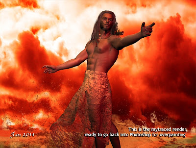
Now you're ready to pose the figure. Go for it! Get every knuckle joint right where you want it. Flare his nostrils, give him a scowl, whatever you like. Render as you go, make sure everything is looking good. Save it!!

Time to set up the lights now.

The lights need to be tuned according to the color(s) in the background, and you also need to be aware of the direction light is falling from in the background. The light direction will tell you which way shadows need to fall to be convincing. Lighting is a whole 'nother subject, but basically it comes down to the brightness of the light, the direction of the light, the color of it, and whether it casts a shadow (and how hard or soft the shadow is). It's impossible for anyone to tell you how to do this!! Like learning to swim or ride a bike, you have to do it till you can. Have fun with the process -- enjoy.

When the lights look great, it's time to import Background.jpg into DAZ Studio as the, uh, background.

Do a test-render, make sure your lights match the artwork ... do a raytraced one, see if raytracing makes a positive difference. Sometimes the raytraced image is a dimension over the deep shadow map -- sometimes not. Your artist's eye will tell you which to use.

Save the best render (and save the whole project. You're heading back into Photoshop or GIMP now, but you could be back in DAZ to make tweaks later, and if you do need to do this, you'll be so glad you saved the project right now).


Import this best render into Photoshop as the new base, or bottom layer...

Make a new layer to paint in/on. Use the color picker to borrow colors from the existing painting -- don't try to guess them. What you're paint in now is going to be ON TOP of the character, and so long as it blends perfectly with what's BENEATH him, it's going to look convincing.

In this stage of the image, I'm painting molten metal, and I'm using an .abr brush set called Ron's Hydro Explosion (available from DAZ). You could do worse than watch some video footage of volcanoes seething, or of molten steel in a foundry crucible. Spent a minute or two on YouTube!

Make a new layer whenever you depart from the current kind of brushwork, and always when you're trying something experimental. It's easy to just delete a layer when something didn't work out.

Paint till you're happy with the result, and then flatten the image and save it as a JPEG, ready to share with your friends. You can go on and do more: you can tweak and push and pull the contrast, brightness, shadows, hues, but if you set up your lights properly in DAZ Studio (or whatever) you shouldn't need to. However, a lot of people find it easier to "get close" in the 3D program and then "fix it" in Photoshop. This one is your call. (You might need to do some painting on the figure to get rid of "buckles" in the 3D body caused by posing Michael 4, but if you pose the figure carefully, this might not happen. Be sensitive to the fact his shoulders and elbows can look really weird in some poses. A bit of painting can really help the realism of the finished work.)

So you'll need...

The idea (!)
a sky picture
.abr brushes for water, waves, splashes etc.
Michael 4
skinmap
hair
costume
diffuse, displacement and opacity maps (make your own!)
your artist's eye, plus your 3D model workshop and either Photoshop or GIMP.

And here's where you need to be when finished:


...this took about an hour, plus the amount of time to write this tutorial, obviously. It might take you longer if you're learning the software and process, but you know how familiarity with the work makes everything faster. Enjoy the process -- in all seriousness, if you really love messing about with art, what's not to enjoy?!

Hope this helps!

Jade, 2 August

Wednesday, July 20, 2011

CG art: The Magician's Pet


CG art and 3D render shake hands here. It's about half and half render and digital painting ... and I must say, I'm enjoying Photoshop more and more. Am getting used to it incrementally (BIG increments, that is), and at last am growing accustomed to the way it does things --

Halfway through this piece, I gave myself a kick and said, "Learn something new, why don't you?" So I stopped painting on the canvas of the original render, and painted in layers from then on. To you guys who've been using Photoshop for yonks, this is No Big Deal. But I always found GIMP's way of handling layers to be less than friendly, and of course when I wanted to do anything at all I ran home to my old favorite, Micrografx. Wellll ...

This time, I'm going to give myself a pat on the back, because I didn't do anything at all in the old programs. Gave this to myself as an assignment, and did the whole thing in Photoshop!

So what's going on in this painting? That's DAZ's Michael 4 wearing the JM Alexandre skinmap and the Akasta hair set to dark brown, and the Euros overskirt with texture and opacity maps by self. The props are a wild and woolly assortment of props from DM and ADS, most notably The Mage's Study, Fantasy Visions etc. -- you can get them all from Renderosity. Carpet is actually the plain, boring old rug from the Apartment 39 prop set, with a texture and displacement map set my me to make it interesting! It turns from a flat carpet into a battered, beat up old leather carpet. The floor and wall are planes wearing various textures ... marble, tiles and what have you.

Then the fun begins. First, the lights and shadows, which you can play with to get them juuuuust right for the final render in DAZ. Save this, and import it into Photoshop and start, uh, painting! Smoke, candle glows, drips down walls, gleams on things, deep shadows ... yup, all painted. And by the time you're done, when you go back to the original render you're bemused by how plain it is! Much of the painting was done with a terrific brush set I just got -- Mystikel's "Dirt" brushes, which is a huge set of cracks, grunge, splatter and muck brushes, from Renderosity for $8. Money well spent there! I also used Ron's Smoke, and Fog, and Bokeh Lights.

Last thing I did, just before uploading this, was to apply a 3% "uniform noise" filter to the whole shebang. What this does is take a tiny little bit of the tack sharpness off the render, which for some weird reason makes it look richer. Don't ask me why; it just does. Mind you, to see this effect you'll have to view the piece at large size. I uploaded it at 1000 pixels wide, so you can do just that.

So, just one image today, because it's more of a painting than a 3D project, and the only downside to this is, it takes a lot more time to paint a picture than it does to click "render" and then buzz off to the next job and let the render engine do its thing in the background!

Nice, though, innit? I call this one The Magician's Pet. He could be a student learning the magician's art, or he could be a captive, upon whom the spells are practised. He's lost count of the times he's been turned into a newt...

Jade, 20 July

Tuesday, June 28, 2011

Jade joins the Photoshop Phlock ... uh, Flock ... uh, say what?!


Well, I guess it had to happen sooner or later ... but you wouldn't have put money on it, right? And now it's happened, you're wanting to know how and why! So here's the story...

Lately, GIMP has been misbehaving -- mostly crashing to the desktop repeatedly. As you know, GIMP is your only alternative, if you want to be able to use the .abr brushes, aka Photoshop brushes, which are such an industry standard today, they're actually just about the signature of any artist who takes art seriously. The first thing I did was to upgrade to the most recent version of GIMP (2.6.11), in the hopes that it was some incompatibility with the version I'd been using. No joy. Coming in right off a restart of the whole PC, I loaded up an .abr brush, clicked to paint a stroke, and zapp! Crash to the desktop.

So I was looking at being seriously stuck, because short of getting a new computer -- to just get rid of the Lenovo ThinkVantage system, which causes nothing but trouble right across the spectrum, and is more than likely responsible for the failure of GIMP, which works perfectly well on everyone else's systems! -- I was down to just biting the bullet at getting Photoshop...

Now, Dave has been listening to me grumbling (whinging, whining, wailing) for long enough that he took the initiative (throttled it) and went looking for something to restore peace and harmony to this part of creation. Hmmm.

The only thing I've ever had against Photoshop was the price. Photoshop Elements 9 has a "proper price" of around US$99, when sold to Americans, in America. The price in Australia is between A$145 and $355, depending on the dealer and the day. A good median price is about A$266, which is currently about US$290 --

Hold the phone right there. Let me get this straight. US customers, inside the US, pay US$99 and get a $20 cash back if they mail in a slip of paper, and meanwhile Aussies are paying US$290, and, if they're dumb enough to not shop around, anything up to US$400, for the same piece of software?

Understandable, there was no way in the world I was going to buy into this system. It's daylight robbery, no other term for it. But Dave was sick enough, tired enough, of listening to the whinging and whining every time GIMP crashes, that he got on the Internet and searched, and kept searching, till he came up with a real, legal source for real, legal copies of Photoshop Elements 9, with proper, legal key --

For A$60. As an OEM download.

Out came the credit card, and -- let the download commence! The source was Software Supreme, and the transaction went through with complete legality. The downside (there is always a downside) is that your software is streaming from the slowest servers in the known universe. It took about 20 HOURS to get the installer from a server in France. The US servers were way slower, and the mirror in Germany stopped altogether!

Patience was the key. If you just have to wait till tomorrow for your goodies in order to save about two hundred dollars, you can can do that. Actually, the download finished at about 5:00am, and by the time I got up Dave had already installed it and gotten it running. I spent the next four or five hours 1) learning the interface, which is refreshingly different, at least to me, and 2) trying to crash it, and being ever more delighted when I found out, PSE9 is so stable, nothing I can do with it, even on a PC overburdened with Lenovo's trademark stupidity, will crash it!

Soooo ... first impressions of Photoshop?

Like I said, the interface is refreshingly different, for one who has been using older software. The interface is the best thing about Photoshop -- this, and its ability to interface with all those brushes! The program does things differently from anything I'm used to; things are called by different names, so a large part of the process, for me, was figuring out where things are stowed, and what they're called, in this generation of software.

It's well worth noting that PSE9 does a lot of stuff that GIMP doesn't -- and that's fair enough, since GIMP is open source, and free! It's also worth noting that although the names and storage places of the various image editing functions has changed over the last 10 - 14 years, little else has changed. Photoshop's most stalwart aficionados will probably hate to hear this, but Micrografx Picture Publisher 10 had all those same filters and effects in 1997. (PP10 also did some things which PSE9 doesn't do ... and sure, I hear you saying, "Yeah, cheapskate, well if you paid for the full-on Photoshop instead of the cut-down version, you'd get all the bells and whistles, wouldn't you?" To which I would have to reply, "Sure, smarty-pants, but PP10 had the bells 'n whistles 12+ years ago, for US$20 -- twenty bucks, not many hundreds!)

The place where Photoshop Elements 9 flies, and shines, is in its handling of the .abr brushes. GIMP will handle these, but there are downsides: one, you can't alter the angle of rotation on any brush (which really cramps your style), and two, once a whole load of brushes is stowed in the /bushes folder, GIMP takes up to five minutes to start up and gets more and more crash prone. I guess the same crash-pronedness might have overcome PSE in earlier versions, because the brains trust at Adobe have incorporated a function letting you load brushes on the fly, only as you need them. Every time you load a new brush set, it automatically ditches the previous ones, so the program is never carrying a cumbersome overhead. Neat.

Overall, I really like the interface, which is absolutely beautiful, and I deeply appreciate the brush handling. I'm not so thrilled with Photoshop's merge modes (which I think they call something like "layer characteristics" ... it escapes me at the moment). Here, Micrografx definitely does better, and when the day comes when I lose my dear old Picture Publisher, I'm going to miss it. A lot. (It won't work on 64 bit systems, incidentally; so when I lose my present PC, Micrografx is permanently kaput.) It's interesting to discover that many effects which are easy to achieve in the old software are just not there in the new. However, I'm learning to love Photoshop's style of handling layers...

Now, I'd gotten used to working with layers in GIMP, but the GIMP interface is a lot less friendly (and in the older software we didn't use layers at all, we used an almost infinite number of floating objects in the same frame ... no need for layers). It took about three minutes for me to get the hang of PSE9's way of handling layers, and ... me like, muchly. If I had access to the old merge modes I'm used to, I'd be in heaven.

The other thing for which I'd like to tip my at to the gurus at Adobe is that I really like the pane across the foot of the active canvas, in which you can have numerous projects open at once, and toggle between them ... and then copy and paste layers out of one project into another. That's every bit as neat as the way we'd have numerous windows open, and cut and paste objects between them at whim. It's fascinating to see how today's software does the same job in a different way -- and an extremely elegant way. Kudos to Adobe.

So there you have it! I'm not going to say a word against GIMP here: the price is right (free), and the program is extremely powerful, and I am absolutely sure its failure on my PC is not due to GIMP, but to Lenovo's "ThinkVantage" system, which every day finds new and ever more mind-blowing ways to stuff up Windows Vista. Bottom line: Photoshop Elements 9 has about 95% of all the old features I've been spoiled rotten with, in Micrografx, and it handles the .abr brushes, which was the whole point of getting it. If you can find it at a good price, it comes highly recommended!

In fact, short of the merge modes, and some of the amazing old filters, and one other key thing, PSE9 and MPP10 are just about on a par (allowing for the difference in the interface, obviously -- PP10 had the 1990s interface, for better or worse. PSE9 is simply prettier).

And what's that one key thing...?

It's just this: I would dearly love to be able to feather the edges of an object in PSE9, and no matter what I do, the program won't do it. Yes, Virginia, I've read the instructions -- even watched some of the incredibly long-winded tutorials online, and on YouTube. It comes down to this: you can configure the "refine edges" tool to your heart's content, but at the end, which you click OK, rather than putting in all the lovely effects you just designed, which show up in the preview ... well, clicking OK dumps them all, and nothing happens, the object reverts back to its boring old self! Hmmm.

I know that a number of people reading this blog are Photoshop afficionados, so -- does anyone know how to get this effect in Elements 9:


It should be so simple -- it's a four click job in PP10, and a five click job in Serif Page Plux X3. But after two days of wrestling with PSE9, no joy. Anyone?! (And no, following the instructions in the Help manual, and online, doesn't work ... and no, importing a PNG etc, and using the magic wand to select, and delete, a border which has been painted into a transparent color, won't work either. What I need is the actual, real, genuine "select object, feather edge by x-pixels, OK" routine! If anyone out there knows where PSE9 has hidden this, or what it's called, I'd be soooo grateful for a comment on this post. Thanks! I know I'm just missing something, but for the life of me, I can't see it...

Jade, 28 June

Wednesday, June 22, 2011

3D cyclorama - natural sunlight


Once again I'm just touching base here -- with copious apologies. The last week or so has been too "interesting" ... any more fascinating than this, and --! Long story short: I've kicked the pleurisy and assorted infections, am now buried in work that's been piling up while I wasn't able to take care of it, and Dave's dad is now in the hospital!

So, just a couple of renders that seem to be something from an epic movie ... I'm playing with a cyclorama here. Notice the sky. That's a real photographic sky, a digital image I shot about six months ago, when a spell of hot weather broke with a bang, and the incoming weather front brought some ripped, torn, amazing skies. Dave and I shot up to the top of the hill, about a mile from here, where you get an uninterrupted view of the sky around about 320 degrees of the horizon, and I shot about 100 frames. Then one of these pictures was trimmed and slapped onto a cyclorama, which is a big curved standing prop, like a backdrop at the theater. It's not a full 180 degrees of curvature, but it has to be close to 135 degrees, so you can drive the camera around and see the sky change in the background of your shots -- without having to set up a scene inside the full-on skydome. The sky dome is fantastic, but it's also a bear to light, and if you don't have time, you probably want to look for alternatives. Obviously, just shipping in an image as a background in DAZ would be the fastest way to go, but then, it stays the same in every shot, and to the photographer's eye that looks .... ummm, wrong.

So these shots were set up using the charactes you saw last month (they're making a movie; you also saw them between takes, bluejeans and all), and said cyclorama, plus an assortment of props. They were raytraced and finished with some digital painting -- the grass and the birds, all of which was done in GIMP, with .abr brushes.

Anyway -- suffice to say, I'm alive, I survived, and with any luck at all I'll get on top of the outstanding work, and Dave's dad will be home from the hospital, and we can get back to normal. Or at least what passes for normal around here!

Jade, 22 June (Winter Solstice)

Saturday, June 18, 2011

Touching base here, with some SF fantasy, and a cool storyline


My apologies for vanishing on you for a few days ... as per my last blogging, I'm working my way through the process of having pleurisy, and it's faaaar from fun.

So I'm just posting a set of images I did a little while ago, while working up some ideas. They're very quick, and based around a theme...

Edit: Nope. The images were remote linked from another site, and they have ... gone. I don't even have them anymore. So I'm replacing them with filler art from "some years later" -- trying to FIND the missing images on some HDD somewhere. But till then ... oh, well. 

About 1000 years from now, hyperspace travel depends on a special kind of people who can see, or feel, or sense, the currents of subspace. These people are priceless because they can take ships through the void, planet to planet or galaxy to galaxy. There's not many of them, so they're highly prized -- and they don't occur naturally. You find someone who has the potential to swim in hyperspace, and you "modify" them for the job. The modifieds are incredibly rare, and precious ... and in typical fashion, there's an illegal traffic in them. There's a whole wing of the Space Corps dedicated to finding them, liberating them and stamping out the trade, but in fact it gets busted from the inside by a number of the "navigators" who discover that they can reach further than hyperspace; in fact, they can reach into the incredible cybernetic systems that run everything in the year 3000. It takes a network of seven of these "navigators" to bring down the cartel that traffics in people like them...

"My gods," you're saying, "that's brilliant!" Well, it's certainly a new spin on a bunch of old ideas, but I'm not going to tell you it's my idea! It's based on THREE previous ideas, all welded together and given a new spin. If you're into Doctor Who, think back to Warrior's Gate, the story about the Time Sensitives who piloted ships through the timestreams, and there was an illegal traffic in them. (It was a Tom Baker story, and I think it might have been in the last season he did, just prior to turning into Peter Davison.) Then, think back to Wing Commander, which featured a subspecies of human who could navigate hyperspace in their heads. Uh huh. Then think back to the book, Dune, in which the navigators were "modified," or somehow mutated by ingesting spice, which let them pilot starships.

None of these prior projects featured any navigator who was female -- not one. Therefore, none of them had navigators who were nubile young women who looked fantastic swimming nekkid among the stars. But this is where CG art likes to go these days! And here's seven images featuring these remarkable folks who can swim in hyperspace (and who don't look like grizzled prospectors, or look like they're steadily mutating into sandworms!) and also reach into the realm of cybernetics and beat the cartel from the inside. Also, none of the prior projects featured anything like a Space Corps dedicated to stopping the illegal trafficking in these folks, so you'd add in a cross between La Femme Nikita and Space Police ... Roy Dupis in black leather, rescuing a bunch of drop-dead gorgeous super-women in space, in 3000AD.

Oooooh, my goodness. Can we say, "Commercial potential?"

The backgrounds are digital paintings based on Hubble photos which have been heavily worked in several ways. Then the Victoria 4.2 model was posed in freefall. Then the renders were finished with iconic overpainting in GIMP, using .abr brushes, for some interesting effects.

Now ... pills. Rest. Gak.

Jade, June 18

***Posted by MK because the internet is AWOL. Intermittent crap.