Showing posts with label Micrographx. Show all posts
Showing posts with label Micrographx. Show all posts
Monday, October 3, 2016
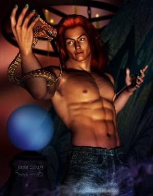
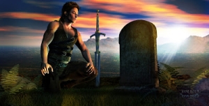
Fantasy warrior ... you might know this face!
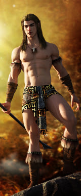
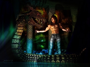
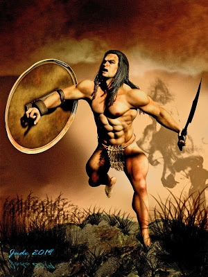
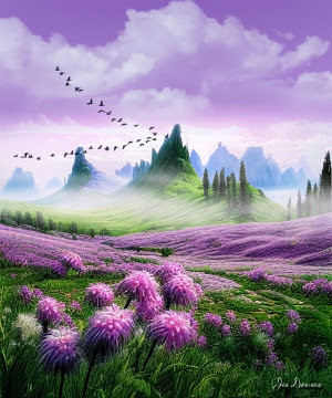
Fantasy warrior ... and this is another one I'll be sending to LuxRender in the fullness of time (meaning, when this current monster assignment is done and I have the time to think). This is a project spanning about eight years. I painted the first version of this book cover a long, long time ago, and at the time it was done completely digitally, without recourse to DAZ Studio, or Byrce. The whole thing was painted inside Micrographx Picture Publisher ... yes, it goes back so far, I didn't even have GIMP, much less the pocket-sized version of Photoshop I'm running now.
(I used to adore Micrographx, but on one of the PC upgrades that were necessary over the years I switched up to a 64 but system, and Micrographx ... ceased to work. For some time I ran on GIMP, but continual crashes and a lot of grumbling caused Dave to track down an affordable Photoshop for me; possibly to save his sanity. Ahem.)
Anyway ... time for a reboot of all these old covers, so here we are reimagining the character and scenario. But the backdrop remains perfect, transferred over directly from the original project. The sky was hand-painted from scratch; the lake is a location in Finland, overpainted from an image appearing in a tourist brochure; the foreground began life as a photo of "somewhere in Fairbanks, Alaska" -- one of my own shots, scanned in from a print.
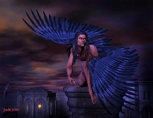
Now, in this incarnation of the cover, it's one of my own Michael 4 characters (I've called him "the Raven" for years. You've seen him with wings, and sometimes in armor, four or five times on the blog here). He's the perfect choice for this project. The hair is the Yannis Rasta dreadlocks (by SAV, I believe), which suits this character to a "T" ... and the rest was a question of muted daylight: it would have been a mistake to overdrive the lights, given the soft colors and "sunset" kind of lighting in the background. The sword is one of the DM props -- from "The Shrine," as I recall (from Renderosity, like the dreads). And if I could only remember what the skinmap is, I'd be happy to tell you. That information has vanished utterly from my brain.
The 2000 pixel high raytrace took about an hour, then another hour of painting to bring it up to a place I was happy to call "finished." By far the longest time was spent in textures and lighting control. The beauty of it is, everything blends so well, you're not even noticing where the work was done ... a sure sign it was well done.
With that remark, I'm going to sign out and go grab some tea.
Followers, note: I'm very likely to disappear for a couple of weeks. A friend is coming in from the States, and Dave and I will be taking some time off to basically tour around the local area and have a well-earned break. But I'll be back before long: scores of images and stories are buzzing around in my head, and I'm really enjoying artwork again!
Labels:
book covers,
fantasy,
Micrographx
Saturday, June 27, 2015
Digital buried treasure, as promised
When I was desperately searching for workable art for the "rejacket half of Keegan" project last week, I stumbled over a cache of digital art going back to 2007-2009, with the most recent pieces being some of the last work I did right before discovering the world of 3D rendering.
Many of these pieces were produced for a kind of "value added" progam intended to make the Mel Keegan website "sticky" -- that is, to get people onto it, and make them stick around and/or return. And in fact, it worked. A couple of years running we actually did a digital desktop calendar ... basically, a set of (free) guycandy wallpapers, part of which was a calendar. You just set them as wallpaper, month by month ... and each month you revisited melkeegan.com, and got your new art. And this did actually work -- bumped the traffic to the site, gave book sales a nice little bump, too. At about the same time we also uploaded some stuff to Zazzle, which was interesting ... before Real Life became a right royal pain for everyone involved, and we ... drifted away from all this.
(Hmm. Gotta wonder about using the best new art for cards, prints, etc. I'm hesitant: the cost of Zazzle is so high. For example, mug blanks are US$20 before you add art and ask folks for $21, so ye artist gets a whole buck! Lemme think on it.)
So, this is what I was doing prior to 3D work, and even now it's rather attractive.
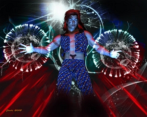
Interestingly, each of the models in the above images was sourced from photos ... but it took three images to make any one of our digital guys, and even then a whale of a lot of painting was done on them. The faces were completely painted, to begin with, to create a new face. A different body was used -- often reduced to line art and repainted, before "face replacement;" hair was entirely hand-painted (check out "Jungle Book," for instance, at full size); a third photograph was used to provide the color pallet for the model; the whole thing was recompiled into a new figure/face combination, then the fun began with a new background, new foreground, overpainting and photographic effects.
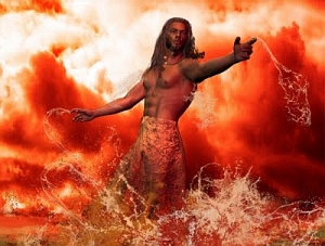
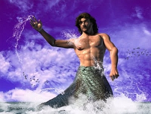
Say... check out the Poseidon image. That's a composite guy added over a photo of the ocean off Brighton Beach! (That's the Brighton in South Australia ... not the one in the UK, of course.) The horse was a color sketch, working from a couple of photo references. There's a HELL of a lot of work involved in this kind of art. It's very different from the current technique of adding Photoshop effects to an image bank picture --
In fact, the main reason I gravitated to 3D work so fast was that when you get the hang of it, it's soooo easy by comparison with the painting techniques you see above! Still ... the more you work in 3D, the more you come right back to painting. Like the broody, moody Home from the Sea cover. That's 75% painting, though it started life as a couple of renders. And this one:
The "figure in a garden" dates back about two-and-a-half years, but I can still remember the sheer volume of painting on this one! I painted the figure. the weeds. The bricks. The walls...!
All of the work done on the pure-digital-painting shots above was done in Micrographx Picture Publisher. I didn't get Photoshop until after I upgraded to a 64-big PC and discovered (to my horror) that Picture Publisher only worked on the 32-bit system, and GIMP only wanted to crash!! to the desktop, causing me to rip out my hair ... causing Dave to track down a third-party retailer for Photoshop that offered the product an attractive price. The rest is more or less history. (The matting and text-as-art effects in these shots is all done in Serif, incidentally.)
All I need to do now is start (!) posting here regularly, sharing some of the rafts and rafts of art that have been done in the last year and more!
Labels:
digital painting,
guy candy,
Mel Keegan,
Micrographx,
Serif
Sunday, January 27, 2013
Jogging my Memory
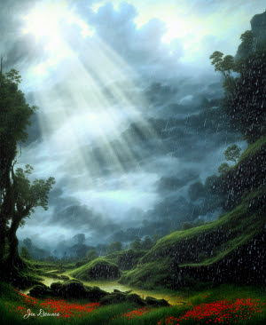
Is it just me, or does everyone forget about 75% of anything, when you haven't had a chance to do it for a few months? I spent a couple of hours today trying to wake up my brain and make it remember how to do stuff that, last November, it was doing on autopilot! There were a number of projects I was fiddling with, before the move. The first two pictures, today, you've actually seen before, a looong time ago. I was never 100% satisfied with the render of the young beauty asleep in the sun, because the hair, when seen in closeup and with the strands seriously stretched and pulled and twisted, reaches a point where you really can see the fact every strand is made of myriads of small straight sections, all articulated at the joins. I've wanted to repaint the hair for months now. The second one, which I call "Misty River," was rendered in Bryce 7 Pro most of a year ago, but I was never able to get back to it, to finish it. And the third one is a "process painting" done in Irfanview and Photoshop, rescuing an image of the trails up at Aberfoyle Park, SA, in the springtime (you can tell it's spring: all those yellow flowering trees). The photo was fine up to a point ... the sky is full of powerlines!
So, in the interests of jogging my memory, I took the opportunity to finish these, since my work space is set up and ready to rock and roll. If you're wondering, this is where it all happens:
Laptop, 24" flat screen, keyboard, two mouses (mice? Meece?) mouse pad, Wacom Bamboo, spaghetti of cables. Confusing, isn't it?! The Mighty Thor's brainbox is on the floor under the desk...
Memory jogged quickly enough. I was very pleased with the repainting on the catnapping dude:
That's much nicer. The one thing that had let this picture down, before, was the hair, in extreme closeup. Call this one fixed.
And while I was hunting around for old files, I stumbled over some folders I'd archived from about four computers ago (yep ... counting them, four, not even including this laptop)...
This is what you'd call "process art" -- each piece starts as a photograph and is tweaked and generally abused until it resembles a painting. You'll need to see a couple of those at large size, to see the effect. The question you're asking is, why would you bother?
Sometimes, it's a useful way to rescue a picture that had a serious defect (like the sky full of powerlines). Other times, the image has great subject matter and framing, but it was shot at incredibly low resolution, which makes it a reject today even though it was a nice photo in 2003. Pictures can be saved by being turned into art, and you can get this kind of effect sooo easily:
In fact, that's the reason I didn't do more process art. It was just too easy. I had a brief flirtation with this, did a few dozen of these pieces, and then let them go. These were all done in Irfanview and finished off in Micrografx Picture Publisher, which had a set of neat borders which were added with a click. I'm sure Photoshop must have the same kind of thing ... I honestly haven't looked yet!
Incidentally, if you're wondering how to do this kind of art: over-saturate the piece; then crank the contrast waaay up; then blur it till it's almost gone, then re-re-re-resharpen it, till the picture goes very slightly whacko at the detail level. Tweak the color and contrast some more, and ... well, that's basically it. You can also play with the color balance -- drop out the red or the blue, see what this does to the image. Fundamentally, here, you're forcing the software to duplicate the artist's human efforts. Paintings are often too contrasty, or too color saturated, or some color or other is overstated. By forcing the software to shift the image this way or that, you can make the same kind of statement an artist would make with a paintbrush. The thing is, it's so easy. Too easy. I guess there was no challenge, so I didn't have much more than a flirtation with this!
But I am playing around with some cool things that Photoshop does, and I gotta get back to Manga Studio. And Bryce, come to that. Going to be busy this year!
Jade, January 26 (Australia Day)
Sunday, August 28, 2011
Book cover art again ... soooo pretty, this one!

Somebody said the other day, "There used to be this great digital artist, went by the pen name -- or would it be 'brush name?' -- of Jade. Whatever happened to her?"
And someone else said, "I don't know ... she vanished. I think she might have died. Well, either that or she gave up the painting and got a goat farm in New Zealand, and she lives halfway up a mountainside right now, catching up on her sleep."
Hmmm. Chance, as the British say, would be a fine thing! No such luck, fellow travelers. August has simply been a blizzard of work, added to which, I haven't been well a lot of the time! Art? Yep, there's been TONS of it. All of the commercial variety, nothing creative ... nothing worth uploading, till this piece, which I did the other day.
A while ago I created a new character, using the Jerome skinmap and the Yannis Rasta dreadlocks, and I'd just gotten done rendering him when I thought, "I know who you are!" I hadn't set out to create Rogan Dahl from The Lords of Harbendane, but that's pretty much what happened accidentally. In the last month, I've been repackaging numerous books from our list, and it was just too great a temptation ... I had to do a new cover for Harbendane while I was there.
This is the third cover this book has had, and it's definitely the best. Here it is with its text objects pasted up:

Now, that's pretty! LGBT and m/m books need quite delicate cover art, because it's entirely possible Aunt Maud might be looking, and we don't want to give her a seizure. But on the other hand the art needs to be representational of the content of the story. Harbendane is a love story as well as a huge epic fantasy taking place in the northern valleys, and the bleaker lands not far south of the arctic circle. I think this piece does the job nicely.
These are two Michael 4s, obviously. Yannis Rastra Dreads and Jerome skinmap on Rogan (face and body morphs my me) while Tristan is wearing the Aether hair and the Mario skinmap. Rogan is wearing the Lockwood pants and the AS Narkilir shirt (all textures changed), and Tristan is wearing the Lockwood shirt and the Cold Life pants (all textures changed). In the background is a digital painting I did a couple of years ago for the original cover. The sky, mountains and foreground are literally cut out of three different photos, and painted together. This was done looooong before I had Photoshop, so the work was done in Micrografx. The foreground comprises the Rodi Design baby fir trees (from Content Paradise), and a bit of overpainting in Photoshop using Ron's Magical Snow brushes (from DAZ). Then the whole shebang was color saturated for extra impact, and shipped into Serif X3 for the text objects to be added.
So sorry to have been absent for eons! I'm almost at the end of the avalanche of work, and in the last couple of weeks I've bought loads of 3D models ... new skinmaps, hair, sets, props, Photoshop brushes ... that I haven't even unpacked yet. I'm dying to get to the end of the overwork, so I can get back to some art -- art for its own same. Ars gratia artis, pardon the Latin.
So, like the man said in the movie, I'll be back! Soon.
Jade, August 28
***Posted by MK because the internet is AWOL. Intermittent crap.
Labels:
book covers,
characters,
costumes,
digital painting,
Lords of Harbendane,
Micrographx,
Photoshop,
Serif,
skins,
Yaoi
Wednesday, July 20, 2011
CG art: The Magician's Pet
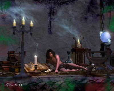
CG art and 3D render shake hands here. It's about half and half render and digital painting ... and I must say, I'm enjoying Photoshop more and more. Am getting used to it incrementally (BIG increments, that is), and at last am growing accustomed to the way it does things --
Halfway through this piece, I gave myself a kick and said, "Learn something new, why don't you?" So I stopped painting on the canvas of the original render, and painted in layers from then on. To you guys who've been using Photoshop for yonks, this is No Big Deal. But I always found GIMP's way of handling layers to be less than friendly, and of course when I wanted to do anything at all I ran home to my old favorite, Micrografx. Wellll ...
This time, I'm going to give myself a pat on the back, because I didn't do anything at all in the old programs. Gave this to myself as an assignment, and did the whole thing in Photoshop!
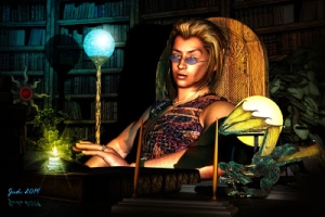
So what's going on in this painting? That's DAZ's Michael 4 wearing the JM Alexandre skinmap and the Akasta hair set to dark brown, and the Euros overskirt with texture and opacity maps by self. The props are a wild and woolly assortment of props from DM and ADS, most notably The Mage's Study, Fantasy Visions etc. -- you can get them all from Renderosity. Carpet is actually the plain, boring old rug from the Apartment 39 prop set, with a texture and displacement map set my me to make it interesting! It turns from a flat carpet into a battered, beat up old leather carpet. The floor and wall are planes wearing various textures ... marble, tiles and what have you.
Then the fun begins. First, the lights and shadows, which you can play with to get them juuuuust right for the final render in DAZ. Save this, and import it into Photoshop and start, uh, painting! Smoke, candle glows, drips down walls, gleams on things, deep shadows ... yup, all painted. And by the time you're done, when you go back to the original render you're bemused by how plain it is! Much of the painting was done with a terrific brush set I just got -- Mystikel's "Dirt" brushes, which is a huge set of cracks, grunge, splatter and muck brushes, from Renderosity for $8. Money well spent there! I also used Ron's Smoke, and Fog, and Bokeh Lights.
Last thing I did, just before uploading this, was to apply a 3% "uniform noise" filter to the whole shebang. What this does is take a tiny little bit of the tack sharpness off the render, which for some weird reason makes it look richer. Don't ask me why; it just does. Mind you, to see this effect you'll have to view the piece at large size. I uploaded it at 1000 pixels wide, so you can do just that.
So, just one image today, because it's more of a painting than a 3D project, and the only downside to this is, it takes a lot more time to paint a picture than it does to click "render" and then buzz off to the next job and let the render engine do its thing in the background!
Nice, though, innit? I call this one The Magician's Pet. He could be a student learning the magician's art, or he could be a captive, upon whom the spells are practised. He's lost count of the times he's been turned into a newt...
Jade, 20 July
Labels:
DAZ,
digital painting,
fantasy,
GIMP,
Michael 4,
Micrographx,
Photoshop,
props
Sunday, July 10, 2011
New fantasy costume for M4 ... very nice!


Sunday. Raining. Looking at the drizzle streaming down the window glass. Taking a break from work ... still not finished the job! Celestial gentlemen with long white beards, sitting on clouds, might have the option of resting on the seventh day, but if they were down here they'd have to get their sleeves rolled up and get stuck in. So while taking a break, I grabbed the opportunity to play with one of the items I bought a little while ago -- here, you're seeing part of it.
It's the Euros costume for M4, and it's actually a set of trousers, overskirt and shirt, but since I'm chronically short of time I decided to play with it one piece at a time. Skirt first. It comes with a very nice kind of chainmail texture, plus several other lovely textures ... and I added an opacity map to one of them, to make it over into a kind of loosely hand-woven fabric which wouldn't leave a heck of a lot of the imagination!
Tomorrow, I'll have a look at the shirt and the trousers which go under the overskirt, and play with textures and morphs. Incidentally, the morphs on the Euros overskirt are very good. The only one that beat me was the kneeling one -- couldn't get it to wrap under the leg. I imagine the morphs to do this are actually there, but you'd need a little bit more time than I have today! So I finished that one with a little bit of digital painting --
Which gave me another excuse to play in Photoshop Elements 9 ... hmmm. Well, sure, you can do this bit of airbrushing in PSE9, but the tools are so cumbersome, the process is so long -- again, I ran out of time. Confession: I ran home to Micrografx and did the job in the 37 seconds I actually had left. My kingdom for the time to play -- seriously, just to play with art and software and so on. One day.
Jade, 10 July
Labels:
costumes,
digital painting,
fantasy,
guy candy,
Michael 4,
Micrographx,
Photoshop,
textures
Tuesday, May 31, 2011
Digitally painting skin tones ... and a lovely book cover


Massive apologies for disappearing on you for a couple of days ... remember that Kreeping Krudd I mentioned last week? It seems to have turned into one of the many viruses from hell. It's the kind of virus that gives you a gut full of knives, the shivers at the same time as sweating, and when you actually can force a breath to the bottom of your lungs, it hurts, and you cough, which makes your back feel like you've been in the rack! Such fun ... and it's still romping through my system. So thanks for bearing with me while I get this together.
It's taken me about three days to finish the cover for An East Wind Blowing, which is Mel Keegan's vintage gay romance about two gorgeous warriors back in the days (the Fifth Century) when the Angles and Saxons were raiding up the coastline of England. So here you have Ronan, with the red curly hair, and Bryn with the dark smouldery looks. The book has just been donated by a member of MK's maliling list -- donated to be chopped out of its bindings and OCR'd, because it was published about 15 years ago (and written about 23 years ago!) and no electronic copy every existed, at least here. GMP Publishers Ltd. would have rendered it to a data file when the paperback was published, but that's a looooong time ago.
This makes the last of the classic Keegans to be released under the DreamCraft banner, and we'll be doing the ebook in June. So if a Celtic v. Angle Raiders gay romance with bags of panic and sizzling bits sounds interesting, you know what to look out for! It's going to Kindle, Barnes & Noble, iBooks, what have you, so you can't miss it.
Also, the last time I touched base here I promised to do a post about painting skin tones, and here it is...
NOTE: all images and guides are uploaded at 1:1 size, so you'll want to click to view (and probably save) them at full size. I'll go through the instructions at greater length, with more detail, in the text too, because (!) Google can't read images, and folks might be trying to find this via Mother Google. So, here we go:

Why would you paint skin tones in any case, especially on a render? There's a bunch of reasons. One is that a lot of renders can come out looking "plastic," and some painting on them makes them look "less fake." Also, all skin maps (for Michael 4, or Victoria 4.2, or any of the many 3D models) are not created equal. Some have their great points and their downsides too, such as veins in the temples which you don't want, or red patches, or uneven skin tones. Also, some skinmaps (especially for Michael 4) can start to show their imperfections in extreme closeup, though they look fine in longshot.
Now, it's very very true that it's the imperfections in human skin tones that make them look real, and you don't want to keep on painting and painting till you wind up with something that looks like you painted features on a hard boiled egg!! But on the other end of the scale you can also get a skinmap that's got a bit of "color flash," or else there are just too many imperfections. You can have an "Italian sausage" effect! This can also happen in photos of real live human beings, and a bit of airbrushing will make people look very much better.
You can also use these same techniques to paint out (or in!) dark circles under the eyes, baggy eyes, red veins, blue veins, wrinkles...!

Here is a "before" shot, and even in this reduced form you can see the irregular skintones. At full size, this is really "troubled" skin, and if this guy were an actor, he'd be wearing a lot of makeup. And in many ways, makeup and airbrushing on photos/renders is very similar.
(I hate to tell you this, but in the days of yore, a Very Long Time Ago, I qualified as a makeup artist. True! I remember a brontosaurus coming right up to the salon windows and looking in, and we used to fight of the veloceraptors to get back to where the cars were parked...)

And here is the "after" shot, in which the skintones have been evened out. You could do this on the set with makeup, or you can do it after the fact on the images.
It's also well worth mentioning here that you can also do this exact same airbrush worn directly on the JPEG images which make up the skinmap, so that the next time you apply the "skinface" file, Michael 4 will come up looking as if he has nice skin (or a nice makeup job). Just be sure you don't overwrite the original file, because you might want it back ... and when you come to apply the newly-painted skinmap to the Michael 4 doll, you apply it via the Surfaces tab, by navigating to the folder where you saved the repainted "skinface" image. NOTE: if you do this, also be very sure you don't paint right down to the bottom edge of the JPEG, because then, when you apply it, you're going to see a "tide mark" where the "skinneck" image begins!! But if you keep your airbrushing well inside the periphery zones, you'll be fine.

Part of the real trick of painting skin tones successfully is in being extremely observant. Notice that natural human skin changes color through scores of subtle tones, about every half-inch across the face. One of the things that makes women look "made up", and which gets glamour the bad rep of beig "fake" is that makeup comes out of the bottle in one single color, and goes on over every square centimeter from hairline to collar bone, and it never changes color or tone. This might be fine, if you were painting a glam skinmap for the Victoria 4.2 doll, but for Michael 4, the skinmap wants to look like natural name skin, so it's a bit more difficult.
So, what you want to do is to sample the colors many, many times, using the color picker, and keep on changing the color you're airbrushing. So long as you remember to paint in many thin layers rather than trying to hose on one thick layer, the accumulation of color will look surprisingly good...
When selecting the color to airbrush with, use the "area select" tool, not the "point select" too. This should let you click on the color picker (looks like an eye-dropper) and then pull out a rubber box or circle (we used to call it a marquee) around a certain area. The tool will then give you the average color of the tones inside the box, and when you start to paint, you'll be hitting that average and making both ends of the scale come into the same color "zone."

So, having taken your average color pick, the next thing you want to do is configure the airbrush tool. This is the part I can't walk you through, not for love or money, because every interface is different! Best I can do is tell you what parameters you need to think about, and then you'll need to find them in your program.
Airbrushes work with a few tools which are common across the whole marketplace, and also right into physical airbrushes too. Brush SHAPE is the first. Stick with round. In all seriousness, a round brush is the easiest to work with here. Brush FEATHER is very important. Stick with 100%, as this blends the edges of the brush "stroke" perfectly into the background. Brush SIZE is just as critical, but I can't give you a number here, because this changes with every painting job. It stands to reason that if you're painting on a 300dpi image that's the size of a table top, you'll be working with a big brush, and if you're painting a small image, it'll have to be a heck of a lot smaller! Try to pick something that would correspond to about a centimeter, a bit less than a half inch, on the human face. Next, the MERGE MODE of the brush is important. Leave it set at Normal. It'll do all kinds of weird and wonderful things that are great for special effects, but you just want Normal here. (Mind you, the rest are a lot of fun to play with.) Lastly -- brush PRESSURE is the most important thing of all. The airbrush is one of very few artistic tools where you have to even think about how much paint you're pushing onto an image! Obviously, the higher pressures mean a lot more paint going through the brush; lower pressures make for thinner coats of paint -- you can control several thinner coats a heck of a lot more easily than you can control one thick coat, and as the coats build up, several thin layers look much more realistic than one thick one.
Below is a screen cap of what the tools look like in the interface of Micrografx Picture Publiser. I have no idea what it'll look like in your program, but the tools will be there. Any good paint program has to have them. If you don't have them, you probably need to get into a "proper" software to do this work -- and it doesn't have to cost a ton of money.

Now, there's another range of painting tools that you can look at, but I'm not going to go into them in any depth here, because only folks who're using either Photoshop or its open source, free cousin, GIMP, can use these tools. Paint.net, Micrografx and even the top of the line Corel Painter, will not give you access to these tools. They are, of course, .abr brush sets of (!) skin tones.
What they are basically, is close-up swatches of the details of human skin, such as pores, wrinkles and what have you. And you can get very, very creative with these tools, using them as subtle, subtle overlays after you've gotten the smooth-out painting finished. But if you're not using Photoshop or GIMP, you're sunk, so let's not even go there. (God knows, if I'd paid $699 for Corel Painter, and somebody rambled on about painting in the pores with .abr brushes, which are out of my ballpark, I'd be, um, a bit cross.)

Color control across the whole image is vital. The best way to manage this is to have a copy of the original image open in a second, visible window. This means you can use it as a pallet, set up your colors from the original and then commence to paint on the in-progress work. Also, having the original open too means you can keep an eye on your zones of highlight and shade. It's very easy to homogenize the whole thing into flatness! Take care ... and if you do lose your highlights, use your "undo" tool to get back to the last "good" point. Or else, set the airbrush up from the original, and paint the highlights right back in!
Don't be tempted to use the "smear brush tool." Seriously. You're not finger painting her, and the smear brush tool just pushes existing colors around on the canvas. This is not what you want. Unless you're very clever with the smear brush, and use it sparingly, it'll jump out of the finished work like a sign saying, "Hey, look at me, I've been painted!"
Lastly ... in all seriousness, know when to stop! You don't want a finished image that looks like you painted a face on a hard boiled egg! You might get away with it if you're painting on Victoria 4.2, due to people's expectation that women will be plastered up in so much makeup, their own skin doesn't show through, and everyone's knowledge that makeup comes out of a single-color bottle. But for guys, well, this is ar from the effect you want. The Michael 4 doll is very, very natural. Some of the skinmaps are a bit "flat," and others might need a bit of airbrushing, but for the most part you'll be trying to keep that natural appearance of the "real" guy.
So there you go -- Painting Skin Tones 101. Have fun!
Jade, 1 June
Friday, May 6, 2011
More bookcovers today ... but hey, these are not bad!


Here's two very different books, warranting two very different covers -- different styles, too. THE DECEIVERS is a nitty gritty 19th Century tale about the last of the tall ships, the shipwreckers, a hot romance, a couple of handsome heroes, and nary a heroine in sight. Well, what do you expect from Mel Keegan?! So that cover was crying out for something realistic as well as sensual.
The background on this one is a digital painting of a schooner I did years and years ago; we used it as the cover of the second paperback edition of THE DECEIVERS. but once again ... it doesn't look all that good at 150 pixels high! So dropping it into the background, using it as the backdrop for a handsome, smoldering, shirtless hunk -- well, when it works, it works. And this does.
The second book is very different indeed: it's high fantasy, a real technicolor romp in the best traditions of fantasy as we've come to know and love it. This one was begging for a color-saturated cover filled with fantasy elements -- Ancient Egyptian and Greek. I had loads of fun with the lighting on this. I had a very deep blue backdrop, and I wanted to create the illusion of firelight, so adding a couple of orange lights down low and angled up worked very nicely.
What do these look like, with the text objects overlaid? Scroll on a bit...


And they do catch the eye nicely, at 150 pixels high. I think I'm getting the hang of this at last! I might be slow, but I get there in the end. Seriously, the whole book industry is changing from moment to moment, and what you thought you knew a year ago, you realize you don't know now. The competition out there is astonishing, and yet getting a sale for your list writers comes down to getting a potential customer to STOP!! at one single thumbnail cover out of a page loaded with them. If the cover doesn't arrest the reader, s/he won't even look at the blurb, and as for the excerpt -- forget it. So if it all starts with the cover, it stands to reason that the cover needs to speak to the reader. In fact, it needs to get up and shout and wave its arms around.
Hey, I'm working on it, guys! These pieces were produced in pretty much the same way as those yesterday, a process involving more digital painting than 3D work. Most of today's painting was done in GIMP, with Photoshop brushes, but the composits, as always, were done in Micrografx...
And this guy is worth seeing full size:
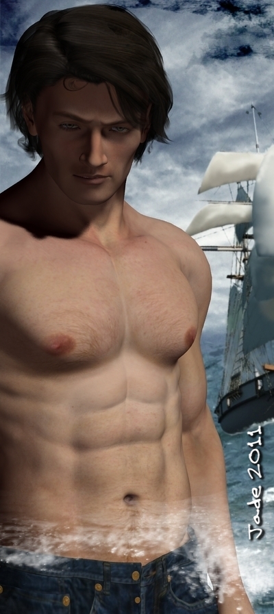
See?!
Jade, 7 May
Labels:
book covers,
digital painting,
fantasy,
GIMP,
Mel Keegan,
Micrographx,
Photoshop
Don't judge a cover by its book!
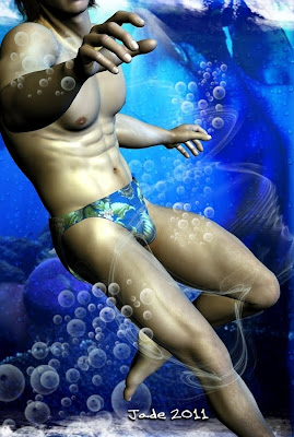
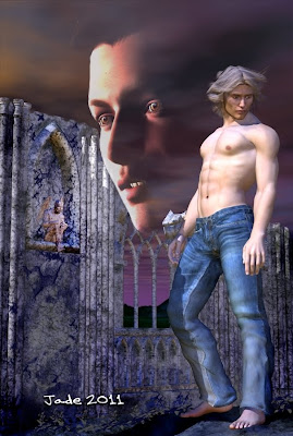
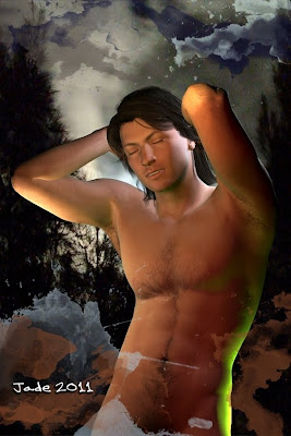
Today it's all about book covers ... and a crazy rush to catch up after being sick for a few days.If you've been reading this blog for a while, you know my health is down the tubes!
Being brutally analytical about our bookcovers, I came upon a truth that hits you late in your advertising campaigns. It doesn't matter how good a cover looks at 6" wide by 9" high. If it doesn't stop traffic at 150 pixels high on a computer screen, it won't inspired potential readers to click on it and look at the blurb -- and if they don't read the blurb, they won't get as far as the excerpt ... and they sure as heck won't be buying the book!
So I sat back and had a look at our covers. I shrank them down to 150 pixels high, and said, "Hmmmm." The truth is, my brain was wired for bookcovers back in the days of paperbacks, when you designed something that would look astonishing on a shelf in a store. Such covers were often filled with fine detail. Some of the 1970s and 1980s fantasy novel covers were great works of art in their own right.
Today, all that is secondary to the question of how striking the same image it going to look when reduced the the size of a postage stamp! So... if I ever want to retire to that villa in the south of France, we need to sell a lot more books, and you know that these days that means being competitive on the ebook marketplace.
Bottom line: it all comes down to grabbing the attention of the passerby who's looking at hundreds of covers in this browsing session. You have 150 pixels by 100 pixels' worth of space to catch their eye, fire their imagination and make them click on the link to read the blurb, right? Right.
Hence -- today it's all about bookcovers!
If you're an artist, you might be interested in the progress images -- I uploaded everything at 1:1 size, so you can see the details. It's basically a layering process, building up from a bottom layer to the final elements in the composit -- click on these to see them full size...
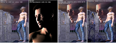
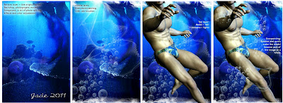
And of course the last layer of all is the text layer. Wondering how they turned out, with the text objects overlaid? Check them out:
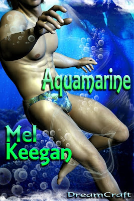
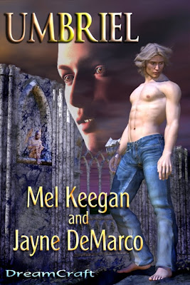
...and the last thing I did was to shrink them down and frown over them at postage stamp size. In fact, they look darned good. I'm happy with these, so I'll pass on to other covers tomorrow. In all, I had about 40 books from our list to rejacket. I'm about halfway there. Long way to go, but it's kinda fun, actually.
The 3D work is done in DAZ, with some backgrounds originating in Bryce (skies and waterscapes ... can't get realism out of Bryce landscapes for love of money); the composit work is all done in Micrografx, without which I would be utterly lost; a lot of the painting, including all the fine work, is done in Micrografx; any work utilizing .abr Photoshop brushes is done in GIMP; and the text objects are done in Serif, and exported from there right to the finished files.
The composit work is especially interesting, because Micrografx offers the merge modes (aka "inks") which give you the freedom to do almost anything -- plus you an see all "layers" at once, with whatever merge modes applied to any or all, and paint on the bottom "layer" while seeing the effects of the painting on the top "layer." I should think you can do this n GIMP, buy I wouldn't have a clue how!
To answer a thrice-asked question: the reason I prefer Micrografx is that it does not work in layers ... all picture elements are floating in the same frame, and you can go from one to another and do anything at all, without ever leaving the "work as a whole." Anything you can do in Photoshop using layers, you can do in Micrografx by pasting your elements into the one frame, selecting them individually, applying any filter or effect, rearranging them, whatever. You merge them all down into one finished image when you're done fiddling.
Oh, I guess it's what you're used to! I imagine the full-blown Photoshop has these same freedoms -- and I also confess, I've been tardy about learning the advanced GIMP features, because my brain is still hard-wired for the other way of doing things! I do like GIMP, and I had to chuckle when I was reading a critique of it, in which some Paint.net aficionado said, and I quote, "GIMP was designed by propeller-heads for propeller-heads." I guess he means it has a basic cuteness, which it does! What I like about GIMP is simply that it lets me get busy with .abr Photoshop brushes, without having to drop a ton of money for Photoshop --! One of these days, if I win State Lotto, I'll treat myself.
Jade, 6 May
Labels:
book covers,
Bryce,
digital painting,
GIMP,
Micrographx,
Photoshop,
Serif
Subscribe to:
Posts (Atom)


