


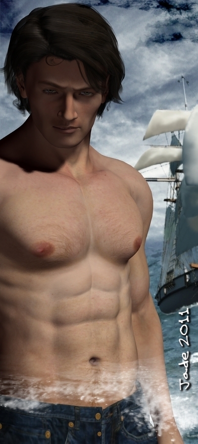
Here's two very different books, warranting two very different covers -- different styles, too. THE DECEIVERS is a nitty gritty 19th Century tale about the last of the tall ships, the shipwreckers, a hot romance, a couple of handsome heroes, and nary a heroine in sight. Well, what do you expect from Mel Keegan?! So that cover was crying out for something realistic as well as sensual.
The background on this one is a digital painting of a schooner I did years and years ago; we used it as the cover of the second paperback edition of THE DECEIVERS. but once again ... it doesn't look all that good at 150 pixels high! So dropping it into the background, using it as the backdrop for a handsome, smoldering, shirtless hunk -- well, when it works, it works. And this does.
The second book is very different indeed: it's high fantasy, a real technicolor romp in the best traditions of fantasy as we've come to know and love it. This one was begging for a color-saturated cover filled with fantasy elements -- Ancient Egyptian and Greek. I had loads of fun with the lighting on this. I had a very deep blue backdrop, and I wanted to create the illusion of firelight, so adding a couple of orange lights down low and angled up worked very nicely.
What do these look like, with the text objects overlaid? Scroll on a bit...


And they do catch the eye nicely, at 150 pixels high. I think I'm getting the hang of this at last! I might be slow, but I get there in the end. Seriously, the whole book industry is changing from moment to moment, and what you thought you knew a year ago, you realize you don't know now. The competition out there is astonishing, and yet getting a sale for your list writers comes down to getting a potential customer to STOP!! at one single thumbnail cover out of a page loaded with them. If the cover doesn't arrest the reader, s/he won't even look at the blurb, and as for the excerpt -- forget it. So if it all starts with the cover, it stands to reason that the cover needs to speak to the reader. In fact, it needs to get up and shout and wave its arms around.
Hey, I'm working on it, guys! These pieces were produced in pretty much the same way as those yesterday, a process involving more digital painting than 3D work. Most of today's painting was done in GIMP, with Photoshop brushes, but the composits, as always, were done in Micrografx...
And this guy is worth seeing full size:
See?!
Jade, 7 May


