Tuesday, November 27, 2018

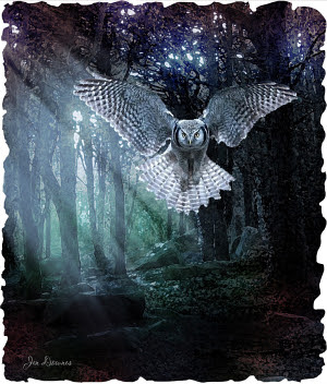
Hello, Krita!! From scratch -- a South Australian little raven, blue eyes and all


Since I'm getting left behind in the 3D rendering field, I find myself doing more and more digital painting, and I've lately been growling about the fact I can't afford the top-end software like Corel (have you seen the price of it?!) and even if I could, my desktop won't run it, and my laptop will run it, but won't shake hands with my Wacom Bamboo. So I'd have to buy a new tablet (if they even make such things in this day and age of touch screens, which I'm not sure they do). So....

Dave had an idea. "Have you checked to see if there's an open source paint program?" he asked. Because there's usually an open source program to do the same job as Corel Painter or Microsoft Word or ... virtually anything.

And it turns out, there is. It's called Krita (check out their website), and it really is a match, and more than a match, for programs like ArtRage from New Zealand, and Rebell 3 (from Escape Motions, which produces the Amberlight program I like so much), and I'd have to guess it's about 90% of the way there to being a match for Corel Painter itself. The team has been developing Krita, crowd funded, for ten years. Give them another two, and people will be preferring this program over the top line branded stuff. Ye gods.

So -- it's a free download, even though it's the most amazing program (yes, I shall be donating to say thanks for this), and it runs like a dream on my desktop, which deliberately doesn't even have a modem ... that machine has run in isolation for about eight years now, never had an update, and it never gives a lick of trouble because it never gets messed about. I just downloaded the 97MB installer to the laptop, passed it across on a jump drive, and ten minutes later was painting!

Ooooh, boy, is there some stuff to learn! Fortunately the manual is online in wiki form, and Krita is very intuitive, especially if you have a background on Photoshop (I still run the old PS Elements 9). So -- baby steps, starting here, with a painting of a little raven sketched from an old snapshot I took at Hallett Cove about ten years ago, maybe twelve...


It's absolutely amazing to be painting from scratch, from a line sketch! In this detail shot, above, you can see the sketched underlay ... you can also see the wet-on-dry and dry-on-wet effects of various brushes, as you lay down your colors and work them, exactly as if you were painting on illustration board! This takes me back years -- okay, decades -- to a time when I used to paint this way with great joy. I'm going to have loads of fun...

And yes, the exotic, beautiful guys will be along very soon, when I get the hang of Krita properly. This painting of a little raven is just a very swift starter lesson ... I used only the "wet and dry bristles for the whole thing," because I figure, the way to learn something is to master one technique at a time. There are HUNDREDS of brushes and blends in Krita, and we're going to proceed one at a time.

Painting again! Hee hee hee!

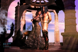
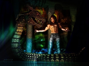
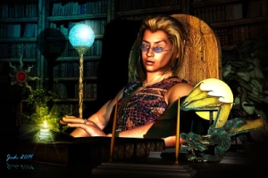
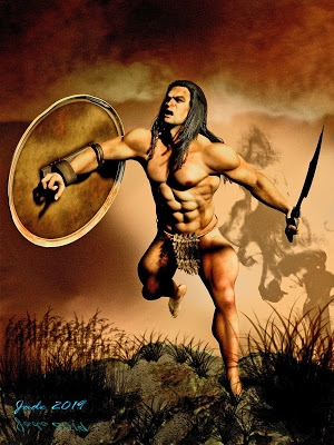
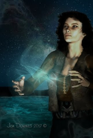
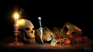
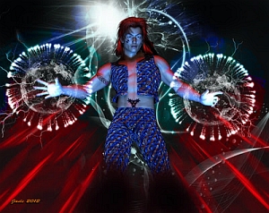
And while I'm here, let me share another couple of Amberlight images ... I've done soooo many, but some of them are extraordinary, so here we go:


More soon ... some old fashioned renders painted up in Photoshop; and some digital art painted from scratch; and some blends of renders and Amberlight! 😃 Having huge fun with art, for the first time in way too long. The truth is, I've been so sick for so long, I'd forgotten how much I enjoyed all this!

Thursday, November 15, 2018

Shades of green


Please do click on this to see it at full size -- it's actually not bad at all! The only thing bugging me is that this new laptop I'm using has such cool, cool colors that the richness seems to drop out as soon as I upload the file. Now, if I color-saturate it to make it look richer on this screen ... what happens for viewers who have screens that do show color properly?

If anyone would like to give me some feedback, you can still contact me via DreamCraft -- I still do website design and page debugging for Mel Keegan, Mike Adamson, and others and tell me what this looks like on YOUR system. Is it close to colorless? After my old laptop died a while ago, I switched to a new HP, and the only thing I have to complain about on it is ... the display is just meh.

Anyway, that's by the by: your system is probably showing the image the way I see it on the desktop on which it was created. Every trick I know is rolled into this project, from surfaces and displacement maps to depth of field, lighting ... two-stage composite background, then loads of of over-painting in Photoshop. I like this character a lot. Also having fun playing with the old, old software. Everyone else is rendering in Lux and running with the Genesis 8 figures. Well, one day I'll catch up! 

And to round it off for today -- a painting. Magnolia Flowers:

Note: this is the 2023 repaint, fixing a few problems
of resolution that couldn't be solved with the
hardware of 2017 


This one was painted from scratch, from a sketch. The photo from which it was developed has a confused background with cars and people, which actually spoils the image. You'll need to see the painting at full size to appreciate it. 😎


Wednesday, November 14, 2018

Today's theme is: GREEN


Today's theme is GREEN. And when I say I green, I mean ... green. I've wanted to do this for ages. Have known how to do it for  years, but never had a reason (read: excuse) to do something thoroughly exotic. But lately art has all been about work, and I'm starting to wonder where the fun went in all this, so -- need an excuse? Find the fun. Put the fun back in art.

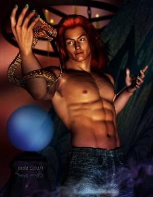
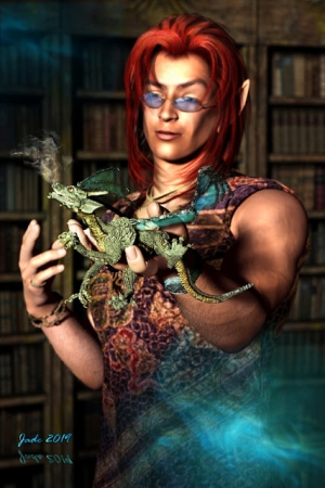
Green hunk with pointed ears and red hair. Exotic enough?! I'll come back to this character, we'll see how he looks in formal, scenes and so forth. I, uh, like it. (If you need to know how to get this effect, scroll down. I'll tell how at the end of the post ... no, it's not a special skin map. You can apply this effect to any old skin map ... and when you remember that I'm still using DAZ Studio 3, you know how generic the technique is!)

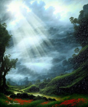
Sticking with the green theme, though -- let me share a painting I did last year. The title is Woodland Morning:


(Yes, before you hiccup, I signed my own name to this. Mainstream art, I sign it for myself, rather than as my evil twin, he he he...) This began life as two photos of a hillside at Joseph Fisher, a pavilion at Belair National Park. It made for a beautiful painting. Am quite proud of this.

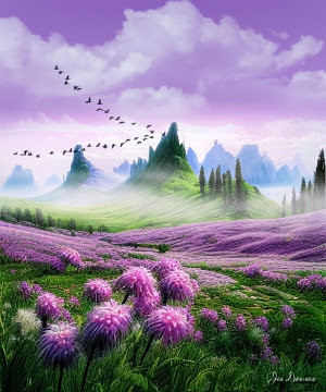
And staying on the green theme, let me go back to Amberlight and share something absolutely surreal  and just as beautiful --


Isn't that gloriously alien? Looks like a life form that drifts among the stars. I do like Amberlight, which is from a company called Escape Motions. The new version of Amberlight is out now, but I don't have it yet. (Money? What's money?!)

And that's quite enough green for today, so let's liven this up with some other colors:


Ahhh, a little red. That's better! More from Amberlight as we go along. I've done loads of art, and will share the best ones a few at a time.

Lastly, a word for those artists who'd like to be able to turn Michael (or whomever) green without investing in a special skin map (if indeed any such thing exists; which I'm not sure it does). Relax: it's easy. You can turn anything and anyone green with a few judicious clicks and an artist's eye.

Remember, I can't give you instructions for the Studio 4 interface: I don't use DAZ 4, probably never will ... Studio 5 is right around the corner now, and I'll probably skip 4 entirely and, in a year or two, hop right into Studio 5, with the newest Lux, Genesis figures, and so forth. All that belongs to the future, though, and for now, let's just turn our characters into Martians!

Load up your figure; apply whatever skinmap you need. This technique will work with swarthy complexions too, but you'll notice the greatest effects in the paler skin maps. Go into your Surfaces tab and select whichever character you're using -- doesn't matter: in the Surfaces tab, the playing field is level. With the character selected, you want to adjust the COLOR in the DIFFUSE value. The interface will give you the names of the skinmaps being used (for example, it might be JM_FalconHead.jpg), but it also gives you a field when you can pick the color on the coordinate system. Click inside that field (in Studio 3 it looks like a cross-hatched rectangle; dunno what it'll look like in your interface ... look for something offering you "diffuse color." You'll find it). Pick a shade of green and apply it to ALL of the figure at one time. The shade I used on this guy, above, was 161,243,131. You might have to pick the shade several times, test render, before you get exactly what you want; but when you have it, save your work.

The first thing you'll notice is that even the whites of his/her eyes have gone green ... so have the teeth. We don't want this. So --

The way to revert the eyes and teeth to normal is to open the Michael (or whomever) list in the Surfaces list/pane, scoll down till you see sclera, iris, pupil, and deliberately revert the diffuse color to white. Do the same with the teeth. And you're done. Render a test shot, and the only thing you may choose to do now is change the nipple color so something like a blue-green.

Red-blooded creatures have rosy nipples, but creatures with blood based on copper or whatever won't. Same process: select "nipple" and use the color picker to get somewhere between blue and green. Apply, and render a test. Happy rendering! (Oh, those pointed ears are done using Morphs++ in my antiquated system. Don't know how you'd do this with the Genesis figures, but I know you can.)

More soon ... I'll come back to this character, also share some more paintings, and some more Amberlight pictures.

Tuesday, November 13, 2018

Nice. Can we do it again? Plus Amberlight -- and a tough assignment...


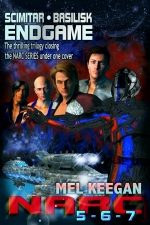
This was the project a couple of months ago. The assignment was a toughie: dream up a cover that reflected not one but THREE stories, because this one was for an omnibus edition in which you had spacecraft in the Jupiter system, Bengal tigers in the wilds of NW Tasmania, and a "western" set in a post-apocalypse, nuclear-winter scenario. Okay -- you come up with something that rolls those ideas together!

I was lucky, in that I'd rendered the spacecraft and Jupiter for another cover a couple of years ago (the job was done wholly in Bryce 7 Pro, including the planet). That got me halfway there. Then, a digital painting of a tiger, and a shot of blizzard-driven snow. Then the job got easier: compile everything into a coherent whole AND leave room for the typography! Anyway, I enjoyed the job, though the paperback cover presented a whole 'nother challenge, not because the work was hard, but because Amazon's new paperback generating engine is changing  -- as so much is changing at Amazon right now ... ask almost any indie author ... there's hell to pay behind the scenes: both the publishing and retail engines are having kittens at this time. Took me (me!) three goes to get it right, but here's the final result:


Very pleased with the end result for this one. (Incidentally, if you're interested, you can find the book online here, in a variety of ebook formats and also the above paperback. Christmas is coming, and all that. Okay.)

That's the beauty of digital art: you can re-re-rework a piece without having to go back to scratch and start over. Imagine if a conventional artist had 20 hours invested in a work, and it was done, delivered ... then the commissioning party (maybe publisher, editor, even writer) said ... very nice, but can you make him a bit older?

Which is exactly what happened late last night! I get a surprise email from the writer saying -- after the fact, mind you! -- "Can you put a few years on him? And incidentally, we're changing the title. Thanks." Meaning, the character created for cover of Falconstone, which I showed you yesterday, because at the time we all thought the bloody thing was finished. Can we age him a little? Hmm. Soooo...

Back to the project files, make the character older -- but not too much older. He has to go from looking 27 to looking 32. Subtle. It's all in the shadows, perhaps the fullness of lips and jaw, the upper eyelids. I went right back to Morphs++ in DAZ, reset a lot of parameters, changed the lighting, and the result is this:


...the fact is, the author's right. The model does look better a few years older, and the effect is very subtle. We're not talking about aging someone from 30 to 50. Just a handful of years ... what a difference they make. And yes, it's very simple to change the typography. What was Falconhurst has become Falconstone ... why? Well, it turns out there is already a book, or books, doing the rounds under the old title, and they're not very "savory" books, something to do with slave culture in America in the early-C18th. Ick. So by all means, let's change it.

Anyway, that is quite ENOUGH work for the moment. It's only yesterday whenI was saying art ought to be fun, so I'm going right back to...


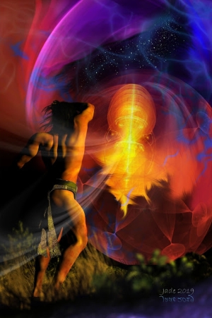
These were done in a fantastic program called Amberlight. It's a load of fun to play with -- have had it for a couple of years now, have done a LOT of art with it. I'll upload a swag more of these in the days to come ... also some paintings which I did last year.

My next work will be something exotic. And yes, I know (!) I've been left far, far behind by the new Genesis models, Michael 6, the new render engines, what have you. But let's see how far one can drive the old software. Can't afford the upgrade price just now, guys. One day. LOL -- if anyone has been following this blog since the outset, you may recall that in the early days I couldn't even generate shadows! My computer was so wimpy at the time, as soon as I turned on shadows, DAZ crashed to the desktop! That was fixed with a new machine. Then tons and tons of investment in models and assorted programs. It ain't cheap, and right now I have to be careful. Still, let's see what we can do.
More soon.

Sunday, November 11, 2018

A new book cover ... ' hell year' ... and what's new?


I know, I know, it's been a long time since I posted here ... and if I told you the story of 2018 it would be entitled "Hell Year." The year when I've spent most of the time trying to find a way to get back on my feet and stay out of the [insert your favorite expletive] hospital! But we're into mid-November now, and I'm still here. So ... here's a post to celebrate a book cover I just finished, and am very pleased with.

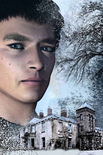
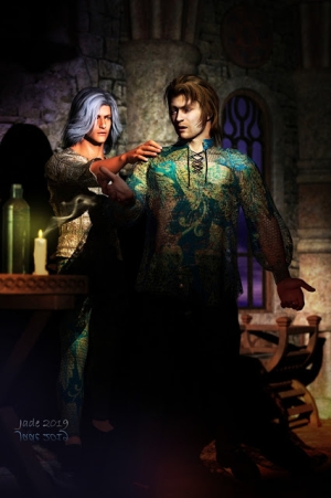
It's actually a digital painting, but it was based on a 3D model plus a drawing, and I designed this face from scratch, so ... 3D art? A cousin of 3D art at least. It's the cover for the new Mel Keegan novel, due out very soon -- a haunted house in the middle of a nasty winter, when you can't get out of the place. Very Gothic. (Very exciting, actually).

To give you an idea of how much painting is involved -- you'll have to see these at larger size to see the real work, but if you've an interest in this kind of thing, it might be well worth it:


The bald truth is, I haven't been able to do much art (or much of anything) in this last year. Right now, I have my eye on a new computer, new software, the works. Have you SEEN what DAZ has come up with lately? The new Genesis figures are out, and they are way beyond anything we could have imagined when this blog began. I'd love to get back into this, and go right to the pointy-end of the art, with the Genesis models, the newest Lux render engine ... and Corel Painter ... good golly, have a look at this, if you're interested in digital painting, even at the hobby level.

Meanwhile, I'm still muddling along with the ooold DAZ Studio 3 I feel most comfortable with, and the old Michael 4 model, and Photoshop Elements 9, because, frankly, that's what I have. And they still work. I haven't even bothered upgrading my Serif X3 yet! And speaking of Serif, which I use for all typography projects --

Serif Page Plus has become "legacy" software. Meaning, it's been discontinued. Serif is selling licenses, and you can get online help via forums and whatnot, but the company is devoted to developing something new which is tipped to blow everything else out of the water. LOL, here I am, still using X3! Again, it's what I have ... and it works.

This painting is one of a handful of formal pieces I've done in 2018, but as usual I'm hoping that next year will be a better year, and not merely for myself. (I'm not the only one "doing it the hard way" right now.) I did the cover for the ENDGAME OMNIBUS about five months ago, then to my surprise I found myself painting the cover for a new omnibus, FUTURE IMPERFECT. I'll upload that next time...

But this one, here, is a beaut ... and I got to design a face. I'd forgotten how much I used to enjoy designing faces, and painting light effects. Must get back into this. Note to self: indulge in art for its own sake. It doesn't have to be work. In fact, if it's not work, it's actually more fun. The brain begins to revolve, imagining new projects ... anyway --

This here novel -- the haunted house on the moor, with the blizzard outside and all hell busting loose inside -- will be out fairly soon. Not quite sure of the date, but I can certainly keep you informed. You can also visit [2023 EDIT: the dot-com web address is defunct as of early this year. For some reason, the system utterly denied access to it, and it could not be renewed. Then some joker bought is as a zombie domain name, and MK would have to buy it back at significant cost. Not going to happen, but the web pages are all still there and still viable. Find MK online in the same place...] Mel Keegan Online and keep tabs on the author there. I spent several days working on a new mobile version of the site, so if you're viewing on a phone, you're in for a treat. Click that link, above, and see what happens! 😃

I'll leave you, today, with the whole, finished cover including typography: neat!

Interestingly, the book had a title change after this
was done and uploaded. It's now
FALCONSTONE...