Showing posts with label Poser. Show all posts

Thursday, December 10, 2020

So, does Michael 4 work in Iray?


Michael 4 in Iray; costume by Xurge3D


The short answer is -- yes, Michael 4 does work in Iray ... it just takes a bit of nipping and tucking! The top image is the Genesis 8 figure, Michael 8, with all materials, textures, surfaces designed for Iray -- it's plug and play, just click everything into place and hit render. This took about eight minutes (!), and I'm fairly happy with it. (The lights are unimaginative, but they're not the focus of the experiment. Time to get fancy with Michael 8 as we go along.)


But about 95% of everything I have is designed for the old raytrace engine; it's thousands of bucks worth of stuff ... surely there has to be a way to save it? I can't actually afford to buy everything again! So the question uppermost in my mind as always been, "Does Michael 4 work in Iray?"

Here's the answer to that! If you can configure the materials, surfaces, textures, the old low-poly models render up very nicely indeed. They don't have the "oomph" factor of the Genesis figures -- but they also render in a tenth of the time! Not too bad at all...

I've worked out how to install shaders and Poser content, and third party content to DAZ Studio 4.14 in Windows 10 -- and I'll share the details in my next post. I'll also share how to fix the surfaces to get Iray to render the old models nicely. So far, so good!  

Sunday, June 9, 2019

Ronin, Xeno, and a lot more!


Been busy ... fiddling with IRay, trying to get it to play nice. Sorta halfway there, although we're not seeing the glorious skin tones that are definitely possible:


Right now, what I can squeeze out of IRay using Michael 4 is like ... "raytacing on steroids." These are seriously nice renders. They're not photographic by any means, but very nice renders. Have been reading on forums and tutorials, and (most old hands at this say) it comes down to needing to buy all the maps and shaders in the world to get those glorious skin tones. And here's the stumbling block: there are no shaders available for Michael 4. They only entered the repertoire with Genesis. The old figure is pretty much abandoned as per specialist shaders, which means that coaxing photographic results out of IRay with Michael 4 is probably not possible. I can maybe improve on this a bit, but to get astonishing results, we'll need to look elsewhere.

Try this for size, for a start:


I did this in 2015, in Reality/LuxRender. In Reality, it's just a few clicks to configure it, and you can re-re-readjust the lighting on the fly during the render. This was done with Reality 2.0. The current version is 4.3; and I got this result in about two hours flat, including posting the model:


To my eyes, this looks better than the IRay render of the same character (same skin map, same lights, same everything). The Lux Render is actually tickling the line of being photographic ... and the software is 100x easier to use than IRay. Soooo...

Just waiting to get the bugs ironed out. Waiting for tech support, but they only write/reply once per week, and this is taking forever. *Sigh* Anyway, at least I've learned the Studio 4 interface backwards and sideways while trying to coax a decent render into being!

And in the course of mucking about, I found some extremely rudimentary morphs that allow you to at least make Genesis look like an adult rather than Peter Pan:


It still looks like a cartoon of a human, but at least it's not an adolescent body form now. What really is creepy is, if you "hide" the costume so as to see the torso, there isn't a detail on the skinmap. No freckles or hair chest, sure, I can see the sense of that. But the Genesis doll has no nipples, which looks ... creepy. You can put body builder muscles on this guy, and he has no nipples. You don't realize how odd it looks till you see it. I guess mammals are as mammals do! 😮 Alas, to do much more with Genesis, you have to chuck a lot of money at characters, toupees and costumes. Right now, I don't have the cash, it's as simple as that! You'll have to bear with me while things chug along as fast as they can. Blame the dentist, LOL.

Also -- something very exciting is happening:


Yes!!!! There is a new Mel Keegan book on the way! This is fabulous news, and it's been a thrill designing the cover. I did most of it in Bryce 7 Pro, working with an old image from years ago, which was re-edited to take out the ocean, move the mountains and so on, so that the background started life like this, kinda like a Chris Foss book cover from the days of yore:


...before it went into Serif to have the byline added, then into DAZ Studio 3 to have the character rendered, then into Photoshop to be painted, then back into Serif to have the title overlaid. There might be some nips and tucks or tweaks to be done to it later -- I have all the files, it can be adjusted at whim -- but the author is delighted with this design. And so am I!

That's all from me for today. More soon ... still experimenting at full throttle!

Friday, April 12, 2019

Iconic. No other word for it. Jarrat and Stone.


Am just finishing the final NARC trilogy, and -- what a shock -- find myself falling for Jarrat and Stone (again) like a load of bricks. So I opened some of the old, old project files. Ooooh, boy, those renders could be so much better. The skills and hardware available now make it possible to do justice to those characters which was impossible in 2010, when I was doing the original work.

I just discovered that most of the stuff I did way back when was before I got the powerful desktop: I couldn't even raytrace! So you simply could not have the kind of treatment that's doable now. This kind of image integrity, below, was not going to happen:


It's not just about the ability to raytrace, it's also about the skill in wrangling lights. Fact: you can squeeze a heck of a lot more out of the old, old render engine with clever lights than you'll get out of SuperFly or IRay with bad, or wrong, or boring, lights. Soooo ... I'll be re-rendering my way through a whole lot of the old NARC images, and this is going to be huge fun.

I did another angle on this scene ... couldn't decide which I like better, so I'll leave it to you to decide:


This one, above, gives you a sense of that fact that Stone is a big boy. They're standing in part of the Vanguard set -- another one of those few models that has an interior as well as an exterior. It looks great from outside, too --


I rendered that way back in 2010! If you see if at larder size, you'll recognize the cockpit from the inside (also, that's Jarrat flying it...)

There are some awesome SF models out there, if you have very, very deep pockets. Take this one, for instance:


This could have flown right out of a movie, but you can have the OBJ to suit DAZ, right there on the desktop ... for US$169, which is waaay over A$200. Too rich for my blood, but if you're interested, here's the link to check it out. It's a (new??) site called High End 3D, and it's expensive!

I'm on the mailing list to get the newsletters regarding new Poser releases, too. Poser Pro 11 is out, and the promos are circulating. Hmm. I wish I could say I was hugely impressed, but in fact, I'm actually not. The showcase image that's being used as the flag carrier is this:


Sure, it's a nice, clean render, but it looks ... fake. Plastic. Or something. Hmm. I'm not so dazzled that I'm about to rush out and drop about $2,500 on hardware and software to bridge the gap between what I'm doing with the old stuff, and what you see there. If it's more subtle skin tones you're looking for, consider this:


That's comparable, and doesn't have the "plastic" look of the Poser picture. It's just a raytrace in the old 3DLite engine, but I've messed about with the saturation, gamma and contrast in Irfanview to give a more subtle, less vibrant image than the pictures I acftually prefer. As I said, hmm. Let me think about this some more.

In the meantime, I'll leave you with the 2019-quality rendering of Stoney -- and take a look at the detail on the back of the hand. Uh huh.


More of everything soon!

Tuesday, November 17, 2015

Talk about temptation --!

Have been gone for months -- and for this, my apologies to all. Life has been rough in more ways than you can shake a stick at, and I'm not out of the woods yet by a very long shot. But Smith Micro just emailed to say ... well, okay, they sent their newsletter, on account of I'm on their mailing list! ... and I just had to watch the promo reel for the new version of Poser that's due out today.

Talk abut Temptation! It looks like they've combined the very best of Reality, LuxRender and DAZ Studio, and rolled everything into one smooth-as-silk interface. The new SuperFly render engine is impressive -- to say the least. Where one goes with this is entirely up to the artist. Check this out:


 And you have GOT to like that!

At the same time, the new Reality is also out -- many times faster than the version I'm using. Ooooh, which to choose?! Sure, switching to Poser will mean a new interface to learn; but I kinda like learning new interfaces, so long as they're well designed, logical, attractive (are you listening, DAZ?!). So, you can see which way I'm leaning right now.

Just a very short post here, largely to touch base and pass along the info that I didn't actually die and go to 3D artist heaven. Only almost.  Like the man said in the movie, "I'll be back." With art. Soon. But not today. It's way up over 100 degrees in the shade, and not even summer yet. I don't do well in the heat, so ... a drink, a cool place to sit, and a book. Yes.

Friday, August 7, 2015

Visit a Gypsy camp in LuxRender, Bryce and DAZ ... and Smith Micro said to me --

LuxRender: Leon and Roald at the Gypsy camp.
(click to see all images at pinup size)
DAZ Studio raytrace painted in Photoshop:
Roald at the fireside
DAZ Studio raytrace in four "laminated" layers:
Meet Iphigenia ... at the Gypsy camp (Abraxas, Chapter 10)
Bryce 7 Pro: the ruined cenotaph beyond Esketh
Bryce 7 Pro: atmospherics and dawn light:
the foothills on the way into the Blue Mountains

Viewers/readers with somewhat long memories will know what they're looking at right here! Yep. I've been delving into The Forgotten Songs again, since the plot notes, which were lost for upwards of a year and a half (!) turned up unexpectedly. And --

Wow. Going back into Abraxas with the resources of LuxRender and Bryce 7 Pro puts a whole new spin on this stuff. Check out this closeup out at full size, guys (it's 1000 pixels wide), even if you don't click to see the leader shot at full size:


Now, that's LuxRender for you, and I'm impressed. It's 90% of the way to a photograph ... like a still from a movie that doesn't exist. 


-- the render is high-rez enough for the venous map in the hand to show. I usually slap on a venous map, but you often don't see it. The map is a bump map (or displacement map, if you want to go that far) which raises the patterns of the veins in torso, hands, arms, so forth, for an added layer of realism. It's great to see this tiny detail in a render; like the wrinkles in the knuckles, too.

The third render for today -- where you meet Iphigenia (you've actually seen her before ... yep, that's Iphigenia in the underground with Leon, in the intense heat and humidity; ergo, a lotta skin, which is pretty typical of fantasy! (Have you noticed how, in movies, guys are dressed from neck to ankles while gals are flitting around in teeny little costumes? Either he's dying of heat stroke in those clothes, or she's freezing! Anyway, that's Hollywood for you, right?) Where was I? Ah yes --

The third render for today, the big scene at the Gypsy camp with all three characters, is a composite shot. It's actually FOUR renders laminated/layered together, starting with an old Bryce skyscape as the bottom layer, and ending up with the foreground vegetation rendered separately:


You start out with a Bryce sky and use his as the backdrop for a dead-simple background image rendered in DAZ Studio (hint: this can be low-rez; not even raytraced -- doesn't need to be). The shot was done at 3000 x 2000 pixels, shipped into Photoshop, blurred, painted, color balanced etc. Then it was shipped back into DAZ Studio to be used as the background for the middle-ground subjects: two Michael 4s and a Victoria 4, with character morphs, wigs, skin maps and costumes, plus a gypsy wagon (the proper name for which is vardo, incidentally...) and the campfire. Only three lights were set and the scene was raytraced ...which took about seven HOURS, just to render this middle ground. The render was sent to Photoshop to be tweaked and painted; then it was shipped back into DAZ Studio, where it was used as the backdrop for the foreground trees, bushes and grasses. So you had a four-layer render, plus --


-- quite a bit of Photoshop painting with those special brushes, after the fact, to get the teeny little details in. Why would you do the image this way? Because it allowed me to do the whole shot in something like nine hours, including painting. If I'd set out to raytrace the entire scene, all of a piece, it'd have been a 20 or 30 hour render.

Maybe it's just me; do I not have the patience to spend 30 hours on an old fashioned raytrace?! Does anybody have the patience these days? Right now, if we invest that kind of time in something, we expect a LuxRender or Octane image (ie., a photographic result) at the end. Beacause ... wellll, with the best will in the world, if you compare a closeup of the three-character raytrace --

(please view full-size ... it's 1600 pixels wide)
-- with the LuxRender fidelity ... no contest. The raytrace is like storybook art. There's nothing wrong with it. But the stuff coming out of Lux and Octane is generations beyond.

Not long ago, raytracing was the be-all and end-all of 3D rendering on any "civilian" desktop; and when I started this blog, I couldn't even raytrace! If I tried, my Lenovo PC crashed right back to the desktop. Kaboom! Now, just a few years later, we look at a raytrace and wish for more! So --

Just for the fun of it, I tried an experiment, to see just how much one can squeeze out of a DAZ Studio 3 raytrace and some Photoshop painting:


In fact, it's not bad at all, what with the colored point lights, depth of field, and then a whole lot of Photoshop work in post. As artwork goes, it's actually pretty darned nice. But, being human, we're never satisfied, and what we want now is a photo, not a painting! So --

Imagine my joy to get the latest Smith Micro newsletter, entitled "The Future of Poser." Long story short: Poser Pro 11, probably due next year, will have a render engine very like Lux or Octane built in, in addition to the highly-respected Firefly render engine. Built in!! Yowzer. Guess where I'll very probably be going in 2016! The only thing that would keep me from going there would be ... oh, if DAZ Studio 5 came out with a decent interface leaving behind the Donald Duck interface we see in Studio 4, and then the new Reality/LuxRender version is indeed 7x faster, as promised. Then, yep, I'd stay with DAZ and Lux. But you gotta admit, the lure of Poser Pro with a built-in unbiased render engine and the much-vaunted Firefly engine ... it's soooo tempting. Like cherry cheesecake.

Monday, May 13, 2013

Home from the Sea ... and Jade's back, too!


I'm actually alive, though there'll be folks out there -- possibly following this blog! -- who'd be prepared to swear I must have been carted off, feet first. Well, life has been a bear lately, but I did survive, and I'm juuust starting to get back to work, with this piece: a mixed media seascape called Home from the Sea, because it was done as the cover for Mel Keegan's new book.

Home from the Sea is a historical, and a romance, and a thriller, and a mystery and a sea story, all rolled into one. It's a cousin of Jamaica Inn and even Treasure Island. I can promise you a fantastic new read -- not much under 100,000 words, so this one is a major novel, which it'll be DreamCraft's pleasure to release at the end of May, 2013.

UPDATE -- actually, at the end of June 2013 ... Real Life intervened and things went ballistic, but HOME FROM THE SEA is launching today, and as part of the promotion, here I am updating this post! If you'd like to know more about the novel, click here, but to save you a click, here's the blurb:

It’s six years since Jim Fairley came west to manage The Raven, a sailors’ tavern on the English coast near Exmouth. For Jim, the inn is a combination of haven and prison, his home and his livelihood. But lately he’s worried he’ll never get out of there -- never see the world, meet the kind of characters, enjoy the sort of adventures he hears of in tales told by the sailors and smugglers who drink at The Raven -- because Jim has been lame for almost half his life, following an accident where he almost died. The last thing he could have imagined was that adventure -- mystery, romance and danger -- would walk right up to his own door, seize him by the collar and haul him into a maelstrom of intrigue and peril. In the fair weather between two storms which hit the coast just days apart in April, 1769, a wandering balladeer strolls up to the tavern, looking for his old shipmate. But old Charlie Chegwidden passed away years before, leaving handsome young Toby Trelane in deep trouble. As he and Jim swiftly become involved, Toby’s trouble becomes Jim’s.  An eight year old mystery explodes like a storm over the inn. Before Jim learns all the shocking secrets Toby Trelane has hidden for years, there’ll be deception and fear, struggle and blood, in a tense Gothic tale which spans the globe without ever leaving The Raven. For Jim and Toby, life will never be the same.

--so endeth the update. Back to the original post now:

(The other publishing news is that it was a load of fun to spend an afternoon with MK, talking Hellgate, sharing mental images and visions ... several pieces of art were inspired among my "leetle gray cells" right there ... more about this as we go along -- I'll be rendering and painting, starting tomorrow!)

But this piece, above ... a dark, moody, evocative seascape in Bryce, DAZ Studio and Photoshop ... is one I'm rather proud of for its own sake, and I thought I'd reverse-engineer it, take it to pieces here, for the folks who're doing as I did, and teaching themselves how to do this kind of work. Here goes:

Step One is to have a clear idea in your head of what you're trying to create. With this organized, you can go into Bryce 7 Pro, or similar, and create the terrain:


With the terrain created, using the "make terrain" and "edit" tools in your program, you then select "export as OBJ" ... and with this done, you can ship the 3D model landscape you just made right into DAZ Studio.

Now, you can do the whole thing in Bryce, if you like ... but it's sooo much easier to control what's going on in DAZ, or Poser, if you're a Poser person. Fact: when you know how to drive DAZ Studio Pro to its dizzy limits, there's not a whole lot of difference between DAZ and Poser; Poser does have the edge on it, where you come to render very, very sophisticated effects involving skin tones, glass, water, metallics etc. ... and that's where the DAZ user ships the render out to LuxRender instead. 

So, for the sake of this discussion, let's say you need or want to get the project finished today, not some time next week, so you're going to render it in old fashioned DAZ Studio! So --

Import the OBJ you made in Bryce right into DAZ Studio. Size it, flip it around, rotate it, till it's where you want it. (Save your work often. It's infuriating to have a crash with 100 changes and tweaks invested since the last save.) Now, adjust the diffuse and displacement mapping to get the land the way you want it. A diffuse map is essentially a picture of the ground, which is stretched over the 3D model of the same bit of ground. It makes gray virtual-plastic look like grass, sand, mud, whatever. A displacement map is a black and white image applied to the same 3D model, where the black and white parts of the image tell the program how to pull up or punch down the model, which effectively displaces (or deforms) it, to give it form, texture ... realism.

The next thing to add is the water: click on Create Primitive, and choose Plane. Resize it till its huge, and move it up and down till you get a shoreline you like, or can at least live and work with! Now you'll want to add a diffuse map and a displacement map to this plane, to make it look like the ocean. I used a digital image of the sea I shot from the Noarlunga Jetty in 2008 for the diffuse map. For the displacement map, I actually hijacked a reflection map from another project and just used it a displacement map to make the plane pull up into a kind of ground swell. The image was originally painted to give a chrome surface a believable luster without taking hours to render, back in the days when I was on a sloooow machine. You used to get up to all these tricks to save render time. 

Okay, so now I had my ground and my sea. The next thing I wanted to do was get the building placed. For The Raven tavern, as created by Mel Keegan for the story, I used Merlin's Medieval Tavern ... at 4% of its physical size, so it becomes a toy building on a diorama. (You can get Merlin's Tavern from Renderosity for about $29; it's fantastic ... it's a full standing set -- walk inside, go upstairs, walk into the bedrooms, check out the stables, 'round the back. Amazing. I bought this a couple of years ago.)

So, with the tavern in place it was time to set the sky:


Yes, the bottom of this image is flat white... with good reason!

For the sky, I used a widescreen shot I took of the lowering, heavy, rain-filled skies down on the Limestone Coast in 2012 ... Dave and I took a roadrip -- if you've been following this blog for long enough, you might even remember the pictures from The 12 Apostles, Mount Gambier's Blue Lake, Tantanoola Caverns, and so on. One of the stops we made as at Bool Lagoon, which is a waterbird sanctuary. On the day we visited, it was about to bucket down, with the kind of sideways rain that cuts you to the bone. I got some pretty fantastic images of the sky -- I stash things like this, because I know I'll eventually be using them. A good tip is -- always have a camera on you, because you never know what's going to happen right in front of you!

Having chosen your sky image, the next thing you need to do is adjust its horizon line, so the horizon in the pic you're going to import into DAZ Studio as a background is in the right place. If you just import the image, DAZ will stretch it to fit your stage size ... worse yet, what should be the horizon will be on the bottom of the frame. It's going to look incredibly weird. The solution is to open the skyscape in something like Irfanview and just change the canvas size (not the image size!!), by setting the bottom margin to whatever height (in pixels) you need to bump the horizon line into the right place. Irfanview is the program I always recommend. It's amazingly powerful, with a tiny download and footprint size; and it's still free.

So, now you have the land, sea, sky, and the tavern. So far, so good. I imported some boulders and shrubs at the water's edge to give it some more detail, and that was basically all the 3D elements in place. There are exactly two lights on this scene. One is a distant light; the other is a point light. The point light is orange on its way to being yellow, and is creating the lamplight spilling out from inside the building. The distant light is supplying the sullen, angry daylight Placing the light, you need to look hard at your backdrop and see where the light is coming from in the sky image. This will tell you where the distant (sun) light ought to be positioned, and which way it needs to be pointing. Also, experiment with brightness and color for the sunlight. I used a blue-gray color for stormy daylight, and not a lot of strength in the light. Turn on shadows, and ... render. Here we go:


That's the raw render -- no painting on it yet, but it's already pretty moody and effective. As a general rule, the better you can get the render, the more you'll have to work with when it comes to painting -- which also tells you, you need to render BIG, to give yourself the wiggle room to get in and paint small details. This one was rendered at 3600 pixels wide; and I rendered it "landscape" rather than "portrait," because we have every intention of producing a paperback of Home from the Sea, and you can clearly see the wraparound cover here!

I didn't bother raytracing this, much less sending it to LuxRender, because the painting was always going to be dark, murky. A LuxRender, especially at this size, would have taken a long time and wouldn't have added much, if anything, to the work. This one was the simplest possible deep shadow map render, before the image was shipped right into Photoshop to be painted.

And there was a lot of painting to be done. I used Ron's Fog (from the DAZ Marketplace) on the skyline and around the cottage; I used a brush from a pack of Grunge brushes by Mystikel to build up the ground around the tavern; then, several brushes from the Waves pack (Renderosity) created the water effects -- I don't remember the designer of this pack, but a quick search at Renderosity will turn it up. The birds were from a pack of Waterbirds brushes (same story ... if I could remember the designer, I'd be delighted to give a credit -- if anyone recognizes them, let me know, and I'll put a plug in right here). The chimney smoke is a brush from Ron's Smoke (DAZ Marketplace again). I also painted in reeds and rank grasses around the waterline and the tavern. 

Incidentally, the waves you see here are not just clicked into place with the .abr brushes; they were built in layers to get this effect, and the last layer of all was a color cast over the top (see below). You have a very finite collection of .abr brushes, and you need to create a wide range of waves from them, so you need to get clever. Prektiss, prektiss, prektiss, is the only answer: do it till you can ... and like any kid playing with clay, have fun making a mess for a while! It's well worth figuring this part out:


Then, the biggest difference to the overall piece was made by placing a "cast" into the bottom of the shot, and also into the top. I overpainted a sea green layer into the foot of the work, and adjusted the blend and transparency of the layer ... this is dark, dark sea green, on Overlay, at 31%, to bring the waves up into super realism. In the top of the shot, I have two "cast" layers -- a crimson one and a green one, both pushed and pulled with blend/transparency tweaks, to get this absolutely surreal effect, which makes it look as if the tavern is at the eye of a storm. 

So that was pretty much the painting finished, and I couldn't resist lashing up the ebook cover, just to see how it'll look:


There you go ... Home from the Sea by Mel Keegan, soon to be available in ebook formats, and not long after that, we'll do a paperback of this one. The text objects, rule and bounding box were made in Serif PagePlus, and I was done. I'll keep you posted on the book, and will tell you where to get it, when it goes live. This is something like Mel's sixth major historical, and I enjoyed it immensely. If you liked things like The Deceivers and Dangerous Moonlight, you'll get a kick out of this one.

Jade, May 13, 2013


Friday, October 5, 2012

Let there be Lux! Ummm ... Photoshop to the rescue

click to see all images at large size

Let there be Lux! As in, LuxRender. It's the first time I've dabbled in Lux in a few months because, frankly, it takes more viable braincells than I've possessed lately. If you know me, you know I haven't been well. If you know me personally, you know why! As they say, "This too shall pass." They just didn't say when! So --

A few days ago I got the hankering to play in Lux, and started it up. First shock: I've forgotten 90% of everything I figured out in the first part of this year. I made some mistakes, and to be honest with you, I still haven't a clue what I did wrong. I wound up reading my old blog posts, looking for clues! But toughing it out bore dividends in the longrun --

Compare the difference between the raytrace and the Lux render:


Oh, yeah. Remember last year, when I used to rabbit on about not being able to get lustrous skin tones out of the 3Delight render engine, which is built into DAZ Studio ... and I even put down the credit card and bought Poser Pro, in search of those skintones, which are doable with Poser's Firefly render engine. (I still have Poser Pro installed, but since it isn't and can't be, installed on my C: drive, I can't do much, if anything with it ... because the human models, Michael and Victoria, refuse to install to Poser if the installation address does not begin C:\ ...) However, I'm glad to say that from what I'm seeing lately, a good Lux render is rather superior to a Firefly render...

The operative word there being "good." And it ain't easy. Lux is a challenge -- and this time around, I swear, I'm going to write it down when I get it worked out! (I could do worse than blog it here, because I can always come back and read my old posts.)

In this render, which I call Leon at Dawn, I had multiple problems, not just the fact I'd forgotten some of the Lux process. I think I set a light wrong, because the image was consistently either red or yellow, and I could never achieve a natural color! This was a fairly easy fix in Photoshop, after the fact. But there was worse:


When you're raytracing, you just don't see mangled, buckled, smashed up mesh. 3D figures are made of gazillions of polygons, forming a mesh for their skin, right? When you push a model too far, through too many deformations, to get an extreme pose, the mesh can buckle. But when you're raytracing, you'll never actually see the base polygons themselves. In Lux Render? Ouch!! I'd set this picture to render overnight; came back 13 hours after it began, and was horrified. (This is why you weren't looking at this picture days ago.)

Now, if I'd overdriven the model by pushing it into poses that had smashed up the mesh, I'd have gone back to scratch and rerendered the whole shebang. But the left arm tells the story: it's just hanging there, relaxed. No reason whatsoever for the mesh to be mangled. And what about the forehead, where the head and the brow components seem to have parted company?! So there wasn't much point in rerendering it.

Photoshop to the rescue. I did a lot of "painting" on this one -- and I put that word in the quote marks because "painting" isn't really the right term. Fixing the figure was a question of cloning swatches of nearby, and perfect, skin, copying them over, pasting them over the damage like patches or bandages, and juuuust blending them in at the edges. I did this in about a dozen places ... right shoulder, left elbow and forearm, forehead, even the torso. Then painted the shadows a little bit, to further fool the eye. The effect is pretty good. You really, really have to know where to look to see the fixes, and even then, you need to squint. I'm happy. 

(This part of the job was very much like photo restoration, where you're mending parts of an image that have been, for instance, stapled through. The techniques are so identical, I'm adding the tag "photo restoration" to this post.)

There was more, though not quite as dire! Thirteen hours of rendering, and I look at how Lux is handling the texture on the column in the background, and say "ugh." (See below) The rayrace was close enough to what I'd wanted for me to say, "sure, I'll go with that." But Lux's version of it, seen at full size, is not very convincing. Did I miss something? Should I have set some displacement or bump mapping?? I don't know, yet (will figure it out), but I did want to save the picture without having to do another overnight render. Sooooo....


There's a technique I've seen done here and there, where you take a raw texture such as the stone you see in the montage above ... you paste it right into a Photoshop layer, and cut, stretch, skew, till it fits and assumes the appearance of what you have in your imagination. I've never done this before -- never had a reason to. But since I saw, a long time ago, a chromium-plated frog that had apparently been done this way, I've wanted to try it. Now, I don't say I could spend 20 hours chrome plating a frog piece by piece for the fun of it, but this fix, here, was dead easy. It was done in two pieces: one for the cap on the column, one for the body; then the shadows and highlights were hand-painted to make it look like there's curvature on the column. It worked, it's effective, and it was surprisingly quick!

The photographic realism Lux Render achieves made me want to push one one step further. This picture uses the character I designed a couple of years ago, and whom I call Leon. This is the first time I've rendered him in Lux, though you've seen him numerous times in raytraces -- notably, in the Abraxas story. But this one is so photographic, it was almost like meeting the real-live human who modeled for the artwork. So I thought, how about the traditional b&w studio photo? Here we go:


Do see this at large size (I've uploaded it at 1200 pixels high), because at that size you'll see the effect that adding film grain contributes. It's quite startlingly realistic. One thing that also works out well in monochrome is that I'd hand-painted the "margins" of the hair, so that you have all those stray wisps that look natural, rather than having something that's "all of a piece," and sits on the head like a hat. The conversion to b&w makes this look very, very real. (I love my Wacom Bamboo!!!)

So, this is DAZ Studio's Michael 4, wearing his High Rez skinmap and the Midnight Prince hair set to auburn  or chestnut, I forget which. Face and body morphs by me. In the background is a column with a nice warm stone texture added, plus two or three lovely little fir tree props (by Rhodi Design ... from Content Paradise, which is the 3D store at Smith Micro). The backdrop is one of my photos a woodland scene, blurred waaaay out and darkened. I have one light set: I named it "sun" and set it low, so it could easily be the rising sun. The scene was set up in DAZ Studio, and rendered in Lux ... then the fun began in Photoshop.

Next, I need to seriously jog my memory regarding Lux! I worked it out six months ago, so I can do it again. And while I'm at it, I need to write the next chapter of Abraxas ... and make a slideshow of the images I captured at the wildlife preserve a week or so ago ... up close and personal with kangaroos, dingos and so on. I don't know how many of you will be interested in wildlife photography, so when I get the show together I'll just include a link. More importantly, Renderosity had a raft of new products showing up in the last week or two, and I indulged myself. Bought a new skinmap, new toupee, jeans, shirt ... and a "graveyard" set that will be perfect for some Halloween type images, in a couple of weeks' time. Have you been with me long enough to remember the Vampire Amadeus and his bratty human sidekick/boyfriend (depending on your preference) ...? They'll be back for Halloween 2012.

More soon!

Jade, October 6

Monday, September 24, 2012

Movie poster ... NARC. Happy 3rd Birthday to this blog!


click to see all images at large size;
wallpapers are 1600 pixels wide

NARC: The Movie. Imagine! Jarrat and Stone and company, the brainchildren of Mel Keegan, in blazing color, on the big screen. In 3D. Whoa. Well, it would cost about $150m and take over a thousand designers and artists to make it happen; then, being a movie in which the romantic thread is ga, it would more than more than likely go over like a lead balloon at the mainstream box office ... but we can dream. So here was the idea:

Design the poster, as if NARC were a major motion picture. 

The first thing I did was have a close look at the posters for the Iron Man movies, and from these I took inspiration in the form of the dynamic. Not the design, but the spirit. This made two or three poster designs jump into my imagination, and I deliberately went with the one that is the LEAST like the Iron Man poster designs, so no one was going to be able to say, "Oh, you just copied." I didn't copy nuthin', and I'm very, very pleased with the final result.

The poster was assembled in Photoshop -- at 4800 pixels high, which gave me plenty of wiggle room for painting. The first step was to assemble a set of big, high-rez renders which would be used to compose the whole image. Where to start? Characters!

The four main heroes were rendered separately: 


Jarrat and Stone, Cronin and Ramos, were rendered at 2500 pixels high, which, for a portrait is big ... big enough to make it possible to paint human hair realistically, which I knew I'd have to do for Jarrat and Ramos, both of whom have hair that's luxurious, a little wild. Turned out, even Stone's hair needed some painting. Only Gil Cronin gave me no chore in this area. Thanks, Gil. 

They were raytraced, not rendered in Lux, for a good reason. LuxRender does fantastic justice to skin tones, but it really, really shows up the shortcomings of 3D hair. (The designers need to get on the stick and work out how to do hair that will look good in the top-end render engines.) In Lux, alas, Jarrat and Ramos would have rendered quite poorly on account of their hair, so I'd have had to paint the hair from scratch. Well ... I could do that, but it would have doubled the time spent on the project ... and the truth is, I'm also still getting the feel of my new mouse pen/tablet. I'm not quite ready to paint that much hair from scratch, though I can touch up existing hair for a composite image like the poster. Last reason for raytracing, not rendering in Lux: each of these renders would have been about a day long, and I'd have run out of time. This project was designed as the Third Anniversary Special for this blog, so it was time sensitive ... if I'd thought of it two weeks ago --!!


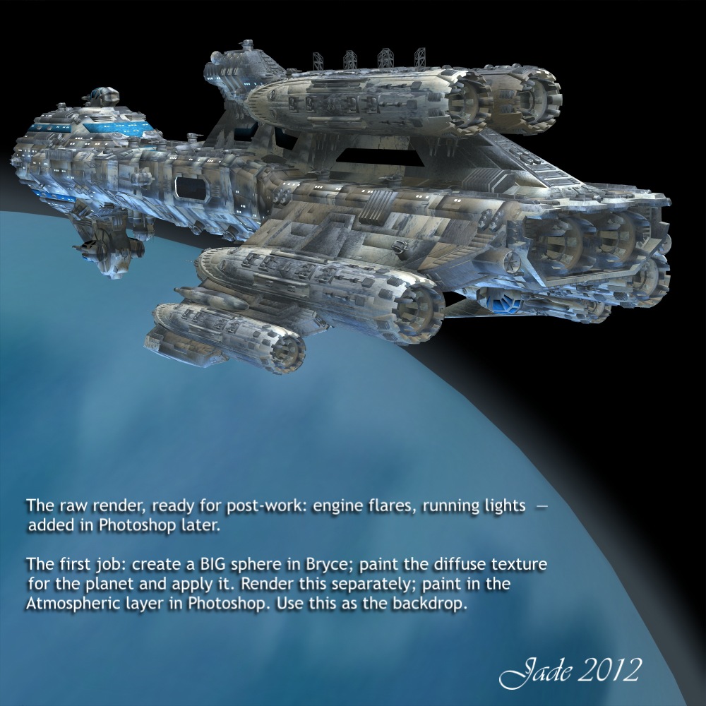
The next major element to be rendered was actually the planet! Working wholly in DAZ Studio, you're a bit hamstrung by what you can do with primitives -- ie, spheres. DAZ's spheres don't enlarge very well. When they get very big (or you get very close to them), you start to see straight lines around the edges, because these primitives are actually made up is gazillions of planes. So I went into Bryce, made a biiiigggg sphere and exported it as an OBJ. Then, I wanted to paint a diffuse map to make the planet beautifully blue ... I was thinking, Aurora, from Aphelion. To do this, I took a photo of the sky on a blue-sky day with white clouds, and in Photoshop put a heavy motion blur on it. Done -- how easy was that? The picture was saved at 2000 square, applied to the sphere in DAZ Studio, and rendered ... the render was passed back into Photoshop to that the atmospheric haze on the edge of the planet could be painted in. Save this ... pass it back into DAZ Studio and use it as a backdrop. Now --

Time to work on the ship! I know, I know ... this is not the NARC-Athena as described in the books. To built that, I need to be working in a 3D modeling program. They have learning curves like the north face of the Eiger ... in the last few years, I've either been working flat out, or sick, or (frequently) both, so I haven't had the time or the braincells to learn a new program and actually build the NARC-Athena. So --

This is actually something called the Allied Fleets Frigate, which costs about $30 from Renderosity. It's a lovely model, and you can do a lot with it. Here, I've fractionally changed the dynamic by stretching it in one axis ... and I've changed 100% of the textures on it, to get a whole new look. It was then lit from two angles. One -- the sun angle, to match the light falling on the planet (several glaring spotlights, far outside the frame), and two -- blue light reflected up off the planet. 

The ship was rendered at 3000 pixels square, and then shipped into Photoshop to have the engine flares added, and the red beacon lights marking high points on the hull, for aircraft avoidance. These were done with .abr brushes -- specifically, Ron's Bokeh Lights.

One element remained to be rendered. Yep -- the NARC riot armor...


Now, as I was saying a moment ago, I never did climb the learning curve to master a 3D modeling program and build the NARC armor as it's described in the books. But I was able to cobble together something very like the armor -- certainly good enough to do the trick, till I can make the real thing! What you see here is jigsaw puzzled together from two different body suits; two suits of SF style armor; a "survival" suit; and an SF style costume for M4. With he exception of the helmet, I'd just about defy the folks who designed the originals to tell the bits and pieces apart...

The trick was to dump every single surface map off every single bit, so the whole suit turned into featureless white plastic, and then start again, and build it back up so everything matched. Obviously, I made everything black, glossy and reflective. I made everything very smooth, and used a reflection map -- something I don't normally do -- to get uniform, consistent reflections, across the whole suit. I used the map because (duh!) I rendered the suit alone, and there's nothing else standing in the frame for those surfaces to reflect. Then ... lights. I did red, blue and gold lights to pick out the armor in dramatic colors; then this was rendered at 3000 pixels high.

In the books, the armor is made of kevlex-titanium alloy. The pieces are "smart" ... you put them on piece by piece starting with the boots, and they "smart seal" around your joints. It's incredibly heavy, but when you put the shoulder pack on, which contains the power source, the anti-gravity turns on, and you can set the apparent mass of the whole suit anywhere you want it ... say, 250 kilos, to hold you down while an explosion goes through, or 20kg, to allow you to literally jump over a house. Soooo cool. The biggest difference you see between this armor and the "hardsuits" as described in the books is the helmet. This is not the NARC helmet.  But it's a heck of a nice helmet, and it'll do! (In fact, it's one of the two helmet designs that come packed with the Sedition Soldier for M4 kit.)

Now all the pieces were assembled, and it was time to start putting them together. The first thing I did was use a lot of compressed, low-rez cut-outs to get a "sketch" going ... basically, to make sure the design I had in mind was actually going to work. And it did. So, now I imported each of the high-rez elements into a new Photoshop project that was created at 4800 pixels high. Cut out each of the picture elements, and start painting on them...


Each of the characters was painted -- skin tones, eyelashes, hair, shadows. This was where I really, really got to play with my early-birthday-present. The Wacom Bamboo mouse/tablet is a dream. This was also a great project for me to start getting in some serious practise with it ... it's very much like drawing with a fine pen, and I love the way it "shakes hands" with Photoshop. 

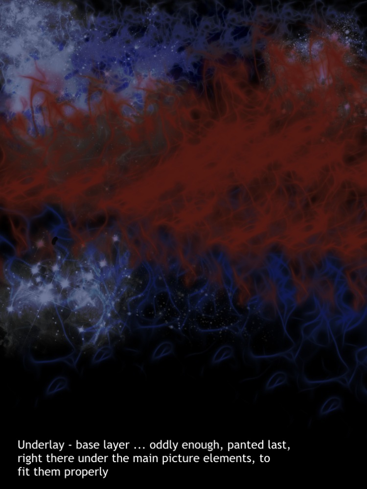
Usually, you'll hear me saying, "start at the bottom and work up," when you're building a complex piece of art, but it turns out that there are times when you'll paint the bottom layer last -- and this was one of them. I'd bucket-filled the base layer to flat black, to let me work on the individual elements; then, with them all done, it was time to fill in the background with dramatic stuff, to make the image consistently interesting across the whole frame:


...this layer was painted right there, under the major elements, so there was no guesswork about where something ought to be, or how bright, or what color. To do this, you're painting on a 4800 high canvas, with your brush size set to 2500 pixels. It's huge ... and I am soooo glad that I got some extra RAM a few weeks ago. I'm working on 16GB of RAM now (with four processors threaded to work as eight). The lag time in the painting process, from brush stroke to "done," was usually unnoticeable; only big blending strokes, using the smudge tool, had a visible, measurable lag. No problem. Slower computers will show a longer lab, but her, just be patient. This background was done in five layers: black underlay; blue "flux" effect; red "flux" effect; bright white starfields; flat blue matte overlay adjusted to juuuuust the right merge mode and opacity to give you this result. The flux effects and starfields are .abr brushes -- find them at Renderosity.

The logos were done in Serif Page Plus ... I'm still using X3, though I believe X5 is out. I'll upgrade when the newer versions do something that I can't do, and need to do. These logos were done in Bolts SF font at something like 100 point. In Serif, I did the big logo green, with gold highlights added with several 3D lights, matted on a black rectangle. Copy to clipboard; paste right into Photoshop. Get rid of black rectangle ... duplicate layer. Make a drop shadow by modifying the lower of the two (adjust lightness to black, apply heavy Gaussian blur), and jog the top layer up and right a bit. Lastly, I "walked the color" of the logo through every shade in the spectrum to find out what worked best. It was going to be green, gold or red, and it turns out, red works best.

The final effects were done in Photoshop: lens flare; a shimmer dancing off the movie logo; major lens flare falling right over the logo; and a diffuse black border under the logo but on top of everything else. Done!

WALLPAPERS
These crops from the final image are 1600 pixels wide. They'll suit almost all monitors. I have them set on a 22" flatscreen and a 15" laptop, and they look ... amazing. Enjoy!


With this project, I'm marking the third birthday of this blog! I uploaded Post #1 on September 25, 2009, which was about five weeks after I started up DAZ Studio 3 for the first time. For post work, I used Micrographx Picture Publisher until I upgraded to Windows 7 and a 64 bit system, which won't run MPP. Three years later, I still Use DAZ Studio 3, (because I -- can -- not -- stand Studio 4), plus LuxRender; plus Photoshop Elements, plus Bryce 7 Pro, plus Serif Page Plus X3. I do have Poser Pro 2010, but don't use it ... too cumbersome, and the Firefly Render Engine doesn't produce work which is one bit superior to LuxRender. I also have Cararra, in which I'll one day -- I swear! -- do the 3D modeling part. All I need is time and health. (On the desk next door, Dave has Vue Esprite with a load of plugins, and he's doing marvellous work. I need to learn that. One day...)

So  it's Happy Third Anniversary!

Next: Abraxas, in a couple of days.

Jade, September 25 ... 2012