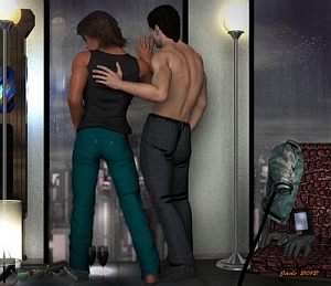
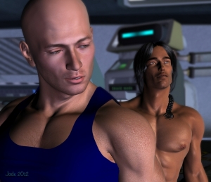
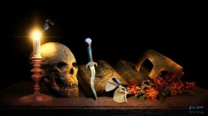
click to see all images at large size
Let there be Lux! As in, LuxRender. It's the first time I've dabbled in Lux in a few months because, frankly, it takes more viable braincells than I've possessed lately. If you know me, you know I haven't been well. If you know me personally, you know why! As they say, "This too shall pass." They just didn't say when! So --
A few days ago I got the hankering to play in Lux, and started it up. First shock: I've forgotten 90% of everything I figured out in the first part of this year. I made some mistakes, and to be honest with you, I still haven't a clue what I did wrong. I wound up reading my old blog posts, looking for clues! But toughing it out bore dividends in the longrun --
Compare the difference between the raytrace and the Lux render:
Oh, yeah. Remember last year, when I used to rabbit on about not being able to get lustrous skin tones out of the 3Delight render engine, which is built into DAZ Studio ... and I even put down the credit card and bought Poser Pro, in search of those skintones, which are doable with Poser's Firefly render engine. (I still have Poser Pro installed, but since it isn't and can't be, installed on my C: drive, I can't do much, if anything with it ... because the human models, Michael and Victoria, refuse to install to Poser if the installation address does not begin C:\ ...) However, I'm glad to say that from what I'm seeing lately, a good Lux render is rather superior to a Firefly render...
The operative word there being "good." And it ain't easy. Lux is a challenge -- and this time around, I swear, I'm going to write it down when I get it worked out! (I could do worse than blog it here, because I can always come back and read my old posts.)
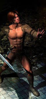
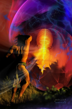
In this render, which I call Leon at Dawn, I had multiple problems, not just the fact I'd forgotten some of the Lux process. I think I set a light wrong, because the image was consistently either red or yellow, and I could never achieve a natural color! This was a fairly easy fix in Photoshop, after the fact. But there was worse:
When you're raytracing, you just don't see mangled, buckled, smashed up mesh. 3D figures are made of gazillions of polygons, forming a mesh for their skin, right? When you push a model too far, through too many deformations, to get an extreme pose, the mesh can buckle. But when you're raytracing, you'll never actually see the base polygons themselves. In Lux Render? Ouch!! I'd set this picture to render overnight; came back 13 hours after it began, and was horrified. (This is why you weren't looking at this picture days ago.)
Now, if I'd overdriven the model by pushing it into poses that had smashed up the mesh, I'd have gone back to scratch and rerendered the whole shebang. But the left arm tells the story: it's just hanging there, relaxed. No reason whatsoever for the mesh to be mangled. And what about the forehead, where the head and the brow components seem to have parted company?! So there wasn't much point in rerendering it.
Photoshop to the rescue. I did a lot of "painting" on this one -- and I put that word in the quote marks because "painting" isn't really the right term. Fixing the figure was a question of cloning swatches of nearby, and perfect, skin, copying them over, pasting them over the damage like patches or bandages, and juuuust blending them in at the edges. I did this in about a dozen places ... right shoulder, left elbow and forearm, forehead, even the torso. Then painted the shadows a little bit, to further fool the eye. The effect is pretty good. You really, really have to know where to look to see the fixes, and even then, you need to squint. I'm happy.
(This part of the job was very much like photo restoration, where you're mending parts of an image that have been, for instance, stapled through. The techniques are so identical, I'm adding the tag "photo restoration" to this post.)
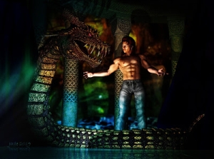
There was more, though not quite as dire! Thirteen hours of rendering, and I look at how Lux is handling the texture on the column in the background, and say "ugh." (See below) The rayrace was close enough to what I'd wanted for me to say, "sure, I'll go with that." But Lux's version of it, seen at full size, is not very convincing. Did I miss something? Should I have set some displacement or bump mapping?? I don't know, yet (will figure it out), but I did want to save the picture without having to do another overnight render. Sooooo....
There's a technique I've seen done here and there, where you take a raw texture such as the stone you see in the montage above ... you paste it right into a Photoshop layer, and cut, stretch, skew, till it fits and assumes the appearance of what you have in your imagination. I've never done this before -- never had a reason to. But since I saw, a long time ago, a chromium-plated frog that had apparently been done this way, I've wanted to try it. Now, I don't say I could spend 20 hours chrome plating a frog piece by piece for the fun of it, but this fix, here, was dead easy. It was done in two pieces: one for the cap on the column, one for the body; then the shadows and highlights were hand-painted to make it look like there's curvature on the column. It worked, it's effective, and it was surprisingly quick!
The photographic realism Lux Render achieves made me want to push one one step further. This picture uses the character I designed a couple of years ago, and whom I call Leon. This is the first time I've rendered him in Lux, though you've seen him numerous times in raytraces -- notably, in the Abraxas story. But this one is so photographic, it was almost like meeting the real-live human who modeled for the artwork. So I thought, how about the traditional b&w studio photo? Here we go:
Do see this at large size (I've uploaded it at 1200 pixels high), because at that size you'll see the effect that adding film grain contributes. It's quite startlingly realistic. One thing that also works out well in monochrome is that I'd hand-painted the "margins" of the hair, so that you have all those stray wisps that look natural, rather than having something that's "all of a piece," and sits on the head like a hat. The conversion to b&w makes this look very, very real. (I love my Wacom Bamboo!!!)
So, this is DAZ Studio's Michael 4, wearing his High Rez skinmap and the Midnight Prince hair set to auburn or chestnut, I forget which. Face and body morphs by me. In the background is a column with a nice warm stone texture added, plus two or three lovely little fir tree props (by Rhodi Design ... from Content Paradise, which is the 3D store at Smith Micro). The backdrop is one of my photos a woodland scene, blurred waaaay out and darkened. I have one light set: I named it "sun" and set it low, so it could easily be the rising sun. The scene was set up in DAZ Studio, and rendered in Lux ... then the fun began in Photoshop.
Next, I need to seriously jog my memory regarding Lux! I worked it out six months ago, so I can do it again. And while I'm at it, I need to write the next chapter of Abraxas ... and make a slideshow of the images I captured at the wildlife preserve a week or so ago ... up close and personal with kangaroos, dingos and so on. I don't know how many of you will be interested in wildlife photography, so when I get the show together I'll just include a link. More importantly, Renderosity had a raft of new products showing up in the last week or two, and I indulged myself. Bought a new skinmap, new toupee, jeans, shirt ... and a "graveyard" set that will be perfect for some Halloween type images, in a couple of weeks' time. Have you been with me long enough to remember the Vampire Amadeus and his bratty human sidekick/boyfriend (depending on your preference) ...? They'll be back for Halloween 2012.
More soon!
Jade, October 6


