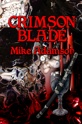
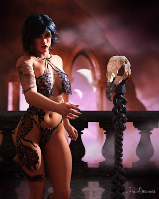
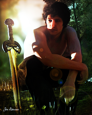
|
All illustrations are uploaded
at full size -- you'll
need to view them at 1:1
to see them properly!
|
If you have a pen tablet and the skill to draw from scratch, any picture will start with a sketch. It’s the “proper” way to create a picture … but not too many people can actually draw! Even artists who
can draw invariably start with photo references. The finished picture will, in almost every instance, be an amalgam of two or several photographs, where you have traced and combined desired elements from each and discarded the unwanted features.
Now, if you can draw, Step One is to start the project with at least a sharp idea in mind of what you’re trying to create. Once you have the image firm in the mind’s eye, Step Two is to gather the reference photos, get into your paint program (Photoshop is great for this … so is Krita), and start tracing off the individual elements that will go together to make your unique image.
But this little tutorial is going to assume you
can’t draw –- or that you don’t have a pen tablet, and no immediate plans to buy one. There’s a hundred reasons for not having one, and not planning to buy one. This doesn’t mean you can’t create lovely images, using tools that are at your disposal, if you have any paint program, or Photoshop (yes, even Elements).
So, assuming you can’t draw from scratch, any image you create is always going to start with one or more photos … but rather than tracing off elements from them and combining them into a fresh sketch, here. we’re going to start simple. In this tutorial, we’ll take the simpler (faster) route, and create a painting that takes
no drawing at all. None. I promise.
It all starts with at least one photograph! In a perfect world, it would be your own snapshot, but if you live in a desert and want to paint the ocean, or on the plains, and you want to paint mountains, you’ll have to find your base photograph(s) elsewhere. Ideally, these need to be free images. You don’t want to actually steal photos from photographers ― luckily, you don’t have to.
The Internet is
teeming with freebie sites. There’s everything from the free wallpaper sites, which supply high quality images, to user-driven sites like pixabay.com …
millions of free images that are posted by users via another form of visual social media. They’ve been made available for visitors. There is also Wikimedia, brim-full of non-copyright images. As a last resort, consider the actual gist of copyright law: a new work (literary or artistic) must be 15% different from the original that was its source. Well, even supposing you stole a photo from a photographer, the image you’ll be creating will be about 75% different, so if push came to shove … well, I leave the ethics of the art to you! I’m not here to talk ethics, rights and royalties!
 |
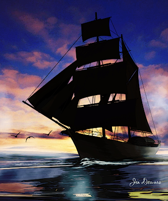
| Found on Pixabay (free) ... it'll do for the base image! |
So, this will be my picture. I’ve sized it to 1600 to 1067. Why? Two reasons. One: this is one of the standard aspect ratios for images. Two: it’s
not very big, because it doesn’t have to
be very big … because I’m
not painting by hand on this one. If I were going to paint with the pen tablet, using Photoshop or Krita, I would set the size to at least 2500 pixels wide. You need the wiggle room to paint ― but there is a major downside to working with colossal images. Unless you have a supercomputer, the processor can struggle when the images get so big. Any hesitation, lag or delay between what your virtual brush is doing and what appears on-screen can be fatal when you’re painting. Rather paint on a smaller canvas and avoid strife. You’ll know the limitations or otherwise of your processor, so sizing the image at this stage is up to you.
Next, you’ll notice that the picture I’ve chosen is extremely flat. This means it has low contrast, no vivid colors, no real white or black zones, and a lot of chromatic grays. This is what you want, to start with. A flat picture will accept the abuse you’re going to heap onto it, when you come to apply all the filters, all that dodging and burning, the merging of layers with blend modes, the over-burning of the lens flare you’ll be adding. If you start out with a high-contrast image, it’ll be stark before you know it, mostly black and white. So, if your image is not soft and flat to begin with ― go into Photoshop (or whatever), and deliberately
make it flat and soft.
(This tutorial assumes that you know how to do this, in whatever paint or photo program you’re using. In Photoshop, for instance, you want to go Enhance > Adjust Lighting > Levels … and just play around till you see what you want. If you don’t know how to do this, just play. Make a mess, have fun … it’s the best way to learn!)
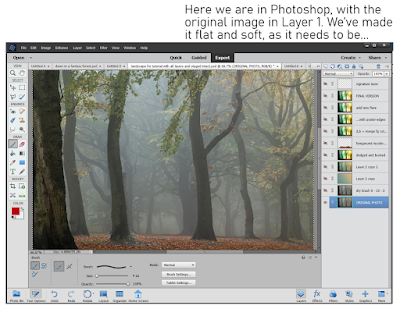
So, now we have our base picture. We’ll put it into Layer One, and rename the layer ORIGINAL PHOTO. Notice all those other layers above it, which I’ve turned off in order to show the base picture. Those layers are where the magic happens, and you’ll be in charge of every filter, blend and merge. Starting with the same image, ten artists will come up with ten different pictures, barely alike. It’s your work … you choose what’s happening on the canvas.
TIP: when you do anything in a project ― apply a filter, adjust the lighting or sharpness, always, always DUPLICATE LAYER before you move on and do one more thing. Work on the clone layer, the copy, not the original layer. If you do further work on a clone, and you make a mess (it’s inevitable; it will happen; no one is immune to this rule!), you can throw the mess in the bin and go back to the original layer. Clone it again before doing things to it. This will save your sanity, if not your life!
If you were going to actually draw now, using the base image as your source, you would start your pen tablet (Wacom or Huion, or whatever; I have used both, and currently use the Huion while the Wacom Bamboo is put away). You would create a new layer op top of the photo … you would select a brush to draw/paint with … pick a color from the photo to paint in … and, in the new layer, you’d start to trace over the shapes and forms of the trees, plants, water and ground. You’d change and adapt what you wanted to change ― say, take out a fencepost, or get rid of a parked car, or omit the trash somebody dumped!
Since you’re
not drawing here, instead, we’re going to use a shortcut. Photoshop has a wide variety of filters that can
sometimes give a photo some of the characteristics of art. The filters are not fool proof. They often do not work well. Even when they do work, if you just slap a filter onto a photo and call it “done,” all you have is a Photoshop filter slapped onto a photograph … it doesn’t look very good. It certainly isn’t an enchanting painting.
But the process of adding a filter to the photo is the first step in getting to the painting.
This is the trick that saves you having to draw, if you can’t draw, don’t have a tablet, or don’t have the time. There are all kinds of filters, some quite good, some really bad, some utterly pointless. A handful can work well some of the time, but don’t expect them to work every time ― it can be a bit of a crapshoot!
It’s up to you to choose the filter you like the best. No one can choose this for you … you are the artist, and this is your project. The photo is going to turn into a painting
in your way. No one else’s!
You’ll find the filters here: Filters > Filter Galley … and you’ll need to sort the wheat from the chaff. It’s mostly chaff. Very few of these filters will do anything at all for you. If you apply just one, the result will probably be boring, lifeless, flat ― nothing enchanting about it. This is just the first step.
So, here is Step Three: apply the first filter, whatever you choose. In my picture, I applied Dry Brush, with a brush size of 0, brush detail of 10, and texture of 3. You could use anything you like … but remember that what you choose must be matched to what the picture needs, or it won’t work out very well. This is why “Zen Photoshop” really is art, not just a mechanical process.
Experiment with all the filters. Apply them all, configure them all, delete what you don’t like till you get to something you do like. Save the file. Now that you have Step Three to your liking, immediately duplicate the layer … you’re going to be working on the clone, not the original!
Okay, now we’ve got some lines into the picture, which simulates the work we’d have done by sketching or tracing, the next thing to think about is the color scheme, or pallet. If I’d sketched the whole thing by hand, color would still have been the next thing to tackle; at this point, the process is fairly similar. Now, if I were painting by hand with the pen tablet, this is the moment where I’d take a large, soft brush and start to put in swathes of color, which set the tone, and would also decide which will be the light and dark areas in the finished piece…
Using the shortcut method, it’s not so different. To a certain extent, the colors are already in the picture, because it started as a photo ―
but the colors are all wrong. I had an idea in mind when I started, and this picture is not even close. I wanted “early morning in an enchanted forest,” but the photo I started with is just a kind of misty, murky twilight. All it gives me are the shapes of the trees. That’s only the starting point. I need to get the colors I want, or it’s never going to look like an enchanted woodland.
There’s two ways to go. You
might get lucky with Photoshop’s “colorize image” function ― I haven’t had much luck with it, and seldom use it, but it’s worth trying. To do this, convert your cloned layer to monochrome, and then … colorize it. See what happens. Don’t be surprised if it’s not very good; it seldom is!
So, I always go the other way, and deliberately set the specific color pallet I want. Okay, so how do you do this? It’s actually not that difficult. In your mind’s eye, see the colors you want. Now, open the color picker pallet. Choose two colors that represent
the most opposite colors in your imagined painting ― it could be the sky and the ground, or the light and the shadow areas. Set those two colors as the active swatches ― ie., they will be the ones your brushes are painting with, and which are used by the bucket fill tool … and when you option the gradient tool, you’ll get both.
This is what you’ll be doing. With the colors picked according to the image in your mind’s eye, select gradient fill. Create a new layer ― and fill it with a gradient. It’s hit and miss in Photoshop, so keep stroking the input path across the screen till you see what you want. Got it?
So far so good. Now,
put a blend mode onto the layer to bake those colors into the layer below, which has the photo converted to lines. Aha! The magic begins as the picture assumes the colors you want! For my picture, the blend mode I used was Overlay, at 100% opacity. You could choose from half a dozen blend modes, and adjust the opacity from 10% to 100%. Only you know what you want your picture to look like. Get in there and play with the blend modes and opacity till you see exactly what you want.
Got it? Then, merge the bucket fill layer into the layer with your chosen line filter. And duplicate the resulting single, fused/merged layer immediately, so that you can go on to the next step.
With the colors set, it’s time to breathe life into this project. The magic happens when you begin to paint with light ― literally.
Look long and hard at the picture. See, in your mind’s eye, where the light is coming from. Can you see it? If you can
see it, you can
paint it, even with a mouse. The tools you’ll be painting with are dodge and burn. Dodge make areas of the painting brighter. Burn crushes the shadows or mid-tones, making them darker. You’re the artist: it’s up to you to paint with light and shadow, and create the picture. You have the outlines; you have the colors. Now ― paint. You don’t need a pen tablet for this; the work is not fine or detailed. Dodge and burn are more like “area weapons” than fine-scale tools. They’re best applied over significant portions of the image ―
Tip: go carefully, applying about 10% or 20% of dodge, and maybe 5% or 10% of burn on any one click. Build up the effect, little by little, and let the image take shape slowly rather than trying to do it all in one mouse click.
You’re the artist here. You’ll need to use your artist’s eye, your judgement, and create the image you saw in your mind’s eye. Photoshop can’t do this for you … this is where the art comes into its own. Experiment; find out what works; throw the failures into the bin and re-clone the previous layer for another attempt until you see just what you want. Note that dodge and burn can both be applied to highlights, midtones and shadows, but you really can’t dodge crushed shadows, and you also can’t actually burn featureless highlight areas to any great effect. Remember, zones close to 1 and 255 have no information in them, and it’s impossible to add information that isn’t there. So be careful how far you go with dodge and burn, because when the information is gone ― when you’ve brightened or darkened too far ― you won’t be able to add it back in. Go gradually, slowly, and build up. (If you do go too far and erase too much information, there’s a trick for getting it back … you can always paste the dead areas over from a previous layer, merge them into the new dodged, burned layer, and dodge/burn them juuust enough to fill in those dead zones. It’s tricky, but it does work.)
At this point, you might decide that you’re finished. If the painting looks done to you, that’s it. If it meets your original vision, you’re done. That’s art, and the call is yours to make.
For myself … I decided I wanted more texture in it. If I were painting by hand with the pen tablet, this is the time when I would start to doodle in color(s) and put in all the fiddly bits, the detail, or pseudo-detail that seduces the eye into thinking you’re looking at foliage when, in fact, you’re not. But we’re taking shortcuts here ― allowing for the fact that you might not have a pen tablet, or else you just don’t have an hour to two to spend faffing around, doodling. For whatever reason, you can take the shortcut.
You can apply another filter, and pour on more texture, save yourself the time and work. This is nothing that you can’t do by hand ― and it’s a lot of fun killing a whole afternoon or evening with this kind of detail doodling. But if you only have ten minutes … Photoshop to the rescue again.
The filter I chose was Poster Edges, with the settings dialed way down, so the filter didn’t ruin the picture….
And last of all, I added lens flare. Go to the very brightest area of the image ― where the sun would be, striking through the morning mist. Go to
Filter > Render > Lens flare, and pick one of three types of lens flare. Position the hotspot. Dial the intensity up or down till it looks right to you. This was the point where I decided the picture was just what I wanted. I did try saturating the colors, but decided this “overcooked” it, and undid the effect. I could have gone on messing about … adding birds and bokeh and dust motes with ABR brushes, but you really can overcook a picture. One of the key things about art is knowing when to stop … when to sign off on the picture, and call it good!
And the result, in closeup, so you can actually see it on the screen here? Worth a quick look before I call this post done:
...and that's the point where I signed off on it and called it done!