Saturday, July 28, 2012

The Forgotten Songs - Chapter Two


Chapter Two

But the man who stepped out of the ruins was not old, and nor did he have the look of any of the trappers who worked these badlands. The local hunters and trapliners were grizzled ne’er-do-wells, almost as leathery as the tanned hides in which they often traded. Martin had seen them, coming into the marketplace to sell their wares. They were bent-backed, uncouth, unshaven, and they smelt worse than the animals they killed.
This man was young, straight-backed, and he walked with an arrogance Martin saw at once. He moved with the strength and flexibility of youth, of the soldier or warrior, and he held his head like a lord. A trapper? At a glance Martin knew better, and he groaned.
Other hunters prowled Barran’s Heath, looking for very different prey. There were faster, easier ways to make a fortune than catching mink and ermine. If a freeman had the courage to prowl the wastelands beyond Esketh and Arkeshan, if he had the luck to stay alive long enough, and not one scruple in his entire body, the marketplace gossips swore he could come home rich.
Just then, Martin’s palms were sweating while his muscles tightened in dread. He kept very still and watched the figure step out of the long moonshadows cast by the ruins. He saw an attitude of contempt as the man came to rest, fists on hips, glaring down at him.
The bulk of a great black leather coat made him seem much bigger than he was, and that coat could have concealed any weapon from a full-sized sword to a shotbow. The moonlight outlined hard, handsome features, dark eyes and a sensual mouth that looked to Martin as if it could easily become cruel. The contempt was written in every line of that face, too, and Martin wondered fleetingly how many other fools the bandit had come upon in this place, every one of them whimpering about being on a quest into the badlands, chasing phantasms told by gypsies.
The voice was deep, strong, harsh, and he spoke with the accept of the local hills. “Do I look like a gnarl-faced, gap-toothed old imbecile? Am I Aelmed?” The man spat into the dust at his feet. “I am Yussan. Do you know my name, foolish boy? You should!”
And Martin smothered another groan, for he did know it. Most folk from Esketh knew it, and they whispered it uneasily. Yussan was a brigand, and he had just spotted tonight’s prize — a tender, juicy prize, probably worth more money in the markets of wicked old Arkeshan than a dozen other idiots he had delivered there I the last year. And if the tales about him were true, Yussan had delivered a great many.
The stories of the road to Atlantis mocked Martin now, as he saw how priceless they must be to Yussan. They were the bait, the lure, bringing prey to him without Yussan even needing to set a snare.
He strutted arrogantly in the deep mauve twilight, and Martin felt the blood rush away from his face. Was he blanching? He knew he was.

Thursday, July 26, 2012

Photoshop retouching ... at last!


click to see all images at large size

As promised -- a feature on retouching in Photoshop. All images have been uploaded at large size -- they're usually at 1:1 size, so you'll be able to see the details. 

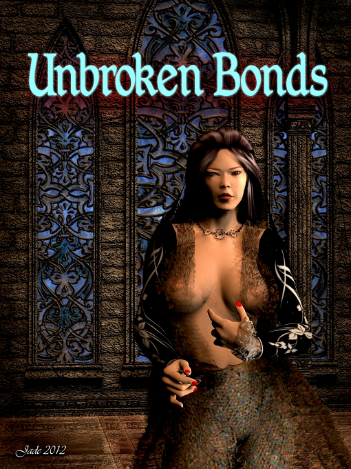
Retouching images in Photoshop is a skill that's essential, if you want to take your pictures to the next level. The difference between a good render and a  fantastic finished image can be startling -- and before you read on, I invite you to compare the above two images. There's a world of difference, though they were both raytraced with the same lights and textures. Everything else happened in Photoshop, in "post work."

I'm working in Photoshop Elements 9. I know version 10 is out now, but 9 gives me everything I need, and I'll stick with it until Adobe makes a huge difference in the program -- a difference that's worth shelling out another large price! I'm assuming the version 10 interface is pretty much the same, so anyone using 9 and 10 should be able to follow me here without problems.

Going into a major retouching project, you'll have rendered your scene (or framed the best-possible photograph), and it'll be pretty good ... but you'll be thinking it's missing something.  If you're delighted with it as-is, you're not going to be thinking about retouching, so we'll assume that, here, you want to take a good image and make it great.

This feature is not about painting as such, because we're starting with an existing image, not a blank canvas. If we were going to 'paint' in Photoshop, we'd be starting with one or more sketches and building up the work from nothing. In retouching, we are actually painting, but everything we're adding is to bring out the details, and make more of the existing features of the painting.

Here is where your artist's eye is critical. Can you look at an image (in this case, a 3D render, but you could also be starting with a digital photograph, or a scan) and see where things need to be adjusted, amplified, diminished? These "tweaks" you'll be making are the retouching process. Like...


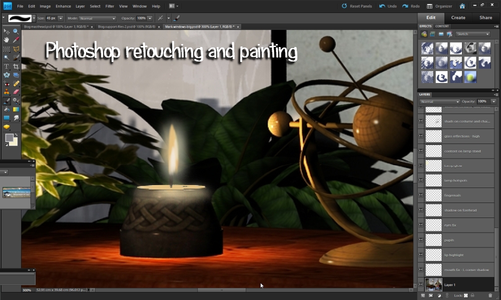
...in these detail crops, it's easy to see what I've been doing. I'm adding highlights and shadows to almost everything, because even in a good raytraced render, the fabric, hair and some of the skin tones looked "flat." In fact, it's often a lot easier to retouch the image, bring it to life, in Photoshop rather than fiddling with the surfaces and lights in your 3D program. Why do I say that? Because of the render time. Each minor tweak in the settings will take a while to render up in test, before you know if you achieved the result you wanted, or it you have to go back and try again (and again, and again...). Three or four hours later, you can still be there, fiddling. Post work in Photoshop can be quick by comparison, and the results ... see for yourself: look at the lustre on the skin, hair and fingernails, not to mention the fabric, and the shadows under the shirt collar, where it lies across his chest, and the shadow under the hair, where it lies on his forehead. 

Obviously, these are illusions. They're effects painted over the "flat" image to bring it to life, and the only question we're asking, and hopefully answering, today is -- HOW?!

In Photoshop, you'll open, or paste in, the original image, and it'll sit in the bottom "layer" of your project. The project is going to wind up like thick stack of sheets of transparent plastic, like the old "animation cells" used by companies like Disney in the days before everything in the world went digital. If you shuffle all the layers into the one pile and look at them from the top, you see the cumulative effects of everything that's been added in, one teeny bit (or layer) at a time.

So the first thing you need to wrap your head around is working in layers:


Over on the right side of your screen is a pane in which you can see the layers stacking up as you create them. In the menu ribbon across the top of the workspace there's a LAYERS drop-down menu; and New Layer is one of the choices. The first thing you get to do when you create a new layer is to give it a NAME. If you don't name the layers, they default to Layer 1, Layer 2, and so forth ... which is dandy, if you're only going to end up with maybe four or six layers. But for this project, today, I wound up about about 25, and you can be soooo lost and confused, if you haven't named the layers! If you don't name them as soon as they're created, don't sweat: you can right click on a layer and name, or rename it later on.

Four things you need to know about layers. 

First: they stack from the bottom up, and the uppermost layers are, in a visual sense, sitting on top of the bottom ones, so whatever you paint into them looks like it's on top of the content of lower layers. This is fantastic for painting mist over trees over hills over sky, for instance. Let's say you painted in a range of hills ... trees in the next layer ... mist in the next layer. Then you went to the bottom of the painting and painted in the sky under the hills, and then clouds on top of the sky, in a layer between the sky and the hills. Aha! You can drag the layers up and down to change their order. You're going to love that feature.

Second: layers have a blend, or merge characteristic:


...and what this means is, you can apply effects to just the layer you're working in, and that layer will change the way the lower layers appear, because of how it, itself, is changed. Let's say you had an area of the painting that was "flat" -- as I had in this image. You wanted to bring out the bright areas and maybe add something that looked like a sheen or glow on various surfaces. You'd do it like this:


In Photoshop, you create a new layer on top of the "flat" picture, and then you paint in a brighter color, where where you want the highlights to appear ... here's the trick: use your color picker to sample the brightest existing pixel in the part of picture you want to liven up (such as the leaves on that plant); then use your color pallet to brighten this way up, close to a pure white. Now, set the size of your brush, and its hardness, and its opacity, to settings appropriate for your piece. Hose on a LOT of virtual paint over the areas where you want the highlights to appear brighter. It looks like you're making a huge mess, but you're not. Trust me. When you've painted over the appropriate parts of the image, go to your Layers pane and set the blend/merge mode to OVERLAY. See how the effects pops up? Is it too pronounced? Could be. So --here we come to the third thing you need to know about layers:

Third: layers have an opacity setting, from 0% to 100%. Using this, you can adjust the "strength" of whatever you've added to the image, to get juuuust the right amount of brightening or darkening. If you're brightening the highlights, the blend/merge mode to use is Overlay. If you're darkening the shadows, the mode to use is usually MULTIPLY, then jiggle the opacity of the layer to get it just right. And --

Fourth: you can also apply filter effects to a single layer, not to the image as a whole. This is great to use for soft, diffuse shadows:


In the original render, the clock looks so flat, it could be a picture painted right onto the wall. So I went in and created three layers on top of the image. One was for highlights; the second was for hard shadows; the third was for soft, diffuse shadows. To paint the highlights, follow the instructions above. To create the hard shadows, it's just the reverse: sample the darkest existing pixel, use your pallet to darken it to close to black. Set the size, hardness and opacity of your brush to exactly what you need for your specific piece, and stroke the shadow in where you think it belongs. Use your eraser tool and your smudge tool to clean it up till you get the illusion of the dark shadow right under the clock. Set the blend/merge mode to MULTIPLY and jiggle the opacity of the layer till it looks good. 

The soft, diffuse shadow? Paint in a separate layer; use a lower opacity on the brush to get a softer darkening effect and go through the layer adjustment process, just the same ... but now, pull one last trick: apply a blur effect to the layer. Because the only thing painted in this layer is the soft shadow, that's the only thing that will be blurred. 

The effect is so easy, and so convincing. I used the exact same trick to get the lovely shadow under the hair on the character's forehead. It looks so natural, you'd never guess it was added later. 

Working around lights is also a challenge. Go back to the comparison shots of the candle on the table. If you view them at large size, you'll see that the candle flame is painted literally from scratch, because the 3D model just gives you something like a "place holder" to show where a candle effect ought to be. Now, in your 3D program, you can work with particle effects, flame effects, reflectivity, luminosity, volumetrics and so on -- you can actually create the effect right there in the program ... so long as you have several hours to fiddle and a looong time for rendering! If you have the time, tools and the inclination to play -- go for it. On the other hand, if you would like to be finished  this afternoon, painting the candle is an attractive alternative. So ... how would you go about doing it?

First, use your eyes. See that the candle flame is made up of a hotspot (the bright area where the color "burns out" to white); and a golden corona; and a halo of light; and notice that the candlelight brightens and warms other surfaces close to is, such as the plant and the astrolabe. You want to make a separate layer for each of these effects: the layer where you'll brighten the highlights on the nearby objects using pale "paint" plus the overlay merge mode, plus a tweak of the layer opacity; then, a layer where you'll paint the halo, using a big, soft brush, very little opacity on the brush, and a tweak of the layer's opacity; then, a layer where you'll paint in the corona, in a flame shape; then the top layer where you'll paint in the hotspot. The pure white hotspot wants to be the top layer; the halo wants to be under the yellow corona...

Painting in the candle flame (the corona shape), you can either hand-paint it, if you're good at drawing with a mouse or mouse pen; or you can use an .abr brush, which would let you zap on the flame shape with one click. If you're using an .abr brush, just make sure to use the right kind of flame, and to get it the right size. You can download .abr brushes from many places (a Google search is a great place to start), and they're often free. You can also spend some serious money on them, and get professional quality brushes. There are marvellous selections at DAZ and Renderosity. Happy browsing!

The other kind of light in this image is an electric light:


In the original render, even though I set a couple of point lights to get the shadows, the lights themselves don't look very "real." Sure, you can spend the next couple of hours fiddling with the 3D settings, and you can get fantastic results. But ... I was in a hurry. Alas, I almost always am! So a bit of post work was the answer, to come up with some lovely results in a few minutes. Just as with the candle, the light bulbs should have a hotspot, a halo, and so on You don't have to worry about painting a corona, because these are physical objects -- big plastic bulbs. So you'll create two layers: the hotspot layer and the halo layer. The hotspot is easy to paint: it's just pure white, where the light "burns out." The halo is done with a big, soft brush, white "paint," and then adjustments made to the layer's merge mode and opacity...

Speaking of the blend/merge modes ... there are loads of them, and the only way to learn how to use them is to play with them. I can't give you any quick way, any "Richard Of York Gave Battles In Vain" mnemonic, because I don't think there is one! But if you just play with the modes, you'll soon get a feel for it.

Similarly, with the effects menu ... there's several different kinds of "blur," even before you get into the other effects, and there are scores! Play. Some, you'll use often. Some will be seldom used. Just remember that you can apply any effect to an individual layer, and then mix it down with the blend/merge mode, and the opacity for the layer.

Painting the shadows and highlights on fabric is a lot of fun. Use the exact same techniques outlines above; work the shadows in one layer and the highlights in another, not forgetting the blend/merge step, and tweaking the layers' opacity levels. Use your eyes and see where the natural highlights and shadows fall, and follow these with your brushes when you magnify them. What you're doing is taking a flat image and making the highlights brighter, the shadows deeper...

Or, you can also decide that the image has an area that "glares" -- meaning, something is so bright, it's "shouting" out of the picture, commanding the eye to come look at it, even though it's an unimportant part of the image. If you go back to the raw render, third from the top in this post, and have a look at the stack of books, you'll see that I dimmed down the bottom of one of the books, which was way too bright in the context of the rest of that part of the painting. Also, have a look at the wax on the candle -- it was pure white and "shouting" out of the image, trying to command the eye. The viewer's eye tends to go to bright places in an image, and linger there, so you might need to dim down some of the brighter zones that aren't important.

One of the things you'll soon learn is how to configure your brushes:


Configuring Photoshop brushes is another skill best learned by playing. You can change the angle, hardness, roundness, shape ... almost anything you need to do with a brush, before you even get as far as the colors and opacities. There are even a few blend modes that can be applied at the brush stage, but I usually find that tweaking the blend and opacity at the layer level works better. 

The simplest job to do with the color picker and brush is to fix "dead pixels." These are pixels that just didn't render in a 3D image ... they finish up white. Or, in a digital photo, they're those "UFOs" or blotches in the sky, or in otherwise plain colors. (Or maybe a bird that blurred through the shot? Or a blot on a window?) Fixing these is easy. Use the color picker to sample the color zone right next to the UFO or dead pixel. Choose a tiny, soft brush and dot in the color till the problem is cosmetically fixed. Do this in a layer on its own, if you can. If you absolutely have to paint directly onto the image, you'll need to "duplicate layer" on the bottom layer where the image itself lives, because Photoshop doesn't let you add anything to the original layer.

So, how many layers can be used to retouch an image? It's only limited by your computer's ability to handle the size of the project file ... but when you're done with a section of the work (for instance, the candle, or the lamp), you can also "merge layers," taking a whole bunch of layers and turning them into one. This can help to control the number of layers you're handling.

When the retouching is all done, you can look at softening, sharpening, resaturating or desaturating the image as a whole. This should be the last phase of the project. You won't know for sure what changes you'll need to make until the whole thing is done, because in the course of the retouching you can find yourself brightening or darkening various areas, such as this:


Until you're finished, you won't be quite sure how bright, how dark, how soft, how sharp, things need to be in he final image, so resist the temptation to mess with these "global" values till you're here:


The original DAZ Studio image uses Michael 4, wearing the Victor skinmap and the Midnight Prince hair set to blond. (The face and body morphs were designed by me.) The costume is the M4 Veranil pants ... and I wish I could tell you what the shirt is, but I can't recall! All the textures were changed out for my own before the scene was rendered. The furniture is the B9999 Queen Ann antique chair and coffee table. The lamp is from the Modern Furniture prop set. The room is the AS New Age Room. Outside the windows is the Dystopia skydome, set for "overcast." The floor was done by increasing the gloss and reflectivity and then adding a displacement map for the textured effect. The window glass was made more reflective and less transparent. Most of the books are from the Apartment Zero prop set, but the big, thick book as actually the "Bible" from the Mesh Manglers Vampire Hunter prop set! The plants and candle are from various DM prop sets, all mixed and matched, and the astrolabe is from The Magician's Study prop set. The scene was lit with a spotlight outside the windows pointing in, plus an off-camera light on the character, plus two "bounce lights" simulating reflected light from the floor, plus a point light on the candle and two point lights on the stand lamp. It was raytraced at 2000 pixels wide.

Hope this helps ... thanks to all those who asked for this feature, and thanks also for bearing with me while I got around to doing it!

Jade, July 26

Sunday, July 22, 2012

From manuscript to bookstore ... a route map to get you there!

The other day I was asked a very good question, and this is an excellent opportunity to answer it, for several reasons. One, I'm in  a blogging mood. Two, I've actually started writing myself. Three, since I've started writing too, I'm thinking analytically about the process of publishing, something I haven't done in years -- and this was the meat and potatoes of the question put to me, which was this:

What does it take to edit, format and publish a book from the time an author hands over the writing to the moment when readers can buy it online?

That's a highly astute question! Let me see if I can put the process into perspective here ... and at the same time show off a little of the art I did as a cover artist for one of the other ebook publishers, while I was working with them in 2010 and 2011.

Here goes...

The publishing process all starts with an evaluation of  the quality of the work that's received by an editor or publisher. Some writers are good enough to deliver what I call "bulletproof copy." This is work that's virtually good enough to go when it lands on my desk. Mel Keegan falls neatly into this bracket, but he's the exception, not the rule. It's far more usual for a writer to need at least a degree of "remedial" editing to get the work fully up to speed.

"Remedial" editing is just what it sounds like: a tidy-up job. Very few writers have grammar that is 105% perfect, 110% of the time. Even fewer writers will be able to hammer out a denouement that is flawless, or close to it. And even fewer will be able to achieve crystal clarify of exposition every time, all the time. A good editor will go through and make recommendations for how a work should be massaged to get it to the point where the reading experience will be highly pleasurable. And let's face bald facts: the writer is trying to please the reader, because they want to sell copies of not just this book, but their next one, too!

So if you're a writer just finishing a book, you might want to bounce it off a couple of reliable "beta readers" before sending it to a professional editor, to get some perspective. The better the work is before you send it in, the better your chances of selling it!

Some writers ... those with many years of experience ... will be able to do all this in their own heads, or perhaps somewhere between their eyeballs, fingertips and computer screens. Let's say you're already darned good and you're sure of the veracity of the work. Next job? Copy editing. Here's where sharp eyes and vast amounts of concentration come into play, and it's true that the more human eyes on the job you have, the better the result will be. Copy editing and proof reading are about scanning on the most minute level, looking for typos (typographical errors), spellos (spelling errors which will elude the spell checker), and grammos (grammatical errors). Even if you known the difference between words like discreet and discrete, and compliment and complement, you fingers can type the wrong one on autopilot, and no spell checker will pick it up. Then there's rhyming typos, and near-mis typos ... like to and too, and the and thee and three, and about a thousand more...

Proofread till you think you're done. Then proof some more. Recruit your friends and relatives to proof for you. As a last resort, high a freelance editor or "proofie" to look at the work when it's as good as you can get it. They'll charge a fee, so make sure the work is very good before you send it to them. A freelance can either heavily correct four pages per hour, or triple-check 25 pages an hour. If the manuscript is problematical when you hand it to an editor, it could cost you a lot of money to get it up to speed...

(And here, it's worth asking the key question: are you sure about your grammar and technical skills? I mean, are you dead sure? Do you know for a fact you have a strangle-hold on the vagaries of the English language, or are you still playing it by ear, taking the occasional shot in the dark, and hoping to score? If you're not so sure of your English technical skills that you can do this stuff with your eyes shut, ask a good freelance editor to look at a few pages for you. Don't submit pages that have been corrected by someone else -- send your own words, just as you write them. If they come back heavily annotated, you'll know it's time to hit the books and learn this trade before you try to sell your work.)

If you do have to hit the books ... don't worry. It's all part of the process. Every writer, bar none, has to go through this. You'll get through it too, and you can enjoy the journey. The bottom line will be the same: you'll become a good writer who's ready to go pro. It'll soon be time to submit your work to an editor -- or, time to go idie, if you've caught the DIY bug. And let me assure you right here, there is nothing wrong with going indie! It can be a lot of fun, and if you do it right, it can be lucrative, too. The only thing readers demand of you is complete professionalism, so you'll need to gird your loins and give them what the want: 1) a top-notch story. 2) Good writing skills. 3) "Proper" book packaging. 4) A lovely cover that will catch their eyes in a catalog. (The eye-catching cover is essential, because if you don't catch the eye in the catalog, readers won't even be reading your sample chapter.)

So the next step in this logic chain is packaging. Once you've reached the point where you firmly believe the body of the work is polished till it shines, it's time to get it into a shape that's acceptable at market. To quote Han Solo, this is where the fun begins.

You might think packaging starts with the cover ... and you'd be dead wrong. Your first question needs to be this: "Who'll be reading this book, and what will they be reading it on?" It's true to say that about 75% of your readers will be reading on a Kindle! So you can let Kindle worry about packaging the product. Make sure you get the "front matter" right, and do a top-notch html file for upload to them, and they'll take care of the rest. But if you only release through Kindle, you're losing twenty out of every potential hundred bucks. It's worth going the extra distance and producing at least two other file formats: epub and pdf.

Everyone in the world can make a pdf these days, so I won't even go there; but epub is still new enough to be worth talking about. Even now, it's a marginal format -- meaning, fewer people are using it than ought to be ... because it's not only better than pdf, it's far, far better  than pdf, and if the format is properly promoted in the near future it won't go the way of Betamax! If it does, I'll be grinding my teeth, because epub is the perfect format for any device I own (BeBook, Android tablet, smart phone, laptop, desktop) while pdf gives me no end of headaches on the BeBook and 7" Android tablet ... and on the phone, phhhtttt. Forget it. Phones hate pdfs. Yet most people (up to 80%, according to the forecast) will be reading on phones inside the next few years!

So here's a tip: don't get too cheap. Spend forty or fifty bucks or so, and get a proper program to make proper epubs. Play a hunch, and guess that there's going to be gajillions of readers like me in the future, who're more and more predisposed to using only epubs because pdfs are just too much hassel ... and we love to read on our phones. So long as you have a program to make the epub for you, you have no problems. The file will be fully professional -- which is what readers demand. If you try to use one of the online "converters" ... well, they're free. That's about all you can say for them. The product? Crap. Sorry, guys.

Now you're cooking: the book is well thought out and plotted, well written and edited, proofread to death; you've done your html for upload to Kindle, your epub and pdf making software is on standby. Now -- now! -- is the time to think about your cover art. And this is where someone like me comes into the picture.


There are artists out there everywhere, and a lot of them are very, very good indeed. The only thing you need to make sure is how much they're going to charge, and if their work is what you want/need. As a hint, or tip, don't pay an arm and a leg, because there are artists who'll deliver fantastic stuff for under $50 -- even under $40; and if you'll take an "off the peg" or "ready to go" piece of work, you can get out of this particular wood for under $30! A red hot tip? Unless you're as sure of your artistic skills as you are of your grammatical skills, don't try to do the cover yourself. Its another of those instances where getting too cheap will hurt you in the long run, because ... well, now you're tickling the wonderful world of marketing books, where having a great cover is one of the concrete ground rules. I'm only going to say a quick few words about marketing books, because this was't part of the original question!

The original question was about what goes into getting a book from the submission copy to the point of release, but What Happens Next is an even bigger story. For instance, it's easy to whack your book onto Kindle, but here you are now, with a fantastic epub and pdf ... what next? You'll need a website and/or blog to sell them. You'll also need a file server to deliver the books and track sales, and pay you. Good news: anyone with PayPal can get a Payloadz account, and this answers almost every question you have about file serving and tracking, in one hit. A website? Well, give some serious thought to using a Blogger blog like this one! Whack your "buy" buttons into the margins as "gadgets," and run your blurbs and covers in the posts. Umm ... duh. But what about getting into those other stores, like Apple iBooks, and B&N Nook, and Kobo, Sony, and so forth? Well, up to very recently I'd have had to say that Smashwords was the best way to go. They're an aggregator, or accumulator -- meaning, they take in books at one end from writers and indie publishers, and they hose them into the big online stores, like the aforementioned. But...

It is nooooo secret that Smashwords can, and does, drive saints to drink. There's a thing the boss, Mark Coker, calls the 'meatgrinder.' I've had reason to call it 'the sausage machine,' because it can make you feel like you've been through a garbage grinder yourself! It's the conversion engine at the heart of Smashwords that takes in the trim, spruce .doc file you submit and (theoretically) converts it into html, pdf, epub, mobi and so forth. When it works, it's a dream. But it doesn't always work, and when it doesn't, you get error messages about things that don't actually need fixing ... a book can wind up 'caught in the machinery' for months. Mel Keegan's Flashpoint was caught that way. It went into the big online stores (other than Kindle) four months late, and there was not one thing we could do to get around this. In all fairness, I'll admit that 80% of the time the Smashwords engine works just fine. But when it chooses to hiccup (or barf, as Dave says), it's the most infuriating process in the world. And it turns out, you have an option. Read on!

Lately, Lulu has branched out into ebooks. Not only that, but Lulu will put you into a lot of the same stores that Smashwords reaches ... moreover, somehow (and I have no idea why), the sales at Nook and so forth tend to be a leeeetle but better via Lulu than via Smashwords. But here's the big thing: the process of getting to Nook and iBooks via Lulu is very, very easy. You send them a pdf and they do the rest. There's only small downside: the epub file will have unjustified text. Before you have the heebie-jeebies about this (too late, right?) it's a good idea to do some research not only into the devices people will be using to read, but also into the software they'll be reading in. One of the most popular epub readers -- free and downloaded hundreds of thousands of times -- is known as Moon Reader. And no matter how brilliant your epub is, Moon Reader will not display justified text. So, before you ditch Lulu as an avenue to get you easily, painlessly, into the ebook stores, think about the number of people who're reading on Moon Reader. Ahhh....so.

Now that you have have your stock and distribution figured out, you're ready to start marketing ... and you'll be asking, "How do I sell books?" That really is another question, and not one I'm going to tackle here, because it's way outside the scope of the original question. However, Mel Keegan has written a fantastic article on this subject, which is about to appear in a book, some time in July 2012. When that book comes out, I'll return to this post and update it with the url.

So ... how long does it take to go from Finished Book, to In-store and Earning? This depends on how much editing you need to go through, how long the book is, how many proofreads you can organize, how exacting you'll be with the cover art, and if you go smoothly through the process of upload to the engines which get you into the stores. Kindle takes just a couple of days to get a book into the catalog ... on the other end of the scale, if you decide to publish in paperback too, you'll need to format everything, then order a physical proof for delivery by mail, give it the OK, or correct it and go to another proof, and so forth. Paperbacks are a different animal, and a complex one, which might account for why the vast majority of publishing these days concerns ebooks! If you can organize reliable editing and proofreading, and you know what you're doing with the software, you can get through a normal-length book in a month or so. That's a book of something like 80-100,000 words. Longer books simply take more time. An artist should be able to deliver a finished work in anything from a few days to a week, depending on what complexity you're asking for. Then, entry to the Kindle catalog takes a couple of days, and getting to B&N, iBooks et al via an aggregator can take from a few days to a few weeks.

Then the marketing starts ... and as I said, I won't tackle that here, but will wait till the book for which MK has recently written a very good feature is released, and will return and update this with the url.

Hope this has been useful!

Jade, July 22

Friday, July 20, 2012

The artist writes: the plunge is taken: The Forgotten Songs -- Chapter One


Chapter One


Barran’s Heath stretched north and south into the blue distance, misty under the light of the full moon. A dozen miles away in the east was the ancient port city of Esketh, and much further, over the dragon-back of the Blue Mountains in the north, was Arkeshan itself — renowned as the ‘city of silk and sin.’ Closer at hand, the heath was a harsh place of bare rocks and ruins that might have been the bones of great animals that had died here millennia ago and were weathering out of the thin turf.
This place had a bad reputation. Bandits ranged here, striking out of mountain lairs — the old folk spoke of rogue sorcerers who could command terrible demons, and even Martin knew about the slave traders who worked the trails that snaked like serpents through the badlands.
Few people who ventured out on Barran’s Heath by night were anything less than bad company — Martin knew the risks. He had always known. Six hours before he had chosen to accept them, but the sunny afternoon, the noise and excitement of the marketplace, the smell of spice and incense, seemed a thousand years ago now … and after dark Barran’s Heath was the last place he wanted to be.
It was still daylight when he found his way into the strange, wind-sculpted ruins. People said they were ten thousand years old. Martin knew nothing of their history, only that they felt haunted, and he wished he was far away.
Waiting there for hours, he had watched the sunset and the twilight gather, as daylight spent itself. The early evening had been glorious, and now the stars would have seduced any astrologer from the marketplace, any astronomer from the royal court of Arkeshan. But as daylight faded into the myriad tones of blue and mauve and indigo, wolves began to howl. Now, mist gathered in the lowlands, where spiny trees somehow clung to life and the ancient ruins took on the appearance of bleached bones.
His pulse was fast and his skin prickled with sweat though the night air was chill. He wished he had dressed more warmly, but he had come here direct from the market, when the afternoon sun was too hot for comfort. Like most young men his age, he wore a wrap about his hips, boots that could have used a lick of polish, and a hooded cloak which was more useful to protect him from the burn of the sun than the icy fingers of the night’s growing chill.

Tuesday, July 10, 2012

At last -- my gallery! 600+ of the best images


At last -- at last! -- my Gallery is done and online, and as the post title indicates, there are over 600 images in a dozen categories. What else can you say about it? Hope you enjoy visiting ... here's the url:

EDIT: the ancient 2012 Gallery has gone and is being replaced, in 2023, with an all-new gallery.

I'll be updating the site now and then with new work, and as I start to write I'll also be posting some readings there. Right now, I'm seriously thinking about a novel -- not Abraxas, Not instead of Abraxas, but as well as. In fact, what I might do is write Abraxas in segments and upload it to my main site, and then we'll see how we go with tackling something like a Very Major Novel. The idea I have right now is huge -- I mean, it's going to make for an enormous book. I want to start out with something a leeetle bit smaller before I launch into a project that'll take a long time to complete just because of the size of the beast. so Abraxas will definitely come along first.

Right now, I'm starting to watch out for the first segment of Event Horizon -- the sixth and final Hellgate novel. If you're thinking it's overdue, you're right! But I can tell you three things right here. One: Mel Keegan is having problems of the RL variety. Life is being a bitch for him, and he's coping at the expense of putting certain items on the back burner. Alas, writing is one of those things. Load him up with one more thing right now, and -- well, you know the old saying about the last straw breaking the camel's back? Not that Mel looks like a camel, but you get the gist of this. Two: Event Horizon is enormous, and it'll be done in segments, just as Flashpoint was done. Flashpoint wound up at 251,000 words, which is four or even five times longer than an average novel in today's parlance. So ... patience, folks.You'll be getting incredible value for money when you pay the usual ten bucks for this! And, Three: Event Horizon is going to be way more than worth the wait. I've seen the outline -- about 12pp of highly detailed notes, as per Mel's usual game strategy. In a word: wow. So I'm watching out for the first segment of Event Horizon; the book will be processed through in chunks, like Flashpoint, and when the last segment is done, she'll be ready to "go." When? As soon as is humanly possible. Beyond that, I can't say ... it depends how Real Life treats Mel! I'm not going to nag about it; I'm just going to look forward to it...

Jade, July 10

Thursday, July 5, 2012

CG fantasy on a really squeezy deadline ... nice!


click to see all images at large size

This one was a tremendous pleasure -- a commission, to illustrate a story in an upcoming magazine. As I read the story, at least a dozen illustrations jumped into my mind, but this was the one that was the "stickiest" -- meaning, the one I kept coming back to over and over.

What was I saying last week about rendering large and then cropping to your heart's content? With this one, the editor will have loads of options -- and you can even cut entirely different images out of it, just as you could with the gypsy boy. Like this:


There's also a great fascination for the super-wide shots. I would love to do something that was in "true cinemascope" rather than the 16:9 format that we know so well from tv screens and also YouTube videos. The aspect ratio is close to this:


...the problem for me is that when I set up the shots I usually can't bear to crop out the top and bottom, which is where so much of the beauty is. Though, I have to say the cinemascope crop of this piece looks pretty stunning. 

Reading the story, it seemed to me that the sky and water, the landscape, were principle players, and that any illustration had to feature them, or else be "missing the important part." So the first thing I did was get into Bryce 7 Pro and custom-design the sky and water. Here it is at half-size: 


...this backdrop was actually rendered at 1600 pixels wide and then imported into DAZ Studio for the character and props to be added. You might actually recognize the "actor" ... you've seen him a couple of times, and he was perfect for this piece. The sword is the same prop you saw in the "Absent Friends" piece, but once again I changed the dimensions and switched out all the materials to give it a new(ish) look. The ground cover was done completely in DAZ by using full-size shrubs, but reducing them to about 40% size and sinking them into the "ground" so that only the tips show through and look like small plants. This works well -- it takes a looooong time to render, so I set it up to render overnight -- but it's well worth doing it this way. You get a better overall result than trying to paint the foliage. Also worth mentioning is that this is "just" a raytrace ... if it were a LuxRender picture, it would still be rendering. The deadline was (!) 48 hours, from "go" to delivery. It really was a case of "drop everything and just do it," which was another reason to do the foliage as 3D objects rather than painting them. Painting is fun, and you can get wonderful results but when you're doing this kind of work, you might not have the time to get really terrific results fast enough. The last thing I should mention is that to get the hair to look like that I combined two hair props. Here, you're looking at both the Yannis Rasta Dreads and the Spartacos hair by SAV!

So then the bare render was shipped into Photoshop for over-painting. A lot of over-painting. As cool as the raw renders are, it's the post work that makes them come to life, gives them the depth and vibrancy ... so what was painted? A lot of the shadows, most of the highlights (on hair, skin, costume, sword), mist, birds, "godrays." I think this one was painted in something like about 12-15 layers.  And I'm very pleased with the result.

Adventures in Scrivener Part 2:
It's a breeze! Don't let anybody tell you that this writer's tool is hard work, or has some kind of learning curve, because it doesn't. It's as easy to run as a word processor, and I'm in the process of getting Mel Keegan to switch over to it. Mel is overflowing with ideas but has very little time to write these days, due to having a work load that would drop a charging buffalo in its tracks. Imaging having the ability to open a project and just chuck ideas into it, and then push and pull them every which way. Scrivener gives you this ability, and it's a tremendous freedom. I'm enjoying it a lot ... full marks to the program's designers, who hang out at Literature and Latte

Sorry to be posting so infrequently lately, guys. Haven't been very well,  health-wise, simple as that! But I'm hoping that the worst might be behind me, and I can get well in the near future. So much to do ... so many ideas for art and also for stories!

Jade, July 5 (July 4 in the States ... enjoy the fireworks, folks!)