Monday, April 29, 2019

The tomb raider is out of luck this time!


As the post title says -- the "tomb raider" is out of luck this time. This one was guarded ... but someone as big as you are, armed with a Very Big Spear. A closer look --


Two hunks for the price of one, I guess! This is "The Man in the Hat," whom you've seen before. It's actually this guy, whom you saw in December (dang, is it really that long?!) ...


And that's the exact same Michael 4 character who becomes the Jones-like guy, when you put the hat on him, much less if you give him the whip and the revolver! Is there a story that goes with this? Not as such, unless it's that the tomb raider dude tried his luck here and found that this one is guarded! The hunk who began life a few days ago as Imhotep is on duty here ... he looks a heck of a lot better with hair, no?

And just for fun ... imagine that this is a scene from a move. Here's the movie still version:


I actually like monochrome a lot. There was also something called Sepiatone, a long, long time ago. Anyone old enough to remember that? I'm not, actually, but I'll confess to being something of a movie trivia devotee. Somewhere among my collection of stuff, I have some images that are so old, they were printed in Sepia. They're either worth a fortune or ought to be used to line budge cages, depending on whom you talk to. Ahem. So, this is what a Sepia movie still would look like:


Okay, that's all from me for today. I'd intended to do more, but it's been an OOTDD, One Of Those Damned Days, when you feel baaaad, and there ain't nothing for it but to scramble through and try again tomorrow. Going for tea now. Tomorrow's another day.

Sunday, April 28, 2019

3D Male ... glamor. Yes, let's call it glamor. Hair maketh the man ... really!


What, two posts in a day?! Not really. The first was art done yesterday that didn't get uploaded till first thing this morning, because my laptop developed the weirdest hiccup that made me wonder if I had a virus ... turned out to be a loose USB plug! (The simplest answer is usually the right one...) Anyway -- here is today's work --

Recognize him? You should, but you'd be forgiven for not. Yep, it's the same model you saw as the Egyptian priest yesterday -- What did I do?!


Please do have a look at the above at full size -- sorry about the potential download time: it's 1800 high by 2400 wide, so you can SEE what's going on. I did three things:

1) put hair on him. That's the Yannis dreadlocks, from Renderosity. 2) I switched the skinmap from JM Falcon to SAV Atlas ... and then 3) I got into Photoshop and painted some body hair on him, because nobody I know shaves from head to foot. It doesn't even look natural on a guy. Also, I switched out the texture on the "butt-flap," as George would no doubt call it. Result: whoa. That's actually quite impressive. But nope, I did nothing with the model itself. The hardest thing about the pose was straightening out Michael 4's odd elbows which don't bend believably (another reason to get into the Genesis figures, I know, I know).

I was asked recently why I render guys, and seldom touch the Victoria 4.2 model I have, even though I have it, and its Morphs++ which is needed create characters, and a bunch of costumes. Well, Victoria 4.2 was actually packed free with DAZ Studio 3, and I bought the Morphs++ and costumes when I started producing contract book covers that required the female character. But the easy answer is bound up in these two screen captures, below, from Pintetest, where the "label" or "tag" producing this search result was "3D Character." Here you go ... what do you see:


That's a very fair sampling on the 3D Character label at Pinterest. There are, I think, THREE male characters lost among the scores of babes ... two are trolls and one is a stupid cartoon. The rest are babes, babes and more babes. Now, I have nothing against babes. But not to the exclusion of everything else! Just touching down on the gallery pages at Poser, Renderosity, DAZ ... it seems that nobody anywhere is rendering good looking 3D men. I'm just about the only one doing it!

So ... it would actually be fair to say that after the first 25,000 3D babes, they all look alike (to me), and I can get a leetle bit fed up of them. I like doing pictures of exotic guys. Um ... that's about it!

And I really, really wonder what this particular guy would look like, in LuxRender.

Saturday, April 27, 2019

Imhotep, anyone --? And why we mess about in Photoshop


Answering a couple of questions today! Yes, you can reach me by email, and yes, I do answer questions! Of course I do ... thanks for asking! But first ...

Looking at Gil Cronin in the pictures from April 25th, something jogged my memory. Ah! The Mummy, of course! Arnold Vosloo as the shaven-headed priest who caused Brendan Fraser sooo much trouble during the First World War. Soooo...

Couldn't resist this:


No, it's not intended to look like Mr. Vosloo; just an excuse to play with the Anton's Treasures of Egypt prop set which I bought in a sale so many years ago, and seldom get a chance to bring out and dust off. I need so use 'The Man in the Hat,' and send him to Egypt, don't I! Anyway ... there you go: Egyptian priest. Looks like a supercilious character, actually; the kind you'd like to give a swift kick. But we won't. The eye makeup is hand painted in post ... the skinmap is actually the same JM Falcon you saw on Joe Ramos last week. It's a lovely skinmap.

And so to questions! 

Why do we muck about in Photoshop so much after a render is complete? Well, several reasons. One, even really good renders often show "artifacts" that need to be painted out before you can do anything with the picture. Say, the costume doesn't fit right; the mesh on the body crumples; the hair prop looks weird, no matter what you do with it, or something that should have been reflective just refused to play nice, till you ran out of time to fiddle with it --

This picture, above, had a BIG problem ... but you needed a good eye to see it. Part of the attraction of this image is the high reflection in the polished marble floor, offset by the lovely softness of the background. The problem is that the balustrade in the background is (correctly) blurred by the depth of field the virtual camera perceives ... but when the same balustrade reflects in that floor, the exact patch of floor in which it reflects is smack in the "band" of the image where the depth of field puts this reflection into sharp focus. So you have a blurry balustrade way back there, plus an upside down one in tack-sharp focus -- in the floor! This is actually 100% correct ... but the human eye perceives it as weird!! The only thing you can do is "paint it down," ie., obscure it with over-painting, so the viewer's eye doesn't go into rebellion at perceived oddity.

The other thing one can play with to one's heart's content in Photoshop (or even Irfanview, if you want the freebie that has a zero percent learning curve), is the "balance" of an image. What does this mean? Okay...


...you'll need to see this, above, at larger size to make sense of it, but the answer to your question is in another question: Which version do you prefer? Darker? Contrastier? Softer and flatter? Monochrome? Usually, you have half an idea in your mind's eye before you begin, a concept of what kind of image you want to end up with. For this one, I wanted a hint of sunset beyond the balcony to show through, give us a hint as to what time of day this is. So, not too dark ... but I also wanted to crush the shadows to give the picture some gravitas. Sure, the original render is pretty flat. Hunh. Well, it's just a raytace, after all ... though I might see what LuxRender can make of it. In the meantime, rather than fiddling with Lux for three hours, I decided to put it into Photoshop and rebalance it. This means fiddling with gamma, brightness, contrast and saturation till you see something you like ... simple as that. There's no hard and fast rule about what's "correct." It all depends what you, yourself, want or need.

The same kind of work can be performed on photos, obviously ... and often is. For instance, let's start with the finished shot, which is half photo, half art:


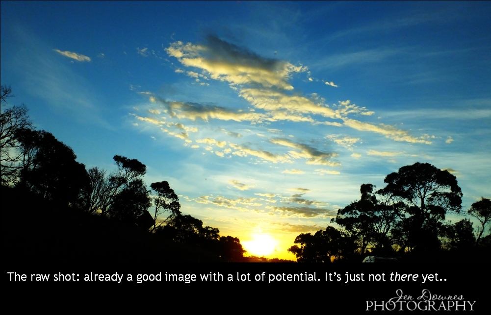
This makes  great wallpaper -- help yourself, I uploaded it at 2000 wide ... you're welcome. But a LOT was done to this shot to get it to this point. Here is where it started:


This was captured through the windscreen, at 100kph, on the way home from the Grampians last month. The sky did the most amazing things that evening. But the original photo has a road sign off to the left, the roof of a car on the right, and a windscreen full of "ufos" (dead bugs) to be painted out. Halfway through the fix-up process, I was here:


And that is already a gorgeous shot. You could stop right there and be very happy with it. I kept both versions ... I like them both. And if you notice, I cut out part of this same image and blurred it down, to use it as the backdrop for Imhotep. Take a look: the colors should look instantly familiar.

And of course you can also add stuff in the post-painting process that ought to be there, but weren't. For instance, the portrait of Gil Cronin. Gil wears a pair of diamond stud earrings, but I don't own any such prop, and I'm not about to go out and spent twenty bucks to buy one, even if I had the harddrive space to install anything new (which I don't: the reason I desperately need a new boot drive ... I'm now under 7GB left, and it's slowing the whole system down). In the interrim, before I can rush out and buy props, it's just as easy to paint the damned earrings! Photoshop to the rescue again, guys.

Some intrepid artists start from scratch and actually paint the whole thing right there in the software, Photoshop and/or Krita, or whatever ... and I've done this on a few occasions. Here's why I don't do it very often: one fairly simple picture consumes several days, and it's a long, slow process involving many hours of painting at the computer. Leaves me with too much pain in back, neck, hands, and often a splitting headache as well! In the same amount of time one could do a dozen renders and touch them up, without pain. But yes, I would, and will, and do, paint, if I'm contracted to, or if I feel like it! I just don't do it very often, for reasons of not enjoying the pain that goes with the job!

Anyway -- that covers the question! Next?

Friday, April 26, 2019

The Raze of Palenque, and SF heroes!


I promised you a barbarian, and here he is! I call this piece "The Raze of Palenque" ... but whether this Conan-clone (Clonan?) razed the temple or tried to save it is another question. I'm inclined to see Conan types as heroes, so maybe he waded in and saved the day. As you know, I'm a huge fan of Frank Frazetta, and I just felt like doing something in that vein today.

Actually, this is a very, very new spin on an ancient piece of work I did for a contracted book cover (The Swordmaker, from Renaissance eBooks, circa 2011, I think). The original work was set up as per instructions from the publisher, character, costume and all; but I always thought, "Dang, what a waste," because the art I was asked to execute was soooo pedestrian. I did the best one could with it, but ... sigh. At the end of the day it was a paycheck. What else is there? But, but, but...

No reason I can't lift out the character, even the pose, and do something fresh, spectacular and rewarding with it. Especially since eight years have gone by ... and don't think Renaissance is even still online. If the book is circulating anywhere, I don't know, so -- here we are.

(For the artists among you: believe it or not, Clonan here is an old fashioned deep shadow map render. I did a raytrace, yes, and this is one of the very few images that looks infinitely better on a plain old deep shadow map, which takes 1% of the rendering time! I have depth of field (DOF) turned ON, and a virtual f-stop of 50, to get this effect. A lot of what you see there was painted in Photoshop, however: you won't be able to score this right out of the render engine. Nice!)

Also --


...this is not a rerender, but a massive repainting of a 2012 image. I always loved this character, but I can't find the project files!!! 😭 Am right now searching high and low for them, on backup drives and so forth. Praying that I put them in some weird place ... I admit, I had a loony way of storing things back in those days. I actually deserve to lose itens. Ahem. Anyway --

Since I can't find (yet) the project files, I decided to put the old render into Photoshop and repaint it. Whoo! Gorgeous result. The original picture was a great idea, but the render was fraught with problems, including the fact that the mesh was trying desperately to come apart! I'd driven the bump mapping on the torso hard, to get real detail out of it, and it was showing the seams in the contours. Sooo, I've done a lot of work there, to correct that; hand-painted the hair, and the eyes; thrown the background out of focus to create proper DOF (which you get in low-light photography), and ... lots of little details, such as brightening up the building lights. It's a lovely result. Photoshop to the rescue yet again!

And...


Just a repost of an oldie, for fun. This one is fine just the way it is, even though it was done eight years ago and painted in ... GIMP! I didn't even have Photoshop at the time. But when a picture is right, it's just ... right. This one is called "Cyborg," for pretty obvious reasons. The only thing I've done with the gallery image is to enlarge is to it'll serve as a wallpaper, if you'd like to collect it. You're welcome ... enjoy.

That's all for today. Good news from the optometrist: my vision has actually improved in the last year, no need to change my glasses, and I don't have to go back till 2021. Phew. Next: call dentist, make next appointment to stand there folding hundred dollar bills into paper airplanes (or aeroplanes, if you prefer) and launching them at the man. Then, if I get a more or less clean bill from him, we can start putting together the funding to look at the computer: new boot drive with contents cloned over; new NVIDIA video card; new USB sockets that don't waggle about; DAZ Studio 4.9.9.9.9.9, or whatever it is (they'll do anything but go to Studio 5), Genesis 8, IRay, and lots and lots of skinmaps and costumes, to get back to where we are right now with Michael 4. Ouch. Bear with me. 😱

Thursday, April 25, 2019

Beefcake, as promised!


As promised, a fresh look at Blue Raven 6 himself, Gil Cronin. That's James Cargill Cronin, to those who know this stuff, nudge, wink! (Credit where it's due: major thanks to Mel Keegan, without whom Gil would no more exist than would Joe Ramos, Jarrat and Stone, and the rest of them.)

This is a terrific character to render, because the camera loves him ... and you can get the fastest raytraces on record, because since he shaves his head you don't have to wait forty-five minutes while the computer does several trillion calculations to render hair. That's the basic, original high-rez Michael 4 skinmap on a face and body of my own design, with some additions: the hairy chest and forearms are hand-painted in Photoshop ... like the diamond stud earrings that are Cronin's signature:


I always liked this character, right back to the first book. Did I say 'beefcake?" Want more? Well --

I've been sorting through the old archives and rebalancing some of the images from yesteryear, and some of them are coming up very nicely indeed. This, in LuxRender:


This one, above, has also been resized: worth seeing this at large size: it's 1800 pixels wide now, and looks a treat on the larger monitors. That looks like the SAV Atlas skinmap he's wearing. It does render up beautifully. I call that character, and image, "Fugitive." Also...


This one is almost a reimagining of a 2011 image: enlarged, rebalanced, blue-shifted, lots of little things done to it, making the old raytrace infinitely more interesting. The truth is, you can get a lot out of raytracing if you know what you're doing. The shots of Gil Cronin are also raytraces ... it's becoming a lost, or forgotten art, in this day and age of LuxRender, IRay, SuperFly, Octane and what have you. That's too bad, actually, because ... Hmm. Well, I put this to you:
NOT an ad. A screen capture... do NOT click!

That's a capture off the actual flag-carrier advertisement for the new Victoria figure, the Genesis  8 female, and it would have been rendered in IRay or, less likely, SuperFly (Poser's answer to LuxRender). Hmm. I'm actually not all that impressed. This is the new Genesis figure, and she doesn't look one whit more realistic than a hell of a lot of the stuff I'm doing with the ancient pre-Genesis, generation 4 figure, and old school raytracing. Like, for instance --


And that is why I'm not going into hock to rebuilt the computer, and racing out to get Genesis 8 and IRay, plus a few grand's worth of "assets," meaning skinmaps and costumes. To be absolutely honest, the only thing about the Michael 4 character that bugs me royally is the way the joints bend. Knees and elbows do NOT bend realistically. If you're highly observational, you might have noticed that these days I tend to keep the arms a lot straighter, or if they're bent, I put a shirt or jacket on him. M4's elbows often don't look quite right when you bend them. And yes, I will get into Genesis and all the rest eventually ... but first, my dentist has a Porche he wants me to finish paying off for him. Ack. Got to get your priorities straight, right? Right.

More soon. I feel in the mood for a fantasy barbarian! Let's see what we can do tomorrow ... after I get home from the optometrist: having my eyes checked and 3D scanned. Dang, is it that time of the year already?

Monday, April 22, 2019

And speaking of skinmaps and characters --


Last post, I was talking about the Falcon skinmap for Michael 4, which I use for the Joe Ramos character, and I found myself wondering ... I wonder what Joe looks like with that hair unbraided? So... there you go! In the books, he's described as half San Carlos Apache, one quarter Mexican and the rest Dublin Irish ("a big beauty, and he knows it"), and this, above, works for me! (All due credit to Mel Keegan, without whom Joe Ramos would not exist. Next time, we'll have another look at his partner, Blue Raven 6 himself, Gil Cronin.)

Thought you might like a closeup look at the skinmap (as well as the character. As I said, highly recommended, not merely because it has a lovely texture and color, but also because it has a terrific venous map which even renders up in LuxRender (a lot of bump and displacement maps either don't work at all in LuxRender, or they look terrible for reasons I never worked out). I used it here:


This one is worth looking at at larger size, to see the detail you can wrangle with this bump map. And yes, I know, I have GOT to go back into LuxRender. Soon. I've gone as far as you can in old fashioned raytracing, and yes, the results are sooo nice. But even so, there's a leap when you get into a proper "unbiased" render engine. Lux is the one I have (albeit an ooold version), and the way things are looking, it will be an even longer time before I can get my computer rebuilt to handle the new software, and IRay. (*sigh* It's all about dentists, how much they charge ... and I think I'm buying this guy a bloody Lexus.) So we'll muddle along with what we have, and see where we can go.

In fact, I'm taking some of the old existing renders and running them through Photoshop just to see what can be done to smarten them up with a little image restoration and enhancement, since the raytraces themselves are pretty good, and the ideas behind them were terrific...


It's actually quite surprising what you can do with five minutes and Photoshop Elements 9! These are great ideas. Right now, I'm trying to find the project files, and they're squirelled away somewhere on the old harddrives, eluding me. Would love to say, "Oh, let's re-render this!" But, not without the project files. I had an absolutely loony way of filing things, back in 2010-11, and actually didn't have the disk space to save everything. I find myself wondering which files got trashed to save space. 😨

Anyway ... more soon. Let's revisit Gil Cronin (hey, I promised beefcake), and then, all being well, I'm onto something new. Ideas buzzing in my head...

Saturday, April 20, 2019

Dartagnon ... and fighters on approach to a star-carrier. Neat!


Dartagnon, anyone?! Rummaging through old project files, I found this guy hiding away, and couldn't resist playing with the character and the concept. And yes, am able to infuse so much more skill into the treatment, it's well worth doing. The magnified detail and image integrity is everywhere, and perhaps nowhere more striking than in this detail shot:


For years, I grumbled that Michael 4's hands were the things that often "let down" a render: they were plastic, juvenile, child's hands, didn't look like a man's hard-worked hands. Uh, well, not really. You can actually squeeze this out of the old model (and an ordinary raytrace), though you do have to know what you're doing.

(For those who're trying: I used the Aged Morph, in Morphs++ for Michael 4, to bring up the bones and knuckles; then you apply a "venous map" to the limbs and adjust it till it's juuust right. Now, it's very difficult to even find a venous map for M4. Few characters (skinmaps) have a decent displacement or bump map packed along with the texture set, and if you want to buy a stand-alone venous map for M4, via DAZ marketplace, it's not cheap. The one I'm using was packed with the Native American skinmap ... now, what was it called? JM Falcon. It's highly recommended. First, it's a gorgeous skinmap ... I use it for the Joe Ramos character, at right below:


...left, above, is Gil Cronin. You're looking at Blue Raven 6 and Blue Raven 7 ... and I would dearly love to get back to these guys --

Also, the Falcon venous map is very good and can be applied as a bump map on top of virtually any other M4 skinmap, to great effect. The venous detail continues into the hands, and renders very nicely. So there you go: secrets revealed.)

Yeah, yeah, okay, I've caught the NARC bug again. No excuses. Blame Mel Keegan, it's all his fault. Am reading Death'd Head again for the twentieth time, and can't resist setting up images like this --


These were designed to look like frames from a movie: cinemascope. That would be Jarrat and Stone coming back aboard the Athena, in the VM 104 Corsairs ... ahem! Actually, it's J Hoagland's Dragonfly fighter plane (from the Renderosity marketplace), posed inside of the Starcarrier set (from the DAZ store??? I don't actually remember), with backdrops in Photoshop. In fact, Gil and Joe are standing in another part of the same set -- it's vast. One of my favorites.

So sorry to be absent again this month: blame it on iffy health. I just haven't been feeling well. I have LOADS of projects in my mind, but my body has to catch up with my brain. Being disabled is a major bummer. But with any luck, I'll be feeling better now, so ... art is on its way! Beefcake. Does one need a reason?!

Lastly, I was just tinkering with textures, mapping, lights and shadows...


That's actually not bad at all. Not spectacular, nor as immediately arresting as the aforementioned beefcake (!) but ... not bad as a new experiment based on an old, old one I did soooo long ago. If anyone has been following this blog long enough, you might notice that it's running up to its tenth birthday, and close to 1,000 posts, and over 900,000 hits. That is just ... amazing. Where did time go?!

Monday, April 15, 2019

SF Heroes, a vampire, a butterfly and a mystery


Having just finished the last NARC trilogy, I find myself having terrible Jarrat and Stone withdrawal symptoms, so I've cycled right back to the beginning and am four chapters into Death's Head ... for about the twentieth time. Sorry. Can't help it. Blame Mel Keegan, it's all his fault. I could live in this universe. In fact, I think of it as my second home, keep running back there when Real Life gets so boring, shooting yourself starts to sound like a reasonable alternative. So --

Another Jarrat and Stone render, using every bit of skill and resource I have today. Must go back and re-do a lot of the 2011 shots. They were such good ideas, but these days I can do them sooo much better. Ack. Just for fun --

The 8x10 movie still version of this, as if NARC is a major motion picture series (golly, I wish it were) ...

Going back through the old, old files, I find myself fascinated by this character:


He's actually appeared in two guises: he was a vampire originally, and then he guest-starred in the unfinished (sorry!) Abraxas story, as Leon's cousin. Happy happy, joy joy, I just stumbled over the project files, so I can reopen them and return to this character. Let's make him a vampire again, and have some fun with this. How about ... Amadeus's arch nemesis, or rival?!

(On the subject of Abraxas: you may not believe this, but I have intended to get back to it, finish it out, every single day since it was suspended. It got away from me when Stuff Happened: in 2012 we had to move house from one massive place to another ... I "did my back" during that move, and it never came good. Going on seven years later, I still have spinal degeneration, it's one of the things contributing to my current disability. Then, Mom entered the very last phase of her life, and made her exit in 2017 after a couple of years that were ... beyond description. She lived the most amazing life, but the last few of her years almost put me in the ground. Eight months before she passed on, I began to suffer pancreatitis, and it took two surgeries to get through that (late 2017), then most of 2018 to recover. Then, it was disability, the inability to even walk ... and you know how depressed you can get about that?? Uh huh. Since I last wrote a chapter of Abraxas, you name it, it's happened to me. Now, so long has gone by, I'm not sure I could get back into it and actually write it; but what I can do is "tell you the story," the short version of What Happened Then. Let me get to this, and get it done, and illustrate it with some lovely art. Then we'll call Abraxas complete, one way and another.)

Searching through the old project folders, I also found this:


A terrific abstract piece done (!) in Bryce 7 Pro. The only thing is, I have no idea, none whatsoever, of how it was done. The only lucky thing is that I found the project file ... I can open it, reverse engineer it, work out what the [deleted expletive] I did to get this effect!

However, I do know what I did to produce this:


That was wrangled in Photoshop, when I was tinkering around with all their filters and effects, still learning my way around the program. I'm pretty sure I never uploaded it, and it's actually rather charming, so ... here it is.

More soon, but not tomorrow: we're taking the day and heading south into the Fleurieu for a "grand tour" of the coasts and lunch at Sails, at Clayton Bay, to celebrate Mike's birthday. This will be fun.

Saturday, April 13, 2019

The Exorcist, anyone...?


Just playing with shadows, colors, textures, depth of field ... this character and scenario just happened. And I thought, ooooh, that's an exorcist. Not the exorcist, but certainly an exorcist!

(Does anyone recall an old Harrison Ford movie, The Possessed ...? A TV movie made at virtually the same moment as Star Wars, so he looks exactly like Han Solo, in spectacles. Yeah, that one. James Farentino played the exorcist in that movie, which I always thought felt like the pilot for a show that was never made. Wish it had been. Google it. I think it's out on DVD ...)

Anyway, I was playing with a character from yonks ago: Roald. Remember this guy?


That one, above, was rendered in Lux, back in 2015 (yes, yes, I know, I need to get back into LuxRender. Soon, I promise). Today, I changed the hair ... but I wasn't intending to change the skinmap. Then ... for some reason, the skin textures were rendering so flat, so matte, the same skinmap that looked good before looked like mud today --

Confession: am nursing the headache from hell, and I just got sick and tired and messing with it, trying to squeeze something out of the specular values, so I quickly got to the point where I said, "Stuff it, switch to a different map." The effect is surprisingly good.

That's the SWAM Garry hair, and the Marco skinmap, added to my old character design ... and he comes up as someone quite new! Makes me wonder how this would render up in Lux. Some characters "pop" and come to life startlingly in the unbiased render engine, while others don't render so well at all. Everything in life is an experiment, even now. That's what makes it such fun.

Hopefully, more tomorrow ... there's some stuff I want to do in Bryce, if this headache would just STOP and let me get on with my life!

Friday, April 12, 2019

Iconic. No other word for it. Jarrat and Stone.


Am just finishing the final NARC trilogy, and -- what a shock -- find myself falling for Jarrat and Stone (again) like a load of bricks. So I opened some of the old, old project files. Ooooh, boy, those renders could be so much better. The skills and hardware available now make it possible to do justice to those characters which was impossible in 2010, when I was doing the original work.

I just discovered that most of the stuff I did way back when was before I got the powerful desktop: I couldn't even raytrace! So you simply could not have the kind of treatment that's doable now. This kind of image integrity, below, was not going to happen:


It's not just about the ability to raytrace, it's also about the skill in wrangling lights. Fact: you can squeeze a heck of a lot more out of the old, old render engine with clever lights than you'll get out of SuperFly or IRay with bad, or wrong, or boring, lights. Soooo ... I'll be re-rendering my way through a whole lot of the old NARC images, and this is going to be huge fun.

I did another angle on this scene ... couldn't decide which I like better, so I'll leave it to you to decide:


This one, above, gives you a sense of that fact that Stone is a big boy. They're standing in part of the Vanguard set -- another one of those few models that has an interior as well as an exterior. It looks great from outside, too --


I rendered that way back in 2010! If you see if at larder size, you'll recognize the cockpit from the inside (also, that's Jarrat flying it...)

There are some awesome SF models out there, if you have very, very deep pockets. Take this one, for instance:


This could have flown right out of a movie, but you can have the OBJ to suit DAZ, right there on the desktop ... for US$169, which is waaay over A$200. Too rich for my blood, but if you're interested, here's the link to check it out. It's a (new??) site called High End 3D, and it's expensive!

I'm on the mailing list to get the newsletters regarding new Poser releases, too. Poser Pro 11 is out, and the promos are circulating. Hmm. I wish I could say I was hugely impressed, but in fact, I'm actually not. The showcase image that's being used as the flag carrier is this:


Sure, it's a nice, clean render, but it looks ... fake. Plastic. Or something. Hmm. I'm not so dazzled that I'm about to rush out and drop about $2,500 on hardware and software to bridge the gap between what I'm doing with the old stuff, and what you see there. If it's more subtle skin tones you're looking for, consider this:


That's comparable, and doesn't have the "plastic" look of the Poser picture. It's just a raytrace in the old 3DLite engine, but I've messed about with the saturation, gamma and contrast in Irfanview to give a more subtle, less vibrant image than the pictures I acftually prefer. As I said, hmm. Let me think about this some more.

In the meantime, I'll leave you with the 2019-quality rendering of Stoney -- and take a look at the detail on the back of the hand. Uh huh.


More of everything soon!