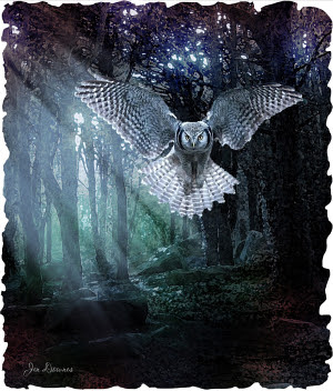
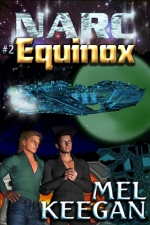
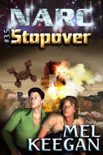
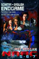
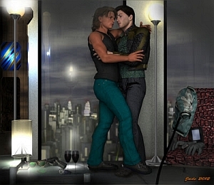
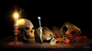
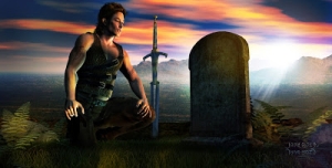
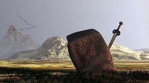
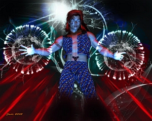
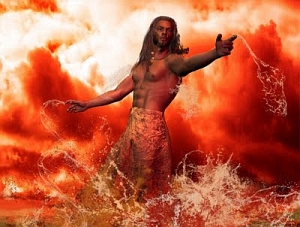
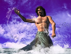
I just discovered that most of the stuff I did way back when was before I got the powerful desktop: I couldn't even raytrace! So you simply could not have the kind of treatment that's doable now. This kind of image integrity, below, was not going to happen:
It's not just about the ability to raytrace, it's also about the skill in wrangling lights. Fact: you can squeeze a heck of a lot more out of the old, old render engine with clever lights than you'll get out of SuperFly or IRay with bad, or wrong, or boring, lights. Soooo ... I'll be re-rendering my way through a whole lot of the old NARC images, and this is going to be huge fun.
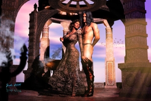
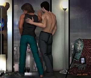
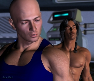
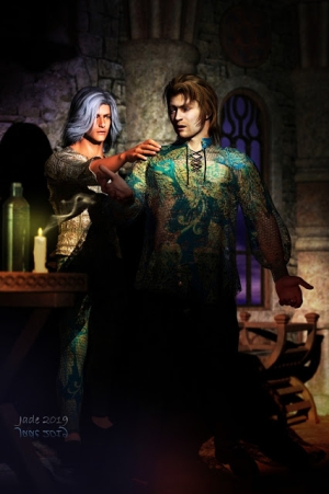
I did another angle on this scene ... couldn't decide which I like better, so I'll leave it to you to decide:
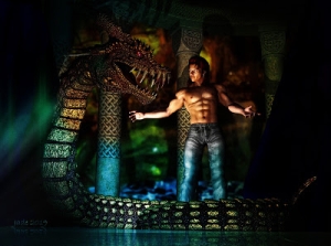
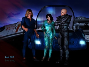
This one, above, gives you a sense of that fact that Stone is a big boy. They're standing in part of the Vanguard set -- another one of those few models that has an interior as well as an exterior. It looks great from outside, too --
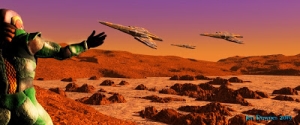
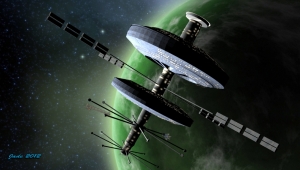
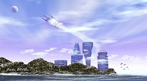
I rendered that way back in 2010! If you see if at larder size, you'll recognize the cockpit from the inside (also, that's Jarrat flying it...)
There are some awesome SF models out there, if you have very, very deep pockets. Take this one, for instance:
This could have flown right out of a movie, but you can have the OBJ to suit DAZ, right there on the desktop ... for US$169, which is waaay over A$200. Too rich for my blood, but if you're interested, here's the link to check it out. It's a (new??) site called High End 3D, and it's expensive!
I'm on the mailing list to get the newsletters regarding new Poser releases, too. Poser Pro 11 is out, and the promos are circulating. Hmm. I wish I could say I was hugely impressed, but in fact, I'm actually not. The showcase image that's being used as the flag carrier is this:
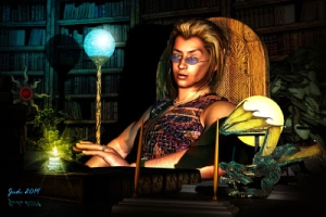
Sure, it's a nice, clean render, but it looks ... fake. Plastic. Or something. Hmm. I'm not so dazzled that I'm about to rush out and drop about $2,500 on hardware and software to bridge the gap between what I'm doing with the old stuff, and what you see there. If it's more subtle skin tones you're looking for, consider this:
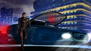
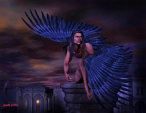
That's comparable, and doesn't have the "plastic" look of the Poser picture. It's just a raytrace in the old 3DLite engine, but I've messed about with the saturation, gamma and contrast in Irfanview to give a more subtle, less vibrant image than the pictures I acftually prefer. As I said, hmm. Let me think about this some more.
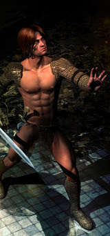
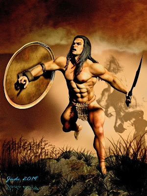
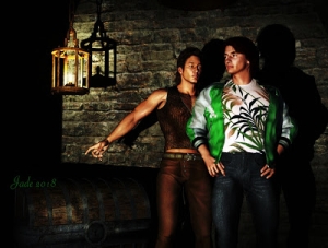
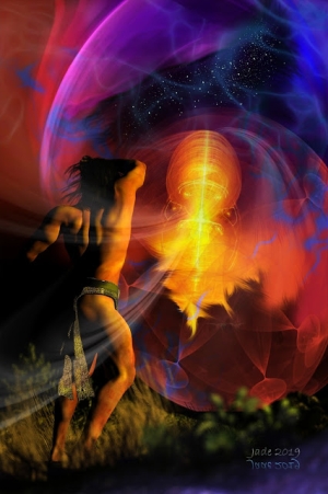
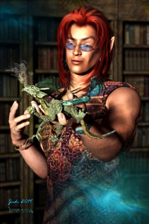
In the meantime, I'll leave you with the 2019-quality rendering of Stoney -- and take a look at the detail on the back of the hand. Uh huh.
More of everything soon!


