Showing posts with label Irfanview. Show all posts

Saturday, April 25, 2020

What went wrong?! (And how to fix it)


To most efficiently answer a question just asked, I’m going to tackle it in a new post. First: relax, take a deep breath! The most common question in photography is, “What went wrong?” And it’s been that way since the first photograph ever taken.

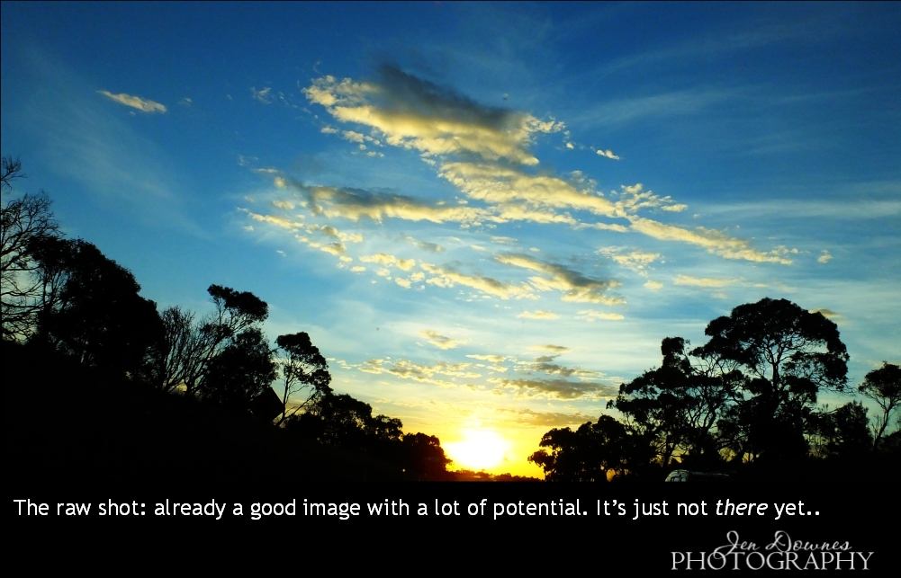
Numerous things can go wrong, but the simplest of all (and trust me, we all do it sooner or later) is where you forget to reset the camera after that special job you did two days ago … your images are consequently rubbishy, and perhaps you had no chance of taking them again. The camera remembers the last settings you tapped/dialed in, and if you have a scatterbrained moment you’ll end up with something just plain sad. (You can also find yourself shooting into the sun to get any photo at all, which won’t produce a good image; or the day can be so overcast, your pictures are almost monochrome, flat dull and boring. See below.) So ―

The question actually was, “How do you rescue photos that went wrong?”

Well, it does depend on *how* the photo went wrong. If it’s out of focus, you’re mostly out of luck. If it’s blurred by camera shake, the same (prevention is better than cure here). But if shots are just way too dark, or too washed-out pale and colorless, so long as they’re not blurry, you can do a lot with them.

The ultimate dull day photo! What can you do with it?
(Disclaimer: dull-day photos can have a tendency to be “soft” too, even if they’re in focus. They can look mushy, even if you held the camera steady. The “mush” effect is down to the camera’s aperture being too large Without getting technical ― big aperture = soft picture. Small aperture = sharp picture. It’s a *lot* more complex than this, but that’s the first rule to bear in mind. The only way to get a small aperture on a dull day, without trading off for a loooong shutter speed and risking blur from camera-shake, is to increase your ISO setting. Any halfway decent camera has this function … the instruction booklet is your friend. Generally speaking, the lower the light, the higher the ISO you want. Higher ISO settings mean the camera gathers and records more light, so you can have reasonable shutter speeds as well as acceptable apertures, even if conditions are dim … theoretically. The more automatic the camera, the more it’ll take you along for a ride, so you’ll always need to be careful. End of disclaimer!)

Back to original question: for the moment, forget about why the picture is under- or over-exposed and looks like crap. Can it be saved, and if so, how?

I can’t give you a how-to for your specific camera or software, because they’re all different. But I can point you at a free program that’s a godsend for working with iffy images and turning out lovely results in a fraction the time of mucking about in Photoshop. Go to irfanview.com and get the latest version. I’ve used this for ten years, and I swear by it. For my purposes, it’s the best thing ever. Now…

When a photo is too dark, too pale, or has no color, how do we save it?

Let’s work with one that’s washed-out pale and colorless (because that’s what I have to hand). Open it in the program. First, before you do anything, use your eyes. Just LOOK at it. See exactly what’s wrong with it.

An old grumble about digital images is they can be harsh, hard, too contrasty, with no information recorded in white areas, and dark zones crushed straight to black. Within the two problem areas (blank whites, dead blacks) there’s an amazing range of possibility. You’ll have to trust your own eyes to know when you’ve achieved what you want, and the good news is that even thoroughly lousy photos usually have a wealth of “information” hidden in them, which you can reveal by jiggling the settings. Have a look at this, for example:

See at full size, please. My word of honor: it's the same shot, before & after!
You might be tempted to pounce right on the “Brightness” setting, because it’s the word you best understand (what’s this Gamma thing, anyway?) but ― please don’t. Brightness is the setting you want to resort to last, if at all. Brightness will affect the whole image, meaning dark areas, mid-tones and highlights all get lighter or darker together, which is almost certainly not what you want. Gamma, on the other hand, controls the “ratio” between dark zones and bright zones. The easiest way to understand how this works is to use it, do it, and see it work. It’ll start to make sense as you play. But ―

Before you get into fiddling with the Gamma, take a long, hard look at your image. Is it harsh, is it contrasty? Digital pictures so often are, it’s actually worth having a quick mess about with the Contrast setting, just to see how it improves the picture, in concert with Gamma correction. Eight chances in ten, it will.

Because digital pictures tend to be contrasty, you want to flatten the contrast. From a default value of 0, drag the slider left till the image looks unpleasantly dull. It probably looks far worse than when you started … but if you study it closely, you’ll almost certainly see that “information” has become visible in both the bright and dark areas, detail you couldn’t see before. Aha! Now you’ve got information showing up, the next step is to improve the ratio (!) of dark to light areas, to recover the lovely tonal balance an image should have. This is what Gamma does.

From a default value of 1.00, drag the slider left (Gamma down) or right (increase Gamma), till the picture looks good to you. Everyone’s preference and eyesight (not to mention, monitor settings) are different; you’ll have to decide what’s right for you. When you’re happy, sit back and look at it. Looking good? Think it might be better?

Please view at full size...
We all tend to judge our pictures against shots we see in magazines and brochures, and by and large these are color-saturated, sometimes even over-saturated. It’s worth at least trying this out, so see if Color does improve your image, before you call it good and save it. You can always undo, if it makes a mess. From a default value of 0, drag the slider right until the color is too vivid, then pull it back till it looks just right for this picture.


In Irfanview, you can also muck about with the R,G,B values (Red, Green Blue) of an image; but you will probably be appalled at the results if you start fiddling with these. It takes a lot of practice to use this efficiently, and it can be a world of frustration. My advice would be, in the early days, leave them alone unless you’re actually wanting whacked-out results! In due course, play with them … learn as you go. Have fun.

TIP: if your image has red areas, keep an eye on them. If you overdrive the color, your reds will become blocks of color without any “information” inside. This is your clue that you’ve dialed up too much color. Dial it down again till the reds contain information, and you know what this image will naturally tolerate. (If you want to go beyond this, you’ll need to be working in layers, which puts you in Photoshop, GIMP, Krita, Affinity Photo, and so forth; and that’s far too technical for the average user, so we won’t go there today. But for reference, Irfanview, Krita and GIMP are free; this doesn’t have to cost you an arm and a leg.)

By the time I was finished rescuing my photo of autumn vineyards just outside Willunga, I’d flattened my contrast by -26, flattened my Gamma to 0.51, and poured a lot of color into it … +128. These are not instructions: every single image is different! I can’t tell you what numbers to type in.

If the image you’re trying to save is way too dark, basically, do the opposite of everything that’s been said here, LOL. I don’t have any blackout images to hand, so I’ve used a washed out image, (yes, the sad result of forgetting to reset the camera. I did reset it ― retook the images from a slightly different spot, and only when I got home did I discover the phone line running right through the sky of the correctly-exposed pictures, spoiling them. The pesky phone line drove me back to the pictures with the incorrect exposure, and the result? Nice).

Hope this helps!

Thursday, May 9, 2019

End of a heroic quest ... and a walk around the tavern, as promised


I love doing images like this, because they tell a story: a whole saga leaps into your mind';s eye ... you know you're seeing the culmination of something that was enormous. Ooooh, what happened?! If only there were 48 hours in every day, I'd write these stories! Now --

Supposing this guy's quest, which just finished (with a glowing crystal something, and an ancient battle ax ...) began right here:


That's the outside of Merlin's Tavern, the standing set, with a Bryce sky/landscape and just one distant light to get this effect, plus a little bit of gamma ans contrast adjustment (in Irfanview, for quickness). It's a fantastic set: around there back is a publican's yard, stables, the works! And then, inside ...

Well, I drove the camera around and framed a dozen shots on both floors; these are the best views, I think:


...complete with "nice little Hobbit-sized bedrooms" upstairs! It really is an inspiration. Makes your imagination light up as you picture scenes here, like yesterday's Amadeus shot. He's sitting just to the right of the fireplace to the left of the bar. Neat!

Anyway, that's it for me, for today. It's late and I must beard the dentist in his den tomorrow, so I'm going to get some sleep and keep fingers crossed that he doesn't grab all of my money in the coming months. If I have the cash, the computer rebuild comes next!

Friday, May 3, 2019

Hunky heroes, storybook landscape and a misty morning


A long rainy day again ... so, art! Just one more look at the character I call "Raven" -- the Guardian -- before we leave this guy again, and go on to others ... I, uh, cheated. He's standing in the middle of the Mog Ruith set, which is VAST to begin with, and I filled it with props, set lights inside and outside (see yesterday's work, for the way the light falls through the open door, for a start) ... then you have the wings, and that hair. I realized, a) you can't see much of the background, but it's all still there and has to be calculated, which means b) this render is going to take a week! Soooo...

I actually rendered the background separately, with everything else dropped out of the shot; and I just did it with a deep shadow map, because I knew I was going to blur the heck out of it to simulate DOF:


...therefore, I got the background in less than a minute! Blurred it (a lot; in Irfanview, for quickness) popped it back in as a backdrop, then all I had to raytrace was the figure - wings - hair combination; which made for a five minute render! Then, some work in Photoshop (highlights, body hair, eyes, shadows, bit of digital grading to direct the viewer's eye where I want it to go), and I was done.

So -- more, since I have a long afternoon to amuse myself through! Why not --


--a storybook kind of image. A misty dawn, in Bryce 7 Pro. No, it's not photo-realistic, but it's actually rather pretty, and is exactly the kind of thing you'd see in storybook illustration. Bryce is pretty decent with atmospherics, even if you don't get photographic results. So, why not?

And continuing on the theme of misty mornings, I went on to this:


Well, it's not really a painting, but it's nowhere near the photograph I started with! What do you want to call this kind of image? I mean, take a look at this:


If it's not a painting, what is it? I'm stumped as to what to call it, so I leave it to you!

While I was rummaging through the old file folders, I found a whole bunch of things Id forgotten, including some borders that were made about fifteen years ago. I couldn't resist this recomposition:


That one is well worth seeing at large size --


...by the time I'd done a dozen things to it, and stripped in a canvas texture as well as the old border (added with a Photostop bend), it came up looking like a painting; so I added highlights and shadows to accentuate the effect. Very, very nice.

Okay, that's all from me for today! Another rainy day tomorrow, as far as I know, and I'm pretty much "home alone" all weekend, so ... expect more art, if only to pass the time! Hope you enjoyed these!

Thursday, May 2, 2019

The Raven out of armor ... SF, fantasy, a landscape, the works.


Rainy weather at last ... and I'm home alone, got the place to myself allll evening. 😶 Sooo... more art than usual, lately! Nothing to do but mess about in DAZ Studio, Bryce, Photoshop, and -- well, here you are: The Raven off duty, out of armor! Now, there's a sight for sore eyes. The set is MOg Ruith, from the DAZ store. I haven't worked with it much. It's a bear to light! Also...


That's just about the best I'm going to squeeze out of the old software, as per realistic landscapes without getting into Terragen and adding "populations" of trees and plants ... that comes later, after the computer rebuild, okay? Okay. The hardware I have now won't do it, and the dentist had dibs on my money. All of it. Rats. 😒

The big tree in the background is also the most complex tree I've ever conjured --

For the artists among you, it's an amalgam of FOUR trees, and I used #2 from this pack, from Renderosity -- inexpensive, at US$10 for about six trees. If you have any 3D tree model where you can get hold of the trunk/branches and the foliage, separately, you can load four trees on the same coordinates; then make the trunks and branches of two of them transparent (!), and fiddle the x,y,z values of all four of them to create a dense, complex tree -- far more realistic than one tree alone. This is also a gajillion percent better than any Bryce tree I ever managed to create in the tree workshop in Bryce 7 Pro. This is just a raytrace ... it is, however, a two hour raytrace. You gotta be patient with this. I don't do it so often because ... I'm not that patient!

Also ... a change of pace now. Let's have some science fiction to offset the fantasy and landscape work:


Although, for the life of me, I can't get Bryce 7 Pro to create a realistic earth-like image, it's terrific for alien planets! I did this in about 45 minutes, and gave the somewhat flat render a tweak in good old (free) Irfanview for good measure. And --


This, in DAZ Studio, finished off in Photoshop to add the snow, headlight glare and lens flare. The biggest problem with this one was getting the city to light up properly! That's one of the Dystopia city blocks ... it lights up automatically in Bryce, damnit, as soon as "the sun goes down," but this is just a DAZ raytrace ... didn't want to wrestle with Bryce anymore today. But in the end I did get the city to light up, and it's not bad at all. Looks like Jarrat and Stone are on their way out somewhere ... possibly on Aurora, the city of Thule -- the city from Aphelion, if you remember. The old ground city, not the domes ones in the sky --


-- you remember those! What's rather cool is that I actually built those cities from scratch, in Bryce, for the Aphelion cover art project! That whole thing was done in the one shot, sky, mountains and all, with just a bit of "zap" added in, in Photoshop. (All due credit to Mel Keegan for the inspiration!)

Okay ... time for din-dins, and a movie. And since I have the place to myself, I get to choose!

Saturday, April 27, 2019

Imhotep, anyone --? And why we mess about in Photoshop


Answering a couple of questions today! Yes, you can reach me by email, and yes, I do answer questions! Of course I do ... thanks for asking! But first ...

Looking at Gil Cronin in the pictures from April 25th, something jogged my memory. Ah! The Mummy, of course! Arnold Vosloo as the shaven-headed priest who caused Brendan Fraser sooo much trouble during the First World War. Soooo...

Couldn't resist this:


No, it's not intended to look like Mr. Vosloo; just an excuse to play with the Anton's Treasures of Egypt prop set which I bought in a sale so many years ago, and seldom get a chance to bring out and dust off. I need so use 'The Man in the Hat,' and send him to Egypt, don't I! Anyway ... there you go: Egyptian priest. Looks like a supercilious character, actually; the kind you'd like to give a swift kick. But we won't. The eye makeup is hand painted in post ... the skinmap is actually the same JM Falcon you saw on Joe Ramos last week. It's a lovely skinmap.

And so to questions! 

Why do we muck about in Photoshop so much after a render is complete? Well, several reasons. One, even really good renders often show "artifacts" that need to be painted out before you can do anything with the picture. Say, the costume doesn't fit right; the mesh on the body crumples; the hair prop looks weird, no matter what you do with it, or something that should have been reflective just refused to play nice, till you ran out of time to fiddle with it --

This picture, above, had a BIG problem ... but you needed a good eye to see it. Part of the attraction of this image is the high reflection in the polished marble floor, offset by the lovely softness of the background. The problem is that the balustrade in the background is (correctly) blurred by the depth of field the virtual camera perceives ... but when the same balustrade reflects in that floor, the exact patch of floor in which it reflects is smack in the "band" of the image where the depth of field puts this reflection into sharp focus. So you have a blurry balustrade way back there, plus an upside down one in tack-sharp focus -- in the floor! This is actually 100% correct ... but the human eye perceives it as weird!! The only thing you can do is "paint it down," ie., obscure it with over-painting, so the viewer's eye doesn't go into rebellion at perceived oddity.

The other thing one can play with to one's heart's content in Photoshop (or even Irfanview, if you want the freebie that has a zero percent learning curve), is the "balance" of an image. What does this mean? Okay...


...you'll need to see this, above, at larger size to make sense of it, but the answer to your question is in another question: Which version do you prefer? Darker? Contrastier? Softer and flatter? Monochrome? Usually, you have half an idea in your mind's eye before you begin, a concept of what kind of image you want to end up with. For this one, I wanted a hint of sunset beyond the balcony to show through, give us a hint as to what time of day this is. So, not too dark ... but I also wanted to crush the shadows to give the picture some gravitas. Sure, the original render is pretty flat. Hunh. Well, it's just a raytace, after all ... though I might see what LuxRender can make of it. In the meantime, rather than fiddling with Lux for three hours, I decided to put it into Photoshop and rebalance it. This means fiddling with gamma, brightness, contrast and saturation till you see something you like ... simple as that. There's no hard and fast rule about what's "correct." It all depends what you, yourself, want or need.

The same kind of work can be performed on photos, obviously ... and often is. For instance, let's start with the finished shot, which is half photo, half art:


This makes  great wallpaper -- help yourself, I uploaded it at 2000 wide ... you're welcome. But a LOT was done to this shot to get it to this point. Here is where it started:


This was captured through the windscreen, at 100kph, on the way home from the Grampians last month. The sky did the most amazing things that evening. But the original photo has a road sign off to the left, the roof of a car on the right, and a windscreen full of "ufos" (dead bugs) to be painted out. Halfway through the fix-up process, I was here:


And that is already a gorgeous shot. You could stop right there and be very happy with it. I kept both versions ... I like them both. And if you notice, I cut out part of this same image and blurred it down, to use it as the backdrop for Imhotep. Take a look: the colors should look instantly familiar.

And of course you can also add stuff in the post-painting process that ought to be there, but weren't. For instance, the portrait of Gil Cronin. Gil wears a pair of diamond stud earrings, but I don't own any such prop, and I'm not about to go out and spent twenty bucks to buy one, even if I had the harddrive space to install anything new (which I don't: the reason I desperately need a new boot drive ... I'm now under 7GB left, and it's slowing the whole system down). In the interrim, before I can rush out and buy props, it's just as easy to paint the damned earrings! Photoshop to the rescue again, guys.

Some intrepid artists start from scratch and actually paint the whole thing right there in the software, Photoshop and/or Krita, or whatever ... and I've done this on a few occasions. Here's why I don't do it very often: one fairly simple picture consumes several days, and it's a long, slow process involving many hours of painting at the computer. Leaves me with too much pain in back, neck, hands, and often a splitting headache as well! In the same amount of time one could do a dozen renders and touch them up, without pain. But yes, I would, and will, and do, paint, if I'm contracted to, or if I feel like it! I just don't do it very often, for reasons of not enjoying the pain that goes with the job!

Anyway -- that covers the question! Next?

Friday, April 12, 2019

Iconic. No other word for it. Jarrat and Stone.


Am just finishing the final NARC trilogy, and -- what a shock -- find myself falling for Jarrat and Stone (again) like a load of bricks. So I opened some of the old, old project files. Ooooh, boy, those renders could be so much better. The skills and hardware available now make it possible to do justice to those characters which was impossible in 2010, when I was doing the original work.

I just discovered that most of the stuff I did way back when was before I got the powerful desktop: I couldn't even raytrace! So you simply could not have the kind of treatment that's doable now. This kind of image integrity, below, was not going to happen:


It's not just about the ability to raytrace, it's also about the skill in wrangling lights. Fact: you can squeeze a heck of a lot more out of the old, old render engine with clever lights than you'll get out of SuperFly or IRay with bad, or wrong, or boring, lights. Soooo ... I'll be re-rendering my way through a whole lot of the old NARC images, and this is going to be huge fun.

I did another angle on this scene ... couldn't decide which I like better, so I'll leave it to you to decide:


This one, above, gives you a sense of that fact that Stone is a big boy. They're standing in part of the Vanguard set -- another one of those few models that has an interior as well as an exterior. It looks great from outside, too --


I rendered that way back in 2010! If you see if at larder size, you'll recognize the cockpit from the inside (also, that's Jarrat flying it...)

There are some awesome SF models out there, if you have very, very deep pockets. Take this one, for instance:


This could have flown right out of a movie, but you can have the OBJ to suit DAZ, right there on the desktop ... for US$169, which is waaay over A$200. Too rich for my blood, but if you're interested, here's the link to check it out. It's a (new??) site called High End 3D, and it's expensive!

I'm on the mailing list to get the newsletters regarding new Poser releases, too. Poser Pro 11 is out, and the promos are circulating. Hmm. I wish I could say I was hugely impressed, but in fact, I'm actually not. The showcase image that's being used as the flag carrier is this:


Sure, it's a nice, clean render, but it looks ... fake. Plastic. Or something. Hmm. I'm not so dazzled that I'm about to rush out and drop about $2,500 on hardware and software to bridge the gap between what I'm doing with the old stuff, and what you see there. If it's more subtle skin tones you're looking for, consider this:


That's comparable, and doesn't have the "plastic" look of the Poser picture. It's just a raytrace in the old 3DLite engine, but I've messed about with the saturation, gamma and contrast in Irfanview to give a more subtle, less vibrant image than the pictures I acftually prefer. As I said, hmm. Let me think about this some more.

In the meantime, I'll leave you with the 2019-quality rendering of Stoney -- and take a look at the detail on the back of the hand. Uh huh.


More of everything soon!

Wednesday, March 27, 2019

Back on duty! Photography can be art too. It often is...


Photography can be art, too. I could tell you I rendered these, above, in Terragen ... but it'd be a fib, of course. The truth is, Dave and I took three days out, packed the cameras and went to the Grampians, the amazing mountains east of the border...


We took several thousand pictures, and I'm just beginning to look through them. Whoa! Some of them are so amazing, they straddle the line between photography and art ... and none of these you see here today have been into Photoshop. I cropped some, and gave the values a tweak, in Irfanview...


We were only in Hall's Gap for two days ... I wish it could have been two years! I'd like to photograph the Grampians in all four seasons (apparently the native Aboriginal people recognize six seasons in this region, which they know as Gariwerd. It took an incoming Scotsman to realize how much these mountains reminded him of homeland and promptly rename them) and every time of day -- and also in both telephoto and macro ...


The truth is, I could go entirely nuts with the cameras in this place and not come home for years. I could also jump in the car and go back there every other week: it was magic! The only downside is that from Adelaide it's a 5.5 hour drive to get to Hall's Gap, even if you don't stop ... and if you don't stop, you will kill yourself with fatigue. The Duke's Highway is incredibly long, and the trucks on it are incredibly big, so...


Above: outbound via the Tailem Bend region. Middle: follow the train tracks due east, while listening to Freddie Mercury, K.D. Lang, Johnny Cash, Hobo Jim, Slim Dusty ... ABBA, Guardians of the Galaxy, Pirates of the Caribbean, Puss in Boots, anything, everything, and keep 'em coming, because they keep you awake! Then finally you cross the border, keep on going for another eon ... at last, hang a right at Horsham and run south into the Wartook Valley, and ... there ... they ... are. The mountains rise right out of the Victorian pancake landscape (which doubled for Texas in the Ghostrider movie, incidentally).  Wooooo...


What can I say? Dave agrees with me that this is the best trip we ever did, and we'll do it again. It was "time of your life" stuff. He caught this shot of me, below, while I captured today's last image. I checked the time indexes on the photos, and they coincide:


Is that cool, or what?! That was dawn on March 27, just yesterday. Hall's Gap is down there, under the mist. I'll go through the photos gradually and get some posts together for the travel blog. I won't post them here, because this page is dedicated to art, but I will give you the links for the posts on the other blog, in case you're interested in Aus, or the Grampians, or photography, too...