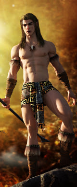
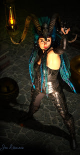
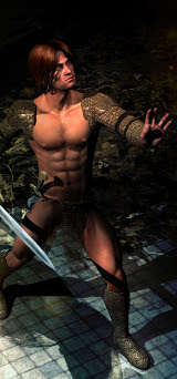
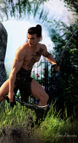
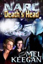
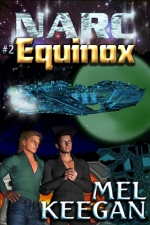
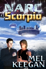
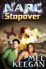
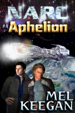
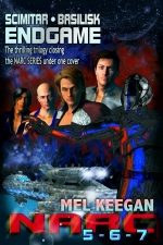
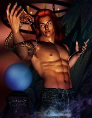
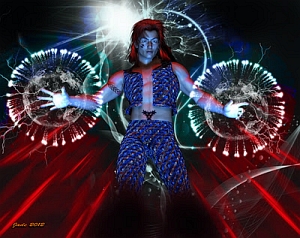
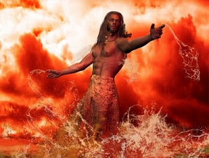
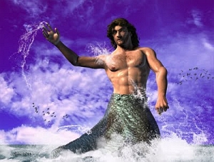
click to see all images at large size;
wallpapers are 1600 pixels wide
NARC: The Movie. Imagine! Jarrat and Stone and company, the brainchildren of Mel Keegan, in blazing color, on the big screen. In 3D. Whoa. Well, it would cost about $150m and take over a thousand designers and artists to make it happen; then, being a movie in which the romantic thread is ga, it would more than more than likely go over like a lead balloon at the mainstream box office ... but we can dream. So here was the idea:
Design the poster, as if NARC were a major motion picture.
The first thing I did was have a close look at the posters for the Iron Man movies, and from these I took inspiration in the form of the dynamic. Not the design, but the spirit. This made two or three poster designs jump into my imagination, and I deliberately went with the one that is the LEAST like the Iron Man poster designs, so no one was going to be able to say, "Oh, you just copied." I didn't copy nuthin', and I'm very, very pleased with the final result.
The poster was assembled in Photoshop -- at 4800 pixels high, which gave me plenty of wiggle room for painting. The first step was to assemble a set of big, high-rez renders which would be used to compose the whole image. Where to start? Characters!
The four main heroes were rendered separately:
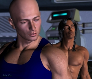
Jarrat and Stone, Cronin and Ramos, were rendered at 2500 pixels high, which, for a portrait is big ... big enough to make it possible to paint human hair realistically, which I knew I'd have to do for Jarrat and Ramos, both of whom have hair that's luxurious, a little wild. Turned out, even Stone's hair needed some painting. Only Gil Cronin gave me no chore in this area. Thanks, Gil.
They were raytraced, not rendered in Lux, for a good reason. LuxRender does fantastic justice to skin tones, but it really, really shows up the shortcomings of 3D hair. (The designers need to get on the stick and work out how to do hair that will look good in the top-end render engines.) In Lux, alas, Jarrat and Ramos would have rendered quite poorly on account of their hair, so I'd have had to paint the hair from scratch. Well ... I could do that, but it would have doubled the time spent on the project ... and the truth is, I'm also still getting the feel of my new mouse pen/tablet. I'm not quite ready to paint that much hair from scratch, though I can touch up existing hair for a composite image like the poster. Last reason for raytracing, not rendering in Lux: each of these renders would have been about a day long, and I'd have run out of time. This project was designed as the Third Anniversary Special for this blog, so it was time sensitive ... if I'd thought of it two weeks ago --!!
The next major element to be rendered was actually the planet! Working wholly in DAZ Studio, you're a bit hamstrung by what you can do with primitives -- ie, spheres. DAZ's spheres don't enlarge very well. When they get very big (or you get very close to them), you start to see straight lines around the edges, because these primitives are actually made up is gazillions of planes. So I went into Bryce, made a biiiigggg sphere and exported it as an OBJ. Then, I wanted to paint a diffuse map to make the planet beautifully blue ... I was thinking, Aurora, from Aphelion. To do this, I took a photo of the sky on a blue-sky day with white clouds, and in Photoshop put a heavy motion blur on it. Done -- how easy was that? The picture was saved at 2000 square, applied to the sphere in DAZ Studio, and rendered ... the render was passed back into Photoshop to that the atmospheric haze on the edge of the planet could be painted in. Save this ... pass it back into DAZ Studio and use it as a backdrop. Now --
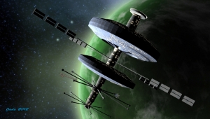
Time to work on the ship! I know, I know ... this is not the NARC-Athena as described in the books. To built that, I need to be working in a 3D modeling program. They have learning curves like the north face of the Eiger ... in the last few years, I've either been working flat out, or sick, or (frequently) both, so I haven't had the time or the braincells to learn a new program and actually build the NARC-Athena. So --
This is actually something called the Allied Fleets Frigate, which costs about $30 from Renderosity. It's a lovely model, and you can do a lot with it. Here, I've fractionally changed the dynamic by stretching it in one axis ... and I've changed 100% of the textures on it, to get a whole new look. It was then lit from two angles. One -- the sun angle, to match the light falling on the planet (several glaring spotlights, far outside the frame), and two -- blue light reflected up off the planet.
The ship was rendered at 3000 pixels square, and then shipped into Photoshop to have the engine flares added, and the red beacon lights marking high points on the hull, for aircraft avoidance. These were done with .abr brushes -- specifically, Ron's Bokeh Lights.
One element remained to be rendered. Yep -- the NARC riot armor...
The trick was to dump every single surface map off every single bit, so the whole suit turned into featureless white plastic, and then start again, and build it back up so everything matched. Obviously, I made everything black, glossy and reflective. I made everything very smooth, and used a reflection map -- something I don't normally do -- to get uniform, consistent reflections, across the whole suit. I used the map because (duh!) I rendered the suit alone, and there's nothing else standing in the frame for those surfaces to reflect. Then ... lights. I did red, blue and gold lights to pick out the armor in dramatic colors; then this was rendered at 3000 pixels high.
In the books, the armor is made of kevlex-titanium alloy. The pieces are "smart" ... you put them on piece by piece starting with the boots, and they "smart seal" around your joints. It's incredibly heavy, but when you put the shoulder pack on, which contains the power source, the anti-gravity turns on, and you can set the apparent mass of the whole suit anywhere you want it ... say, 250 kilos, to hold you down while an explosion goes through, or 20kg, to allow you to literally jump over a house. Soooo cool. The biggest difference you see between this armor and the "hardsuits" as described in the books is the helmet. This is not the NARC helmet. But it's a heck of a nice helmet, and it'll do! (In fact, it's one of the two helmet designs that come packed with the Sedition Soldier for M4 kit.)
Now all the pieces were assembled, and it was time to start putting them together. The first thing I did was use a lot of compressed, low-rez cut-outs to get a "sketch" going ... basically, to make sure the design I had in mind was actually going to work. And it did. So, now I imported each of the high-rez elements into a new Photoshop project that was created at 4800 pixels high. Cut out each of the picture elements, and start painting on them...
Each of the characters was painted -- skin tones, eyelashes, hair, shadows. This was where I really, really got to play with my early-birthday-present. The Wacom Bamboo mouse/tablet is a dream. This was also a great project for me to start getting in some serious practise with it ... it's very much like drawing with a fine pen, and I love the way it "shakes hands" with Photoshop.
Usually, you'll hear me saying, "start at the bottom and work up," when you're building a complex piece of art, but it turns out that there are times when you'll paint the bottom layer last -- and this was one of them. I'd bucket-filled the base layer to flat black, to let me work on the individual elements; then, with them all done, it was time to fill in the background with dramatic stuff, to make the image consistently interesting across the whole frame:
...this layer was painted right there, under the major elements, so there was no guesswork about where something ought to be, or how bright, or what color. To do this, you're painting on a 4800 high canvas, with your brush size set to 2500 pixels. It's huge ... and I am soooo glad that I got some extra RAM a few weeks ago. I'm working on 16GB of RAM now (with four processors threaded to work as eight). The lag time in the painting process, from brush stroke to "done," was usually unnoticeable; only big blending strokes, using the smudge tool, had a visible, measurable lag. No problem. Slower computers will show a longer lab, but her, just be patient. This background was done in five layers: black underlay; blue "flux" effect; red "flux" effect; bright white starfields; flat blue matte overlay adjusted to juuuuust the right merge mode and opacity to give you this result. The flux effects and starfields are .abr brushes -- find them at Renderosity.
The logos were done in Serif Page Plus ... I'm still using X3, though I believe X5 is out. I'll upgrade when the newer versions do something that I can't do, and need to do. These logos were done in Bolts SF font at something like 100 point. In Serif, I did the big logo green, with gold highlights added with several 3D lights, matted on a black rectangle. Copy to clipboard; paste right into Photoshop. Get rid of black rectangle ... duplicate layer. Make a drop shadow by modifying the lower of the two (adjust lightness to black, apply heavy Gaussian blur), and jog the top layer up and right a bit. Lastly, I "walked the color" of the logo through every shade in the spectrum to find out what worked best. It was going to be green, gold or red, and it turns out, red works best.
The final effects were done in Photoshop: lens flare; a shimmer dancing off the movie logo; major lens flare falling right over the logo; and a diffuse black border under the logo but on top of everything else. Done!
WALLPAPERS
These crops from the final image are 1600 pixels wide. They'll suit almost all monitors. I have them set on a 22" flatscreen and a 15" laptop, and they look ... amazing. Enjoy!
With this project, I'm marking the third birthday of this blog! I uploaded Post #1 on September 25, 2009, which was about five weeks after I started up DAZ Studio 3 for the first time. For post work, I used Micrographx Picture Publisher until I upgraded to Windows 7 and a 64 bit system, which won't run MPP. Three years later, I still Use DAZ Studio 3, (because I -- can -- not -- stand Studio 4), plus LuxRender; plus Photoshop Elements, plus Bryce 7 Pro, plus Serif Page Plus X3. I do have Poser Pro 2010, but don't use it ... too cumbersome, and the Firefly Render Engine doesn't produce work which is one bit superior to LuxRender. I also have Cararra, in which I'll one day -- I swear! -- do the 3D modeling part. All I need is time and health. (On the desk next door, Dave has Vue Esprite with a load of plugins, and he's doing marvellous work. I need to learn that. One day...)
So it's Happy Third Anniversary!
Next: Abraxas, in a couple of days.
Jade, September 25 ... 2012


