I'm actually alive, though there'll be folks out there -- possibly following this blog! -- who'd be prepared to swear I must have been carted off, feet first. Well, life has been a bear lately, but I did survive, and I'm juuust starting to get back to work, with this piece: a mixed media seascape called Home from the Sea, because it was done as the cover for Mel Keegan's new book.
Home from the Sea is a historical, and a romance, and a thriller, and a mystery and a sea story, all rolled into one. It's a cousin of Jamaica Inn and even Treasure Island. I can promise you a fantastic new read -- not much under 100,000 words, so this one is a major novel, which it'll be DreamCraft's pleasure to release at the end of May, 2013.
UPDATE -- actually, at the end of June 2013 ... Real Life intervened and things went ballistic, but HOME FROM THE SEA is launching today, and as part of the promotion, here I am updating this post! If you'd like to know more about the novel, click here, but to save you a click, here's the blurb:
It’s six years since Jim Fairley came west to manage The Raven, a sailors’ tavern on the English coast near Exmouth. For Jim, the inn is a combination of haven and prison, his home and his livelihood. But lately he’s worried he’ll never get out of there -- never see the world, meet the kind of characters, enjoy the sort of adventures he hears of in tales told by the sailors and smugglers who drink at The Raven -- because Jim has been lame for almost half his life, following an accident where he almost died. The last thing he could have imagined was that adventure -- mystery, romance and danger -- would walk right up to his own door, seize him by the collar and haul him into a maelstrom of intrigue and peril. In the fair weather between two storms which hit the coast just days apart in April, 1769, a wandering balladeer strolls up to the tavern, looking for his old shipmate. But old Charlie Chegwidden passed away years before, leaving handsome young Toby Trelane in deep trouble. As he and Jim swiftly become involved, Toby’s trouble becomes Jim’s. An eight year old mystery explodes like a storm over the inn. Before Jim learns all the shocking secrets Toby Trelane has hidden for years, there’ll be deception and fear, struggle and blood, in a tense Gothic tale which spans the globe without ever leaving The Raven. For Jim and Toby, life will never be the same.
--so endeth the update. Back to the original post now:
(The other publishing news is that it was a load of fun to spend an afternoon with MK, talking Hellgate, sharing mental images and visions ... several pieces of art were inspired among my "leetle gray cells" right there ... more about this as we go along -- I'll be rendering and painting, starting tomorrow!)
But this piece, above ... a dark, moody, evocative seascape in Bryce, DAZ Studio and Photoshop ... is one I'm rather proud of for its own sake, and I thought I'd reverse-engineer it, take it to pieces here, for the folks who're doing as I did, and teaching themselves how to do this kind of work. Here goes:
Step One is to have a clear idea in your head of what you're trying to create. With this organized, you can go into Bryce 7 Pro, or similar, and create the terrain:
With the terrain created, using the "make terrain" and "edit" tools in your program, you then select "export as OBJ" ... and with this done, you can ship the 3D model landscape you just made right into DAZ Studio.
Now, you can do the whole thing in Bryce, if you like ... but it's sooo much easier to control what's going on in DAZ, or Poser, if you're a Poser person. Fact: when you know how to drive DAZ Studio Pro to its dizzy limits, there's not a whole lot of difference between DAZ and Poser; Poser does have the edge on it, where you come to render very, very sophisticated effects involving skin tones, glass, water, metallics etc. ... and that's where the DAZ user ships the render out to LuxRender instead.
So, for the sake of this discussion, let's say you need or want to get the project finished today, not some time next week, so you're going to render it in old fashioned DAZ Studio! So --
Import the OBJ you made in Bryce right into DAZ Studio. Size it, flip it around, rotate it, till it's where you want it. (Save your work often. It's infuriating to have a crash with 100 changes and tweaks invested since the last save.) Now, adjust the diffuse and displacement mapping to get the land the way you want it. A diffuse map is essentially a picture of the ground, which is stretched over the 3D model of the same bit of ground. It makes gray virtual-plastic look like grass, sand, mud, whatever. A displacement map is a black and white image applied to the same 3D model, where the black and white parts of the image tell the program how to pull up or punch down the model, which effectively displaces (or deforms) it, to give it form, texture ... realism.
The next thing to add is the water: click on Create Primitive, and choose Plane. Resize it till its huge, and move it up and down till you get a shoreline you like, or can at least live and work with! Now you'll want to add a diffuse map and a displacement map to this plane, to make it look like the ocean. I used a digital image of the sea I shot from the Noarlunga Jetty in 2008 for the diffuse map. For the displacement map, I actually hijacked a reflection map from another project and just used it a displacement map to make the plane pull up into a kind of ground swell. The image was originally painted to give a chrome surface a believable luster without taking hours to render, back in the days when I was on a sloooow machine. You used to get up to all these tricks to save render time.
Okay, so now I had my ground and my sea. The next thing I wanted to do was get the building placed. For The Raven tavern, as created by Mel Keegan for the story, I used Merlin's Medieval Tavern ... at 4% of its physical size, so it becomes a toy building on a diorama. (You can get Merlin's Tavern from Renderosity for about $29; it's fantastic ... it's a full standing set -- walk inside, go upstairs, walk into the bedrooms, check out the stables, 'round the back. Amazing. I bought this a couple of years ago.)
So, with the tavern in place it was time to set the sky:
 |
| Yes, the bottom of this image is flat white... with good reason! |
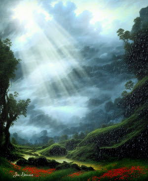
For the sky, I used a widescreen shot I took of the lowering, heavy, rain-filled skies down on the Limestone Coast in 2012 ... Dave and I took a roadrip -- if you've been following this blog for long enough, you might even remember the pictures from The 12 Apostles, Mount Gambier's Blue Lake, Tantanoola Caverns, and so on. One of the stops we made as at Bool Lagoon, which is a waterbird sanctuary. On the day we visited, it was about to bucket down, with the kind of sideways rain that cuts you to the bone. I got some pretty fantastic images of the sky -- I stash things like this, because I know I'll eventually be using them. A good tip is -- always have a camera on you, because you never know what's going to happen right in front of you!
Having chosen your sky image, the next thing you need to do is adjust its horizon line, so the horizon in the pic you're going to import into DAZ Studio as a background is in the right place. If you just import the image, DAZ will stretch it to fit your stage size ... worse yet, what should be the horizon will be on the bottom of the frame. It's going to look incredibly weird. The solution is to open the skyscape in something like Irfanview and just change the canvas size (not the image size!!), by setting the bottom margin to whatever height (in pixels) you need to bump the horizon line into the right place. Irfanview is the program I always recommend. It's amazingly powerful, with a tiny download and footprint size; and it's still free.
So, now you have the land, sea, sky, and the tavern. So far, so good. I imported some boulders and shrubs at the water's edge to give it some more detail, and that was basically all the 3D elements in place. There are exactly two lights on this scene. One is a distant light; the other is a point light. The point light is orange on its way to being yellow, and is creating the lamplight spilling out from inside the building. The distant light is supplying the sullen, angry daylight Placing the light, you need to look hard at your backdrop and see where the light is coming from in the sky image. This will tell you where the distant (sun) light ought to be positioned, and which way it needs to be pointing. Also, experiment with brightness and color for the sunlight. I used a blue-gray color for stormy daylight, and not a lot of strength in the light. Turn on shadows, and ... render. Here we go:
That's the raw render -- no painting on it yet, but it's already pretty moody and effective. As a general rule, the better you can get the render, the more you'll have to work with when it comes to painting -- which also tells you, you need to render BIG, to give yourself the wiggle room to get in and paint small details. This one was rendered at 3600 pixels wide; and I rendered it "landscape" rather than "portrait," because we have every intention of producing a paperback of Home from the Sea, and you can clearly see the wraparound cover here!
I didn't bother raytracing this, much less sending it to LuxRender, because the painting was always going to be dark, murky. A LuxRender, especially at this size, would have taken a long time and wouldn't have added much, if anything, to the work. This one was the simplest possible deep shadow map render, before the image was shipped right into Photoshop to be painted.
And there was a lot of painting to be done. I used Ron's Fog (from the DAZ Marketplace) on the skyline and around the cottage; I used a brush from a pack of Grunge brushes by Mystikel to build up the ground around the tavern; then, several brushes from the Waves pack (Renderosity) created the water effects -- I don't remember the designer of this pack, but a quick search at Renderosity will turn it up. The birds were from a pack of Waterbirds brushes (same story ... if I could remember the designer, I'd be delighted to give a credit -- if anyone recognizes them, let me know, and I'll put a plug in right here). The chimney smoke is a brush from Ron's Smoke (DAZ Marketplace again). I also painted in reeds and rank grasses around the waterline and the tavern.
Incidentally, the waves you see here are not just clicked into place with the .abr brushes; they were built in layers to get this effect, and the last layer of all was a color cast over the top (see below). You have a very finite collection of .abr brushes, and you need to create a wide range of waves from them, so you need to get clever. Prektiss, prektiss, prektiss, is the only answer: do it till you can ... and like any kid playing with clay, have fun making a mess for a while! It's well worth figuring this part out:
Then, the biggest difference to the overall piece was made by placing a "cast" into the bottom of the shot, and also into the top. I overpainted a sea green layer into the foot of the work, and adjusted the blend and transparency of the layer ... this is dark, dark sea green, on Overlay, at 31%, to bring the waves up into super realism. In the top of the shot, I have two "cast" layers -- a crimson one and a green one, both pushed and pulled with blend/transparency tweaks, to get this absolutely surreal effect, which makes it look as if the tavern is at the eye of a storm.
So that was pretty much the painting finished, and I couldn't resist lashing up the ebook cover, just to see how it'll look:
There you go ... Home from the Sea by Mel Keegan, soon to be available in ebook formats, and not long after that, we'll do a paperback of this one. The text objects, rule and bounding box were made in Serif PagePlus, and I was done. I'll keep you posted on the book, and will tell you where to get it, when it goes live. This is something like Mel's sixth major historical, and I enjoyed it immensely. If you liked things like The Deceivers and Dangerous Moonlight, you'll get a kick out of this one.
Jade, May 13, 2013


