


Today it's all about book covers ... and a crazy rush to catch up after being sick for a few days.If you've been reading this blog for a while, you know my health is down the tubes!
Being brutally analytical about our bookcovers, I came upon a truth that hits you late in your advertising campaigns. It doesn't matter how good a cover looks at 6" wide by 9" high. If it doesn't stop traffic at 150 pixels high on a computer screen, it won't inspired potential readers to click on it and look at the blurb -- and if they don't read the blurb, they won't get as far as the excerpt ... and they sure as heck won't be buying the book!
So I sat back and had a look at our covers. I shrank them down to 150 pixels high, and said, "Hmmmm." The truth is, my brain was wired for bookcovers back in the days of paperbacks, when you designed something that would look astonishing on a shelf in a store. Such covers were often filled with fine detail. Some of the 1970s and 1980s fantasy novel covers were great works of art in their own right.
Today, all that is secondary to the question of how striking the same image it going to look when reduced the the size of a postage stamp! So... if I ever want to retire to that villa in the south of France, we need to sell a lot more books, and you know that these days that means being competitive on the ebook marketplace.
Bottom line: it all comes down to grabbing the attention of the passerby who's looking at hundreds of covers in this browsing session. You have 150 pixels by 100 pixels' worth of space to catch their eye, fire their imagination and make them click on the link to read the blurb, right? Right.
Hence -- today it's all about bookcovers!
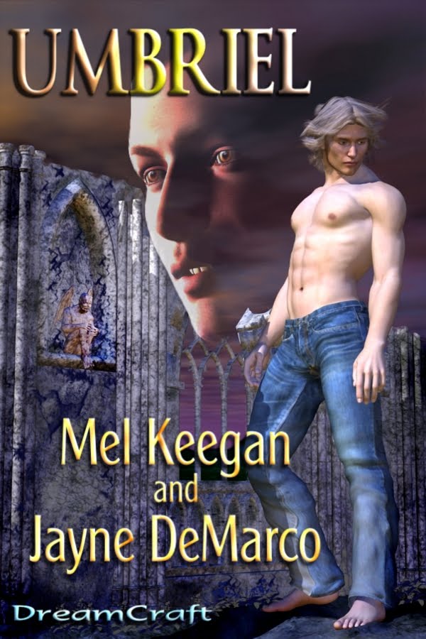
If you're an artist, you might be interested in the progress images -- I uploaded everything at 1:1 size, so you can see the details. It's basically a layering process, building up from a bottom layer to the final elements in the composit -- click on these to see them full size...


And of course the last layer of all is the text layer. Wondering how they turned out, with the text objects overlaid? Check them out:


...and the last thing I did was to shrink them down and frown over them at postage stamp size. In fact, they look darned good. I'm happy with these, so I'll pass on to other covers tomorrow. In all, I had about 40 books from our list to rejacket. I'm about halfway there. Long way to go, but it's kinda fun, actually.
The 3D work is done in DAZ, with some backgrounds originating in Bryce (skies and waterscapes ... can't get realism out of Bryce landscapes for love of money); the composit work is all done in Micrografx, without which I would be utterly lost; a lot of the painting, including all the fine work, is done in Micrografx; any work utilizing .abr Photoshop brushes is done in GIMP; and the text objects are done in Serif, and exported from there right to the finished files.
The composit work is especially interesting, because Micrografx offers the merge modes (aka "inks") which give you the freedom to do almost anything -- plus you an see all "layers" at once, with whatever merge modes applied to any or all, and paint on the bottom "layer" while seeing the effects of the painting on the top "layer." I should think you can do this n GIMP, buy I wouldn't have a clue how!
To answer a thrice-asked question: the reason I prefer Micrografx is that it does not work in layers ... all picture elements are floating in the same frame, and you can go from one to another and do anything at all, without ever leaving the "work as a whole." Anything you can do in Photoshop using layers, you can do in Micrografx by pasting your elements into the one frame, selecting them individually, applying any filter or effect, rearranging them, whatever. You merge them all down into one finished image when you're done fiddling.
Oh, I guess it's what you're used to! I imagine the full-blown Photoshop has these same freedoms -- and I also confess, I've been tardy about learning the advanced GIMP features, because my brain is still hard-wired for the other way of doing things! I do like GIMP, and I had to chuckle when I was reading a critique of it, in which some Paint.net aficionado said, and I quote, "GIMP was designed by propeller-heads for propeller-heads." I guess he means it has a basic cuteness, which it does! What I like about GIMP is simply that it lets me get busy with .abr Photoshop brushes, without having to drop a ton of money for Photoshop --! One of these days, if I win State Lotto, I'll treat myself.
Jade, 6 May


