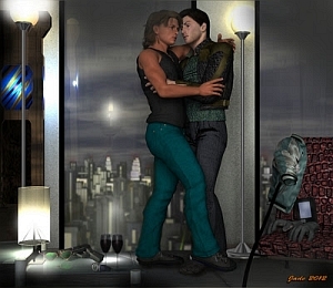
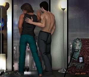
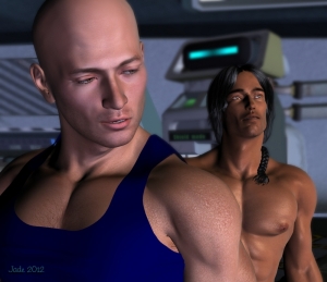
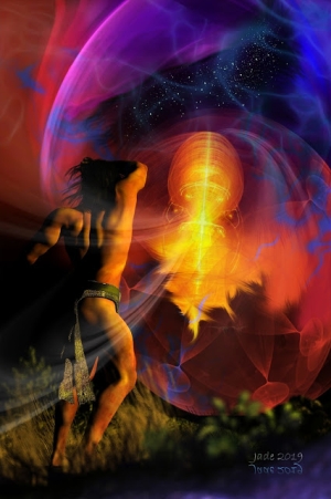
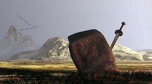
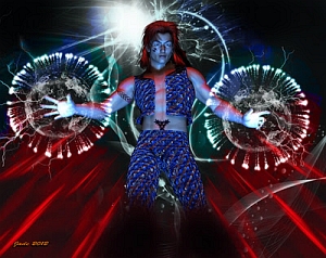
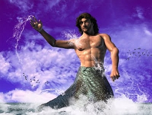
Click to see these at full size ... 1000 pixels high.
The other day I was looking through some fantasy calendars ... actually, the 2011 calendars that have just come down off the walls and and are being consigned to the cupboard. I was thinking to myself, "I need to sit down and do something gloriously complex, filled with textures and -- and --
Dragons. Now, Dave is the one who works with dragons all he time. He loves his dragons. I've been after him to do a guest post on my blog here about them, but so far, no joy. His stuff is very, very different from my work -- refreshingly offbeat, surprisingly "left field," full of potential ... and I wish he'd do more of it.
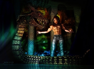
This critter here isn't actually a dragon at all. The model is called the Dinokonda, and you can do a lot with it. In fact, the original Dinokonda is green, but I wanted him to be red and gold, so ... job #1: get in there and make a whole new skinmap for him. Then change out all the textures on his horns and teeth ... and give him blue eyes.
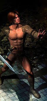
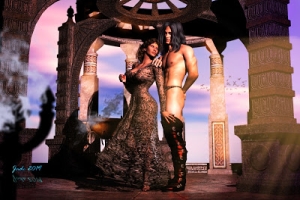
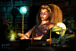
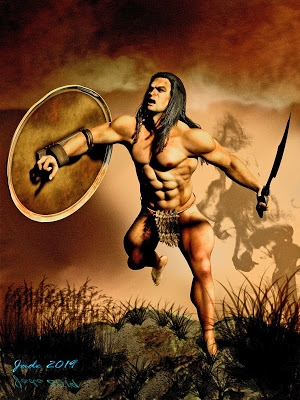
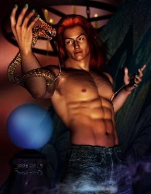
Next? The hero. Create a dude who looks like he just walked right out of a fantasy calendar! No problem. Then ... paint the backdrops. Import a standing set ... I used DM's Circular Shrine, but even Danie and Maforno, the designers, would have to look twice to recognize this, because every texture is changed, every map, the lot. The shrine has become The Gate, and the Dinokonda is the Gatekeeper -- keeping people out, or keeping them in? Good question! The scenes were raytraced, and then shipped into Photoshop to be heavily overpainted. I'm very pleased with the way these turned out.
Meanwhile, I took an hour or so out and installed DAZ Studio 4, took it for a test drive...
Well, I'm grateful for two things: 1) The Uninstall button. 2) I didn't pay money for this.
To be fair to it, I was very impressed with the Genesis mesh -- this is the new fundamental "substance" underlying the human figures you work with in Studio 4. You can indeed bend and stretch the figure, and his/her joints don't crumple and buckle. However, after I was done posing the Genesis figure, I rotated it to see how it looked from the other side ... it left its eyeballs and teeth floating in space!! It did this twice, on two restarts of the program. I suspect a bug in the works --
And the Genesis mesh is the only thing that Studio 4 does, that's a useful "plus" over Studio 3. The other new features are very subtle -- for instance, a new kind of light, the linear point light. These features are likely quite useful, but --
They're heavily outweighed by the downsides. And there are several. First, there's the interface. The old interface was dead simple, understated, positively professional in its linear appearance. The Studio 4 interface is loud and "in your face." Dave took one look and said "They've cartoonified it." This is pretty accurate. The new interface is pure Tom and Jerry in its huge-icon-driven approach. Gods help the people who're trying to use this on a laptop with a small(ish) screen. The enormous panels full of whopping great icons and cascading graphical menus fill up my 22" monitor! And the only reason my system is handling all this is because it would just about run the space program ... if you've been following this blog at all, you'll know that this new machine was under the Christmas tree a couple of weeks ago, and since then -- well, my art has exploded. My old system would have turned belly-up soon after starting Studio 4.
Suffice to say, I don't have much time for the new interface. I could get used to it, if I were forced to, but it's a visual clutter ... added to which, if you're used to Studio 3, you spend your time hunting high and low for where they've put the tools. Some tools seem to have utterly vanished, and doing things which used to be simple is now a big issue. It's very confusing to one who's used to the old studio ... so much so that you would really have to have a solid reason for climbing this learning curve. (If you come to Studio 4 brand new, never having used the simple old interface, the story will be different, I guess. It's what you're used to!)
Next thing that's problematical: if you're "upgrading" to 3 from 4, it stands to reason that you have a large library of 3D models and resources already installed, yes? I have 23 GIGS of these, ready installed and at my fingertips. Studio 4 cannot seem to get a-hold of them. Any of them. They would have to be reinstalled to suit the new program's directory structure ... in other words, I'd spend days installing models. Urk. Studio 4 would have to be the bees' knees to inspire me to do this.
Next problem: I have a lot of money invested in wigs and costumes for Michael 4 and Victoria 4.2 ... none of them fit the Genesis model, without me dropping another $75 to buy the Genesis Morphs pack, plus the Generation X plugin, which drops the Michael and Victoria morphs right onto Genesis. With them in place everything ought to fit, and the figures should bend and stretch without buckling. But I'm not, at least not right now, in the mood to spend the bucks, because Studio 4 doesn't offer enough incentive to make it a "must have, must do" thing.
One reason to get into it would be if Studio 4 were stuffed full of things that Studio 3 doesn't do ... but the fact is, it's not. Once you get past the Daffy Duck interface, and start dropping down menus, the infrastructure -- what the program does, and how it does it -- is sooooo familiar. All the old functions are there; and precious few new ones, so that you're left with the question: I have to learn this whole Bugs Bunny routine, just to keep on doing what I was doing yesterday, without any problem whatsoever --? Hmmm.
The good news is, Studio 4 installs separately from Studio 3 so that, theoretically, you could run them back to back and make the transition gradually (the way I merged over from Micrografx to Photoshop, without much real pain at all). In practice, it's not such good news. Studio 4 hijacks your file association, and nothing, repeat nothing you can do will change it back. I went through the file association process three times, with three restarts, to be sure of this. Worse yet, shutting down Studio 4 when it has fired itself up without being wanted, makes the program crash. It hangs up and take some time to get out of.
Bottom line: I think the program still has a swarm of bugs; the pluses don't warrant the awful new interface, or the time it would take to reinstall everything, or the money I'd need to spend on the plugins, just to end up right back in the same place ... and it's damned annoying to have your file association irrevocably hijacked.
For myself ... I'm probably going to stick with Studio 3 and wait for Studio 5, which will almost certainly come around in a big circle and fix a lot of the things people didn't like about 4. If it doesn't ... well, obviously, eventually we'll all have to make the change to the new "cartoonified" interface, or else change to another program! Now I understand why people on various forums are saying, "I would become a Poser user before I'll change to Studio 4 ... and I've been a DAZaholic since Version 1.2!"
Well, I'd been curious -- and now the questions have been answered. I do like the Genesis mesh! But that's the only thing I like. The rest is a rather large nuisance, so I hit the "uninstall" about 90 minutes after I'd installed it. Back to Studio 3 -- and loving it.
Jade, 6 January


