Tuesday, September 27, 2016

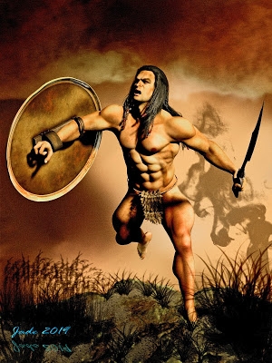
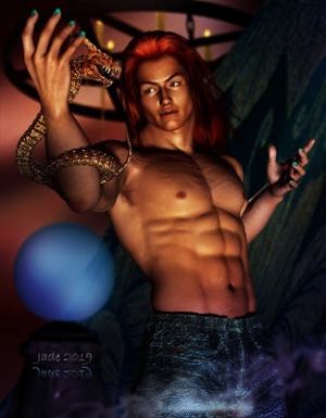
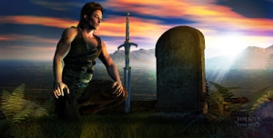
Fantasy warrior ... DAZ Studio, of course


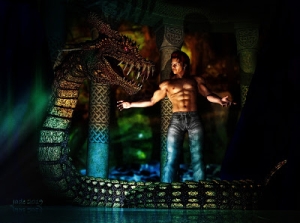
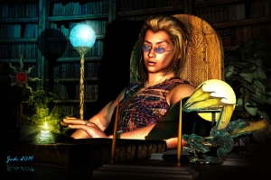
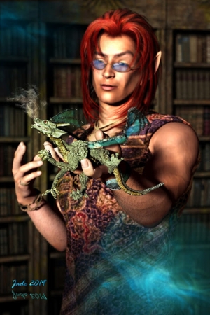
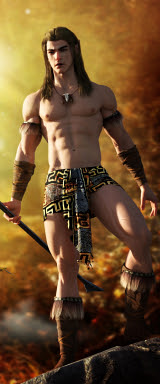
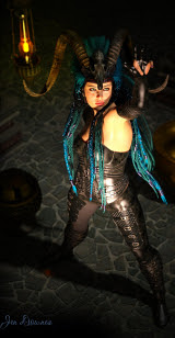
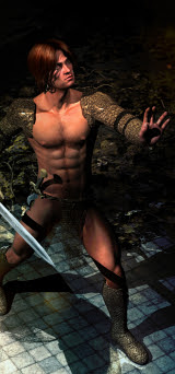
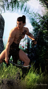
Fantasy warrior in DAZ Studio ... for a book cover, as usual this week. I'm still on schedule to scramble through by the weekend, which is my deadline, but it will be a scramble. The whole suite of covers is due to be uploaded for a promotion, and it's the most major commercial job I've done in well over a year. Quite a challenge.

Not much to say about this one, save that once again it's spot on the popular contemporary cover style: muted-color background that's soft-focus or outright blurry; striking foreground figure in good light, offset to one side to make way for text objects.

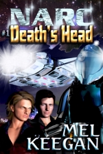
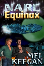
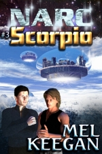
The hardest thing with this kind of cover design is knowing many people are browsing catalog images which are not merely just 100 pixels high, but also b&w due to the monochrome display on their device (such as the garden variety, inexpensive Kindle). And they use these tiny images to choose which book to buy. Egad. You wanna know what such cover images look like -- which is to say, what the artist and publisher are up against? Allow me to demonstrate:


That's the total amount of space you command, to reach out and GRAB a potential reader, and make them want to at least read the blurbs for poor author's book. The best book in the world could be bypassed on this rather ridiculous system, but -- like it or not, this is how it works today; git with the system. O...kay. (And here is another reason for not investing several hours in each cover, by way of a LuxRender project. These are just raytraces; and for this purpose, raytracing is more than adequate.)

I hope I'm rising to the challenge here! [blots sweated forehead with handkerchief]

Sunday, September 25, 2016

The vampire reimagined ... in "breakthrough color"


The vampire ... a new version of an old project, jacketing a book that's worn several covers across the years. It might ring a bell -- and if not, you may enjoy discovering it. This art is a contemporary spin on the old theme, using what I'll call "breakthrough color," a technique you can use to great effect in Photoshop. Here's how you do it:

Have your finished full-color art in the bottom layer. Make a new layer, and bucket fill it with a solid tone -- I used blue. This will make your art disappear -- but now, apply a blending change of "Color" (probably second from the bottom of the menu) to the bucket fill layer, and an opacity percentage of something like 40% - 60%, depending on how much color you want to take away from the original ... because as you drop the opacity of the solid, bucket-fill layer, your original artwork will reappear -- but it'll come back up in monochrome.

Now, you'll have a wall to wall monochrome image, and if this was what you want -- dandy. You're done. But if you want the "breakthrough color" effect, there's one more thing to do. Load up the eraser on the "brush" setting, and dial the strength way down -- 10% is fine, because this will give you the option of painting out a little of the blue bucket fill, or a lot. Stroke by stroke, just paint away the blue layer ... and as you do, the color of your original art shows through. Paint only where you want the color to show -- and with your eraser at 10%, you can maintain a very tight control over what's going to show.

It's a neat effect, and so simple.

This is a fresh render: a more dramatic pose on the Michael character than in the original art, with new lights. I used two spotlights, one blue, one red, with shadows set to 100% soft ... just pulled them this way and that, rotated them around and around, till I got just the effect I wanted. Michael is wearing a new skinmap (H3D's Bart, from Renderosity), and the Danylel hair (DAZ marketplace). It's just a raytrace, because I knew so much overpainting was going to take place, the time invested in a LuxRender project would be wasted ... you wouldn't tell one from the other by the time I was finished vandalizing it. What makes it look better than the average raytrace is, depth of field is ON, and the virtual aperture is larger than the default value of f/22, which softens the image and gives it a more "real" feeling ... notice how his nose is in focus but his out-flung left forearm and hand fall out of focus, exactly as it would be in a photo taken in low light conditions.

I like this a lot. Now ... on to the next cover. About ten more to go, and this art job is complete. The only problem is, I need to be done by the weekend. Ouch. Fortunately, I managed to find the Wacom Bamboo nibs I needed at a store called Digital Camera Warehouse. Expensive: $22 for a pack of five, with shipping. But, what the hey? I've also ordered some from Hong Kong -- $3.50 for a ten pack -- but they won't be here till the end of the month, and I can't wait so long. It'll be interesting trying to make this current nib I'm using last that long ... it's going "scratch, scratch, scratch" on the tablet as I paint. Grrrr.

Just the pictures. Honest.

Do I talk too much? It's been said ... it happens when one has a lot to say! But on the other hand, I've been seeing the sense of a "just the pictures" blog for some time. So --


-- here it is: the product of a flash of inspiration and a sloooow Sunday. No blather about when and where and how and why! Just the pictures, and plenty of them. I chucked fifty assorted pieces of art and photographs into the empty new template earlier. Next weekend I'll do another fifty ... and so on. A combination of the best art and photography, and none of the chatter.

Here's the address: JUST THE PICTURES ... enjoy!

I, uh, guess I should stop talking now. Just for a while. Before I start to blather about the fact I need to change the nib in my Wacom Bamboo (the virtual pen you "paint" with, in digital art), so I went to the place where my pare nibs are supposed to be, and ... they're gone. Utterly, totally gone. I'm very close to hamstrung without a new nib, and it's going to take days-to-weeks to get a pack, because Wacom Australia is OUT OF STOCK on the model I use, One could scream and chew the furniture, but one won't. Find a way to calm down and be creative and patient. Yes.

Friday, September 23, 2016

Boy meets Gargoyle ... in Photoshop, thank gods


This one is a serious digital (Photoshop) painting. Almost every pixel on the Michael character in the foreground was overpainted -- see it at full size! -- and everything else in the shot is painted six ways from Tuesday, in about twenty layers, based on three photo references. This one was quite the job, and I'm really pleased with it.

The version you see here is one of two; the book cover version is rather different. The w:h ratio is different for a start (book covers are any multiple of 67:100 you like or need), and it has lots more blank space at the top, to accommodate titles. This one can afford to be darker, less contrasty etc. These days, book covers have to look good at 100 pixels high, in black and white! This hamstrings the artist somewhat; a lot of things you might like to do, you can't. So, for this one, after the cover version was finished I went back in and painted for fun.


Anyway the ruin in the background is Guisborough Priory. Have actually been there, when I was very young. I originally wanted to base the ruin on Whitby Abbey, but the fact is, that one is way too well known. The gargoyle started out as a snapshot of a real gargoyle statue, somewhere in the world. I don't know where it is, but I believe it's fairly famous in the world of gargoyle spotting. It's actually a marvelous piece of sculpture; I wish I knew more about it. The painting was done from that.

Incidentally, the jeans Michael 4 is wearing are actually an old, old Michael 3 prop. With a bit of jiggery-pokery you can make them fit. The hair is the Aether toupee, which renders up nicely. It would probably look good in LuxRender too ... this image uses just a raytrace for the figure: since it was going to wind up very dark, and especially since it was always going to be extensively over-painted, there was no reason to invest about four hours in a Lux project. Must try that next!