Tuesday, September 27, 2016
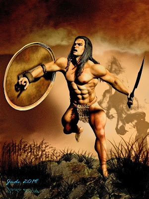
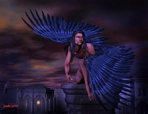
Fantasy warrior ... DAZ Studio, of course
Fantasy warrior in DAZ Studio ... for a book cover, as usual this week. I'm still on schedule to scramble through by the weekend, which is my deadline, but it will be a scramble. The whole suite of covers is due to be uploaded for a promotion, and it's the most major commercial job I've done in well over a year. Quite a challenge.
Not much to say about this one, save that once again it's spot on the popular contemporary cover style: muted-color background that's soft-focus or outright blurry; striking foreground figure in good light, offset to one side to make way for text objects.
The hardest thing with this kind of cover design is knowing many people are browsing catalog images which are not merely just 100 pixels high, but also b&w due to the monochrome display on their device (such as the garden variety, inexpensive Kindle). And they use these tiny images to choose which book to buy. Egad. You wanna know what such cover images look like -- which is to say, what the artist and publisher are up against? Allow me to demonstrate:
That's the total amount of space you command, to reach out and GRAB a potential reader, and make them want to at least read the blurbs for poor author's book. The best book in the world could be bypassed on this rather ridiculous system, but -- like it or not, this is how it works today; git with the system. O...kay. (And here is another reason for not investing several hours in each cover, by way of a LuxRender project. These are just raytraces; and for this purpose, raytracing is more than adequate.)
I hope I'm rising to the challenge here! [blots sweated forehead with handkerchief]
Labels:
book covers,
fantasy


