Thursday, September 29, 2016
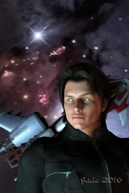
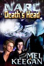
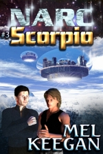
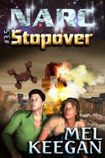
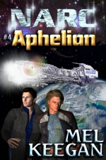
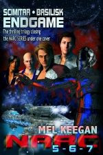
Space pilot ... the ever-versatile Michael 4
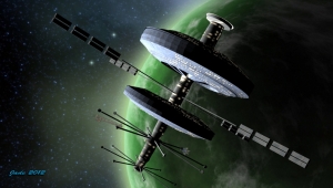
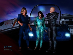
The space pilot, rendered in two layers, so as to avoid having a big lighting battle between the foreground human and background spacecraft. The backdrop is a one of the HST photos, which was cropped and enlarged specifically to fit. The ship was raytraced with some new textures to get around some unwanted decals inherent in the original model; then that render was shipped out into Photoshop to be muted and blurred, in line with the current paperback vogue. I use a slight motion blur, which seems to look better than the usual Gaussian blur ... this 'shopped version was shipped back into DAZ Studio to be the background for the portrait. Lots of toing and froing, but, trust me, it's the most efficient way to do this, even if it does take an extra half hour.
Michael 4 is wearing the Jagger skinmap and the Aether hair; and the M4 flight suit with the mission badge darkened out. The character was raytraced against the existing backdrop, then shipped back into Photoshop for some adjustments in the gamma, contrast and so on.
(The last step was to import the "done" version of the picture into Serif to have the titles overlaid, but we're not concerned with titles here. In fact, I'll hit you with the promotion for these books later ... you'll have a chance to pick up a swag of ebooks FREE, from Amazon, B&N and so forth, and get hefty discounts on a lot of others. I'll let you know when the deal is on.)
Not much else to say about this one. I have SIX covers left to do, to get out from under this job, and though it's been all kinds of fun -- and yes, I have appreciated the work (!) -- I'll also be grateful to have it done.
One of the reasons is, I'm starting to actually WRITE on a new fantasy novel, and as I imagine the scenes, I want to illustrate them. Am dying to cast the parts and get some images going. More about that later.
Labels:
backgrounds,
book covers,
characters,
SF
Wednesday, September 28, 2016
The nineteenth century poster boy, and the "fifty year storm"
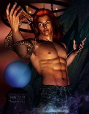
The quintessential nineteenth century hunk ... in DAZ Studio, of course! What can you say? Technology by DAZ, face and bod by moi. He's wearing the JM Alexandre skinmap, and the hair is a Michael 3 toupee, "Ricardi Hair," which you can get to almost fit properly, if you jiggle the settings using the "Victoria 4 Male" fit. It still needs painting in the "post" phase, which is why I seldom use it; but it was just right for this piece, where our 1865 mariner needs to be deliciously windswept. Yes, it's another book cover. There's a bunch more to go, to get this whole assignment done. Phew.
(Incidentally, if you enjoy classic cinema-- some people do, some don't, I know -- there's two you need to track down. The World in his Arms, with Gregory Peck and Anthony Quinn captaining two schooners in a white-water race to Alaska: fantastic. Plus Reap the Wild Wind, with a stunningly young John Wayne, and Hollywood's iconic tomboy (precursor to Ripley and Sara Connor), Paulette Goddard: ship wrecking on the Florida Keys. Alas, they don't make movies like this anymore. Wish they did.) Anyway --
It's DAZ Studio and Photoshop again. Truth is, if I did this in LuxRender, I'd still be working on it; but I've pulled every trick I know on both foreground and background. You name it, the technique is invested in this one, from the"venous map" applied to Michael -- makes the veins rise in his torso and arms (I used the venous map from JM Falcon, applied as a displacement map) -- to the camera settings, lighting settings, then tons of over-painting. The background itself is a full-on digital painting which began as two photos. One was from Wikimedia (a schooner at sea, c. 1900), the other, a storm sky photographed from the beach a long time ago. Then the painting began!
Quite a drama unfolded as I tried to upload this one last night. I did the work while a "fifty year storm" barreled in off the Southern Ocean, and literally as my finger hovered over the "upload files" button, the lights flickered, flickered again, and the power went off. Uh huh. Here we go --
 |
| The storm crossing Brighton, South Australia... |
 |
| ...and at Woomera, faaaar away in the interior. |
 |
| The big picture, from the Himawari weather satellite. Dang. |
Next day, there's still about fifty thousand homes without power, and the sting in the tail of the storm isn't yet spent . Our power came back on after about five hours in the dark -- we were lucky. Got the central heating on at once, because things got very cold, very fast. Today, rain continues to lash; thunder and hail are forecast for this afternoon. Dave and I are going to run errands in the lull, and be back inside when the "fun" starts ... with a good supply of candles, flashlights, batteries and fully-charged mobile devices. Like last night.
So let's get this uploaded before anything more dramatic can happen!
Tuesday, September 27, 2016
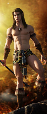
Fantasy warrior ... DAZ Studio, of course
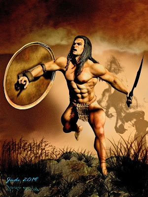
Fantasy warrior in DAZ Studio ... for a book cover, as usual this week. I'm still on schedule to scramble through by the weekend, which is my deadline, but it will be a scramble. The whole suite of covers is due to be uploaded for a promotion, and it's the most major commercial job I've done in well over a year. Quite a challenge.
Not much to say about this one, save that once again it's spot on the popular contemporary cover style: muted-color background that's soft-focus or outright blurry; striking foreground figure in good light, offset to one side to make way for text objects.
The hardest thing with this kind of cover design is knowing many people are browsing catalog images which are not merely just 100 pixels high, but also b&w due to the monochrome display on their device (such as the garden variety, inexpensive Kindle). And they use these tiny images to choose which book to buy. Egad. You wanna know what such cover images look like -- which is to say, what the artist and publisher are up against? Allow me to demonstrate:
That's the total amount of space you command, to reach out and GRAB a potential reader, and make them want to at least read the blurbs for poor author's book. The best book in the world could be bypassed on this rather ridiculous system, but -- like it or not, this is how it works today; git with the system. O...kay. (And here is another reason for not investing several hours in each cover, by way of a LuxRender project. These are just raytraces; and for this purpose, raytracing is more than adequate.)
I hope I'm rising to the challenge here! [blots sweated forehead with handkerchief]
Labels:
book covers,
fantasy
Sunday, September 25, 2016
The vampire reimagined ... in "breakthrough color"
The vampire ... a new version of an old project, jacketing a book that's worn several covers across the years. It might ring a bell -- and if not, you may enjoy discovering it. This art is a contemporary spin on the old theme, using what I'll call "breakthrough color," a technique you can use to great effect in Photoshop. Here's how you do it:
Have your finished full-color art in the bottom layer. Make a new layer, and bucket fill it with a solid tone -- I used blue. This will make your art disappear -- but now, apply a blending change of "Color" (probably second from the bottom of the menu) to the bucket fill layer, and an opacity percentage of something like 40% - 60%, depending on how much color you want to take away from the original ... because as you drop the opacity of the solid, bucket-fill layer, your original artwork will reappear -- but it'll come back up in monochrome.
Now, you'll have a wall to wall monochrome image, and if this was what you want -- dandy. You're done. But if you want the "breakthrough color" effect, there's one more thing to do. Load up the eraser on the "brush" setting, and dial the strength way down -- 10% is fine, because this will give you the option of painting out a little of the blue bucket fill, or a lot. Stroke by stroke, just paint away the blue layer ... and as you do, the color of your original art shows through. Paint only where you want the color to show -- and with your eraser at 10%, you can maintain a very tight control over what's going to show.
It's a neat effect, and so simple.
This is a fresh render: a more dramatic pose on the Michael character than in the original art, with new lights. I used two spotlights, one blue, one red, with shadows set to 100% soft ... just pulled them this way and that, rotated them around and around, till I got just the effect I wanted. Michael is wearing a new skinmap (H3D's Bart, from Renderosity), and the Danylel hair (DAZ marketplace). It's just a raytrace, because I knew so much overpainting was going to take place, the time invested in a LuxRender project would be wasted ... you wouldn't tell one from the other by the time I was finished vandalizing it. What makes it look better than the average raytrace is, depth of field is ON, and the virtual aperture is larger than the default value of f/22, which softens the image and gives it a more "real" feeling ... notice how his nose is in focus but his out-flung left forearm and hand fall out of focus, exactly as it would be in a photo taken in low light conditions.
I like this a lot. Now ... on to the next cover. About ten more to go, and this art job is complete. The only problem is, I need to be done by the weekend. Ouch. Fortunately, I managed to find the Wacom Bamboo nibs I needed at a store called Digital Camera Warehouse. Expensive: $22 for a pack of five, with shipping. But, what the hey? I've also ordered some from Hong Kong -- $3.50 for a ten pack -- but they won't be here till the end of the month, and I can't wait so long. It'll be interesting trying to make this current nib I'm using last that long ... it's going "scratch, scratch, scratch" on the tablet as I paint. Grrrr.
Labels:
Photoshop,
Raytracing,
vampire,
Wacom Bamboo
Just the pictures. Honest.
Do I talk too much? It's been said ... it happens when one has a lot to say! But on the other hand, I've been seeing the sense of a "just the pictures" blog for some time. So --
-- here it is: the product of a flash of inspiration and a sloooow Sunday. No blather about when and where and how and why! Just the pictures, and plenty of them. I chucked fifty assorted pieces of art and photographs into the empty new template earlier. Next weekend I'll do another fifty ... and so on. A combination of the best art and photography, and none of the chatter.
Here's the address: JUST THE PICTURES ... enjoy!
I, uh, guess I should stop talking now. Just for a while. Before I start to blather about the fact I need to change the nib in my Wacom Bamboo (the virtual pen you "paint" with, in digital art), so I went to the place where my pare nibs are supposed to be, and ... they're gone. Utterly, totally gone. I'm very close to hamstrung without a new nib, and it's going to take days-to-weeks to get a pack, because Wacom Australia is OUT OF STOCK on the model I use, One could scream and chew the furniture, but one won't. Find a way to calm down and be creative and patient. Yes.
Friday, September 23, 2016
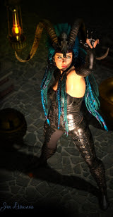
Boy meets Gargoyle ... in Photoshop, thank gods
This one is a serious digital (Photoshop) painting. Almost every pixel on the Michael character in the foreground was overpainted -- see it at full size! -- and everything else in the shot is painted six ways from Tuesday, in about twenty layers, based on three photo references. This one was quite the job, and I'm really pleased with it.
The version you see here is one of two; the book cover version is rather different. The w:h ratio is different for a start (book covers are any multiple of 67:100 you like or need), and it has lots more blank space at the top, to accommodate titles. This one can afford to be darker, less contrasty etc. These days, book covers have to look good at 100 pixels high, in black and white! This hamstrings the artist somewhat; a lot of things you might like to do, you can't. So, for this one, after the cover version was finished I went back in and painted for fun.
Anyway the ruin in the background is Guisborough Priory. Have actually been there, when I was very young. I originally wanted to base the ruin on Whitby Abbey, but the fact is, that one is way too well known. The gargoyle started out as a snapshot of a real gargoyle statue, somewhere in the world. I don't know where it is, but I believe it's fairly famous in the world of gargoyle spotting. It's actually a marvelous piece of sculpture; I wish I knew more about it. The painting was done from that.
Incidentally, the jeans Michael 4 is wearing are actually an old, old Michael 3 prop. With a bit of jiggery-pokery you can make them fit. The hair is the Aether toupee, which renders up nicely. It would probably look good in LuxRender too ... this image uses just a raytrace for the figure: since it was going to wind up very dark, and especially since it was always going to be extensively over-painted, there was no reason to invest about four hours in a Lux project. Must try that next!
Labels:
digital painting,
fantasy,
Photoshop,
rendering
Thursday, September 22, 2016
The cover artist's quotidian conundrum
Your mission, should you be unable to dodge it: After all this SF and fantasy art, with the tonnage of gravitas and all the high-powered heroes ... now, sit down and package a domestic comedy which doesn't have the slightest bit of gravitas or so much as an erg of high-power! Oh...boy.
Okay: so far it's been all guns and swords, rain forest, stone circles on the tundra, the planet Jupiter ... and now you have to design an engaging cover for a tale that's witty, quirky, often downright hilarious, set in an ordinary house, in an average Californian suburb, featuring an ailing cactus plant and an elderly lady with a deadly vacuum cleaner. Eep.
Well ... try this:
With about thirty minutes to spare -- literally -- I remembered that good old DAZ Studio renders to cartoons. What better way to change pace, strip away any hint of seriousness, than to fall back on comic art to illustrate a comic situation. And it works!
Which is not to say that comic art can't be absolutely astonishing. If you're 17 or older (!) go do a Google image search. Here's your search term: "Warlord of Mars Deja Thoris," Ye gods. It's a Dark Horse comic. (Where was John Carter when all this was going on?!) But --
All that blood 'n guts 'n bare flesh -- exactly what we don't want here, today. So ... a cartoon render (lightning fast), plus a quick recombination of old elements in the trusty Photoshop; then splatter a lot of digital paint around, and -- there. Done.
Incidentally, if you're trying to find this function in Studio, it's in your Render Settings dialog. Have fun playing!
For those who came in late:
Okay: so far it's been all guns and swords, rain forest, stone circles on the tundra, the planet Jupiter ... and now you have to design an engaging cover for a tale that's witty, quirky, often downright hilarious, set in an ordinary house, in an average Californian suburb, featuring an ailing cactus plant and an elderly lady with a deadly vacuum cleaner. Eep.
Well ... try this:
With about thirty minutes to spare -- literally -- I remembered that good old DAZ Studio renders to cartoons. What better way to change pace, strip away any hint of seriousness, than to fall back on comic art to illustrate a comic situation. And it works!
Which is not to say that comic art can't be absolutely astonishing. If you're 17 or older (!) go do a Google image search. Here's your search term: "Warlord of Mars Deja Thoris," Ye gods. It's a Dark Horse comic. (Where was John Carter when all this was going on?!) But --
All that blood 'n guts 'n bare flesh -- exactly what we don't want here, today. So ... a cartoon render (lightning fast), plus a quick recombination of old elements in the trusty Photoshop; then splatter a lot of digital paint around, and -- there. Done.
Incidentally, if you're trying to find this function in Studio, it's in your Render Settings dialog. Have fun playing!
Labels:
cartoon,
Photoshop,
render settings
Wednesday, September 21, 2016
Fantasy in DAZ Studio: Swords in the Sunset
...A raytrace in good old Studio, with a mountain of Photoshop painting. The background was worked separately, of course, starting with a sunset shot. Depth of field is ON, with the focus set on the hand that's holding the sword, so the face is juuuust a little soft, which gives a gorgeous effect:
This also has the effect of concentrating the focus of the piece on the weapon and, by extension, on the skill demanded by the weapon, which is very fitting for this story. Yep: book cover assignment.
The model is DAZ's Michael, of course, but the face and body were designed by me. This is a character I created a few years ago ... and I'd love to see how he'd render up in Lux. The skin map is Atlas (from Renderosity); the hair is Akaste (ditto), with just a little hand-painting added. The sword is the VAL Rapier Mystic, but I did change out all the textures for my own. The costume is a mix of bits and pieces, bit from here, bit from there, and again, I switched out most of the textures.
The lighting: firelight, with very soft shadows. As mentioned, depth of field is ON, with the virtual aperture set at f/22, so you get decent DOF even in very soft light. (The setting for the story was a caravanserai on a desert road, in a fantasy world ... the assassin and the fire juggler; and it all played out between one evening and the next dawn, as I recall.)
The flavor and quality of this one is closer to painting than render. I'm almost tempted to go in and plunk a canvas texture on it. Should I??? Naaah. It's way too nice as it is.
Well, this is a fairly luscious fantasy; just not the one I was planning! Once again I got stuck for time and opted for something I knew I could do in the available hours, rather than starting something and shuffling it off onto the back burner "for another free afternoon." This turned out not to be the free afternoon I'd been hoping for. So -- try again tomorrow. I think this makes five covers I've done ... a couple more, and this part of the assignment is complete. Then I'm on a break and will be "doing my own thing." And yes, there's some technicolor stuff percolating in my brain. Got a whole new fantasy project on the simmer.
Labels:
book covers,
fantasy,
Photoshop,
sunset
Tuesday, September 20, 2016
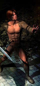
DAZ's Michael stars in another fantasy book cover project
Hell bent on Revenge would be the title of this piece -- a fantasy book cover, as you can guess. The question is, can you guess which one?! Give it some thought ... you might actually have read it! Take the stone circle in the winter storm background as your clue...
This is "just" a raytrace with two distant lights, plus a backdrop that was painted separately, and then a hulluvalot of Photoshop painting over the top. I did send it to LuxRender to see how it would look there ... and for some reason Lux ignored virtually every texture on the costume and sword. verything dropped out, leaving just plastic bits behind. So odd. and quite nasty I could have done the textures over, in the Reality "bridge" interface, but the work would have consumed hours, what with the test renders. Fact is, I didn't have the time, so --
Back to a raytrace and Photoshop to the rescue!
I'd intended a luscious fantasy today, but didn't get the chance to get it done. Tomorrow. I'm about halfway through the first part of the book cover assignment, so I can afford to take a break. I'm actually ahead of the curve, time-wise, so ... something lush and extravagant next!
Labels:
book covers,
fantasy,
Michael 4,
Photoshop
Monday, September 19, 2016
Reflections on the water. With ducklings.
Well ... fudgesickles, as Dave says. A couple of hours' excursion to the national park turned into a priceless photo op, with the most amazing stuff right in front of the camera ... and it turned out, the light levels were too low for a compact digital to produce more than a handful of good pictures, counterbalanced by a huge amount of dross headed for the bin. So here I am turning some of the shots into art, by messing about in Irfanview...
Yeah, okay, the art is dandy, but I'd rather have had a swag of top-notch photos! There were ducklings, and parrots, and miners, and a darter ... birding is a hobby of ours. On the rare occasion when the camera actually got its tiny little brain around the job, I came up with pictures like this:
That's a darter, in the "above" shot, and the magpie and miners in the "below" shot. You can't imagine the shots that got away. Sigh. Well, as someone wise once said, "You can't get a coconut every time." So ... let's put some of the lesser dross through the process and resurrect them as art:
These were all done in Irfanview, just pushing and pulling color values, over-driving contrast, blurring and sharpening. Some really neat results. But ... oh, the opportunity that just went walkies! Better luck next time. And next time the light levels are low, I'll click the whole thing over to full manual ... cut some of the technology out of the loop and do it the old fashioned way.
Labels:
cameras,
Irfanview,
photography
Sunday, September 18, 2016
DAZ Michael 4: gunfighter
Gunfighter on the frontier, in a post-apocalyptic scenario, "after the comet" ... book cover. This one gave me so much trouble, I almost dumped the whole project and started over with a new approach. The background was easy. It started life as a b&w photo of a town on a snowy road -- no problem there: colorize it; mute the colors; drop it into a soft Gaussian blur, according to the current trend. Then the fun part...
Pose Michael 4 ... no real problem, except the bloody gun prop refused to "parent" to the hand, (which means to stick in place and go wherever the hand goes, like part of the costume); so every time I repositioned the guy, and gun wandered off on its own and had to be moved independently.
The costume was no problem ... in theory. But I wanted to render this in LuxRender, to get a really top-notch result --
You guessed. What else? For reasons unknown, LuxRender wouldn't have a bar of the surface textures on the jacket and pants. They looked awful, even though the skintones and hair on the model looked pretty good. So here was the situation: raytracing was doing a horrible job on the skin tones, and LuxRender was doing a thoroughly nasty job on the fabrics. I blew off hours, trying to get Lux to play ball, but it never did. Soooo...
How to salvage all the work that had been done up to that point, and not wind up with a wasted Sunday afternoon???
Photoshop to the rescue ... well, Photoshop plus about two more hours' painting time What you see here has three layers: 1) the colorized, muted, blurred-out photo as the background; 2) the head and hair rendered in LuxRender; 3) the costume and prop raytraced. Then, the whole lot was painted together with every kind of Photoshop effect I know to make this work. I think I might even have invented a couple.
Ack. That was a hard job. The end result is worth it -- nice picture, makes a great book cover. But I wouldn't do this over again, even though I actually learned a thing or two. Some jobs are just too much aggravation. There must be an easier way to do this one -- though, if there is, I still can't see it. Anyway: job done here, and ... I'm going to do a nice, soothing fantasy next time -- something luxurious, and luscious, and drool-worthy. Work can wait.
Labels:
book covers,
digital painting,
Michael 4,
Photoshop
Saturday, September 17, 2016
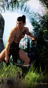
The classic "muscly torso" -- art for its own sake. And for a book cover.
Playing in LuxRender and Photoshop today ... and it's actual work. Whoo! Doesn't get any better than that. As you can probably tell from the dimensions of the image (67:100), it's a book cover. What's more, it's a book cover in current design trends.
It's astonishing, when you look at a few hundred book cover (as they show up on the book club sites, Amazon, whatever) and you start seeing trends. Not every cover on every book follows the trend; but a hell of a lot of them do, and the majority of books falling into the "big seller" range seem to adhere more or less to the set criteria. So -- what the hell?
So, what you have here is a heavily over-painted rainforest image (it's far more than 50% Photoshop painting, as it stands right now), and then the LuxRender of one of my Michael 4 designs; and then some more painting on top. The LuxRender layer is so photographic, I'm thrilled to bits with this. Can't wait to set something up tomorrow and see it go again! This is fun.
You have actually seen this Michael 4 character before. I designed him a couple of years ago, and you saw him back in January, 2015:
That one had hand-painted hair, he's what you could call "scruffy-adorable," and looked a few years younger. I actually prefer the model with a few years on him. In fact --
One of the projects I've promised myself I will get down to, soon, is ... Harrison Shapiro. You know Harrison Shapiro? The General who actually managed to catch the whole lot of them, from Rick Vaurien right through to Mark Sherratt, Curtis Marin, Neil Travers -- the whole lot. If you don't have the foggiest notion what I'm talking about ... hehehe, you don't know what you've been missing. But you can catch up. Anyway -- those of you who do know what Jade is babbling about today will know that Harrison Shapiro is a doll, one of a kind. I've modeled Travers and Marin, Mark, Mick Vidal, Barb Jazinsky, engineer Tully Ingersol, mercenary Sergei van Donne, the hitman, Ramon, and even the little twerp, Tonio Teniko. But I need to model Harrison Shapiro and his other half, Jon Kim, and also Robert Chandra Liang.)
This is fun. Have been looking some more at the Michael 6 model (Genesis 3), and they're up to Victoria 7 now ... and the first rumors are circulating regarding DAZ Studio 5. Ahem. The latest version of Studio is 4.9, which means Studio 5 can't be more than a year or so away. If I just hang on, I might be able to leapfrog right over Studio 4 altogether and re-enter at Studio 5. Also, recently something called Luxus has come out: a plugin for DAZ Studio which places the icon for LuxRender right there on your Render menu inside Studio. Hmmm. This is starting to get interesting.
Thursday, September 15, 2016
A delicious Michael 4 fantasy ... while LuxRender decides to be weird
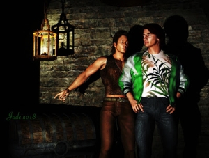
A delicious fantasy ... two Michael 4's for the price of one, in a marvelously exotic setting: sunshine, blue skies and a fair sailing breeze. I'm quite certain there's a story that goes with this picture. Those two are planning something -- hatching some plot, or hashing out a voyage. One of these days, I'll get around to writing ... and in the meantime:
You've actually seen these characters before, though you might not be able to recall where. This one was the "Hyborian Age Pinup Boy", more blond and less redhead at the time. Today:
And the second Michael 4 making a reappearance today --
...now, I know how to fix the "black eyes" problem, which one runs into all the time when taking DAZ Studio humans into LuxRender. But I blew off something like about two hours trying to figure out some way to fix the lack of any skinmap whatsoever on the brow, and at the end of that time I ended up saying words along the lines of "Stuff it, I'll raytrace this and call it good." Which is exactly what did happen.
Now, I know for a fact LuxRender will display this Michael 4 sknmap properly, because I've done it it before. I'll figure it out and rerender this piece, when I have some answers. But it could take a while, because I'm utterly stumped; so we won't fret over this. We'll just go on with other pictures and work on this one in spare time! So ... one light set, and depth of field turned ON; maybe twenty minutes to get the raytrace and then -- into Photoshop for a modicum of painting. Less than you might think, actually. The original render didn't need to much done to brighten it up here and there and fix the occasional glitch.
If you're curious, the hair on the left is the Yannis dreadlocks, and the shorter hair is either Akaste or Aether, which I believe come from the Renderosity marketplace. Both costumes are sufferent parts of the Wood God costume set, which came from the DAZ marketplace a looong time ago. Don't even know if the old models are still available but one hopes
In any event, I'm very pleased with the raytrace. That's a hell of a nice image. [Pats self on back] So we'll worry about the upmarket render later.
Take Two, in LuxRender -- really blurring the line between art and photo
As promised ... here's the LuxRender version of yesterday's Michael 4. And boy, did I have to jog my memory! I started up the Reality bridge and went utterly blank. Blanker than blank. Floundered around for about ten minutes, made some false starts, and then sort of halfway remembered where some of the controls are and what they do!
The two things I did forget: when you set up your lights for LuxRender, you use ONE distant light only, and name it "sun," so Lux knows what to do with it ... and if you want to turn on depth of field, so the background is realistically out of focus, you must select what you want in focus, in DAZ Studio, before invoking Reality. Then Lux automatically pulls focus on that object. In this case, it's focused on Michael 4's face so tightly that you notice the hand closest to the camera is fuzzy. Neat!
For objective comparison purposes, here's a resized crop chopped out of yesterday's raytrace:
 |
| Compare yesterday's raytrace... |
And there's one more thing I often do these days: have a look at the render in good old b&w. You can often get a clear idea of the photographic values of a piece of digital art when you drop out the color:
I feel a visual fantasy coming on. Something good is percolating in the back of my mind, and if it wasn't 10:21 at night I'd be starting up a new project. But I'm propping the eyelids open here, so -- tomorrow. Yawn. I'm off to bed now...
Labels:
LuxRender,
Michael 4,
Raytracing
Wednesday, September 14, 2016
How much photo-realism can you squeeze out of raytracing?!
Assignment: how much photorealism can you squeeze out of old fashioned raytracing before you get into the more upmarket render engines, like LuxRender and SuperFly?
And the reason I ask this is that I just spent half an hour on the gallery pages at Smith Micro, which is the company behind Poser. Hmm. Well, the fact is, if it's near-photorealism you're looking for...
...you'd actually be fairly surprised what you can do with raytracing, and it's not a million miles away from what you'd expect from one of the top-end engines. I'm asking this question because I have a LOT of images to render, and the version of LuxRender I'm running is slow. The new one is said to be seven times faster, but to get into that would take more than I have to give right now. So we'll just run for the moment on the old system and see how far we can push it.
Which means I need to drive raytracing to the very limits it's capable of! And here we are, experimenting ... actually, jogging my memory too. I confess, it's been a while since I drove the software (have been far from physically well, as you know if you've been following these ramblings), and it turns out you can forget how to fiddle all the details, just as your piano playing can get "rusty" through lack of use.
So, the model I chose to work with was a Michael 4 I developed five or so years ago for a book cover. At the time, the effect we wanted to achieve was ART, not photo, so the render was set up to give this effect:
The object was to achieve something much closer to a painting than a photo. That's two versions of M4. The bratty little imp on the right, and the more mature one -- which is the Michael 4 I chose to work with today. What did I do to make so much difference in him?
First: change the hairstyle. He's wearing SAV Eros short hair today. And then switch out the skinmap. The original dude is wearing the hi-rez Michael 4 "Millennium Man" skinmap, which is always a "go-to" skin when everything else fails. Today, he's wearing SAV Eros:
Out in the field, one can very rarely achieve "studio lighting" effects. There's a reason they scorn it as "available light." Natural daylight tends to be too bright, or too dim, or too harsh, or too blue ... always too something. So let's use this deliberately.
I used just two distant lights, and deliberately overdrove one of them to get the "available light" effect. These lights are bright pale blue and dim soft orange. Shadows are turned on and left hard ... as per camera effects: depth of field is ON. The background outside the viewports is a photo which was blurred and blurred some more, and then blurred again, to match the amount of blur on the walls. I played around with adding film grain and lens flare in Photoshop, then decided not to. I think the render right out of DAZ Studio is good enough.
It'll be interesting to see what happens with this image in LuxRender. They don't always work, as this post shows! Very occasionally, the raytrace looks better. Also, there's a tendency for the Michael 4 "mesh" to collapse or distort. This doesn't become visible in a raytrace, but in a Lux project it can be catastrophic. So ... let's see what happens. Tomorrow.
Labels:
book covers,
DAZ,
DOF,
lighting,
Michael 4,
photography,
Raytracing,
rendering,
skins,
textures
Tuesday, September 13, 2016
Help! The project files are missing!!
Well, fudgesickles, as Dave says. I've just spent about an hour and a half tearing several harddrives apart, looking for a whole swag of the project files for Jarrat and Stone, the Hellgate characters, and a lot of other stuff which I've been wanting to rerender in Lux and so forth. A case of mild panic ensued. A lot of the files are there to be found. A lot aren't. Well ... dang. The good news is, Jarrat and Stone have survived; and Rick Vaurien, Mark Sherrat and so forth. The bad news is, some of the minor characters -- such as Tully Ingersol, the Weimann specialist on the Wastrel, for instance, is just gone. So...
Some of the characters will have to be reimagined. Like this:
There's the new Tully Ingersol -- somewhat serendipitously, because I'd just finished doing fresh art to rejacket at old book...
...and couldn't resist playing around with the hairstyles. Would you believe that the two characters you see above are actually the same Michael 4 morph, just with a switch of hairdo! Amazing, but true. I'm barely believing it myself, but the facts are right there in the software. Cool.
So the next weeks will see me recovering a lot of the old ground ... but this is actually a good thing, because so much of the art from 2010 needs to be re-rendered in any case. It's always astonishing, the way it comes up afresh in LuxRender -- or even with the techniques I learned in later years.
In fact, we're running up to a milestone. The first post went up on this blog on September 25, 2009. We're racing toward the seventh anniversary of the day when I decided to share the process of "nutting out" 3D art. Dang, what a long way I've traveled -- and we're not done yet.
Stay tuned. Good things are to follow.
Labels:
book covers,
faces,
hair,
Hellgate,
Michael 4
Monday, September 12, 2016
After a very, very long absence ... am I back? I sure hope so!
 |
| Richard Vaurien and Sergei van Donne |
After a very, very long absence ... I'm back. At least, I hope I'm back. I'm certainly going to try! I've been wrestling with health issues that came close to utterly defeating me, and though I'm still not well, the fact is, I'm bored out of my gourd. So I'm going back to artwork and writing, and nuts to the fact I don't feel so good. My head's going to ache permanently? Fine: be like that. It'll just have to get on and ache, because I'm bored enough to stick out a thumb, just ahead of the next UFO, and bum a ride right out of here. So...
What better place to start than Hellgate. Always my favorite place to "run home" when I need a vacation. I could live there in a heartbeat because I love the places, the people ... everything. All credit to Mel Keegan as the creator of this fantastic universe. [2023 EDIT: the dot-com web address is defunct as of early this year. For some reason, the system utterly denied access to it, and it could not be renewed. Then some joker bought it as a zombie domain name, and MK would have to buy it back at significant cost. Not going to happen, but the web pages are all still there and still viable. Find MK online in the same place.]
I did a lot of Hellgate art years and years ago, and some of it has traveled surprisingly well across time, and some ... hasn't. Generally, it was "okay in its day," but CG art has progressed by leaps and bounds since the last time I dabbled. Michael 4 has become Michael 6, while I was looking in another direction, hunting for my health! Well, I don't have access to Michael 6, or the Genesis figures, or anything remotely similar. But I do know where I am, driving the classic software.
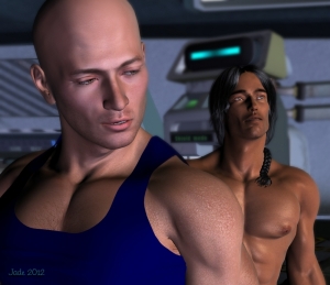
So here's one of my old favorites: Richard Vaurien, talking to Sergei van Donne in the big industrial airlocks on the Wastrel. This is "just" a DAZ Studio raytrace with a modicum of Photoshopping in post-production. No Lux or Bryce involved here. Most textures on the costumes were switche dout for my own textures, and displacement maps added. Depth of field (DOF) is turned ON, and much work was done with lights and virtual camera settings before the whole shebang was raytraced at 3200 pixels wide. Good old Studio 3. Still works -- dead simple, friendly interface. Next, I'll go play with LuxRender!
And just in case you're into Hellgate, here's a wallpaper version ...
... at 1600 x 900, which suits most monitors. Certainly, if you have Irfanview, you can tell it to "stretch proportionally," and it'll fill the whole screen on a big 26" monitor --
-- like that. Neat. Loads of space on the blank left side of screen for parking icons out of the way, allowing you to keep the art clear. Golly, you'd think it was designed that way, LOL.
So in the days and weeks ahead, look out for new art, with all the bells, whistles and skill I learned and acquired in the seven years since the original art on this blog was done! If I do manage to trade up to new software and Genesis models -- dandy. If I don't, the art will still be suitable eye-candy ... and there's a lot of it, backlogged, from the ten months or so (I know, I know ...) since I had the chance to upload here.
Cross fingers, things are "coming good."
What better place to start than Hellgate. Always my favorite place to "run home" when I need a vacation. I could live there in a heartbeat because I love the places, the people ... everything. All credit to Mel Keegan as the creator of this fantastic universe. [2023 EDIT: the dot-com web address is defunct as of early this year. For some reason, the system utterly denied access to it, and it could not be renewed. Then some joker bought it as a zombie domain name, and MK would have to buy it back at significant cost. Not going to happen, but the web pages are all still there and still viable. Find MK online in the same place.]
I did a lot of Hellgate art years and years ago, and some of it has traveled surprisingly well across time, and some ... hasn't. Generally, it was "okay in its day," but CG art has progressed by leaps and bounds since the last time I dabbled. Michael 4 has become Michael 6, while I was looking in another direction, hunting for my health! Well, I don't have access to Michael 6, or the Genesis figures, or anything remotely similar. But I do know where I am, driving the classic software.
So here's one of my old favorites: Richard Vaurien, talking to Sergei van Donne in the big industrial airlocks on the Wastrel. This is "just" a DAZ Studio raytrace with a modicum of Photoshopping in post-production. No Lux or Bryce involved here. Most textures on the costumes were switche dout for my own textures, and displacement maps added. Depth of field (DOF) is turned ON, and much work was done with lights and virtual camera settings before the whole shebang was raytraced at 3200 pixels wide. Good old Studio 3. Still works -- dead simple, friendly interface. Next, I'll go play with LuxRender!
And just in case you're into Hellgate, here's a wallpaper version ...
 |
| Hellgate wallpapeer: 1600x900 |
-- like that. Neat. Loads of space on the blank left side of screen for parking icons out of the way, allowing you to keep the art clear. Golly, you'd think it was designed that way, LOL.
So in the days and weeks ahead, look out for new art, with all the bells, whistles and skill I learned and acquired in the seven years since the original art on this blog was done! If I do manage to trade up to new software and Genesis models -- dandy. If I don't, the art will still be suitable eye-candy ... and there's a lot of it, backlogged, from the ten months or so (I know, I know ...) since I had the chance to upload here.
Cross fingers, things are "coming good."
Labels:
DAZ,
Hellgate,
Mel Keegan,
Photoshop,
Raytracing,
SF
Subscribe to:
Comments (Atom)


