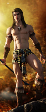
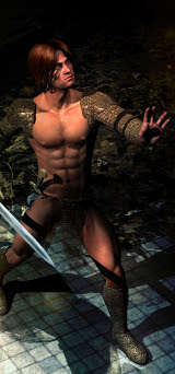
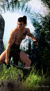
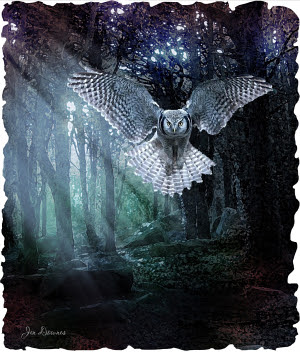
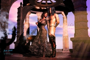
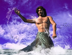
Click to see all at large size. Above: the 1600 wide wallpaper!
Something beautiful today, because I'm in a mood for sheer beauty. Life is being something of a bitch, and one just wants to escape to one's "happy place." So here's Male Nude: Figure in a Garden. It's a long time since I did a nude for its own sake -- in fact, this blog used to get a lot more traffic when I was doing a lot of nudes! Sure, it's neat to "legitimize," but the drop in traffic shows you what people really want, and what they're thinking. Anyway, I was looking for a texture file I'd lost, and wound up searching through the old, old image files, from well over two years ago. I came upon a set of images I'd rendered three computers ago! Back in those days, I couldn't raytrace, and it took the old PC so long to handle textures and mapping, I was usually happy to go with the defaults supplied by the designer, and just get a render!
However, I saw the world of potential in the old images, so I copied the project file over to my current working folder, and took a good, long look at it...
In fact, the image you see today isn't one render: it's an amalgam of three renders, and a whale of a lot of Photoshop painting too. It took about an hour to get everything set up for the new version of this old picture; and then it was a four hour raytrace, because I added trees and extra plants. Every time you add a tree, you can potentially add an hour to your raytrace. I added three! Or was it four? But one of the things that makes the picture go is this:
I "overdrove" all the texturing. The original set is The Garden of Galahad, and it's very nice, but no displacement maps are provided and only a tiny bit of bump mapping is set by default. All this makes for a curiously "flat" image. The last time I rendered this set, I didn't have the computer power to do anything much with it, and then ... well, the fact is, I forgot I had it.
This time around, I used the bump maps provided as displacement maps, and drove them hard, to produce very, very nice texturing. You really have to see some of these detail shots at full size. They were cut out of the full-size image, which was rendered, uh, big. I have about six lights on this (skylights and "bounce" lights, representing reflected sunlight). The sky was custom painted at 3000 pixels wide, specifically for this project. Then -- as I said, a loooong render, on account of the plants and trees, but the results are worth it.
As well as the raytrace I also did two deep shadow map renders -- all three were done at 3000 pixels wide; and the three renders were shipped into Photoshop and blended together to produce a fourth image that is much, much better than any one of the individual renders. Then...
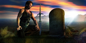
...painting, and painting, and more painting! Literally all the highlights and shadows you see in this piece were hand painted. The detail shot, above, reminds me strongly of the scene in the director's cut of Fellowship of the Ring, where Aragorn goes to visit his mother's tomb at Rivendel. To get this effect, I laid down a pink/red "cast" in the sky, in Photoshop, in three layers each with different merge (blend) characteristics. The final touch is the "god rays" overlaying everything else.
The same pink/red tone was stripped into the bottom of the shot to make the colors balance, as you can see in this detail shot, above; and this also had the effect of making the detail in the image "pop" ... if you're doing this kind of work either in DAZ Studio or Poser (or Photoshop, come to that), you might be interested in how the grass was done. I massively overdrove the displacement mapping on the ground -- using the model maker's bump map as the displacement map. The effect gives you a nice rugosity, but it doesn't bear too close examination, because if you see it up close and rudely personal, the ground just jags into millions of tiny pyramids. So the next thing you do is get your Photoshop brushes going, and paint some grass to break up all those little triangles! For the lawns, I didn't use .abr brushes; just configured a hard round brush at 2 pixels, and several shades of green and brown, and painted stalks of grass. I did use some .abr brushes to quickly do the weeds growing along the borders of the path...
But of course it's the male nude figure that draws the eye ... and this is pretty much hand painted, right across the whole figure. The hair is also hand painted. For some reason the raytrace was great on the garden and baaaad on the figure ... and this, after several hours of work for the computer! One of the deep shadow map renders wasn't too bad (the other was configured for the background and disastrous for the figure), so I blended the deep shadow map and the raytrace renders into one, and then ... painted right over the top of the blend. The shadows were brushed in with a round soft brush, in gorgeous reds and ochres, and blended in ... but the whole figure came alive when I added the highlights. The highlights are painted with a medium brush, picking out the ridges and high points of the muscles, which catch the light; then that layer was set to "overlay" in Photoshop's merge mode options; then the layer was given a few percent Gaussian blur, and an opacity of something like about 30%. Little else was needed to bring the figure alive -- and when the "god rays" were added over the top (they're the top layer of the whole painting), the effect is just beautiful, if I do say so myself. And I do!
So there you have it ... a weird hybrid technique with a very lovely final result derived from three renders and about 30 layers of painting! To do this, you'd need Michael 4 and the Gardens of Galahad set, and I added several iterations of the silver birch tree, from Merlin -- all of these items are available from the DAZ Marketplace. For the painting, it's all the Photoshop default brushes, with the exception of Ron's Birds, and Designfera's Ivy, and a set of grass/weed brushes ... and if I could remember who designed them, or where to get them, I'd tell you! They might be freebies from Deviantart or Brusheezy, come to think of it.
More soon. Have been trying to get a project to work out ... but something isn't gelling. They do say that you learn a lot more when things go wrong than when they go right! I have this one project that won't come together (well, not to my satisfaction...) which is annoying, because there's a really neat story that goes along with it. If it had worked for me, you'd have read the story a few days ago. As it is, I'm still scratching my head and muttering those famous words, "What went wrong?" All the lights and textures, reflections and shadows are just fine. So why does the picture look "off" --?! Back to the drawing board!
Jade, November 9


