


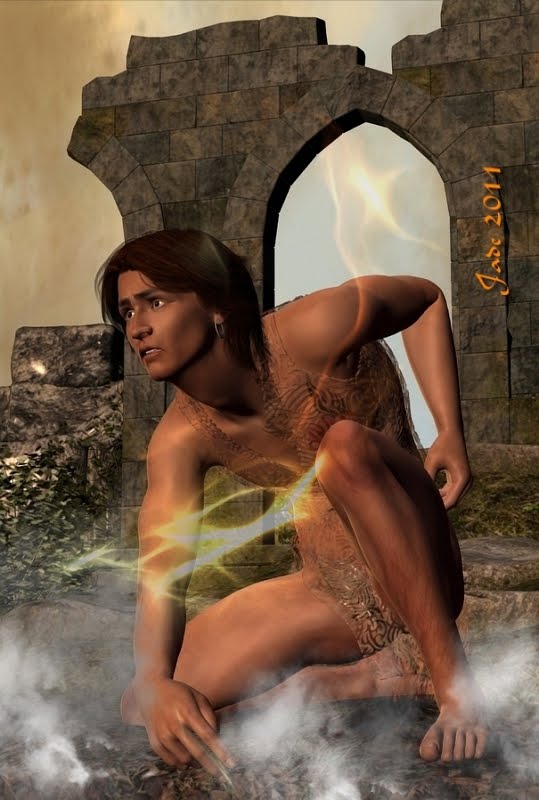


 At last! Fifteen minutes to call my own ... and here I am to talk about working with lighting effects as overlays. It's actually not as complex as you might think. In fact, it's not actually complex at all. The new generation of imaging programs (Photoshop and its stablemates, and GIMP, which is the open-source equivalent which a lot of people use because, being free, it's also affordable!) have actually made working with overlays a lot more complex than it needs to be, or used to be.
Circa 2400BC, before the modern software, we used a different system. And it worked. And it was easy. What it didn't use was layers. Back in those days, we used inks and masks and objects, and you could have fifty objects all floating around in the same frame, all with different blends and filters and transparencies and feather effects etc,. etc. applied to them
(I think I must be the last person in the world who still works (ooooh, a lot!) in the old gem, Micrografx Picture Publisher. It was perfect. In fact, it still is! The only problem is, on anything after Vista Service Pack 2, you can't even get the installer to run! So I spend a fair bit of time lately, trying to make GIMP behave itself the way Micrografx does, because I do know that when I lose this PC, I'll be losing Micrografx forever. Sob.)
Now, GIMP works with layers, and I still have to "nut out" how to make them do what the old software did much more easily, but even so, the fundamentals are the same. You have your basic image, you have your flame effect, and you want to get the lighting effect whacked on over the image as an overlay.
Someone who's much more familiar with GIMP than me will say, "Import the overlay into a new layer, on top of the old one, set the alpha channel, pick a color to be transparent and set a Gaussian feather on part of the image that's left non-transparent." Cool. Except my GIMP won't configure an alpha channel for love or money ... I'm starting to think it's corrupt and needs to be reinstalled!
And the process is exactly the same -- identical! -- to the old process we'd use when Alexander the Great was a lad, only we'd do it in the same layer, or frame, or whatever you wanted to call it. You'd have your picture open ... you'd paste the lighting effect into it. You'd select the lighting effect and use your color picker magic wand to pick all the black (or whatever) pixels and tell them to vamoose; then you'd "feather object," and play about with your inks and filters and transparencies, and resize the pasted-in light effect ... all right there in the same layer, all the while toggling back and forth between this and the original image, and painting on either one to your heart's content.
Nostalgia. These were the same tools you'd be using when you enhanced images, which were usually scans of photos -- because remember, Julius Caesar still hair hair, which means, yea, digital cameras had not yet come to pass. You got very, very used to digitally enhancing images, and it turns out to have been great skill-forming stuff ... because the same techniques are used on CG artwork, to get the best out of images.
A few weeks ago I was asked, "Why do you enhance images, and how do you do it?"
The best way to answer the first part of that is to delve into my photography rather than my CG art or digital painting, and show you this:

That shot is gorgeous! It's just absolutely beautiful -- but it didn't start out that way. Even with a very expensive camera, a lot of patience and no little skill, it started out like this:
 The beauty of it is, if you have a good camera, bet your bottom dollar all the information is in the image, even if you don't see it at once. There's nothing wrong with this picture; but the Monarch butterfly was sitting in the shade, not in the sun. And you need sunlight, or full frequency light from some source, to bring out the colors. So you process it in the computer the way we used to work with images in the darkroom.
The object is get that "magickal" effect, as if the picture is not quite in the real world...


 ...and the only thing you need to keep an eye open for is that you don't "over process" the work. You can tell if you're "overcooked" when the black areas go chromatic (pick up color casts), or when the edges get the "jaggies" due to the picture being sharpened too much. Photographers who're just starting out learning how to process images often go too far with contrast, color saturation and sharpness. In fact, you might or might not want to muck about with sharpness and contrast in a digital image, because digital pictures are inclined to be too contrasty ... and pictures don't want or need to be so sharp, they look more like diagrams!
You need to work with your software of choice (and I use the freebie, Irfaniew), and use you eyes. You can only learn by doing, and only you will know when you've got it right. People can and will tell you when you're getting it wrong -- listen to what they say, and if your blacks are chromatic and your straight lines are jagged, you know what to fix. I can't actually tell you how to do this stuff, because you could be using any one of two dozen different programs; but the fundamentals are always the same: gamma, contrast, color saturation. Everything is a balance between these values. Work with BAD images, and see if you can make them good. It's a lot of fun learning!
Jade, 27 February
***Posted by MK: my connection is intermittent -- way too slow for this.


