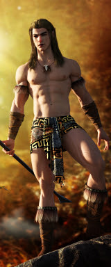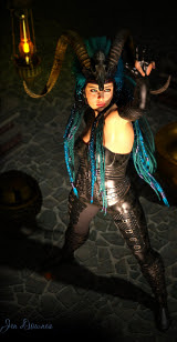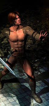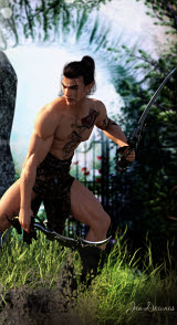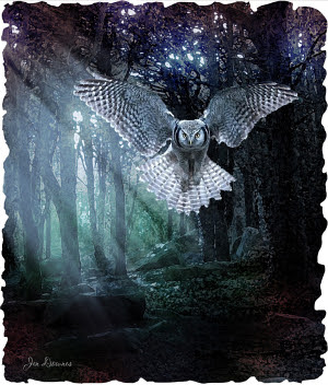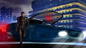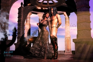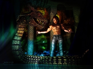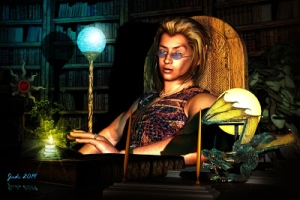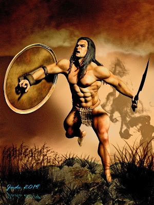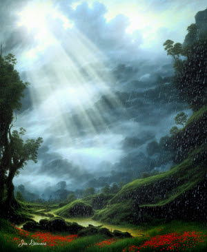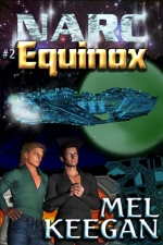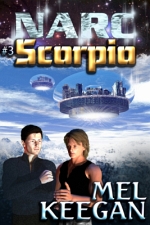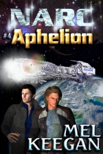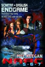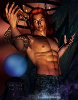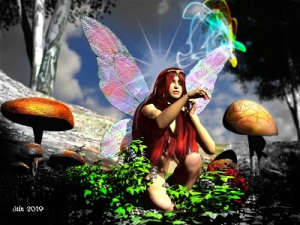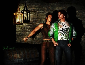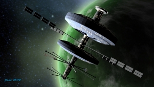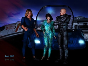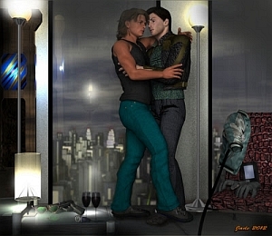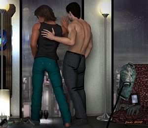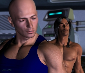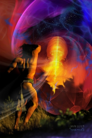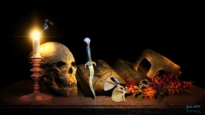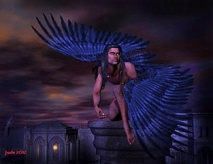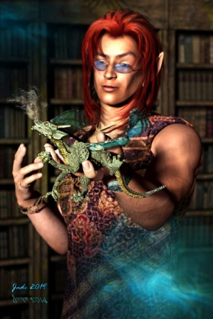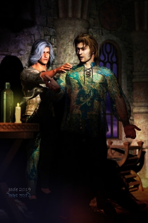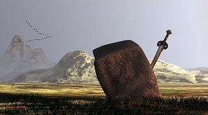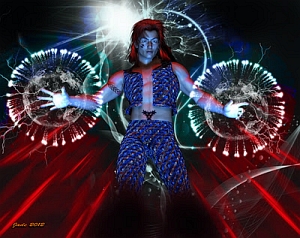

Book covers again, but in fact if you take the font objects off them, the works themselves are very nice pieces!
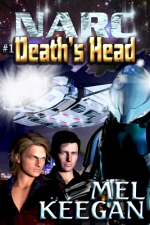
And what do they look like, when the text objects are overlaid? Take a squiz:


People often overlook the importance of the text objects, but the fact is, they can be almost artistic in themselves. There's so much you can do with fonts and font effects.
Looking at these pieces makes me go back to a discussion I read online a long time ago. It went along these lines: "If the guy, or guys, have their clothes on and are not actually in a clinch, how do you know it's a gay or m/m story?" There's no easy answer to that one, unless the image is also loaded with "gay signals" ... you know, like the blue kerchief in the right hip pocket, nudge nudge, wink, wink. Which tends to be more separatist than inclusive these days, yes? Or is it just me?
Anyway, we're making up all the epub versions of ebooks from waaaay across the years, and it's a great opportunity to indulge in suites of new art, and to touch up some images which were done eons ago.
Sorry for being brief. Must go and lie down for a while, and try to get warm. It's midwinter and coooooold, even when you're not sick. When you're sick to boot, it's a bit dire!
Jade, 18 July


