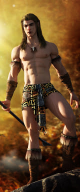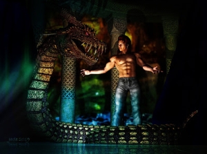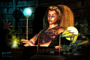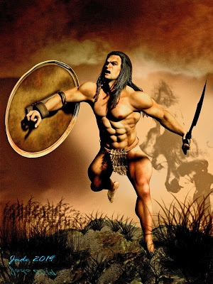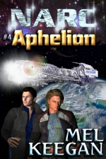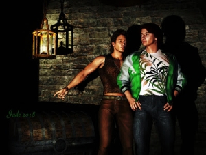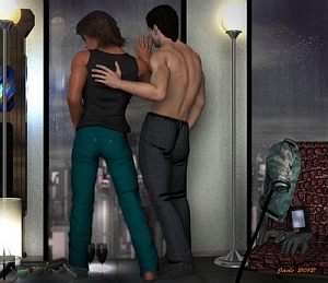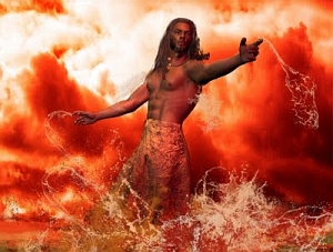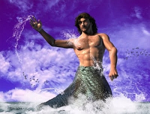


Change of plans. I was originally thinking about a kind of Michael 4 fashion show, along the lines of the Victoria 4 fashion show of yesterday, but my muse went in a different direction. It all started with this:

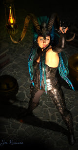
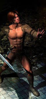
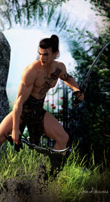
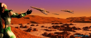
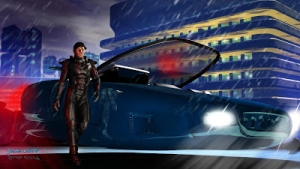
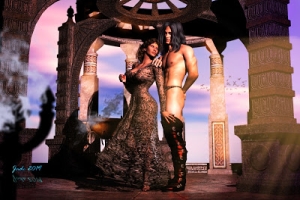
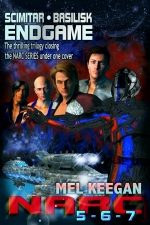
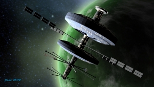
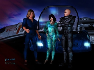
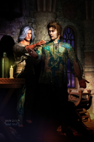
...which partners two of my own characters, and my favorite characters. And then I thought, "Wait a second, this would look amazing as a promo still for Hellgate. So I dropped the Neil Travers and Curtis Marin characters into the same setting, and discovered I was right! (Clarification, it be necessary: this is Mel Keegan's HELLGATE, not, repeat not the video game from a few years ago. Mel Keegan's HELLGATE dates from 2001, and is a million-word SF opus with glbt content -- it has nothing whatever to do with the "shoot the zombies" game.)
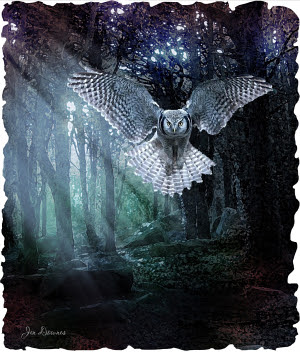
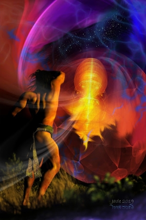
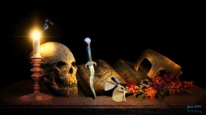
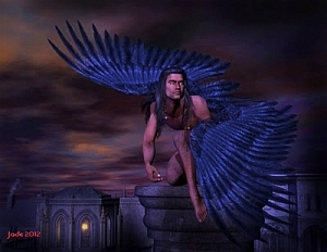
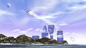
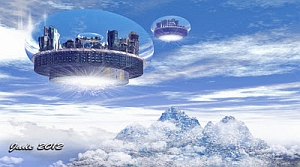
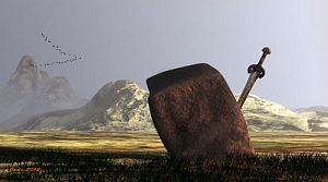
All of which got me to thinking about promotional materials for movies and shows, and I caught a glimpse of the other shots, which are the kind of formula images they generate to catch your eye and make you wonder, "Hey, what am I missing?"
So I'm really pleased with the way the Hellgate promo stills rendered, but I am REALLY pleased with the piece featuring my own characters.
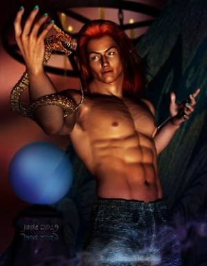
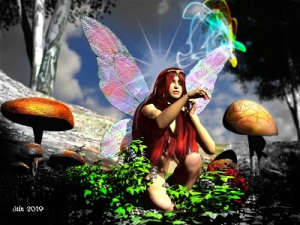
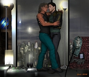
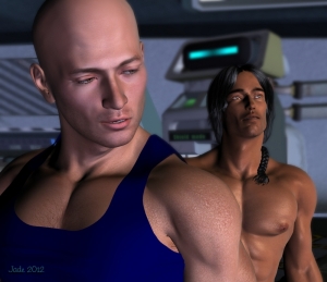
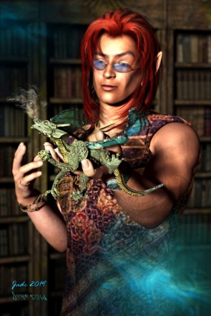
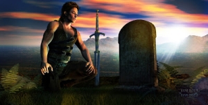
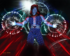
Long-time visitors to this blog will recognize Leon from many, many projects, including the Abraxas story -- that's the guy with the red hair tired back on the shoulder of an exotic shirt. The new character ... with the dreads and the leather, is just that, new. He's also one of those characters that the lights and the camera just seem to love. Now and then, when "doodling" with character design, it all comes together into something amazing -- and here's one that drops into that category. The amazing ones get names. This one is Roy --
And this shot also looks like a promo still for a movie! I get flashes of storylines ... Leon and Roy could be military veterans who're about to get involved in some dangerous, exciting, hilarious, intriguing events. And don't I wish there were 36 hours in a day, and 12 days in a week, which would give me the time to tell these stories in pictures and words?!
Well ... maybe soon. Right now, behind the scenes, we're experimenting with the best epub-maker software on the market. Yup, the one you pay money for, and which gives the 100% professional results, not any one of the numerous free conversion engines which give weird results, to say the least! So from here, working with images as well as text in the ebook format is a definite "can do."
The reason we've never bothered to do this with with PDFs is that the PDF file size gets too big, too fast, as soon as you start to embed images in them. Once the file size blows out over about 5MB, the hand-held devices (like BeBook, which is the one we're most familiar with here, on account of we invested in them) quite literally barf. And for anyone trying to read on a smart phone, it's instant disaster.
The hand-held ebook readers have a hell of a hard time time reading a *lot* of PDFs ... such as anything formatted on Letter size paper with page breaks inserted! I have otherwise perfectly viable ebooks that just make the BeBook roll over and quit. And very, very long ebooks, such as the complete annotated Iliad, which is about 7MB. The little machine just jams up tight.
All of this got us to looking at the alternatives to the PDF format for big documents which demand a lot of images, and epub is by far and away the best. Now, a file on the .epub file extension turns out to be a ZIP archive in which are embedded numerous files and folders. The text is all encoded in an XHTML file; images are only ever linked, not embedded, which is why the file sizes stay small and don't crash the hand-held readers (duh!), and the proper software breaks a long book down into separate files for each chapter, which makes navigation from a Table of Contents a breeze. Making an epub file from scratch, by hand, is right royal pain in the posterior, but the software does it for you. All you do is format everything up properly and click "go." First, of course, you have to put down your credit card and ante up some of that elusive stuff called, uh, money. So far, so good!
Long story short, the illustrated ebook, half images, half text, is starting to look very attractive. I've been asked a dozen times (hi, guys!) why I don't go back to the Abraxas project and just go ahead with it, and ignore the fact it was deemed to be porn -- despite that fact that it has NO sex, NO full-on nudity, NO bad language, NO violence, just a bunch of adult concepts. Go figure. I was, and am, mystified.
Well, the reason I haven't -- yet -- returned to Abraxas is the time factor. Doing it as a graphic novel was incredibly time consuming, because every shot had to be set up to accommodate the dialog, two or three lines at a time -- which added up to a heck of a lot of panels, a huge amount of design work, and then the additional job of doing the overlays for speech and narrative. It takes 3x to 4x times the amount of time to tell a story in that format as it does to tell a shorthand plot fleshed out with maybe 50-100 pieces of Very High Quality artwork. (Then along comes some bright spark on a puritan crusade and deems the whole thing porn. Excuse me?!)
However, with the epub format, using linked images rather than embedded images ... suddenly the illustrated novel idea starts to become more attractive. Hand-held devices won't crash with the epubs, and also -- the age of the Full Color Ebook Reader is upon us. They have them at Walmart for about $100!
So my mind is wide open, and I'm very happy to see where this goes. You know me by now ... my brain is so full of stories, they're always trying to escape! But, find the time to sit down and write a whole novel?! [sounds of manic laughter] Illustrated novels, though? Now, that's another question. Give you the story in shorthand, and 100+ fabulous images to add the flesh and blood to the tale. Now, that's another proposition entirely! Food for thought...
Jade, 9 July


