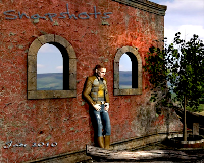
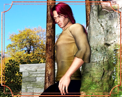
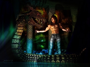
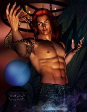
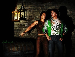
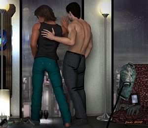
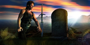
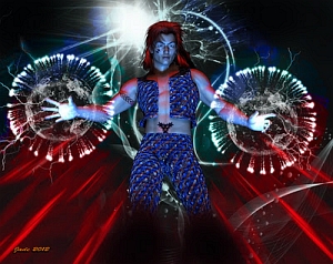
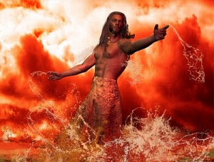
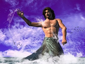
3D sets, props and characters all come together ... I think of this kind of project as a scene from a movie that hasn't been made. What you have here is something along the lines of a mercenary hard boy, waiting for someone to show up with the details of the job he's about to do.
The costume is similar to the one Jarrat is wearing in the first part of the recent series of NARC renders -- not the same at all, but similar. You do this by changing the textures on the models ... the "models" in this case being the jacket, jeans and boots. The way DAZ Studio works is that you buy the basic models quite cheaply (anything between free and $30), and then you add on textures as you need them. So you never need to pay a fortune at any one time.
The set here is made up of bits and pieces from three different collections of props. This is another thing that works so well ... $10 for Western Brick-a-Brak, $10 for DM Instances, and so on ... then you mix and match, put together anything you want on the fly. It's like having a props department at your beck and call!
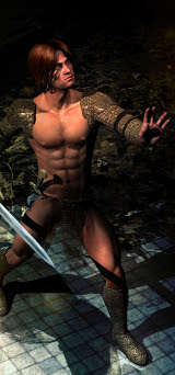
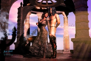
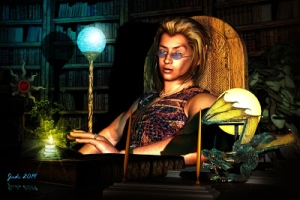
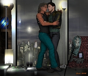
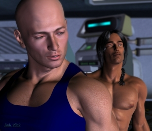
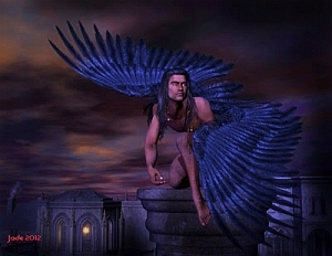
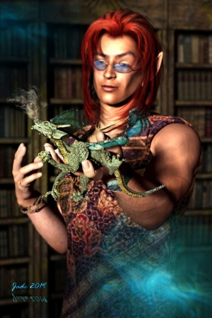
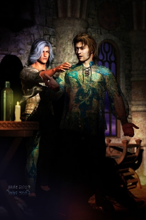
These shots below were done the same way -- and okay, I'm going back to Leon, because he's one of my very favorite characters ... make maybe because he's 100% mine. I'm getting a real fondness for this character. I love that face...
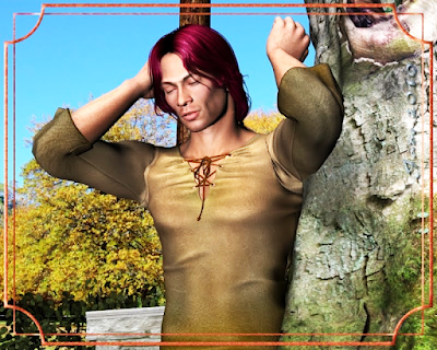
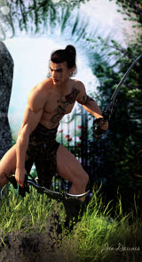
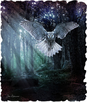
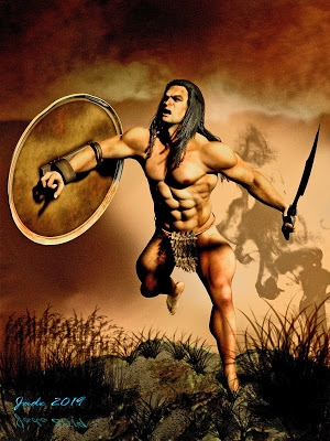
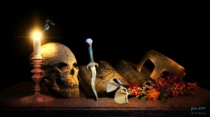
And these shots were done the same way as the mercenary. It's a real background with 3D props building the middle- and foreground. So long as you put a ground plane under the character's feet, he can cast shadows on it and look like he's connected to the ground instead of just floating there!
Don't forget that 3D models can only cast shadows on other 3D models, not on the background image ... well, not as such. You can also plaster a background image onto a flat vertical surface and have it stand there and look like a backdrop, and you could cast shadows on that ... but five gets you ten your character will be casting shadows on the sky, or on something (like a hill!) that's supposed to be five miles away! So it's actually a good idea that models can't cast shadows on the background JPEG, or artists would be in big trouble! The trick is put a ground plane under the character's feet, and then obscure the edges of it with other props, so it's not visible as a big flat rectangle or square!
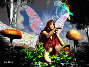
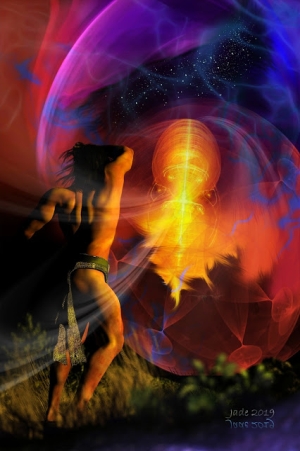
This trick works really well. You see it in the mercenary above, and in the shots of Leon in the garden yesterday, and numerous other shots on this blog including the gorgeous Native American, and the horse in the enchanted forest... Trust me, this works! It also gives better results than working with the full-on 3D environments, which gobble RAM, slow the system way down, and don't actually look all that realistic in the final render. (The problem is the trees with the hubcap-sized leaves ... and there's no way around that, that I know of. Rats.)
Speaking of all this, I've just taken my first wobbly steps into the fantastic world of Bryce. I've seen what can be done ... and I just have to do it! Right now I know about 1.5% of what I need to know, and it's going to be a steep learning curve, but I'm on it and scrambling upwards!
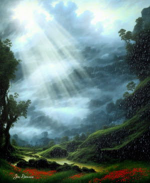
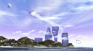
Now, experienced Bryce artists might laugh, and I won't get in their way of a good chuckle, but I want to set a bench mark -- for my own benefit, not theirs!! Today, March 15, I got my feet wet and wrangled the Bryce interface for the first time ever, and came up with this:
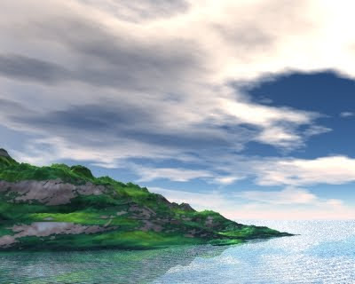 And sure, it's basic. But the water's blue and reflecting both the sky and the land, and it's also the right degree of transparency (!) with a nice little afternoon chop on the waves, and the seaward crags are pretty much what I wanted to achieve, and pretty much the color they ought to be. I have about 1% idea of what I'm doing so far, but it's a whole lot of fun. This is the way I started in DAZ Studio 3 ... sort of bumbling around the interface and learning by doing!
So as I learn, you'll start seeing some amazing landscapes ... and then you can import the Bryce Landscapes into DAZ, so very soon our characters can go places and to things. Hmmm...!
Come back soon and see what's happening!
Jade, 15 March
***Posted by MK: my connection is intermittent, too slow for this.


