Monday, May 20, 2019
Red dwarf homeworld, Terragen atmospheres, gorgeous gay heroes and Photoshop brushes. Yes!!
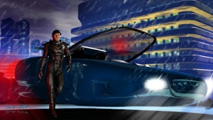
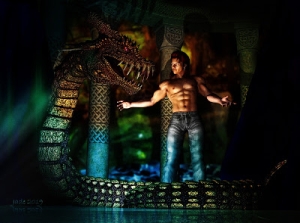
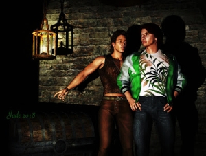
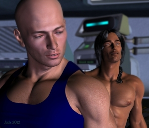
Yep ... Jarrat and Stone ... and this picture is chock full of experiments. You might not believe it, but even now, after how many thousands of images, almost every picture I render and/or paint is still an experiment! I'll yack a bit more about that in a second, but for those of you who can't open the image at bigger scale (small phones, for a start), here's a closer look at our heroes:
(Credit where it's due: all kudos to Mel Keegan for creating Jarrat and Stone and the NARC universe, without which these gorgeous gay SF heroes would not exist, on these pages or anywhere else.)
Okay --
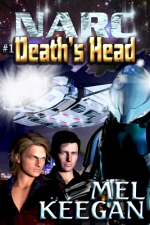
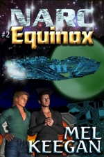
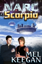
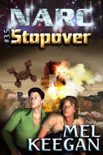
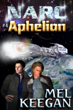
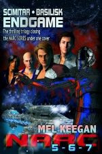
One thing I do love is "old fashioned SF" where writers like Poul Anderson (my absolute favorite of the Old Brigade ... he created Nicholas van Rijn and David Falkayn, for a start!) would not only spin great yarns but also build alien environments designed on solid science. Keegan is on my mind again lately, not merely because I'm up to Scorpio this time through (!), but also because he's writing again (!!!😁!!!), and he describes the current project as "At last, a 'Golden Age' romp without the 'warts' ... gay heroes and up-to-date tech." It's going to be great. Seriously. And what Mel is doing here really is as if someone like Poul Anderson or maybe Brian Stableford just decided to write a full-on gay adventure/love story on a fabulous alien world. Yeah ... wow. Which got my own imagination to working, and I found myself daydreaming about a fertile planet circling a red dwarf star (meaning a smaller and dimmer and cooler star than our own sun). So --
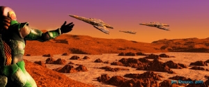
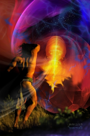
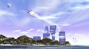
Into Bryce 7 Pro, and let's model it. The sun is small and dim and cool, so a warm, fertile world has to orbit close to it, right? So the angular size of it in the sky is somewhat larger than our sun appears; this planet sits in the "sweet spot" where the world is just warm enough to be fertile ... the cool sun looks yellow, not white, when you look right at it, and the red end of the spectrum puts a bloody wash over the sky and everything else. Makes for a very nice picture, too.
All of which got me interested in atmosphere, so --
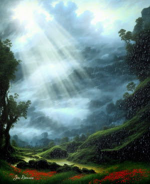
Terragen sky: late afternoon, and ...
...right on sunset; and...
After sunset, when the sky is bronze and dimming rapidly, and the world is becoming dark, you expect the stars in a few more minutes. Nice.
(Does anyone else find Terragen a bit overwhelming? There is so much to learn that, frankly, I've decided on the old KISS rule: Keep It Simple, Stupid. AKA, one thing at a time. I've learned about all I can for now about "heightfield terrains," and "proceedural terrains" continue to baffle me a bit. Atmospheres are the next thing I need to master, then I'll come back to proceedurals, and, when the computer is rebuilt (soon!) I'll see about working with populations: adding forests and so forth. Ack. Soooo much to learn here. But it's fun. It's good for your brain, especially at my age. Put it this way: I ain't gettin' any younger. 😒
Now, going back to the experiments in today's main render! As I began, the picture is full of them, and they work! For a start --
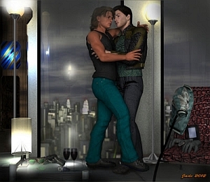
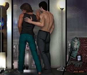
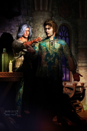
Look at the forearm on the left, and the hands on the right. This is a combo of bump mapping and painted highlights, using a blend mode (thank you, Photoshop), plus a touch of "aging," using the special morph in the Morphs ++ package. That's ... not bad at all. The hint of veins makes this so much more realistic, yet it's subtle. Your eye expects to see this; it doesn't hit you in the face, but it makes the figure that much more "real." Well worth the extra minute or two it takes to switch out the bump maps and do a few test renders to get the settings just right. Then, this, below, was the big experiment...
...and I don't know why I didn't do this a long time ago. It's the hair. Jarrat wears the Mon Chevalier hair from Neftis (via the DAZ marketplace; you can still get it, but it's a bit more expensive than it used to be, from memory). The one thing about this toupee that always annoyed me was that, "fresh out of the box," as it's applied, it looks awfully fake, as if it's ... plastic. Eventually (rolls eyes) I thought, "I wonder what would happen if I overdrive the bump mapping on the hair???" Uh huh. Duh. A bit of overdriven bump mapping, and the hair "pops" into an effect that's far, far more realistic than the results I've been getting across the years. I could kick myself, honestly. 😝
Then, the last thing I did differently on this is...
...I hand-painted Stoney's hair. There's nothing much you can do with the GQ Event Hair when it's set to a shade near to black (as Stone's hair is described in the books). You can't see detail in it, ever. But the shape of it is always 100% identical, in every single render ... which is not really realistic. Nobody's hair stays the same for ten consecutive minutes. So this one is hand-painted, to give Stoney a slightly more tousled look for once!
The brush I'm using for the hair is a (free) download from a very, very talented artist and brush creator at DeviantArt. I want to give a plug to "para-vine," and say thank you, thank you for this brush set, which has been terrific. (For clarification: no, I don't know para-vine personally, but I'd like to shake him by the hand and say thanks for these brushes. Wow.)
That's all from me for today. Back soon -- hopefully tomorrow, because on Wednesday the computer goes into the shop and you won't see new art for a few days while it's upgraded. Whoooo!


