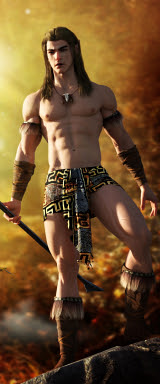
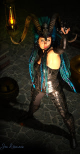
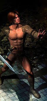
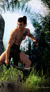
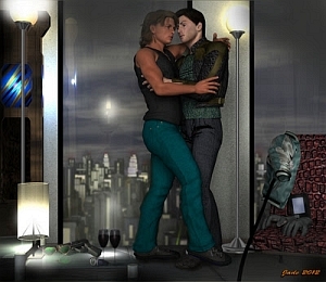
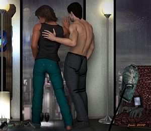
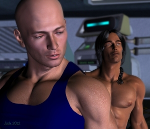
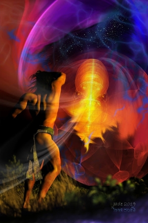
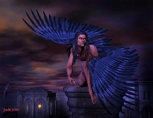
It's the boys' turn. And about time. Yaoi.
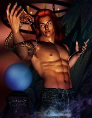
This one is a study in light and gold. It uses only three models, a texture, and a background:
Michael 4 (would you believe this is still DAZ's Michael 4?!)
The Mon Chevalier chair set to golden blond
The "head jewels" from the Destiny jewels set
The Jagger skin map on Michael 4
A background JPEG.
Now, the Destiny jewels set is not designed to be used with male models. There's precious little jewelry designed for the guys, and what there is, is clunky. Extremely. So, though you can buy plenty of jewelry bits and pieces, there's no automatic fit for them...
It really is no problem. Once you learn how to get around the x,y,z controls, you can move the object up, down, around, rotate it, skew it, whatever ... you drag the object down on top of "neck" in the scene contents list, and it locks to the model and stays where you put it. And if you want jewelry which looks great on a guy, just take the light-and-airy little wispy things created for Victoria and the rest of the 3D female regiment, and scale it up. Make it bigger, more robust, more masculine, if you like. The design is the same; but not it looks great on a guy in a fantasy setting.
The Jagger skin map is so useful. I use it on my Gypsy characters and on Jarrat too. Got this in a sale for about $14. (I got the Destiny Jewels in a sale this morning, for abut $6 ... hence, I'm playing with them today! Keep an eye on DAZ's specials -- there's always something on sale, ad even free. You'll have to spend a few bucks eventually, but if you're smart, you can keep the cost way down by knowing what you want and being a bit patient.)
The background is a heavily-painted photo of some faux marble columns. I admit to being clueless as to where the image comes from. Looks like it started life in a clipart set. However, I did everything imaginable to the pic, which is not very good quality ... changed the color balance, the gamma, the contrast, and then got to work painting on it. Originally, there were doorways messing it up, confusing it, to left and right. They had to go. Then there's a mess of pixely rubbish in the top of the shot, where someone bounced a flash off the ceiling. So, a not very good photo was heavily painted to make a rather nice, artistic backdrop.
Then the fun with lights began ... and I actually remembered to render progress shots today. I often forget, but -- here you go:

Click on that, it opens up at 1000 wide, so you can see the steps. What you have here is one gold distant light angled up from the bottom left to simulate off-camera candles or a lamp, or a brazier; then a white point light off the left shoulder to simulate the light falling in through that window or doorway on the right of the picture (his left). Then a blue point light on his left him, adding to the effect of candlelight from one direction and daylight from behind and opposite.
The whole project was suggested by the jewelry, but I actually got into this one -- went as far as designing a new face. If you don't recognize him, this is because you never saw him before. I "made this face" about an hour ago. And the face looks as good in closeup as from a distance ... sometimes, when you put expressions on a face you just created, something's not right, it doesn't look so good. But this one -- click to see it at 1000 pixels high, it's a treat:
So there you are ... a new character, as well as a lovely picture! Exotica, and call it Yaoi if you like.
Jade, 3 January
***Posted by MK: my connection is intermittent, too slow for this. Seriously, guys, I've got dialup speeds. How are you expected to do anything these days, at 1990 dialup speeds?!!!


