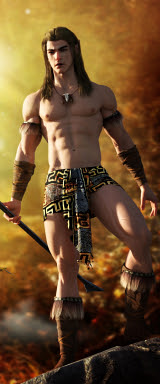
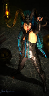
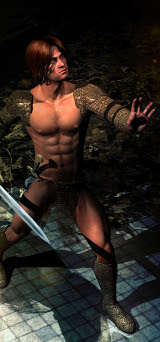
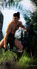
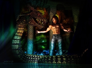
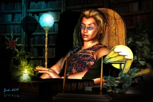
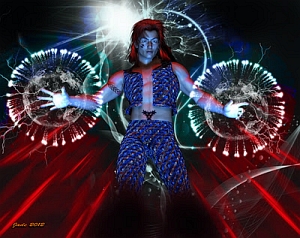
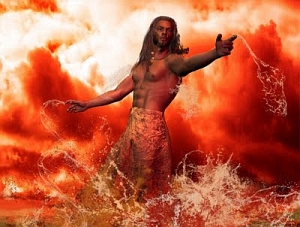
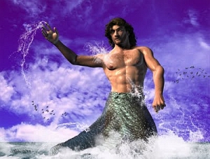
So, I guess I have a niche to fill.
2024 Edit: fast forward by fourteen years, and this has actually changed somewhat. I'm not going to say that there's loads and loads of fabulous "gorgeous fantasy guy candy" out there (yet), because there isn't. But since the ability to do digital painting landed in the lap of everybody who wants to have a go, I must butt in here and add that DeviantArt has loads of gorgeous young men now. This was not the case in 2009, when I started. I guess I was making a valid point after all, because things did change!
Anyway ....! Off the soapbox, Jade!
Today I'm in a hell of a hurry, so I won't ramble on. I'll just get down to brass tacks.
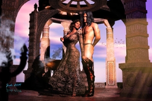
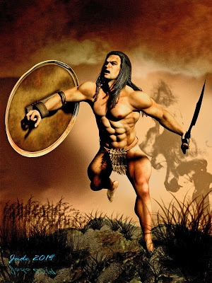
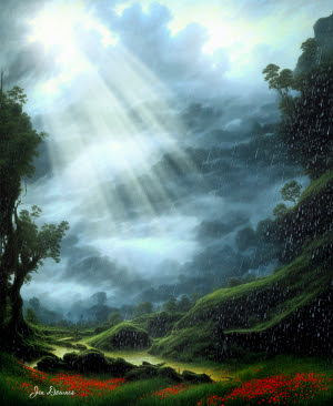
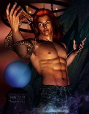
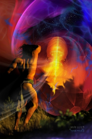
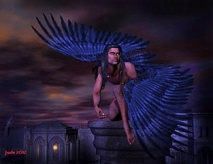
The idea came out of a photo of a storm, which happened along at the same time as I got a new hairstyle. Seriously! This hairstyle has about 101 morphs, some of which are really long ... and I could just see it on one of Boris's fantasy godlings.
Problem #1: it was never designed to fit Michael 4 ... so it's the biggest fiddle in the world to get it to go on and stay on, and be halfway decent. It's actually designed for Victoria 4.2, and was one of the hairstyles I bought in when I started to work with Sara Lansing, designing covers for her upcoming books...
But it really looks good on a Yaoi version of Michael 4, so I put about fifteen minutes into getting a fit ... then changed the style to one of the loooooong ones. Great so far!
Then I wanted the smooth body map. Godlings are not usually hairy. Well, some are. But this one isn't! For the smooth body map, I use the Jagger "full mat," which you're accustomed to seeing on Jarrat and the golden Yaoi elven princeling. Very useful.
Then, a flying pose -- that much was easy. Import the background: again, easy. To get the backdrop, I cut a small tile out of a vast image, and I admit, it's not one of my images. I downloaded it. It started life as a wallpaper. But I swear to you, I used only about 15% of it -- and I did all sorts of things to it. The original image is very, very grainy. Notice, by the time I was done with this, it's as smooth as silk. I also darkened it waaaay down (gamma down), and then cranked the contrast, then adjusted the colors to make it much more purple. Finally, I super-saturated the colors.
Now the fun starts: lights!
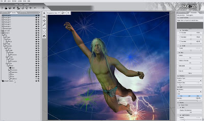 ...and you can see from the list on the left there, I have seven lights on this to get this effect. If you use no lights at all, the effect is very flat and "plastic." Like this:
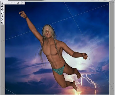
So, it might be easier to wuss out and not wrestle with the lights, but to get really good images, you have to bite the bullet and get into it. The problem with the "no lights" render is that it looks like a photo montage. The character is lit in warm ambient tones that have nothing whatever to do with the twilight storm sky he's supposed to be flying through. So, pretty as he is, he tends to look kind of like he was cut out and stuck on there. The solution: lighting!
Jade, 12 January
***Posted by MK: my connection is intermittent, too slow for this. Seriously, guys, I've got dialup speeds. How are you expected to do anything these days, at 1990 dialup speeds?!!!


