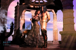
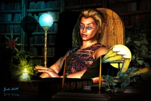
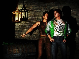
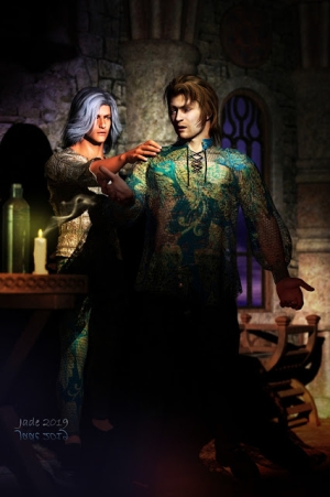
Which means you can stage a scene. So I chose the faux columns, and the marble, to give it a real look of an ancient Egyptian or Greek or maybe Trojan structure. But our Michael 4 is very blond here, so it's almost certainly going to be a fantasy setting. So I figured, why not add the Yukimi lamps, which are a great prop, and get a real fantasy texture about this.
What I like about the Yukimis is that you can size them big or small, and they look just as good. I mean, how big's a Yukimi? You get tiny ones and huge ones, right? And you can park a point light right inside of them, makes them look like there's a candle burning inside... this gives a great effect. Everything you can do to add texture and complex shadows to a scene adds to the reality of it.
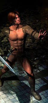
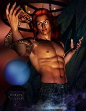
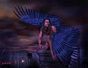
Then -- well, I had it easy with the Michael 4 model, because this is the same character I created just yesterday. Blond and pointed-eared and blue eyed and lithe, brown skinned and just plain beautiful. Hey, this is Yaoi, so why not?!
The really tough part of this render was in getting the props positioned AND the lights. You don't believe how much there is to learn about the x,y,z environment till you start moving things, and lights, around in it. Also (here's another big "duh") I wondered for ten minutes why my spotlight wasn't casting a shadow on the marble wall behind him...
Ready for this? I'd backed the light off so far, it was outside the set! In other words, the spotlight was happily shining on the outside of the wall to Michael 4's left. No way was it going to cast a shadow from him onto the other way, because no way can a light shine through a solid object.
Ouch! Well, I got that one figured out, and got the prop placement figured out ... in numbers. Lately, I've been working more and more with numbers rather than just pushing and pulling objects and trying to "eye match" where they look right.
Here's the thing: when you're lighting a set rather than just a backdrop ... and particularly when you're flying your camera around inside a closed set like the Space Blocks or the Dragon's Lair (I just got this! Fantastic!) it's a major headache trying to figure out which way is which. You have to look at the x,y,z coordinates...
And suddenly it sorta-kinda clicks into place. For instance, to put characters into a really huge set, it's a safe bet your set is probably standing at something like 0,0,-1000 on the coordinate system. Okay, fine. That's the set. Now, import a model -- Michael 4, perhaps. But when he teleports onto the stage he comes in smack on the 0,0,0 mark ... nowhere near the set.
First thing you do is start hunting around for him ... where the hell did he go?! But if you went into the numbers and set the coordinates just right ... whap! He just jumps into place on the set. Same with the lights and props.
Anyway -- to get this render I used my Yaoi elven princeling from yesterday, and added two copies of the Backdrops Made Easy model ... and then three Yukimis. Then I lit the scene with a distant light plus two point lights on the guy's face, plus a spotlight to cast the shadows, and then two point lights inside the two small Yukimi, for texture and effects.
Then it was "just" a question of adjusting the color and brightness of the lights to get a good effect. I also did a few different poses...
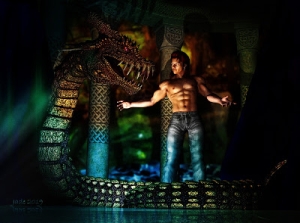
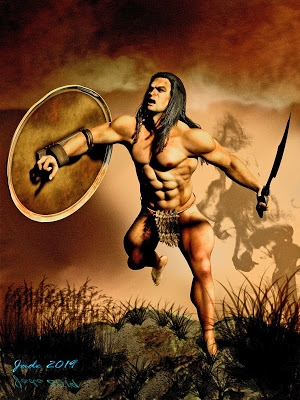
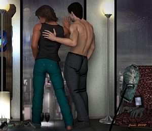
Our Yaoi elven princeling seems to have been challenged. Looks like a fight is impending ... well, he's backed into a corner, after all! I was looking at this and thinking, did somebody chase you here? Did you get away or are they still after you? By the looks of this render, he didn't give 'em the slip, and will have to fight his way out. Go for it, kid!
If you have a look at either of these two renders, you can also see how nicely the parquet floor came out ... I know, I should have changed it to tiles or stone, but I clean forgot to do this till the final renders were finished, and then I was out of time. So, what the hey? In this fantasy land they have parquet floors in their marble temples.
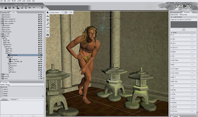
Here's what the DAZ "viewport" looked like: you don't see the shadows till you render the shot -- they do show up in a spot render, though. Nice! Then, the finishing touches were added to this one with a border and signature, both done in Serif. (I still say Serif X3 has more in it for artists than for publishers, even though they market it as a DTP program. Fantastic software, any way you push and shove it. What would I do without it?)
Back tomorrow with something new...
Jade, 4 January
***Posted by MK because the internet is AWOL. Intermittent crap. Be warned, guys: our connection is going to be in and out for a week or two, as of this point: Telstra (or whatever) is doing a lot of work on the landlines in this area. And as you know, if you've been looking at the "poster notes" on these journal entries in my looooong adventure through the world of CG, 3D and digital, even at the best of times we can find ourselves with dialup speeds in this area. This is why MK has been making many posts for me, since Day One -- Keegan has the fast connection, not me! (This should change in the near future, when the cables or whatever are updated, and they stop working on them. At least, s'wot Telstra promises.) Credit where it's due: this blog would not have been possible without the support of a pal with decent internet. Because ours sucks. We moved into this area about six months before I got into Studio and blogging about it, and I almost quit right there: DAYS to download something from the DAZ store, at one point. Argh. Thank gods for friends when you need 'em!


