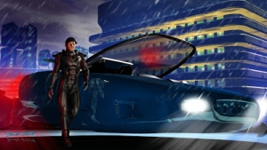
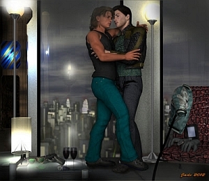
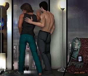
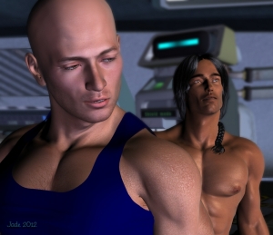
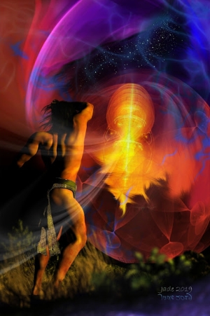
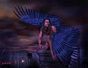
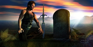
 I call this one "Immortal" because I'm thinking of the McLeod cousins, Connor and Duncan, when I look at the city and the sword ... but there's also elements of Daredevil in there ... the rooftops and the night. I got into the lights again with this one. Here's the detail:
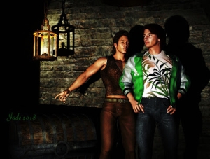
 You start off with a pretty ordinary Michael 4 and start adding mix-n-match costume bits. For this one, I used the "morphing" leather jacket; the pants and belt from the SF costume I got last week (see Spaceport), Mario's Hair, and the greatsword from the fantasy weapons set. Then I tweaked everything to change colors, textures ... the shoes went black; the pants got full-length and dark blue; the jacket went tan, with a high collar; the sword's detail was recolored.
Then... background. Hmmm. By this time I was already thinking "Highlander," so I wanted a city at night. I lucked out with a Wikimedia shot ... they're mostly public domain, because there's such a ruckus over copyright, derivative works and so on. (Everybody seems to expect to get paid even if 2 square inches of an image were used by someone else, transformed utterly, and the work was done for fun anyway. It's unrealistic. It's impossible.) Anyway, I lucked out with the Wikimedia shot, and then did EVERYTHING to it in Micrographx to get what I wanted. I doubt the person who stood on a rooftop and shot the image would recognize it (but if you do: great work, man, and thanks for making it available in the same spirit the digital art on this blog is made available).
Now, the shot was set up with "render settings" of an aspect ratio of 5:3, which is the same as Super 16mm. So it looks like a frame out of a movie. The hardest thing was resizing the part of the image I wanted to use, to wind up with the right aspect ratio. I did 2500x1500 pixels ... which is 5:3, if you figure you're dividing both side by 500.
Then came the fun part: the lights. This one was done with three lights -- a dim "distant light," which represents the general backwash of light from the world, then two spotlights -- yep, a blue one and a green one, set to left and right of the character. Then I told DAZ to render at 1200 pixels wide, so the image is big enough to see the character's face.
Here's what he looks like from a slightly different angle, before the backdrop and lights were set up:
 So there you go ... mix'n'match costumes and props.
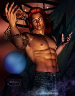
 I like this hairstyle, too. It's Mario's Hair, and it looks pretty good on most faces ... not the real psychopaths, though. When you start to design evil villains, curly hair just doesn't seem to look right. But that's not the fault of the Mario's Hair! It actually looks good on the female models too.
Not that I've worked much with the female models ... and one more time I'll tell why: because everyone is done pictures of women and girls! Even the female digital artists are doing females. And when males are depicted, they're cartooned or deformed or freaky. There's a huge space to be filled, and I'm plugging the gap, one render at a time. So if it's female characters and digitals you want ... you don't have far to look, but you won't find very many of them on this blog, sorry. This blog is about beautiful guys.
Jade, 21 November


