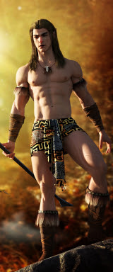
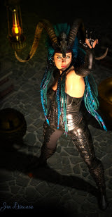
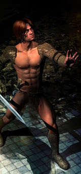
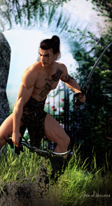
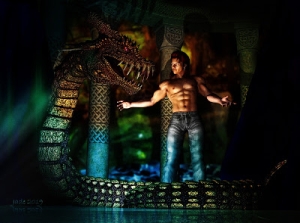
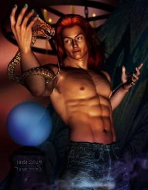
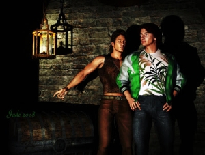
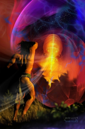
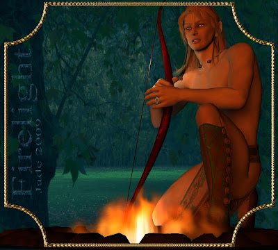
 This one was sheer inspiration. It actually occurred to me late last night, and when everyone else went to bed I spent a really great half hour doing this. It's the elven (or elvish, or elfish, depending on your school of thought...) character from yesterday, and it you look really hard, you might even be able to see it's the same background location, an image shot at exactly the same time ... daylight has been turned into night! Stay with me, and I'll tell you how...
So he arrives at this forest glade and pitches camp. He's ... waiting for somebody. And it looks like he just heard a sound in the woods. Someone coming? A branch snaps? He reaches for the bow and every sense comes alert...
All well and good, but how in the heck do you get a DAZ image to look like this?! It's all about light. The model and props and backgrounding are all virtually the same as yesterday. The only thing I changed was, I added a firepit in the foreground, changed the backdrop to night, and set the lights to simulate firelight.
The firepit was easy. DAZ was having a sale a couple of weeks ago. There's a kit called "Dungeon lighting kit" that caught my eye. It has a fire pit, a brazier, pitch torch, wizard staff, candelabra, even a jar of fireflies! I think I got it as a "Fast Grab" for about $7, and it's well worth it -- even though there's a couple of problems with some of the props in DAZ. The package is meant to work in both DAZ and Poser, so it shares the textures ... and DAZ can't find the textures, which means the designer who made this kit didn't get the file hierarchy just right. One day when I'm bored enough and have nothing to do, I'll track the textures down and put them in the right file ... but right now, with Christmas and work and all the volunteer stuff I'm doing for the GLBT Bookshelf [EDIT: link deleted, because the site went down permanently in 2015-ish] and fiction blog projects ... bored? What's bored?! So, the Dungeon lighting kit is a terrific kit, but you do have to have a bit of experience in this, so you can either replace the textures with your own (it's only rock and metal!) or else track down the original textures and put them where DAZ can find them.
So, to do this picture ... start with yesterday's project and take out the background completely. Set the background color to black or dark purple or something similar. Load the fire pit, or a "place holder" object that can pretend to be the fire in the project, and then get replaced with a photomontage of a fire, if the picture ends up being finished in your paint/photo program.
Now, pose the figure however you want it posed. It's a lot of fun to do this yourself, using the Parameters tab. You can also buy packages of pre-done poses, which you add to the figure and watch Michael 4 sort of jump into place. There are some really good pose sets, and I did buy a couple -- but I have to confess, I use them for the basic pose and then get to work on them, tweaking and pushing and pulling, till I get what I really wanted. You have no idea how many poses the human body can get itself twisted into till you start doing this! Millions.
So: background plain, Michael 4 in, and dressed, and posed ... firepit in place. Now the fun begins, because the trick is to turn the background and the character into a firelit scene.
If you're really lucky, you might be able to find a nighttime picture that's just right. You could probably steal something off the web ... but web pictures tend to be the wrong shape and size. They can get pixelly when you stretch and enlarge them. Also, you really don't learn anything when you just swipe someone else's photo -- though I realize you might have to do this, to get something to work with, short-term.
But you don't have to find a nighttime shot. You can also find (or take) a nice background shot that's broad daylight, and make it into night. Like this:

 It's the same photo. I took is about eight months ago at the Long Gully area of Belair National Park, which used to be the "Government Farm" back in the state's colonial days. The farm people planted loads of European trees, including oaks, sycamores, birch, chestnut, the works, because that's what they liked. The trees are now about 150 years old, and if I want a backdrop that looks like Europe or the UK, or New England, I know just where to go for it...
Now ... how do you turn broad daylight into night with a patch of silver moonlight? The difference between sunlight and moonlight is not just in the strength of the light -- obviously it's dimmer at night! -- but also in the fact that moonlight doesn't bring out colors at all. You need good bright light to get sharp shadows and a lot of contrast, so to make daylight turn into night, you have to do three things:
- Turn down the color
- Turn down the brightness
- Turn down the contrast
- ...it also helps to increase the blue tones of the picture.
Here's what it looks like, working in Irfanview, in the Color Corrections dialog:
 Could it get any easier?! You have absolute control over everything you need, with a set of seven slider bars. Pull 'em left and right till you get what you want, then save, and you're ready to import the backdrop into DAZ.
So, now you have the nighttime backdrop and the firepit, and the character posed. The next step is the most important. You have to make it look as if the character is lit almost totally by the fire. And this means setting some DAZ lights.
There's three things about light, and once you get a death-grip on them, you can make light do what you want it to (at least as far as painting and artwork are concerned ... the physicists trying to make starship engines work would probably have fits at the first half of this sentence).
Light has 1) strength, and 2) color, and 3) direction.
The strength of the light tells how bright something is going to be. The direction of the light tells which way the shadows are going to fall. The color of the light tells how an object will show up, and even change color. For instance, did you ever notice how blue turns purple in fluorescent light? Shine a bright yellow lamp on something blue, and it turns green...
There's only three "rules" you need to obey. One: if all the shadows in the picture are cast by the same light source, they all have to run, or fall, in the same direction. You'd think this was simple, but you'd be amazed how often pictures go dead wrong, with shadows falling the wrong way! Two: the "focal point" of the picture needs to be where the light, or the effects of the light, get together to draw the eye. In other words, if something way off on the side is too bright, or too brightly colored, it'll pull the eye away from what's supposed to be the subject of the picture. Your job is to turn down, or subdue, the light you don't want. Three: (and this one is totally subjective) manipulate the lights to get the "right effect." And if you get three people in a room, they'll have a fist fight over what "the right effect" is, so ... you decide what you're trying to say with the picture! But -- once you've decided what you're saying, and doing -- stay true to the rule you made. Pictures only get lumpy and uneven when you stray from your own rules.
The light is generated by the fire, so most of it ought to be starting in the fire pit. Set a distant light first; make it pale gold and tell it to "point at" the character's head. Then set a spotlight, and make it orange, and -- seriously! -- park it in the middle of the firepit and tell it to point at the character's chest. Then set two point lights, a yellow one and a white one, and set them off the front of each shoulder...
Now, you're ready to play. Hit render right here ... and brace yourself to be appalled. The lights are going to be way too bright, too red, too yellow, too close, too far away ... and so on. Yuk. Really. Trust me. They almost all start out this way. But the rendered shot gives you a place to start ... a map you can use to navigate your way out of the mess. Keep rendering shots till it's perfect. I usually render 3 or 4 ... to get "Firelight" right, I did half a dozen!
Here's what the DAZ desktop looks like, when you're in the middle of working with lights:
 If you click on that and view it larger, you'll be able to see the star shapes hovering here and there. These mark out the positions of the lights. You can select them, same as you select anything else in the picture, and use the X,Y,Z controls to move them around. You can also go into the Parameters pane and set the POINT TO value, and the color, and the brightness; also, the "cast shadows" value.
Play! There's nothing much you can do wrong, though you'll get some weird results while you work out of to get it right. If all else fails, select and delete all the lights and start again. Working with the lights is a big part of the fun. The model looks fine and dandy ... and plastic ... till you add the lights, and then it comes to life.
Jade, 21 December (Solstice of Summer ... downunder)


