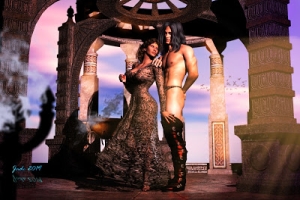
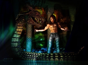
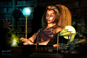
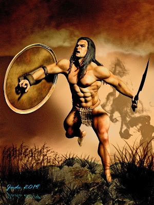
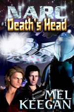
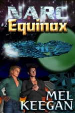
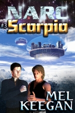
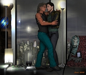
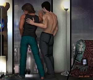
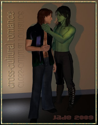
 Here's a lovely fantasy ... Yaoi fantasy, if you'll forgive (or indulge) the whim! Cross-cultural romance. Hey, they do it in Star Trek. You ever notice that Bill Riker will chase anything in a skirt, doesn't matter the species! Now, add a dash of Yaoi and you get ... well, something like this, and like I said, it's a lovely fantasy!
I'm also still on the subject of casting shadows, as you can tell! If you're tuning in late, and you're wrestling with the problem of casting shadows in DAZ Studio 3 (or any 3D program come to that ... the theory is all the same), you might want to go back and take a squizz at the first couple of posts in this series:
1: 3D Fantasy and the World of Shadows
2: Heroes in 3D (and Shadowlands, continued)
You could write a whole book, never mind a chapter, on creating shadows and the affect realistic shadows have in an image. I'll try to keep it brief...!
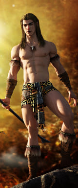
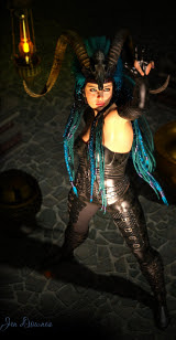
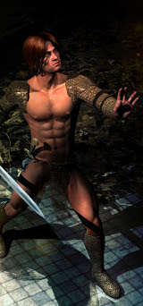
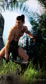
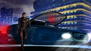
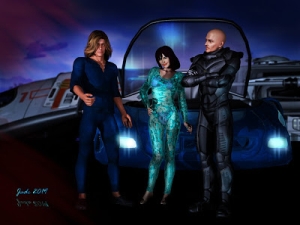
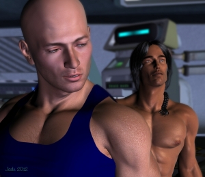
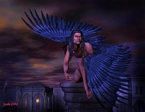
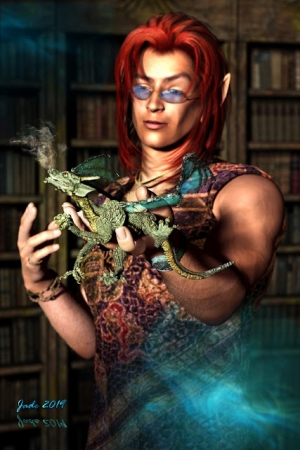
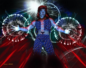
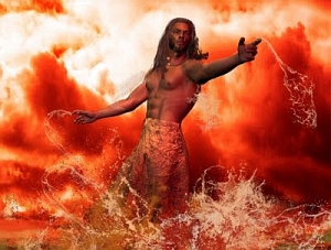
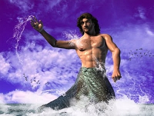
First, a few words about the models ... uh, actors. You probably recognize them. The green-skinned beauty is the alien version of the Yaoi elven archer; the human in this shot is the same character I designed a long time ago:
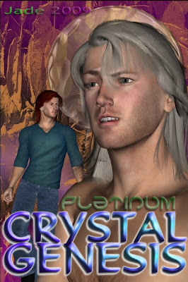
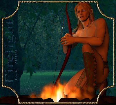 They're all Michael 4 ... same actor, different role. I made the elf green skinned and gave him a sci-fi costume. Then I took the "Platinum" character from Crystal Genesis and made him a redhead.
Here's something important: never, ever delete your old project files, because any character you created in those files can come out and play another part. Or think of it this way. You're creating a huge ensemble cast of characters. Very soon you only have to go back to the casting agency and tell 'em what you need, and out they'll trot.
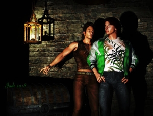
Again, you need to think about the interactivity of the two characters -- it doesn't just happen by itself. You also need to think about the stature of the characters. For instance, you might assume that, being an elf, the pointy-eared one will be small. Well, maybe he would be, as an elf (smaller than Aragorn, at least). But there's no reason why as an alien he has to be small. So I made this one taller and a little more robust than the human. He's also raven haired, against the redhead; he's also smooth and ripped, against the hairy-chested and less-gym-happy human....!
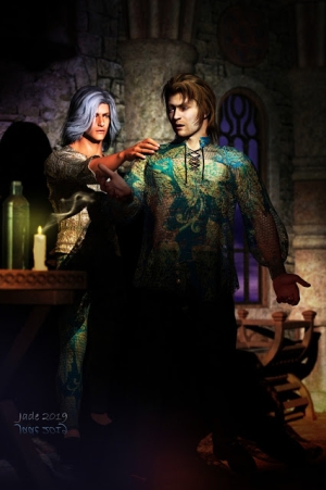
Today's render was done with six lights: a distant light; a spotlight; two point lights off the human's right shoulder; one point light off the alien's left shoulder; one spotlight pooling light on the floor to give you a sense of depth and gravity, so it doesn't look like the guys are kind of floating against a background image. (The "playbill" for Crystal Genesis is like that -- no sense of gravity, because it's not a "scene" but just a photomontage.)
The point lights are just there to add highlights to the image. The highlight on the alien's arm, and on the human's cheekbone, and the pool of light on the floor. Take these away, and the picture is flat and boring.
The magic happens, though, in the balance between the spotlight and the distant light ... and this is the thing I want to talk about today. It's a big thing, though you might not think it at first. Mood, atmosphere, drama, all start right here...
Here's what happens when your distant light outweighs and out-muscles your spotlight:
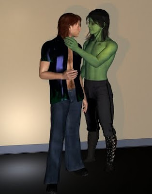 It's an okay shot, but ... it looks like a rehearsal. It looks like the actors are going through their lines, getting it right while the lighting technicians do their thing. The only difference between the two shots is the brightness level of the distant light.
So here, you can plainly see that the white distant light and the orange spotlight are counter-acting each other and making a "vanilla" shot. In fact, let's go back another step and have a look at the shot without any lights at all. This is what it looks like with just the ambient lights that import along with the model(s):

And boy, is that ever vanilla! They really are obviously 3D models. The sense of reality ... and movement, and life ... isn't there yet. But these are the same models, same pose ... I just decided on a whim to take the jacket off one and put another jacket on the other, for variety.
When you turn down the distant light, the spotlight becomes the principle source of light in the shot. The whole brightness of the picture turns down, and most of the light is coming from one angle. This means you get the deeper shadow on the wall, and shadows form around surfaces and limbs and features. Suddenly the viewer's imagination kicks in... it's a passageway on an upstairs floor at a tavern where these guys met a while ago; and one of them's booked a room!
Painting with shadows is where 3D work really gets into the realms of art. This is one of the things I like the most ... painting with light and shadows.
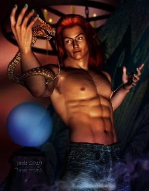
And still there's more to say about shadows, but I'm going to leave the subject there for a while and come back to it later, because I'm working on something really good in the "male nude art" line, and I want to render that one for tomorrow.
Stay tuned...!
Jade, 28 December


