


 Aha ... at last ... the seduction scene! The gypsy meets the dancer, back in the woods. It's night ... the lamps are lit, it's warm and fragrant with cedar and frangipani and night-blooming rosemary, and these two characters finally meet!
Remember this:
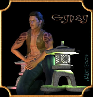 Uh huh. Well, turns out he was waiting for the dancer -- and we now notice that the dancer is wearing the same tatoos. Tribal tatoos, maybe? And this wayward little exhibitionist is leaving the gypsy camp, the gypsy way, to dance in the spotlights (see yesterday!), and his other half ... who is also his conscience? ... is trying to talk him into being sensible, not putting himself in danger's way, because the city folk will eat him alive.
It's a nice story, isn't it? Makes me wish I was a writer!
Okay, so how was this one done?
You start off with either the Gypsy or the Dancer -- you've saved them all, so go back to the one you liked best. Open it, and File > Merge in the other character you liked best. Now you have both characters in the same scene ... SAVE THE FILE! (Even on a monster system, DAZ Studio 3 loves to fall over, crash and burn. Luckily it starts right back up with no problems.)
First: scale both the characters so they're the right size in comparison with each other. Then pose them ... you're going to end up with something a bit like this:
 Now, this is fine and dandy as a vignette, and to finish this one off all you have to do is adjust the custome on the Gypsy -- the vest isn't fitting quite right yet. But if you had the seduction scene in mind ... well, you need a background, and then you need to set up your lights to make the characters look like they're standing in moonlight or starlight, or at the very least lamplight!
 It's tough to get nighttime pictures. And if you like to use your own picturs for backgrounds (I do) you run into the problem of needing images you don't have to hand ... and then it's hard to get digital cameras to work properly in the dark! So here's the solution: take a daylight picture and recolor it to look like nighttime.
Here's how you do it. First ... I'm going to describe how to do it in Irfanveiw. Not because I own shared in Irfan's company (I don't even know the man!) but I *love* this software, and it's free, and it works better than anything else up to and including the $1,800 monster, Photoshop. So if you don't have Irfanview already ... it's a one-minute download, a 30-second install, and no learning curve -- the interface is that easy. Get it here: http://www.irfanview.com/
So choose a daylight picture and open it in Irfanview. Go Image > color corrections. You get a dialog box that is instantly easy to understand. Flatten the gamma halfway ... flatten the contrast close to zero. Trust me on this. Nighttime has no contrast, and it's dark! Keep on flattening the contrast and gamma till the picture is flat and dim. Then un-saturate the color a bit to get rid of bright tones in the image (nighttime tones are not bright). Then, you want to make the picture a bit bluer to make it look like moonlight ... but the best way to do this is to turn DOWN the red. This automatically turns up the blue, without making the whole picture go pale blue. Also, work in tiny increments till you get what you want.
Save this, and import it to your DAZ image as the backdrop. SAVE again. Now, the difference in color tones between the characters and the background will look huge. Your job now is to change the lighting to look more like this:
And you do this in DAZ by selecting your lights one at a time and (!) turning them blue. That simple. These guys have about five lights set on them. Just go around and select them one by one and change the colors away from warm tones, to cold tones.
Now you can afford to play around with the exact pose ... the expressions on the characters' faces ... the fit of the vest ... when you see what you want, hit RENDER!
Then, if you want a border, ship the picture into Serif X3 and put whatever kind of border you like onto it. Now -- borders are a whole 'nother question. They really only "look" 3D. They're not, they're 2D objects made in Serif, and I had the pleasure this morning of describing how to do it, so all I have to do here is paste in that text and include some examples... Serif is another one of my favorite programs. The stuff I to, I could NOT do without Serif X3 (I don't use X4 -- don't need the photo editing additions, which are the major update over X3). You can also get X3 for as little as $50, and when you see what this program will do, that is just amazing.
But right now, right here, what you're interested in is two things: Serif's abilities to make these fantastic borders, and it's rendering engine -- that is, its abilities to export publication-quality images. Maybe a third thing: its phenomenal ability to handle text, to make your signatures and titles...
(Incidentally, the banner at your left is an affiliate link and I do make a few bucks when someone buys Serif from this page. If you've a mind to buy it, consider feeding the starving artist ...!)
MAKING BORDERS IN SERIF:
When your main subject material is finished (art, painting, photo, montage, anything), open it in Serif and click on the QuickShape flyout; choose square/rectangle...
Pull out a square or rectangle over the top of your subject. Right on the border, or inside the border, as desired.
Leave the rectangle selected, and look up at the *bottom* of the three tool ribbons (Top is File...; middle is icons; bottom is Page Setup...), and see where you have your LINE STYLE dialog.
The default is 1p. Go in here and set the width (thickness) of the default border on your rectangle to anything you want. 5 - 10 is usually good.
Now, you have a border on your rectangle ... you need to get rid of the white "fill." leave the rectangle selected and go over to your Studio tabs on the far right...
Open the left-side tab -- Swatches. Notice the icons. Extreme left is FILL. To the right of fill is LINE. The FILL tool is the default. In the dialog below, set this to "none" -- it's the top swatch in the dialog box, represented by a checkered square.
When you click that, you're left with the border only -- the rectangle went transparent. Okay so far! It's going to look something like this:

Fine ...but you don't want it black. So, change to LINE in the Studio's Swatches tab (second icon from looks like a box with a heavy black line under it). This means you can now set the color of the border...
Pick a color from the many, many options they give you in the little "paint boxes" ... you're halfway there now. (Don't worry -- when you've done this three or four times, you'll do it without even thinking about it. It's only tough the first time through.)
Now, you've got a colored border but no effects on it. So the next thing is to get into the FX Tab, which is way over on the left -- second from the bottom of the vertical toolbox. Leave the rectangle selected and click on FX...
This is where you get to play. There's about a million options, but you only need to know what they do, and you can create anything you have in mind. Check out the Drop Shadow ... then check out the Bevel & Emboss -- play with all the settings till you see something you like.
Now, you should have a colored border with a drop shadow, a bevel, maybe an inner or outer glow or shadow that creates color variations ... this might do the trick for you.
You could also want more.
You could want a round-cornered box; or one of those borders where the corners sculpt themselves into something like a Celtic Cross ... and you could want a pattern on there, something like gold filigree...
To get the rectangle to reset its corners to round or sculpted (I don't even know what that's called but am sure it has a proper name. Note to self: find out!) notice that the rectangle, when selected, has a "node" on the left side. Looks like a blank square riding a rail ... get hold of it with the mouse and drag it up or down. magic!
Now, textures are *almost* as easy. Leave the rectangle selected and go back into FX. Now, I can't tell you everything, because there's 25 ways to do this, but I can get you started, and after that playing is a lot of fun.
In FX, click 3D Effects ... then click 2D Pattern Map ... then click on the chessboard swatch ... the texture library pops open. Aha! (Eureka moment). Choose one and apply...
Now, you can pile-up effects -- bevel and emboss, AND drop shadow, AND texture, AND pattern, AND 3D lighting effects --
In particular, notice where you can set the Displacement, Scale and Curvature -- this is the "bump map" (meaning Surface Texture) which governs how the *pattern* looks when it's applied to your border. There's many ways to set up the texture and the pattern -- this is just one (probably the easiest to describe...) so -- play with the settings. It's a lot of fun, and you'll be amazed at what you can do. I *love* Serif.
Now, when you have the whole piece finished, select all and lock them together; then right click and Export as Picture. Set a file name and select at least 200dpi for high-quality final-render results. And that's it -- at least as far as borders are concerned. You can do virtually anything as soon as you figure out what the controls are for: pattern, texture, depth, scale, displacement. The best way to learn is play. It's a lot of fun -- and I couldn't do what I do without Serif. (Tomorrow, I'll talk a little bit about fonts, and how to tie 'em in knots...!)
Jade, 16 December


