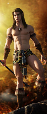
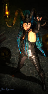
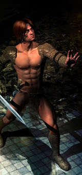
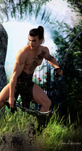
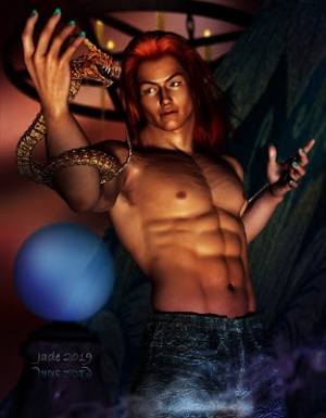
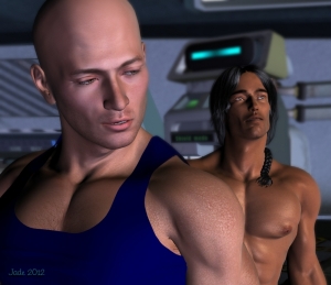
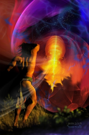
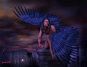
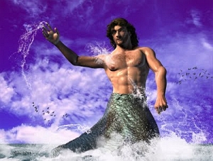
 Today, a new character! This one is 900 pixels high, so click on it, see thas detail. Notice the pointed ears, and the whole new skin texture,not to mention the new set of props! Call this Legolas if you want. He sure is pretty, and I'm especially pleased with this because I designed the face -- not just the expression, but the face itself...
 What did I say about pretty? Okay, so what went into this picture? First, obviously, you need the props; and the backdrop; what you also need is a good idea in your head of what you're trying to design. Then, you figure out what combination of what elements will get you the results.
This pictures use this list:
Michael 4
Mon Chevalier hair (set to golden)
Albane skin map (actually albino!)
Jagger's aqua eye color
Face designed by me
The torc from the Wood God kit
The kirtle from the Wood God kit
The moccasin boots -- same kit
The bow from the High Fantasy props kit
The quiver from the same kit
The ring from the same kit
Lighting designed by me
A pose for the character
Backdrops by me
Border by me
Okay, so to absolutely duplicate this you would need Michael 4; Mon Chevalier; Albane; Jagger; the Wood God; High Fantasy props, and some digital photos.
The Albane and the Jagger are skin maps. You buy these separately and slap them onto Michael 4 to change the color and texture of his skin ... boy, is there a "duh" in there somwehere.
So: load up Michael 4, and put on the hair. Next -- apply the skin texture you want and the eye color. Now, the costume. Then, if you're not worried about the face design, mess about with the pose before importing the props (more about those later).
But I wanted to design a whole new face as well as the physique, and I really got into this one...
So, how do you start with Michael 4 and end up with the vision of loveliness you see above?

When you buy the Morphs++ for Michael 4, you're normally thinking about the body ...turning a skinny little dweeb into Conan the Barbarian ... and vice versa. But it gets better. There's a lot more to the Morphs++ than just the body. There's also the head morphs...
This is where it all happens. Select Michael; then go Content > Poses > Michael 4 > Morph Injections > Head ... and see what happens over in your Parameters pane on the right! If I had a smiley face to put in right here it would be wearing a huge grin...
Because every control in the world has just opened in your Parameters pane. You can change everything from the slope of the cranium to the angle of the nose to the breadth of the jaw to the size of the eyes to the shape of the tear ducts to the depth of the upper lip to the cleft of the chin ... on and on and on. You can also set werewolf fangs and (!) elf ears. Note the pointed ears on this character here!
Now, it's not actually as easy as you might think. You can (and will!) get some really weird results till you get the hang of this, but as soon as you have it down, you're at liberty to make new characters as and when you need them.
So spend a little white getting the face just right -- it's time well spent, because you can bring this character back out as often as you want, like an actor ... cast him in a part, have him play a role. When the face is set, then start thinking about the pose --
And this is where you also need to give some thought to the props, because how the character has to hold the props to make them look realistic affects the pose itself. The best way to do it I've found yet is to get the props positioned and locked to the model, and then move the model around!
So import the props one by one and maneuver them around till they fit into the hands; then lock them in place by catching them in the Scene contents list and drag-and-drop onto the body part they're supposed to be locked to. The ring, for example, is locked to the left ring finger. Then you can start positioning the model for the best effect ...
And thinking about the background. To me, this shot looked like it needed an "enchanted forest" kind of backdrop, which was dead easy, because I have a huge library of woodland images right around the whole "wheel of the year" from spring right back to spring. So I picked a couple of really nice fall pictures to be the backdrop, trimmed them into shape and added them in...

So, with a really good pose organized and the props positioned ... render one ... and prepare to scream. Because it's almost certainly not going to look right. There's still an element missing. What's wrong with it is the lighting ... right now, there isn't any. You can see the character all right, because it has default lights, but default lights are like room lights -- totally ambient. And the real world isn't like that. Ever.
There's a couple of classical artists I like a lot. One of them is Caravaggio -- who might have been a mental case (as well as a druggie and a murderer!) but by golly, could he paint. And the strongest thing, for me, about his painting, is his eye for light.

If you compare an unlit 3D render with a photo, your eye can be biased to just see a picture. You don't even notice the light and shadows. But when you look at a painting, the use of light and shadows just jumps out at you.
And when you go back to your unlit 3D render suddenly it hits you ... the light's all wrong.
That's a whole 'nother subject! I'll talk about lighting tomorrow...!
Jade, 20 December


