


 Finally --! The dancer and the gypsy get it together ... looks like they've patched up their differences, and maybe the gorgeous little tyke will come home, now he's had his "fifteen minutes of fame" in the spotlights! I love happy endings.
And of course I rendered the MA-15+ version of this -- but I wasn't going to upload it to this blog, which is a "general audience" blog. However, I also consider well-behaved vignette artwork like this to be "general," because it's high time the world at large recognized the rights of gay couples to be couples, and be married, and ... okay, Jade, off the soapbox.
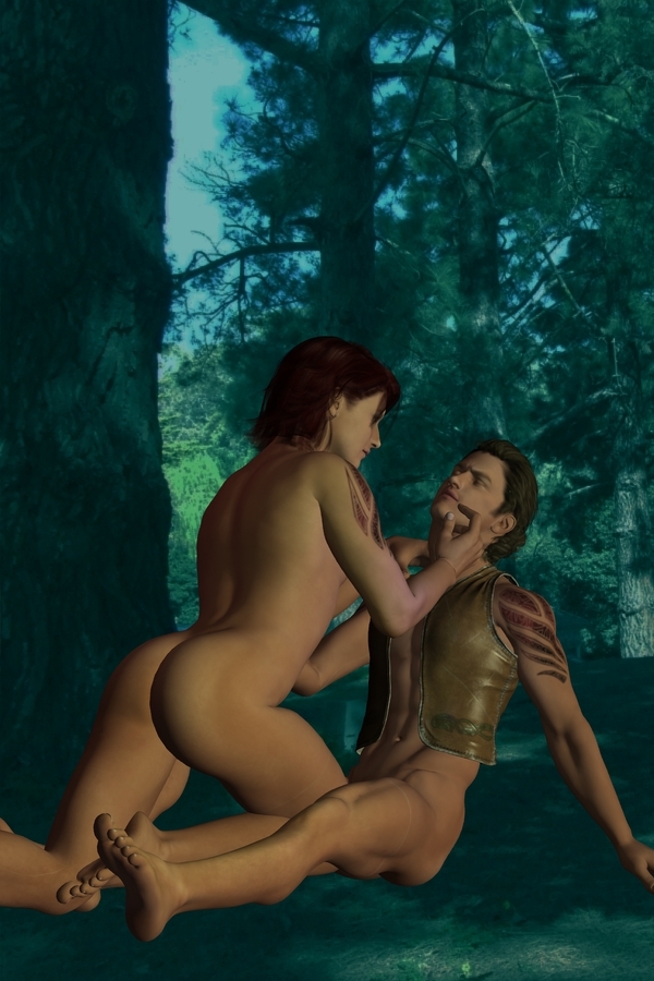
But if you're "of age" and would like the adult version -- consider yourself warned, and click here. It's not R-rated, just ... well, in DAZ Studio 3 you can, um, "lose the costumes" by clicking an icon that looks like an eye. Eye open = they have their pants on. Eye closed, uh, no, um, costume. I stand by my art: it's a *very* beautiful image, but it's also one step further than I want to go on this general blog. Enjoy!
How do you get this shot? Well, it's exactly the same backdrop and characters as the shot you saw yesterday:
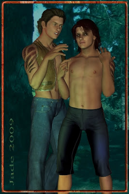
Go back to the original post if you want to reference it at 1000 pixels high. The lights, everything -- the same. The only difference is the pose and the expression on the gypsy's face.
There's four ways to do poses. You can do the whole thing yourself ... which is fun, but it takes a while to learn and you can get some hysterically funny results. You can literally twist a guy's head around backwards! You can also buy sets of poses -- but they tend to be a bit "cardboard," and you see this especially when you put two characters together. Something will always need to be adjusted -- which gives you the third way: start off with a stock pose and adjust it to get what you want. Which gives you the fourth way: when you have the pose you want, you can save it and trot it out later as a "pre-set," which saves you loads of time.
I have to say I *love* this lighting set. It's the rich blue-greens, and what they do to the olive skintones and the tribal tattoos. These colors, I could look at forever.
The other thing I wanted to talk about is how to tie font in knots with Serif. Okay, everybody knows about buying fonts (you can also get some fantastic ones free. Try this: http://www.1001freefonts.com/ -- the site is fantastic, and you can get anything you'd want to do artwork.)
But what about if you wanted to take a font and rip it up, or tie it up, to get a signature like this:
 You cannot buy the font out of which I used the J for Jade. That was made up by yours truly, in about two minutes flat, and if this interests you strangely, stay with me for a few minutes and I'll tell you how!
 In Serif X3 or X4 (actually, as far back as version 10, but very few people are still using that) you get really clever with letters. Here's how you do it:
First, forget about your text frames. They're for writers and publishers. When you're doing art, all you want is the Text Flyout -- way over on the left, in your toolbox looks like a Capital A with a down-pointing carrot beside it. Take the default setting, which creates plain text in a box you can size and stretch. It also defaults to Times Roman, so this is probably the first thing you want to change. You must have something in mind that you want to create, so pick a font that at least gives you a start -- serif or sans serif, meaning with or without the little ticks that differentiate Times and Palatino from Arial and Optima.
Okay, type a letter into your box and drag it out to at least 40 or 50 point, so it's big enough to work with. Now, select it ... and RIGHT click on it. A dialog pops open, and the magic is about to happen. See at the bottom there, convert to curves...

Click the curves option ... and the magic is about to happen. This is the next thing you see:  ...and you're about to discover a whole new toybox, because every one of those little squares is a "control node" which you can catch with your mouse and pull or push. You can also click between the nodes and pull or push, and create a nice convex or concave effect ... and if you double-click you can create a new node any place you want it.
Then, you can stretch and squeeze the letter to get the exact dimensions you want; then get into the same bitmap fills, drop shadows, bevel and emboss, 3D light effects and such, that I was talking about yesterday, apropos of borders.
So there you go: Serif for artists. I know it's marketed as a DTP package, but there's more in it for artists than for writers and publishers. I love Serif, Irfanview, Micrographx and DAZ -- and here's the trick: put them all together, legal versions, and you're under a hundred bucks!
Mind you ... getting into DAZ 3D you also have to think about buying models, and I guess I ought to talk more about that. I'll aim at this for tomorrow.
Jade, 17 December


