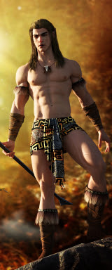
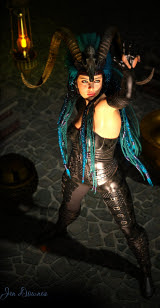
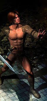
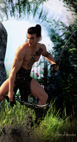
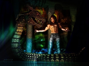
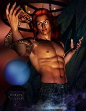
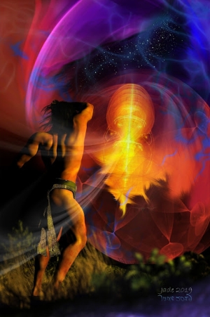
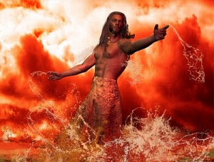
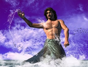
Here's a glorious figure, for the sheer joy of artwork. I like this picture a lot, even though it's not much more than a figure against a backdrop. It's the way the light falls around him ... how it turns blue-green and bronze, with a lick of mauve picking out the top of the forearm.
Life meets art, seriously. You can do this with an airbrush or a paintbrush -- I used to, all the time. I'd work a few days to get a sketch I really liked, then transfer it to board and ... paint. Come back next week or the week after, and there'll be a painting.
Working in 3D is better in so many ways. First off, you can "see" this in your imagination and then set out and finish it, border and all, in half an hour (so long as you know what you're doing with the controls. Second ... paint stinks, especially when you vaporize it in an airbrush. Paint and solvents give you a headache, and they're also toxic. Did you know many of the classical painters of olde died of illnesses -- or were crippled by them -- caused by the toxic nature of the paints they were using? True!
Also, with 3D art you can make a mess, delete it and start over without having to go back to the store, buy another board, trace off your sketch ... major work, that, not to mention the expense. Art boards ain't cheap these days! Would I go back to painting traditionally? Yes, but only when I have a lot more time. Which means, when I retire.
So, how was this piece done? It's actually dead simple, it's just the play of the lights that makes it look clever. There's only one model -- Michael 4 -- and he was loaded in from an old project from a few weeks ago. Turn off the costume; turn off the tattoos. Re-pose the model...
I started with a stock pose (something out of the M4 Nuance Poses set, which costs about $10, I think -- and well worth it), and then I changed the whole thing, tweaked it, pulled it ... made it look like he's reaching out toward the storm.
The physique is also changed for this. I was using the Morphs++ when I designed this character, so the morphs stay loaded, and pop back up when you load the old model into the new project:
 Look down in the right hand corner there ... click on this and see it at 1000 pixels wide, you can read the tabs. Everything has a slider attached, and you just muck about till he's, um, perfect. You can get some really weird results -- it can get hilarious. But eventually you'll come up with the physique you were looking for.
Then, the camera angle ... and here, you have to be a little bit careful. You have to be aware of something they call the "infinity plane," or the "plane to infinity." What this is, is an imaginary floor lying right under your character's feet. As you move the guy around, the infinity plane changes all the time. You have to see where "infinity" is, and match that up with the horizon line in whatever you chose as a backdrop.
Now, you can chicken out totally and make the background plain, in which case forget all about the infinity plane. And I have done this sooooo many times! Especially when I'm in a hurry. Also, a totally plain background means the figure is the only feature, so Michael 4 is the whole shot. Like this, for instance:

There is nothing else in the shot, just Michael 4 and a torc around his neck, and shadows. (This is one of my vary favorite images -- see the original post, and see it at full size here.)
But after a certain point you start wanting to do scenes ... which means you start thinking about backgrounds ... and eventually you have to think about the "plane to infinity." There's basically only two things you have to keep in mind:
1) Where's the horizon in the backdrop? Match the infinity plane to this, and you'll be halfway home. And, 2) what's the camera angle?
Camera -- what? It's 3D art? Well, even artists (or especially artists!) think about this, but it's true, before the days of George Eastman, it wouldn't have been called "camera angle." They used to call it the "angle of view." Put it like this: if you lie on your belly with the camera 6" above the ground, the foreground of the shot will be compressed -- you get fantastic photos this way. Dramatic. If you stand up straight, you get a standard (boooorrrrring) wide shot. If you get up on the roof, you'll be looking down on the scene...
Every time you change your height above the ground, the "angle of view" changes. (There's another Eureka! moment. It was a real epiphany when the penny dropped for me.)
So when you set up your figure and fly the camera around ... look at the horizon; look at the trees of buildings or windows or whatever, in the background. Is the camera pointing straight at some tree? Is the tree more than two meters tall? In that case, if Michael 4 is standing in front of it, there's no way you can be looking either up at him or down at him, because the tree in the background sets the camera angle!
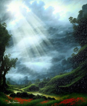
The background on this picture is a stormy sky ... it's also a digital painting. It wasn't that stormy! Just overcast and coming on to sunset; one bunch of clouds was actually throwing a shadow on another ridge of clouds, and it just looked like there was a storm coming in. I just made it darker, and turned up the red ... which made the picture's purple tones come up.
Then I posed the figure as per the horizon line, and then set up the lights to give the "storm light" effect. As usual, the lights were the roughest part of the picture. I got it waaaay too purple a couple of times.
Male nude ... pure art ... loads of fun!
Jade, 21 December


