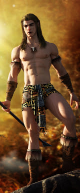
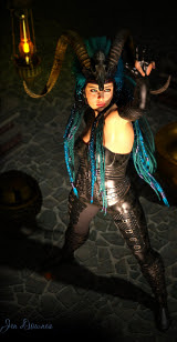
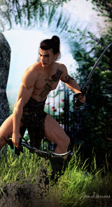
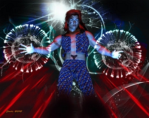
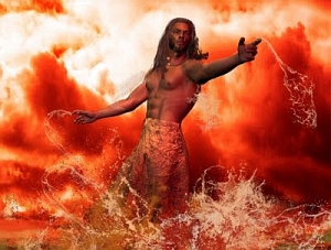
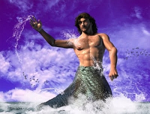
 As promised ... a male nude art fantasy, which I think of as painting with light. This is where 3D work crosses a line and becomes real art, and there's quite a lot of skill involved. It's not all done by the computer! (In fact, you think it is, I urge you to get the DAZ Studio 3 software and have a go yourself. Believe me, great pictures don't just happen by themselves...)
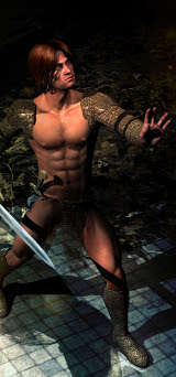
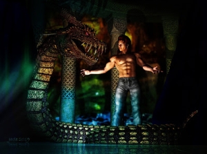
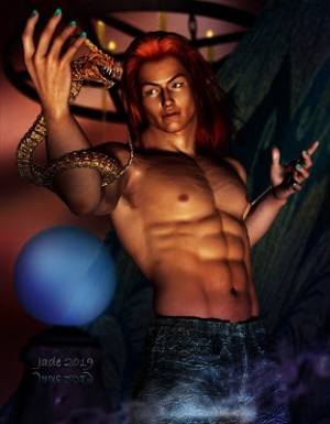
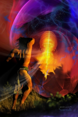
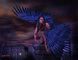
This one, here uses two models -- Michael 4 and his hairdo -- and no background at all. But it does use five lights -- one distant light and three point lights -- and each light it set to a different color.
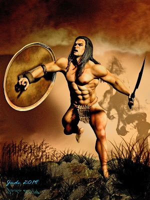
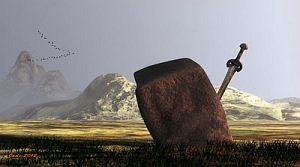
The idea for this picture occurred to me when I was looking at the render from a while ago, Valedictory:

Okay, this guy won. But that automatically means somebody else had to lose ... and it's a mistake to assume he was fighting an ork or a monster who was just begging to have its head lopped off! Suppose for one moment he was fighting a noble opponent -- a challenger, or maybe a prisoner taken in battle. The Romans did this all the time. You were captured as a prisoner of war, you wanted to live, you fought for the right. (Hey, I saw Gladiator three times at the movies and then bought the DVD!)
So, if this guy with the chain mail won, who lost? Which got me to thinking, and I decided I'd render the other side to this scene. Presumably the challenger was also dressed in chain mail when it all started. Notice, the armor is gone now, and the defeated will bend his knee.
Believe it or not, it's actually the same model with the costume removed, reposed, and the lights all reset! I know it doesn't look a bit the same, but that's what it is!
Two main things went into this picture: the idea, and a bit of skill "driving lights around." What in the world do I mean by "driving lights" ...? Bear with me.

When you create a light in Daz Studio 3, it lands on the stage in the o,o,o spot. This gives you a reference point for 1) finding it after you've created it (!) and 2) maneuvering it around! When scenes start to get big, you can start to lose things -- seriously! You can create a light and see no difference in the scene ... then the hunt is on and you're looking everywhere for it.
The best way to find things it to look at their coordinates in the x,y,z language of 3D worlds. Then, you can adjust the numbers and get the lights (or props etc.) exactly where you want them for best effect.
This picture uses Michael 4, wearing the Mon Chevalier hair set to dark brown; then I created a distant light ... nice and bright, so I could see what I was doing while I got the model posed! I started with a stock pose, but it was too off-balance from this angle ... and if you want do do a real a male nude you're a bit restricted in the pose you can use without, uh, everything showing! So I had to adjust the pose a lot to get what I wanted.
When you're painting with lights, you need to think about where the lights should shine to cause the shadows to fall just right ... and you need to think about colors, too. One of the things that you remember most about some of the paintings of Boris Vallejo is that he didn't hesitate to paint someone green down one side, because that was the way light fell on his subject's skin. I often try to emulate the "feel" of Boris's work, but I paint beautiful guys. If you wait for Boris to paint gorgeous men, you'll have a long wait. He paints men occasionally, and when he does, it's almost always the muscle-bound stereotype, and the bing! Right back to muscular women.
So think about colors, and when you add a light here and there to outline the model's calf or chest or thigh ... it doesn't have to be white!
To get the pose for this image I went through a few variations...

... and of course I rendered a proper nude one! In fact, I rendered two, but I'm not about to just upload them to the open blog here! We live in a society where about 50% of the world thinks there's something wrong with the nekkid human bod, no matter how perfect it is, and everybody and his uncle is out on the pickets campaigning to save kids from the evils of the Internet ... which can be, and are, extended to include a copy of this above picture, rotated another 20 degrees to your right!! (This is the part I don't get: humans are made in God's image? Then, is God's holy bod also, uh, shameful or whatever is supposed to be wrong? Leaves me scratching my head.)
Anyway, if you are of age (whatever that means in your part of the world), and if you're sure you're not going to be shocked out of your gourd and have your growth stunted, and end up in 500 hours of therapy by seeing a nude male human being, then -- click this to download the "full" version of the image, and click this to download the other full version ... and don't write any whining letters to me about him not wearing any shorts!
In other words ... enjoy, live a little, peace, man, and all that Sixties stuff which we need today a hell of a lot more than they needed it back then. (Bring back the sixties, please, somebody...)
Jade, 29 December


